
After analyzing the Samsung Galaxy Gear watch last year, I wrote that “Smartwatches are the future—but Samsung Galaxy Gear only partway there.” In spite of the unbridled enthusiasm that the Apple watch has generated on many tech sites, unfortunately, its UI didn't get us much closer to the future. Here are some observations and corresponding recommendations for designers.
Tiny Targets
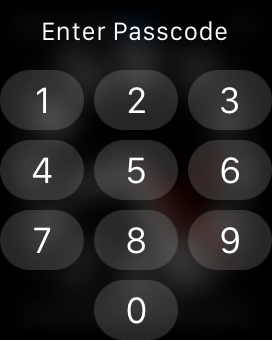
It’s no news that touch input requires bigger targets than the mouse. Like it or not, people have fat fingers, and to ensure that they can reach touch targets quickly and reliably, the recommended target size is 1cm × 1cm (0.4 in × 0.4 in). That’s why perhaps the most striking feature of the Apple watch is how much it seems to have embraced teeny-tiny targets. To unlock the screen you have to type your pin on a minuscule numerical pad. And the application screen uses a plethora of tiny circles (representing apps) organized in a focus-plus-context visualization — the center of the screen is the focus and has the largest circles, and as you get further out, the icons get smaller. Launching an app is an adventure — not only because the icons (in-focus ones included) are too small even for the tiniest pinkies, but also because deciphering them requires good eyes, or at least diligence and the will to scroll around and bring them in focus. And good luck trying to erase any of the apps directly from the watch: those “X” icons are suited only for infant digits! (Yes, people can touch the whole icon, but in practice the vast majority of users will attempt touching the small “X” because that’s what they have been conditioned to by countless closeboxes all over the web and software. While padded touch targets reduce user errors, they don’t solve the fat-finger problem, because we know from usability testing that users attempt to hit within the visibly touchable area.)

You may ask: with a small screen (the watch itself is 38 mm × 38 mm in its smaller version, and the actual screen is even smaller than that — only about 32 mm × 35 mm), what else is there to do beside embracing really small targets? Definitely a good question. Here are two answers: voice and gestures. Both voice and gesture save screens from UI elements (also known as chrome), while allowing users to navigate around the app or the device and input information.
Gestures
So far, touch apps have struggled with implementing gestures, and legitimately so. Gestures have few affordances and are hard to learn. In user testing, those few apps that rely extensively on gestures fare poorly with regular users and require a fair amount of patience and willingness to learn. On phones and tablets, interface redundancy is often recommended as a way to ease users into gestures — that is, instead of relying on gestures as the sole way to implement a functionality, have an alternate way of doing the same action that involves visible chrome.
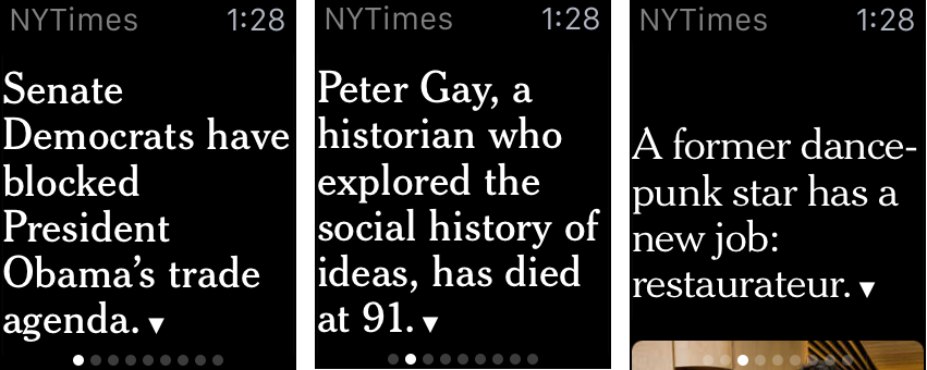
But with smartwatches, gestures are pretty close to being the only reasonable alternative. A swipe is more forgiving than the simple tap and is by far the easiest way to interact with the device. The watch apps use the swipe extensively to move through different items in a deck of cards (see below), and the right swipe means (almost) consistently Back.
One new gesture that the watch introduces is the force touch, a distant relative of the long press familiar to Android users. Like the original version of long press on Android, the force touch can be used to display a contextual menu, relevant to the current screen (similar to a right-click in desktop Windows). But unlike the long press (or a right-click), the force touch is attached to the whole screen, not to a UI element of the screen. Thus, it doesn't matter exacly where your finger touches down when you initiate a force touch. Fat-finger problem solved, though at the cost of diminished contextualization.
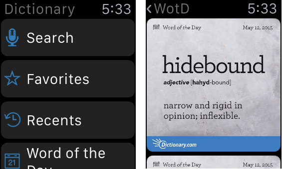
Beyond the novel hardware, emphasizing force touch and swipe-as-back as key gestures represents an interesting, albeit fairly timid opportunity for gesture standardization. The swipe-as-back is already part of the iOS gesture vocabulary, yet many users are not familiar with it because they don’t need to be (the Back button in Safari is accessible and more familiar — an example of the aforementioned interface redundancy). If Apple forced watch users to rely on the swipe for Back, then that gesture would perhaps trickle back to phones and tablets and become more standard. However, the swipe-as-back functionality is duplicated even on watches by a top Back/up button (see the hierarchical view in the Dictionary app above), which although difficult to use because of its small size, may still get more usage since it’s visible.
The force touch is a gesture with no perceived signifier — that is, with no visual indication as to when the gesture can be used. This gesture is fairly unfamiliar to iPhone users (long presses or touch-and-hold gestures are far from common on iOS). If used consistently by apps, its familiarity may increase and it could become a viable gesture for other touch interfaces. However, history teaches us that the lack of visual signifiers or cues for that gesture is likely to slow down its adoption.
Deck of Cards Works Best
The tiny targets have some important implications for design. Because using navigation elements such as buttons and links is so tedious, in fact, what works best on the watch is the deck of cards, a pattern that definitely is not optimum for other devices.
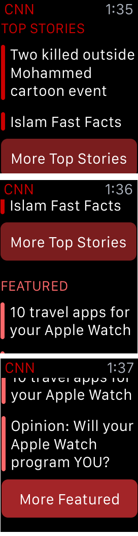
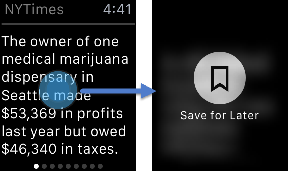
The deck of cards (a full-page relative of the carousel) is a presentation model that goes back at least 20 years. Cards provide sequential instead of direct access and usually should be reserved for content that has a clearly sequential nature (e.g., books) or for lists with just a few elements. Yet, on the watch, the deck of cards is preferable to the the alternative list interface, which often requires going back and forth between a list view and an item-detail view (a form of pogo sticking), and thus involves multistep navigation. Plus, with the deck of cards, users can easily trigger the contextual menu (to save the story for later reading on the phone, for example) for each item right away, whereas in the list view users must navigate to the detail to invoke the contextual menu corresponding to that item.
The deck of cards is of course tedious when you have a hundred items (or even 20), but it is ok with 10–12. In fact, a user may never go through 10–12 cards on a watch — the length of the session would be long enough in that situation to warrant taking out the phone.
The other disadvantage of the list view (besides the more complex navigation and the crowding of targets) is that it makes it easier to accidentally touch something while just scrolling down.
Handoff
Handoff refers to allowing users to continue the task started on the watch on their phone. This used to be one of the strengths of the Samsung Galaxy Gear, but with the Apple Watch, the handoff is a lot more painful, for two reasons: (1) not all apps allow users to continue their tasks on the phone, and, more importantly, (2) the interaction cost of resuming the task is fairly high. Unlike with the Samsung Galaxy Gear, your iPhone is not automatically unlocked when the watch is in its immediate proximity. So you have to swipe up (not touch) a tiny icon in the bottom left corner of your lock screen — an utterly bizarre interaction design — and then unlock your phone before being able to continue the task on your phone.
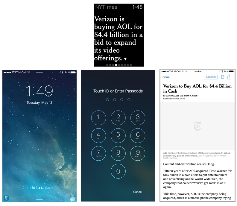
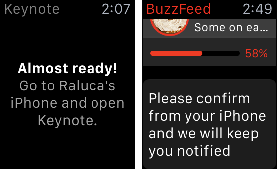
Handoff is a powerful tool that should be used not only for getting more detailed content that cannot fit the watch screen, but also, more generally, for tasks that cannot be done on the watch. In particular, designers should help users recover more smoothly from errors using handoff. Keynote, for instance, asks users to go to the iPhone and open the app, instead of using handoff to help them do that. Ideally, the apps should hand over situations like these to the phone app, instead of having people launch the app by themselves.
The recommended approach is exemplified by Starbucks: the watch app tells the user to log in, and the handoff feature promptly takes the user to the login screen in the iPhone Starbucks app.

Standalone Content
Just because the screen is small is no license to truncate content. Although handoff should be supported, the content on the watch should be treated as an independent piece of content that can stand by itself. Moving from watch to phone is a high-cost action that should not be needed for most quick interactions. The BBC has been writing meaningful headlines in 34 characters since the days of teletext. If Auntie can do it, so can you.

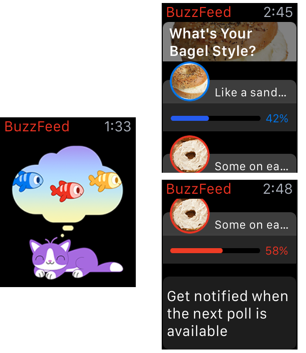
The Buzzfeed app displays a poll in its app, but good luck understanding what the poll options are. The splash screen and the low speed aside (some image elements of the page load only after a significant time, thus increasing the confusion), it is hard to say whether we’re looking at an invitation to vote or just at the results of a poll collected elsewhere.
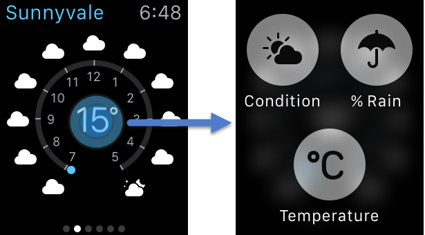
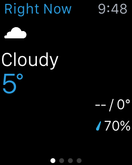
Sometimes apps eliminate important information in their attempt to streamline information and take advantage of the small screen. For instance, when I first started The Weather Channel app, I was presented with a screen that showed that the current temperature to be 5 degrees Celsius (41 degrees Fahrenheit). Even at 9:48 pm, this is uncommonly cold for a May evening in Sunnyvale, California. The app simply copied the first screen in my list of locations on my Weather Channel app, which happened to be Tahoe City. On my phone, I could see that 5 degrees Celsius corresponded to Tahoe City and easily scroll to my current location, but on the watch there was no indication of which city this temperature corresponded to.
Focus on the Essential
You don’t need a watch app just because everybody has one. Fandango has an app that displays movie quotes, and the BuzzFeed app above is completely useless, especially in the current implementation. And, at the other end of the spectrum, a watch app should not be an attempt to replicate the iPhone app: the screen size is too small and cannot accommodate the same amount of information as the substantially larger iPhone screen.
History repeats itself:
- The lesson of 1997–1999 was that a website was not a glossy brochure, nor a TV show.
- The lesson of 2007–2009 was that a mobile phone is not just a smaller computer.
- Maybe the third time will be the charm — say it out loud: a watch is not a smaller phone.

The average interaction with an app on the phone is about 70 seconds and about half the duration of a web session on a computer. On the watch, we can expect the average session size to be substantially shorter. Think of the information that people care for and that they can access easily in just a few seconds. That’s what you should offer on the watch.
The small screen size forces designers to think hard about (1) what users care about most in their app; (2) how to compress that information so that it fits the tiny screen. Complex interactions do not belong on the watch: Remember that people can always go to their iPhone if they need more.
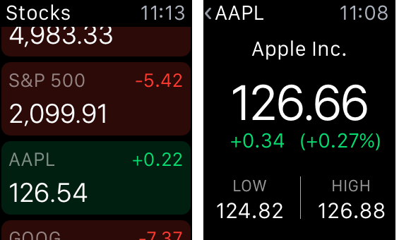
Allowing users to manipulate the level of detail in a stock chart (like Apple’s Stock app does) is unnecessary and does not belong on a watch. If I care about a stock enough as to have it in my list of stocks on my phone, I probably am mostly interested in checking last-minute changes on my watch, and not in researching its performance in the last 6 months.

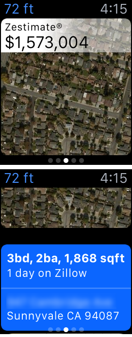
Similarly, Zillow, the real-estate app, shows a (house) price and a map, but who can tell where the map is, based on the aerial view? The 72 ft title is cryptic: is it 72 ft from me? In what direction? Is this the closest house for sale, just the closest house, or a random house that is 72ft away? Where is it on the map? Luckily, if I scrolled down I could see the address, but the map is pretty much useless in this type of display.
Recommendations for Designers
If you’re thinking of designing a watch app, think twice, because your intended app may be no good on this platform. If you think you can create value for watch users, follow these guidelines to allow users to actually reap this value:
- Distill the essential content that people are interested in and present it in a compressed form that would fit the tiny watch screen.
- Avoid buttons and complex navigation as much as possible, and if you do include buttons make them few and big.
- Use handoff to phone to enable users to get more details and solve problems that require more complicated interactions.
- Create standalone bits of text that can easily be read and comprehended and truly convey the gist of your content.


