Proposing new CSS primitives to enable great web experiences on foldable & dual-screen devices #4736
Comments
|
I have 2 question:
|
|
I'm a little concerned about extending this out in the future, and I'm wondering if maybe we should be splitting this out a bit more e.g. We might not be able to return all the fold information for 5 folds via an environment variable right now, but at least the media query can be a little more accurate and can extend more gracefully into the future possibilities of N panels. |
|
The CSS Working Group just discussed The full IRC log of that discussion<dael> Topic: Proposing new CSS primitives to enable great web experiences on foldable & dual-screen devices<dael> github: https://github.com//issues/4736 <dael> dlibby-: As maybe you've seen MS has announced 2 new dual screen devices. <dael> dlibby-: Given these are cross variety of platforms and browsers and web would be great. CSS is great for layouts. Been bandying about ways to expose CSS for this so they can control how webcontent is in relation to the hinge. <dael> dlibby-: Had some principles about don't want to expose unnecessary new capabilities. Trying to be cognizent that these devices aren't comprehencive of future. Don't want to shut door on future form factors. <dael> dlibby-: It's a new media feature called 'spanning' Intent is to desc when viewport is spanning several screens. Depends on how viewport is positioned. <dael> dlibby-: Need to understand where gap/hinge is in terms of css coord. Proposed 4 env variables to desc where is the fold, width and height of fold <florian> q+ <astearns> ack florian <dael> dlibby-: Excited to hear feedback, if this sounds reasonable, any drawbacks. Definitely open to changing based on collective experience <astearns> q+ <dael> florian: Always a challange for a new MQ for new device. Categorizing devices doesn't stand as time passes. I'm happy to see this proposal is trying to test a relevant aspect of what's going on. Means we're on the right path. A little concerned about env variable. When it comes to sizing I think this is likely to overlap the unsolved viewport units conversation and which parts have and don't have scrollbar and keyboard <dael> florian: All the struggle with vh/vw seem to overlap here. I don't have a solution. Proplem space seems reasonable. <dael> dlibby-: Makes sense. Aware of some interaction with things like vch unit to reference visual viewport. I would agree there's rationalization to be had there. <dael> dlibby-: Being desc with viewport units I don't think it sits how we've been thinking about it. Not sure if you're jsut noting tie ins <dael> florian: Similar issue, not nec. units. If you want to size something to 80% after folding, what 80% are you talking about? Probles are same as vh/vw even if not same units. <dael> jensimmons: Question: Haven't thought a lot abotu devices with hinge. Is mental model for anyone designing for screen simply that there's a wider screen with a web window like we've known for years and then suddenly it's magically half as wide and that's it? It jumps wide to narrow and narrow to wide? <dael> jensimmons: Or is it that people think about design of the screen where you have more space then that. WHen you open a browser window it's usually one space and hwen you go wide it goes two up? Are there thing like that? <dael> jensimmons: Is it simply a different way but similar to responsive or is it more complicated whre you have 2 up b/c new screen? <Rossen_> https://user-images.githubusercontent.com/5052316/73715033-8a3e5b00-46c7-11ea-8839-af3801c97502.png <dael> Rossen_: A little of both. Awareness of hinge is important and that's what desc spanning. Spanning is going across hinge in middle. THat allows you to create different experience on that hinge location <dael> Rossen_: If you look at motivational examples in issue they're pretty well thought through. If there's an email app you can do solumns on left for folder, email titles and then right side is full experience with selected message <myles> q+ <dael> Rossen_: These are doable but if you don't know where hinge is you have content half on one side and half on the other. That's a simple example. Many others that Zo (sp?) has been working on <dael> Rossen_: Knowing where hinge si is important <heycam> q+ <dael> dlibby-: Knowing where hinge is and mapping to it might be useful to developers in many cases <dael> jensimmons: Some of these things we know so far like where is screen aren't issues. THIs is where hinge is. <dael> Rossen_: Right. And this is why we're nto defining viewport, but there's something that splits viewport <fantasai> s/many cases/many cases. Also different OSes treat the gap differently, e.g. some mask content in that area whereas others split the screen apart/ <dael> astearns: Is this prop MQ matching cases where phsycial hardware doesn't have hinge. Thinking like a reader view or something like that where might want to layout differently between left and right page. I think ther answer is this MQ is not for a case like kidle to view on content where content flows from one side to another. This is about having a phsycical gap in screen <astearns> ack astearns <florian> q+ <astearns> ack myles <dael> Rossen_: I dont think we're insisting on physical paradigm. I can see an epub that uses multiple tabs internally to drive that experience using this css mech. It's something we haven't thought about. Good to consider <dael> myles: It's clear there are use cases for one browser window to span both halves. I've also seen use cases like in explainer with google maps where one half has map and other is locations. For one big browser window we can do that today. 2 panes could be solved with preso API <plinss> q+ <dael> myles: Your prop is more powerful b/c allows mix both these. Some content aligns to fold and other span both. I haven't seen cases for this mix. Can you desc one? <dael> dlibby-: I think you said there's single window paradime and you split content. THe other where you lean on preso API to open another full window. Correct? <dael> myles: What type of content are you encouraging web designers to create with this API. Because with no API web designers could create for this. Presentaion API would encourage 2 different independent. You haven't proposed either of those types. You're proposing a 3rd type that doesn't fall into first two buckets. What type of content are you encouraging that's not in those buckets? <dael> astearns: Specifically a mixed mode were some content is split but other content spans both? <dael> Rossen_: Let's consider a mail app with an application bar that spans both screens and then left and right sections for the two screens <dael> myles: Yeah, I think that answers. A nav bar that spans across the fold. <astearns> ack heycam <dael> heycam: A little unclear to me if the model here is the window that spans the two displays. Does it have a strip of pixels which are not rendered because they overlap the folder or is the back buffer for the window is split? Or both? <dael> dlibby-: Accomodate both. Early MS devices is that they'd have different. One has pixels across the back and the other has a split. In one case your fold-width would be 0 but it's still there <dael> heycam: Understood. <dael> heycam: For UI or content you want to span, the toolbar and you've got buttons you want to avoid the fold space so you don't lose half a button- not sure if there's a great way to use env variable to make them avoid fold if you're using flexbox. I gues syou can fallback to script <dael> Rossen_: What you're saying is exactly what [missed] to avoid having loss of content to avoid having the button fall under the hinge <dael> Rossen_: If you see fold width it essentially describes that space <dael> heycam: I'm imaginging a flexbox container that spans the width. I'm not sure how you use nth env variable to make sure the flex items when you get to fold one doesn't go over fold. <dael> florian: Similar is a 3 column grid where you want 2 and 1 and you don't care which side is the 2 but you don't want a split grid. <dael> ??: First one is a single flexbox with an arbitrary number of buttons with width. You won't know when buttons reach hinge but it'll help you make 2 columns. Request is a single flex and avoid the gaps <dael> heycam: Right. THat might be an example of the more general region flow <astearns> s/??/Zouhir/ <dael> Zouhir: The original demos we experimented with we didn't touch on arbitrary number of childrens avoiding hinge. We did make multiple grid and flexbox where we can snap to the fold nicely. It's a good note to take <Rossen_> q? <dael> astearns: Good to add examples of env variables with layout mechanisms <florian> q- <fantasai> It sounds like you really need media queries against the fold offsets <astearns> ack plinss <fantasai> plinss++ <Rossen_> +1 to plinss <dael> plinss: Couple points- Lot of work done on folding screens and I'm hesitant to do something in CSS that we'll have to carry around when folding screens might no longer have hinges. However multiple monitors on desktop is comment. Would like to make sure if we solve what we do applies on desktops as well. Food for thought <dael> dlibby-: Good feedback. Have that in the back of our mind but not concrete <dael> Rossen_: We've taken steps to make sure that's not obstructed. But yeah multi-monitor is first that came to discussion <dael> plinss: And there's 4 monitors in a grid where you have vertical and horizontal <dael> astearns: Thanks for the introduction. I'm sure we'll discuss on the issue and again on a call |
|
I'm wondering if flex and grid need some kind of extension to allow positioning of "hinges" in them , in a way that the flex/grid layout algorithm could take into account (possibly but no necessarily including a gap at that point). In the case of a flex, that would probably behave sort of like a flex-wrap in terms of laying out and sizing items within each piece of the flex, but unlike flex-wrap, the two pieces wouldn't be on different lines, but contiguous to eachother. If we had something like that, it feels that the environment variables being discussed here would be a lot more useful. Even then, another difficulty with the environment variables is that they give you the position (and size) of the hinge relative to the screen/viewport, but to be able to use them in css for the layout/position/sizing of things that aren't the root element (or absolutely positioned with the root as a containing block), that's not super useful: you'd need to know about whether your parent element / parent formatting context is being cut by a hinge, and if so where in terms that are relative to your layout space. Without that, it feels like you're going to have to use complicated calc expressions to duplicate the way your ancestor chain has been sized / position in order to figure out where the hinge falls with regards to you. |
|
Multiple screens is going to lead to some fun in general with media queries. Nearly all queryable properties can differ depending on the screen being used. It would be... bad... not to allow content to query the capabilities of each screen it is using. It is hardly unlikely that someone is using a laptop (close to user, high dpi) connected to a beamer (far from user, different aspect ratio). Or just a big TV sized screen. And then there is the issue of hardware acceleration. Screens aren't equal, but neither are graphics cards. Ain't no rule that all graphics cards in a machine are equally capable. Heck, I bet that there are setups that have multiple candidate graphics cards that share the same screen with a software controlled switch. In fact, I hear that's a common setup on laptops. |
|
Is there any specific reason why the spanning and environmental variables are targeted towards dual screen devices? My main concern is that there should be a way of identifying a foldable independent of if it is seamless or with a seam. This proposal can be useful even on seamless devices (I’m thinking here of Galaxy Fold and other upcoming devices) to adapt the UX based on the state of the device. At the moment we are working in Samsung on an explainer that will shed more light on scenarios and new capabilities and how they would combine with the spanning media feature and fold environmental variables. Out of curiosity, in a device like the Galaxy Fold or the Motorola Razr, and according to the definition provided in the explainer about ‘spanning’, would it resolve to none? If that’s the case, it might be better to specify the ‘single-fold-vertical’ or ‘single-fold-horizontal’ and appropriate env fold variables to potentially accommodate the content on the web page? To summarize, my concern is with the ‘multiple screen’ wording that keeps appearing in the explainers, since these concepts are useful for single screen devices as well. |
|
@fantasai- That is a great suggestion - your proposed features would indeed make extensibility much easier for authors to reason about, and removes the hurdle of future form factors needing to come up with various individual values to describe available configurations. We'll look into testing the concept and validating with authors that have been keen on trying out these features. @frivoal- Thanks for the feedback and use case! We had not fully considered the best way to treat containers with children that want to avoid the fold. Many of the design patterns suggested for the Microsoft form factors have focused on, as you mention, a high level splitting of content, or absolutely positioning things around the hinge/fold. We'll take another look and see if the current environment variables can be harnessed or if we need some additional mechanisms to enable these scenarios. @diekus- The proposal has is not aimed at making the spanning and environment variables exclusive to dual screen devices. I'll go back and re-review the wording to clarify this point. We're trying to expose the underlying system's description of the semantics of the window. For devices like Galaxy Fold or Motorola Razr, if the window manager reports a fold (I believe the currently discussed abstraction for Android is DisplayFeature), then If the window manager doesn't expose this information (i.e. expects apps to just use the available space and not treat it as logically split into content regions), then |
|
The media query would need to be able to handle multi screen setups. Users could have a huge variety of set ups though. There are sensible 3 screen set ups like this: All the way up to something ridiculous like this:
The users display also might not even be rectangular:
The 3 screen set up is sensible to support. Do we want to support the more intense screen set ups as well though? |


It would feel very unCSSy to not have respective bottom and right fold positions as well. Overall, this issue raises some important points on design constraints, but the actual representation thereof in CSS, MQ or environment variables requires some additional thinking. Some display mosaics simply represent a fixed segmentation of a common shared planar surface (i. e. the viewport), like an infinite virtual wall. The static edge width around each screen (and thus between any two neighboring screens) may vary, often approaching zero for a seamless appearance, and are important to consider in layout because the wall may either be split at these frames or be covered virtually by the physical bezels, i. e. continue invisibly beneath them. For the simplicity of a first level, we may assume that the gutter between all segments is the same and distributed evenly, except we would distinguish horizontal from vertical ones. We should also note that the classic spread of left and right pages in a printed book or magazine is conceptionally very similar to two adjacent screens. They can also be more complex, e. g. in centerfolds. If media can be folded completely at a joint, the distinction between recto and verso or front and back also becomes important. Media Queries
Environment variables
Desktop setups with multiple screens would often have angles between 0° and 45° with For curved surfaces (and spheric caves, i. e. physical rooms, or virtual rooms around the user), we might want something similar:
|
Something to add to this is that in single screen devices like the Galaxy Z Flip or what Intel showed as the Horseshoe bend concept, the device is partially folded and the fold may or may not be usable (touch not working reliably or image distorted). So indeed the single-fold-vertical/horizontal properties could be defined even if there is no physical seam because the platform could or should define one arbitrarily. Also the platform/vendor may choose to give the opportunity for the developer (if she/he wants) to provide a split layout (top and bottom of the app being different) because it makes more sense for the website.
I second this as per above. |
/cdn.vox-cdn.com/uploads/chorus_image/image/66037667/DSC00612.0.jpg)
|
Thanks @fantasai and @Crissov for your feedback, since this thread have quite a few feedback items, I thought it might be worth breaking them down into a separate forks \ issues. I have opened this issue to change our currently proposed I have also went ahead and requested feedback from early API customers and I'd expect them to chime on that issue shortly. |
|
@Crissov , I have opened an issue to addd |
|
The problem with the term "fold" is that it is too device specific. Would you call the gap between 2 monitors a "fold"? Maybe, but it isn't as obvious in that context. |
|
Great point @Dan503 -- I was actually meaning to reply to your comment regarding multi-monitor. I completely understand that the concepts are related (dual-screen, foldables and multi-monitor) and I am not opposed at all to consider multi-monitor setups, therefore, if we were heading down that path, I agree we need to find a better name than While working with developers who are planning to add support for dual-screen & foldable devices, multi-monitor never came up as something they are wanting to target or apply their dual-screen layouts to. So, if we can have a customer with a good use-case for multi-mon, that'd be ideal, until then, I think we can brainstorm what we need to do to enable that path, some questions I have:
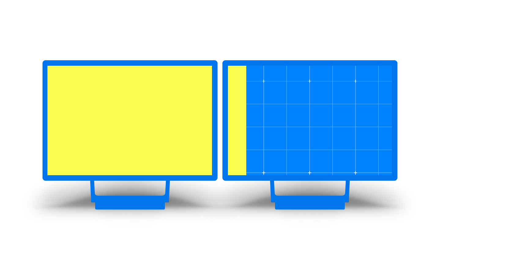
the right side in the figure above is not good for any content, and media queries does not yet enable us to check how big that side is, example: @media (display-span-x: 2) and (min-width: 900px) and (calc(100vw - env(fold-right) >= 400px) {
/* only now apply spanning layout, because it's more than a tablet with enough room on the right side of the fold */
}
I am worried developers will start using device specific |
|
And I would add that the fact that often multi monitors have heterogeneous setup where resolution/dpi and zoom level may differ between the monitors (different brands/model or spanning from laptop screen to monitor) therefore it makes even harder to span across screens in a reliable fashion. Window managers struggle today with that, just drag a window from one screen to another and see how it gets redrawn and layout again if the monitor configuration differs. When the window spans across two "different" screens they also look weird and "zoomed in" (see my picture) : on my main screen it doesn't look right for e.g. (and it seems that they're are some decision in the WM on when to pick a given state, often based on how much the window is spanning on a given screen). So I don't know how we would expose that to the content.
In the illustration of @zouhir it will be hard to align the right yellow piece (even if it was full screen) to the left yellow piece, so it may make the content look weird unless the author purposely create a split UX (not to mention the physical aspect of it). I think at the end we're opening a can of worms by enabling this on multi monitor setup. And the fact that multi monitors have been around for decades and nobody asked for features like this (aka spanning on multi monitors) is also a strong indicator that maybe we don't need that. I would like to point out this btw which somewhat try to address multi monitor and window placement : https://github.com/webscreens/window-placement/blob/master/EXPLAINER.md |

|
Those are some good points @darktears. A good middle ground might be to only work if the screens are the same resolution. But then a foldable device comes out where one screen is slightly smaller than the other screen and now these foldable things in our CSS don't work anymore for this new device. |
|
I want to also bring up that we seem to be focusing a lot on media queries but what would be more useful I think is a way to use the size of the current display when setting the size of elements. I'm thinking that we would need new .fullScreen {
width: 100dw;
height: 100dh;
}We might also be able to use this as an opportunity to enforce a fix for the problems with the existing viewport units that drive web developers insane. The problems being that
|
|
We'd like to discuss options we've been exploring to update the syntax to be more forward-compatible at the upcoming vF2F. |
|
The CSS Working Group just discussed The full IRC log of that discussion<astearns> topic: Proposing new CSS primitives to enable great web experiences on foldable & dual-screen devices<astearns> github: https://github.com//issues/4736 <AmeliaBR> ScribeNick: AmeliaBR <AmeliaBR> dlibby: A few months ago, we wrote up initial thinking on this project space. Specifically, foldables with 2 identical screens. We've had a lot of feedback, a lot about more exotic form factors or possible application to desktop multi-screen. <AmeliaBR> dlibby: (shares slides from explainer) This was the proposal, a new media feature, screen-spanning, with value describing direction, and then environment variables for the dimensions. <AmeliaBR> ... we went back to the drawing board based on feedback. Some detailed comments about how this interacts with bezels and so on, and how can we make it extensible to multiple dividers/folds in different directions. So need more complex environmental variables. <AmeliaBR> fantasai: this slide shows 4 panes, but 3 in the media query. Is that correct? <AmeliaBR> dlibby: yes, though that's open for debate. We're counting the number of folds/divisions, not panes. <AmeliaBR> ... For the environment variable, that means we then have an array-like structure, needs a way to access the nth value. Can't use comma, because that's the fallback. One possibility is a nested function. <smfr> q+ <AmeliaBR> fantasai: Or could just use a space separated `env(divider-left 3, <fallback>)` <fremy> @dlibby: also, why not just divider-left-1, divider-left-2, etc...? <Rossen_> q <AmeliaBR> dlibby: We then can start looking at more complicated cases (3 by 2 panes in example). Should there be different names to access horizontal vs vertical, top vs left. Getting a little overwhelming in complexity. Wanted feedback from WG about whether there is a more generic way to describe this. <astearns> ack smfr <AmeliaBR> smfr: I don't really have a mental model of how content is supposed to interact with the different screens. Can you pinch zoom on one screen, or would that zoom the whole display? Or scrolling, doesn't the divider line move relative to the content? <AmeliaBR> dlibby: Our proposal was based on defining things in the “client” coordinate system, doesn't change by scrolling. Zooming, haven't looked at that. Depends on a pinch or layout zoom, whether it changes the geometry in CSS px. <astearns> ack fantasai <AmeliaBR> fantasai: Generally, we say pinch zoom shouldn't change geometry, don't re-compute layout. But layout zoom would require computing everything. <AmeliaBR> ... on the slide, you're calling this 1,2,3,4 dividers for the top row and then the bottom row. That's really confusing to number in this wrapping fashion. I'd try to name more like grid dividers, assuming continuous columns, maybe taking the widest gap if they're not all the same. <AmeliaBR> plinss: I agree that number seems weird, but in multi-monitors, they're not necessarily be in a grid layout. We can't assume something simple if we want to include that. <AmeliaBR> florian: And desktop screens are often different sizes. <AmeliaBR> plinss: and that will probably be true in future for foldable mobile devices. <AmeliaBR> dlibby: Yes, we're trying to define in a generic way that doesn't make geometry assumptions. <AmeliaBR> fantasai: But at a certain point, what are the chances that you're going to make a design for arbitrary inconsistent sizes of panels? Can we start with a simple assumption of a grid-like layout. The original proposal was for just a single fold. <AmeliaBR> plinss: But we should at least consider whether more complex is possible. <AmeliaBR> fantasai: So long as simple cases stay simple. <AmeliaBR> dlibby: Agree with that. Kind of hard at this point in time to imagine all application use cases and all devices in the future. <fantasai> extending to multi-fold from single fold wasn't hard, so worth doing; extending to arbitrary geometry in space, it's harder, so I wouldn't be opposed if there was a proposal that handle complex cases but still kept simple cases simple, but don't want us to get stuck on trying to solve arbitrary geometry and make simple cases hard or impossible for the next 5 yrs <AmeliaBR> astearns: Like with custom origins and masonry, it would be helpful if specific questions are split out into separate issues. Right now we have a giant discussion. As these questions come up, please make separate issues. <AmeliaBR> dlibby: Agreed. Main goal for this f2f is to ensure we're on the right track. <AmeliaBR> astearns: On that note, any other concerns that came up from the presentation? <fantasai> +1 to florian, that's important consideration <AmeliaBR> florian: I'm slightly concerned about how this media query will be used & is it the best approach to the problem. E.g., can you make your grid just nicely snap to the folds, without needing to calculate all the environment variables, margins, and so on. <fantasai> s/so on/so on of ancestors and previous siblings and cousins/ <AmeliaBR> Rossen_: Snapping to the gaps is definite a use case, but we have so many different layout contexts, and we already have ways to make those sizings. Yes it uses calc. But if tomorrow we change grid, we don't want to need to retrofit a lot of magic. Trying to keep it simple rather than baking in interactions with all layout models. <tantek> Curious about relation to "multi screen" work if any <AmeliaBR> fantasai: I do think that florian's point is really important. We don't want people to need to calculate many layers of margin and padding to figure out where they are on the screen. <AmeliaBR> Rossen_: I disagree. <AmeliaBR> dlibby: There's certainly things we can look at, but I do think this proposal covers the basic primitives to start to get developers exploring things. Integrating with special layout modes could be revisited. <Rossen_> q <AmeliaBR> fantasai: One thing to look at is re-using fragmentation module to avoid breaks. That's what fragmentation is designed to address. <AmeliaBR> astearns: Most examples I've seen treat different screens differently, two or more separate layouts. Not fragmenting content across screens. <AmeliaBR> Rossen_: And fragmentation is one-dimensional. <tantek> In particular I'm curious about possible overlap with https://www.w3.org/2014/secondscreen/ specs and thoughts |
|
This stuff does not seem at all easy to use. I can't imagine that adoption by web developers would ever be all that high. Is there any plan for something simple, like a css function that adjusts a size or coordinate to snap to a natural boundary position? Something like: |
It's a media query opt-in, I don't find particularly complicated to use. See examples here: https://github.com/foldable-devices/demos
How you would handle the physical hinge covering content with that proposal? Typically, when designing for dual screen or foldable in split mode, the idea when spanning is not to have your content be the width of the 2 (or n) screens because the hinge may cover content or the fold could create an interaction issue (think if the device is half folded). The screen estate being bigger and the expected interaction being different typically would require the developers to rethink the layout slightly. Matching the MQs make the developer think that there are now 2 segments of content that can be displayed and thus enable a new layout (often a two pane or reflow the current one to take the hinge into account). This is an opt-in which is good. Microsoft put up some nice videos that showcase some new layout patterns. See https://www.youtube.com/user/surface/videos |
|
I encourage anyone interested to join this TPAC breakout session to discuss alignment opportunities between JS API proposals for foldables and multi-screen environments. That will continue discussion from the Second Screen CG meeting; minutes. Thanks! |
If the nav is aligned left, and the left edge of the nav is positioned such that the distance from that edge to the left edge of the hinge falls within the range the author has contemplated, that the width of the nav will end up being exactly the distance to the left edge of the hinge. Same with align right and right edges. Center alignment is naturally more perilous. In all cases without a good solution, the nav will end up with the author's ideal width, which may not be ideal for the user of the device, but then there is no fully generic solution to creating a "great web experience" on all possible foldable displays. My syntax makes it quick and easy to support foldable devices that the web site's existing design intuitively should support. This snap-to-natural-boundary behavior should be supported on at least left, right, width, top, bottom, height, margins, and paddings. |
My colleague @dlibby- and I have published an explainer on MicrosoftEdge's Explainers repo where we have proposed a new JavaScript API and a CSS media query with a set of pre-defined env() variables. Both aim to enable developers to lay content out effectively in a window that spans multiple displays, and more specifically for dual screen devices.
We wanted to communicate our thought process behind why are we proposing the new CSS primitives and collaborate with the working group to help web developers continue to build great responsive experiences on the web for every device that runs a browser.
The flexible form factor trend
The trend started in 2019 when Samsung, Huawei, Asus and others released their foldable & dual screen devices, and in 2020 Microsoft will be adding 2 devices, Surface Neo and Surface Duo to this flexible device category.
Why are we proposing new CSS primitives?
When the browser window is spanning across the device fold, informing developers about the fold orientation and display boundaries can help them design great experiences. Here’s a quick overview of possible patterns and opportunities for the web platform when CSS can provide the necessary information on this class of devices:
1. Bringing wider-screens UI patterns to smaller portable devices & Creating enlightened UIs on the web
Due to screen size limitation, traditional portable touch-screen devices rely a lot on “stacking views” where clicking on an email in your inbox list for example will cause that whole inbox list view to be replaced with the selected email content view. This behavior usually creates additional navigation steps while wider screen devices have a more natural configuration where the email inbox list view and email content view are side-by-side.
When the browser is spanning across the 2 screens on a dual-screen device developers should be able take advantage of the wider-viewing area and also snap to the natural boundary of each screen.
We also strongly believe that re-creating patterns that make sense is not the only PRO here - this device category with 2 displays and flexible hinge can offer unique opportunities for developers and designers to create new experiences as long as the web platform provides necessary information (eg. screen boundaries, fold orientation).
2. Easily improve existing sites & UI components
Developers might not want to introduce major UI changes for this class of devices and would just want to simply move some components around. In the example below, it makes more sense for the modal dialogue to avoid the device fold, whether the foldable device is seamless or has a seam; and we want CSS to offer the capability to match this device class and allow developers to progressively enhance their site.
Operating systems & Native app platforms status
Microsoft has released some information about OS & native app platform APIs and SDKs.
Android SDK & Emulator for surface Duo
Windows 10x API documentation
Microsoft blog post about app patterns for dual-screen devices
We’d like to have a standard declarative web API browser vendors can implement so website and PWAs can match native app platforms capabilities.
Proposed CSS primitives and general design principles
The 'spanning' CSS media feature
A simple CSS media feature to test whether the browser window is spanning across multiple displays on a dual-screen device.
The
spanningmedia feature value can be one of the following keywords:single-fold-vertical: This value matches when the layout viewport is spanning a single fold (two screens) and the fold posture is vertical.single-fold-horizontal: This value matches when the layout viewport is spanning a single fold (two screens) and the fold posture is horizontal.none: This value describes the state of when the browser window is not in spanning mode.Device fold CSS environment
env()variablesWe propose the addition of 4 pre-defined CSS environment variables
fold-top,fold-left,fold-widthandfold-height. They represent the fold's (device hinge) rects and web developers can utilize those variables to calculate each screen segment size at both landscape and portrait orientations.Some notes on our general design principles
Our first attempt tried to find a way to infer the hinge orientation using the existing orientation media feature. However, we quickly found that this is something we can’t generalize; a device can be in landscape orientation but has a vertical fold (folds like a book) another device in landscape may have horizontal fold (like a laptop).
It’s much simpler to design a JavaScript API that returns an array for DOMRects and have it scale for a device with
nnumber of screen; the reason is in JavaScript mappings are more direct, we have concept of for loops, conditionals and arithmetic operations. These can be combined to enable the developer to react to arbitrary topologies.For CSS, we decided to scope our solution to this new class of device that has specific design principles around how the displays are utilized by an application. However, we believe the new media feature can be extended with new values that match future form factors down the line.
Final thoughts
We'd like to hear your thoughts and feedback, so please feel free to use this GitHub thread as a discussion forum or open issues for us on our Edge Explainers GitHub repo.
Additional material you might be interested in looking at:
Demo URL
Demo source code
Colored boxes positioned absolutely example
The text was updated successfully, but these errors were encountered: