
Understanding Media Queries in Email
Mobile devices play a major role in your email subscriber’s experience, so it’s important to make sure that your email designs work well across a variety of devices and email clients. factors. Media queries in email are one way to make this task easier.
Read on for a closer look at what media queries in email are, and why you should use them.
What are media queries in email?
Media queries in email are a component of cascading style sheets (CSS), the language used to style websites and email campaigns. At its most basic level, media queries act as a switch for triggering styles based on a set of rules.
A media query consists of three parts: the media type, an expression, and the style rules contained within the media query itself.
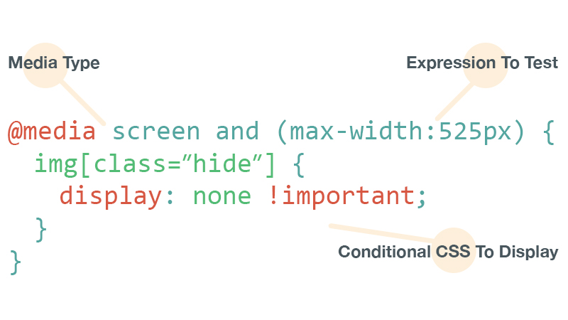
The media type allows you to declare what type of of media the rules should be applied to. You can declare four options: all, print, screen, and speech.
For email, you can nearly always use the screen type.
Expressions allow you to further target devices based on specific conditions you pass the media query. Expressions test media features (different features of a device), such as width, height, aspect-ratio, and color. You can test many media features but most email designers rely on the following:
- max- and min-width
- max- and min-device-width
- device-pixel-ratio
Media features can also be combined within the media query to provide greater control over targeting devices and clients.
CSS rules can be be toggled when the email is opened on a device that satisfies both the media type and expressions.
Media queries need to be included within a style block (typically located in the head of your HTML). This has implications when it comes to CSS rules and support for media queries. l
The benefits of media queries in email
Media queries in email allow you to fine-tune email designs so they are more usable across a wide range of devices.
Consider this common scenario.
Many email designers once built their emails using a desktop-only approach. The email uses fixed table widths; everything is optimized to look good on desktop and webmail clients. But when the email is viewed on mobile devices, the email design breaks down. The email is zoomed to fit, making text and buttons too small to tab. The layout is broken and unusable. The right-side of the email might be hidden from view, making horizontal scrolling necessary.
Media queries in email let you target mobile devices and adjust styles accordingly.
A quick example
Our guide to mobile approaches explains that fixed-width emails are typically scaled down on mobile devices, leading to small, unreadable text. Fluid emails, which use percentage-based widths, allow content to flow and fill various screen sizes.
Suppose you have a container table with a fixed width of 600 pixels. In this scenario, you’d switch that fixed width of 600 pixels in desktop views to a fluid, percentage-based width (100%) on smaller screens.
<table border="0" cellpadding="0" cellspacing="0" width="600" class="container-table">You’ll notice that a class has been added to the container table. The fixed-to-fluid switch is achieved by using classes to name and target HTML elements, and using the media query to override the styles applied to the table. Every class needs a name. In this case, we’ve named ours .container-table. Give classes obvious names that speak to their purpose in your media query.
/* TYPICAL WEB DESIGN METHOD */
.container-table {}
Once the class name is added to the the table tag, add the media query to HTML, along with an expression and the same class name. The expression you see below (max-width: 600px) tells the media query to apply the rules any time the screen size is less than 600px wide.
@media screen and (max-width:600px) {
    .container-table {
    }
}
Now, add style rules that adjust the value of the CSS width property for that table. The container table is fluid on any viewport narrower than 600 pixels.
@media screen and (max-width:600px) {
    .container-table {
        width: 100% !important;
    }
}
This same approach can be used to adjust common pain points on mobile such as text, image, and button sizes. For example, to adjust the text size of copy on mobile, you can do so in a nearly identical way:
@media screen and (max-width:600px) {
    .mobile-text {
        font-size: 18px !important;
    }
}
By targeting class names or specific elements, you can manipulate designs and make them more readable and usable on smaller devices.
It should be noted that, in most cases, these media queries are used to override inline styles. If you are familiar with how CSS works, the cascade uses the order of declaring CSS rules to determine which styles should be rendered. Since media queries naturally live at the top of an HTML document, any inline styles applied to the content of the email will take precedence. Therefore, you need a way to override those inline styles.
This can be accomplished using the !important declaration:
td { font-size: 24px !important; font-weight: bold !important; }A lot of web designers rail against the overuse of the !important declaration but, it can be a best friend for email designers!
Advanced targeting
Many email designers will only use media queries in email to adjust styles for mobile devices, but they can be used in more advanced ways, too.
For example, there are a lot of coding and design techniques that simply don’t work in some email clients. One of the most valuable uses of media queries is to target specific email clients or platforms and progressively enhance content, so cutting-edge techniques can be used in the “right” places–without worrying about breaking the experience for everyone else.
A great example of this is our popular email featuring a background video which we sent to promote our first Litmus Live event. Video in email has long been considered the holy grail of email design. While a few clients support it, most don’t. Instead of attempting to shove the video into everyone’s inbox, we used media queries to target only those clients that support video in email and enhanced the campaign for that audience.
Video backgrounds are only supported by certain Webkit-based browsers, namely Apple Mail and Outlook 2011 for Mac. While other email clients saw a background color and background image (when supported), thanks to the following media query, the Webkit-based clients saw a full-width video playing in the background:
@media screen and (-webkit-min-device-pixel-ratio: 0) {
    /* Insert styles here */
}
Similar expressions can be used to target a whole host of devices based on their features. For example, if you wanted to target the iPhone X in standard view, you can use the following:
@media screen and (device-width : 375px) and (device-height : 812px) and (-webkit-device-pixel-ratio : 3) {
    /* Insert styles here */
}
Using media queries to target specific email clients or platforms gives email designers previously unheard of control over their designs. When combined with things like CSS animations, designers can deliver truly astounding experiences right in the inbox.
Which clients support media queries in email?
Most popular email clients now support media queries:
| Media Query Support | |
|---|---|
| iOS (iPhone/iPad) | Yes |
| Android 4.x native client | Yes |
| Android Outlook Exchange via native client | No |
| Android Outlook.com app | No |
| Android Gmail app | No |
| Android Yahoo! Mail app | No |
| Android Samsung Mail app | Yes |
| Gmail (Android Browser) | No |
| Outlook.com (Android Browser) | No |
| Yahoo! Mail (Android Browser) | No |
| Windows Phone 7 | No |
| Windows Phone 7.5 | Yes |
| Windows Phone 8 | No |
| BlackBerry OS 6 | Yes |
| BlackBerry OS 7 | Yes |
| BlackBerry Z10 | Yes |
| Kindle Fire native client | Yes |
This information is partially sourced from Campaign Monitor and Style Campaign. Information is supplemented and verified by first-hand testing when possible.
This varying degree of support is why we typically recommend building a solid foundation for your email using HTML and inline CSS, with media queries added in to progressively enhance the design. The hybrid approach to building emails is the perfect foundation for when media queries aren’t supported.
If you’ve built a responsive email design using media queries, but your Litmus screenshot is showing the desktop version of the email, it could be that the particular client/device you’re viewing doesn’t support media queries.
When troubleshooting responsive email designs and media queries, also keep in mind that the media query will be triggered by the viewport size of the device. Viewport sizes can vary drastically based on the physical screen size of the phone, the screen’s resolution and the pixel density or device-pixel-ratio of the device.
Improve your campaigns
Media queries allow designers to build experiences for a wider range of devices than ever before. More importantly, they allow you to fine-tune your designs for an increasingly mobile audience. As with any new technique, it’s important to test your campaigns to make sure they look great.
 | Ensure your designs come across right Broken emails lead to less conversions. Preview your emails across 100+ email clients, apps, and devices to ensure an on-brand, error-free subscriber experience. Every time. |
Post was updated on May 10, 2022.
Jason Rodriguez
Jason Rodriguez was the Community & Product Evangelist at Litmus
 Blog
Blog 