The story of how responsive images made its way into the browser doubles as an inside look at the standards making process itself. For some of us on the web, myself counted among them, it was our very first look behind the curtain. Web standards, the rules of CSS and HTML and Javascript that govern the direction of technology on the web, aren’t made in a complete vacuum, even if sometimes it can feel like that. But it’s probably not something you think about every day. I have two goals here. As we walk through the history of responsive images, I also hope to also uncover some of the mysteries behind browser features and evolving standards on the web.
First, though, what exactly are responsive images? The problem started with the iPhone. Mobile devices, which rose in ubiquity in the early 2010’s, were all suddenly tethered to the web. Responsive design was developed to meet that challenge, but these devices also had much tighter bandwidth considerations than their PC counterparts; data was at a premium. Images were the biggest tax on this network. Even though mobile phones required images that were only half the size (or less) of desktop computers, they were still getting served the same massive images, slowing things down and ultimately costing people money.
Then, “retina” screens hit the market. This added to the problem, since retina screens demanded even crisper, higher resolution photos than desktops normally did, which meant phones were left basically holding the bag.

Thankfully, more than a few developers recognized the problem. They devised all sorts of clever hacks and strategies for dealing with it. Adaptive images, for instance, was a technique that offloaded the resizing of images to algorithmic calculations on the server, dynamically generating exactly the image size users needed. Other techniques fell back on using plain old CSS. Most of the work, though, was being done with Javascript, familiar territory for web developers and often used in the past to fill in the gap’s between a user’s needs and browser functionality.
But even as the stopgap solutions piled up, and they did pile up, an undeniable fact was slowly brought into focus. Hacks and tricks and half-measures weren’t going to cut it. Developers were going to need help from the browsers.
It was time for something completely new in HTML.
It’s important to understand how something new even gets added into HTML. The W3C and the WHATWG govern what is known as the official specification of HTML, basically, a very long and evolving document. When a new feature is proposed, typically by somebody from inside these two groups, a “working group” is formed to retool and work out the details of implementation. At this point, a draft is written up by the working group describing what exactly will be added to HTML, and how it will work. This is when browsers will typically begin testing things out, gathered feedback from the community. After months (or sometimes years) of this, a draft is finished up, edited, and made a recommendation, and the feature is ready for primetime.
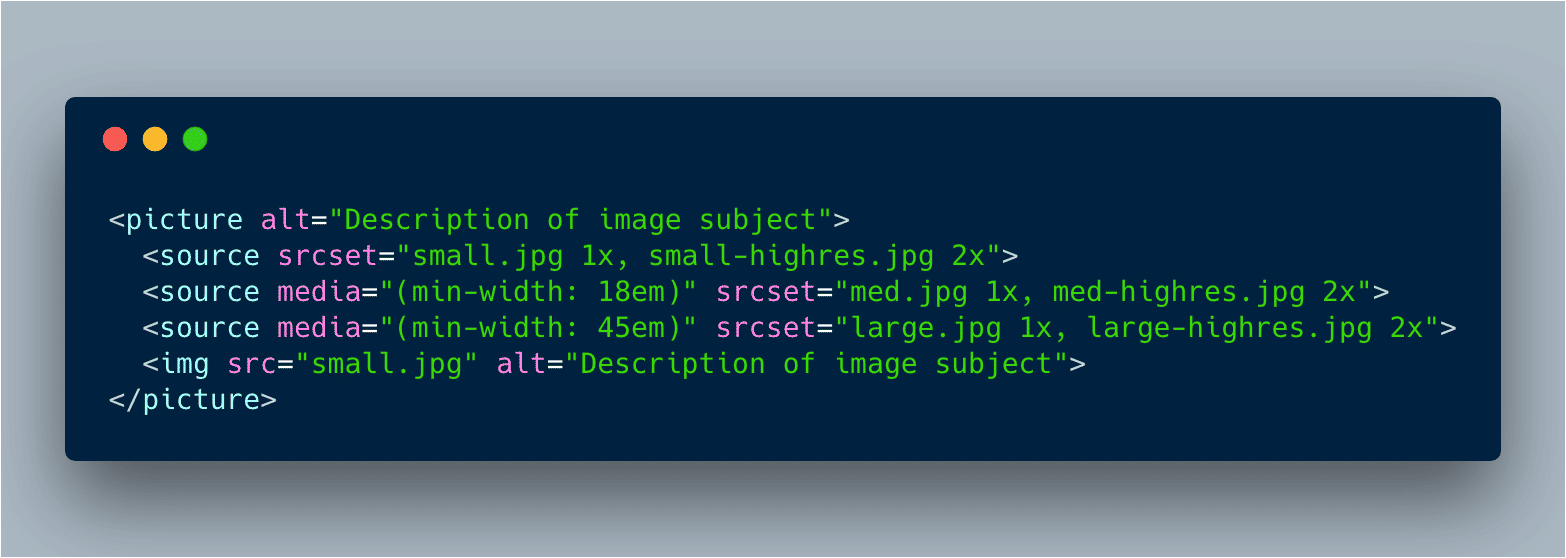
The new HTML element this time, the one that would solve the problem of responsive images, did not come from the browsers. It came from the community. It was to be called the picture element.
The idea of a tag in HTML called picture was not entirely new. If you trace it back, the first mention actually goes all the way back to 2007, before the iPhone was on anyone’s radar. But it was an idea that was eventually abandoned, only to resurface in 2011. With the right syntax (the way in which it would be coded), some developers realized it was theoretically possible to use picture to serve low-resolution, low bandwidth images on mobile devices, normal images on desktops, and huge, high-resolution images on retina screens. With just a few lines of codes.
Mat Marquis was a huge fan of picture. He worked at Filament Group with Ethan Marcotte and others when the agency redesigned Boston Globe and effectively invented responsive design. So he knew a thing or two about what was needed.
He began talking with other developers, gathering use-cases and feedback about the proposed new element. He posted on A List Apart to let people know about what he was working on. And after months of research and discussions, working in tandem with some really talented folks, he finally had a version of picture that everyone in the web community seemed to agree on. No fuss. No hacks. It could all happen right in the browser with HTML.
Could being the operative word here.
That, however, was not going to be quite enough. Picture was going to need to become a standard. And in order to do that it would need blessing from browsers and to pass through the WHATWG. They aren’t always the most approachable group.
The WHATWG formed at a time when a bunch of browser makers, unhappy with the direction and pace of HTML standards, decided to split off from the W3C and start working on a new specification. After HTML5 came out, the two groups agreed to come back together, as separate but cooperative groups. But they don’t always agree, and the WHATWG is still primarily made up of representatives from actual browsers, and as such, remains pretty insular (and rightfully protective) even if their conversations and mailing lists are technically public.
Marquis began to talk with a few developers at browsers, and hopped on the WHATWG mailing list and IRC channel to shop around the new picture element he had been working on. That task proved rather difficult, with the WHATWG at first not necessarily even recognizing the problem. Eventually though, one member suggested that Marquis and his fellow picture advocates go and form a working group over on the W3C site to make things more official and starting working out a full proposal.
Within a few days, the Responsive Images Community Group (RICG) was formed. Marquis gathered together pockets of developers and standards editors, to try and work out what would be the best possible version of the new element. All across the web a call went out for feedback and discussion. In just a few short weeks, the group had not only gathered a ton of support but had a pretty solid implementation of picture all worked out.
There was, however, a twist. As it turns out the WHATWG member who suggested forming the RICG in the first place was not an official member at all and was in fact just a random member of the same mailing list. Of course, no one on the chain from the WHATWG stopped Marquis from going off on his on. But unbeknownst to the group, they also didn’t, at least in an official capacity, support the effort.
That would not be the last misunderstanding in our story.
So while the RICG was off at the W3C making progress on their own version of responsive images, Ian Hickson, editor of HTML5 and spokesman for the WHATWG, began asking around internally if anyone else had a solution to the responsive images problem. Theresa O’Conner did. She was working for Apple, and had been sitting on a possible solution for a while. She even had an email draft all set and ready to go. When she saw Hickson’s request, she sent it.
O’Conner suggested an alternative approach. Instead of creating a brand new element, she proposed extending the already popular and widely used img tag to include a new attribute called srcset (e.g. <img srcset=""). Using that attribute, developers would be able to basically tell the browser which images to serve to which devices and resolutions.
It was an implementation that most browsers preferred because attributes, in general, are easier to add than new elements. But its syntax left a lot of developers confused. And many believed that though it addressed the issues with resolution and retina screens, it did not necessarily allow for different images to be served to mobile devices, known generally as the “art direction” use case.
Simply put, there was room for improvement, as was the case with the picture element. That’s why the RICG had worked so hard on it. But this new proposal was discussed for only a few days before it was added to the HTML draft.
To the developer community, it looked as if picture was being abandoned. It looked like Marquis was asked to go start a community group, which he did, to keep his group of developers busy while the WHATWG could work out what the real responsive images solution was going to be. It looked like the standards organizations didn’t care what developers thought. It really didn’t look good.
That’s not what happened. Not exactly. Another misunderstanding. The WHATWG had lots of valid reasons to prefer the srcset solution over picture. And their choice to move it to draft status was really just another step in what is often a very long and iterative process. But no one communicated this to the RICG. Naturally, tensions rose.
In May, Marquis once again posted to A List Apart, venting some of his frustrations about being, in his mind, effectively steamrolled by the organization that was supposed to be helping move the web forward. His sentiment was shared by many others in the web community.
We forget this sometimes. The web is built by people, and people can sometimes be flawed. Browser implementors knew that there would be implementation issues with picture. Web developers knew that there would be programmatic issues with srcset. After a few weeks of back and forth, the WHATWG and the RICG began discussing a way to meet in the middle.
That would arrive in the form of Florian’s compromise, first proposed on June 18, 2012. It was named for Florian Rivoal, editor of the media query specification. Rivoal suggested merging the two ideas together. The new element picture would be created. But to offset some of the trickier bits, the new attribute srcset would also be added, albeit with a simplified syntax. Together, they were actually far stronger than apart, and they could address every use-case that RICG had gathered along the way.
Everyone came together around Florian’s compromise. Both browsers and developers realized that without a solution, the web would continue to languish and it would be the users of the web that suffered. Bottom line, everybody (well the good ones anyway) are in it for us. Web users. By 2014, they had begun rolling out. Today, they feel almost commonplace. And there may have been bumps along the road, but the web is an undeniably better place for it.
Leave a Reply