Android 12 was only just released last month, though we managed to get our hands on what we thought was Android 12.1 before its release. It had a number of improvements and features aimed at foldable smartphones, including a new dual-pane notifications panel, a new split-screen UI, and a whole lot more. Later, we learned that the next version of Android wasn't going to be called Android 12.1, but was instead going to be called Android 12L. Now we're getting another look at all of its major UI changes and features, months in advance of its final release.
While we've already seen a lot of what's on offer from Android 12L, we're getting an even closer look at a lot of these changes (and more) thanks to a deep-dive post shared on Esper.
User interface changes in Android 12L
Redesigned apps and system elements
Android 12 has a ton of visual changes, the biggest of which is Material You. Material You’s dynamic colors feature makes use of monet, a new theme engine introduced in Android 12 — and currently exclusive to Pixel phones — to extract colors from your wallpaper and generate a rich palette of pastel colors. Apps can then apply these colors to their UIs in various ways, which is what apps that incorporate Material You typically do. However, all of these changes and improvements that Material You added to the design of your phone were just that -- improvements for your phone.
Source: Esper
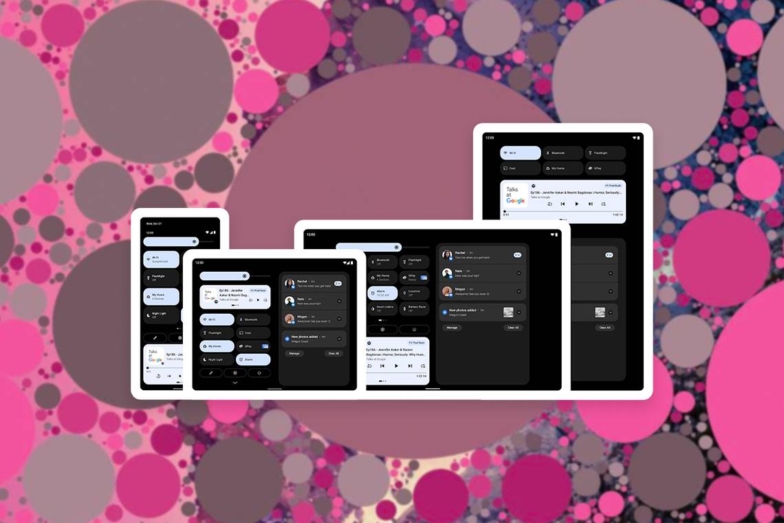
As a result, Android 12L has a more particular focus on larger screen devices such as tablets and foldables. Google's apps such as Files, Gmail, Google, and Messages have been updated to split their view on larger screens. Apps that have multiple activities can do this through activity embedding, which the deep-dive from Esper says is a new platform feature in Android 12L. Android 12L adjusts the layout of multiple system interfaces in order to take advantage of larger displays with a screen width greater than 600dp. These elements include the always-on display, lock screen, home screen, notification shade, recent apps overview, power menu, settings, and several system applications.
Lock screen, always-on display, and home screen
Source: Esper
Just like on Android 12, Android 12L has a different lockscreen design dependent on whether or not the user has any pending notifications. By default, like on Android 12, the clock takes up a large part of the center of the display on the lock screen, so long as there are no notifications. If you're using a large screen device, then when a notification is received, the clock will shift to the left-hand side of the screen. Notifications will then be displayed on the right-hand side, and after three notifications are shown, further ones are relegated to an overflow card.
Additional buttons can be displayed on the lock screen. For example, if a user has multiple profiles on their device, then they can tap the user profile switcher on the top right of the lock screen. As well, floating buttons to access your Google Pay wallet or your device controls can also be added. When a user sets a PIN or pattern to unlock their device, the UI to enter the PIN or pattern will be shown on either the left or the right-hand side, depending on what side the user swiped from. The user can also have the keyguard entry move to the other side of the display by tapping it. If the user enables a password, however, then the password entry will be centered.
Source: Esper
As for the always-on display, because users expect a smooth transition between it and the lock screen, there aren't too many changes. The clock takes up a significant portion of the screen in the center, and beneath it is the current battery level. Notification previews are hidden to reduce the number of pixels lit up on the display, and icons are shown for notifications.
Finally, Launcher3, Android’s open-source launcher app that most OEM stock launchers are forked from, can show two home screen pages simultaneously.
Notification shade and power menu
When the device’s screen is sufficiently large, the Quick Settings and notifications panel can both be shown at the same time on Android 12L, with the Quick Settings on the left half and the notifications on the right half. In contrast, large screen devices running Android 12 can only show the Quick Settings panel when the status bar is fully expanded. Android 12 doesn’t make effective use of the extra screen real estate afforded by foldables, but Android 12L does. The brightness slider and quick settings tiles are much larger than before, and the quick settings can display eight tiles at a time. You can then access the power button by tapping the power button below the quick settings grid.
Source: Esper
However, in Android 12L, tapping the power button will call the Assistant by default. According to Esper, the behavior can be overridden so that tapping it brings back the power menu like on Android 12.
Recents overview
Google made a subtle tweak to the layout in Android 12L. The cards are no longer uniform in size; rather, the most recent one has been enlarged, while the rest have been shrunk and arranged in a 2-row grid. Underneath the most recent card is also a new “split” button that launches split-screen mode; previously, you had to long-press on an app’s icon in the recent apps overview to access split-screen mode. These make Android's split-screen options much easier to spot and use, and with the addition of a new taskbar feature too, it's clear that multitasking is a key feature that Google is focusing on for Android 12L.
Source: Esper
Miscellaneous user interface changes
There are a number of smaller changes included in Android 12L too. For starters, navigating to Settings -> Display -> Colors now has additional sample photos to showcase how screen mode changes affect color reproduction. The screencasting quick settings tile now has a chevron to make it clear it opens a menu, the default position of the slider in audio adjustment settings is now properly centered, and the default wallpaper included in AOSP has been changed.
New features in Android 12L
Taskbar
Android 12L introduces an all-new taskbar in AOSP. It only appears on devices with a screen size above 600dp, and it's built into AOSP's Launcher3. It's integrated into the application dock which sits at the bottom of the home screen. The user can select five apps to appear at the bottom of the screen in every application. There's an opaque gray color in the background to distinguish it from the currently running application, and when the user returns to the home screen, it turns transparent. The taskbar will automatically be minimized when viewing a full-screen application, such as when playing a game or watching a video. However, it can also be minimized by long-pressing on any part of the taskbar.
[video width="1178" height="828" mp4="https://static1.xdaimages.com/wordpress/wp-content/uploads/2021/11/Android-12L-Taskbar-Demo-compressed.mp4"]
Source: Esper
The taskbar doesn't support more than five applications at a time, nor a context menu when long-pressing on an app. No elements found in the status bar such as the date or time can be integrated into it, though the 3-button navigation keys, when enabled, are displayed on the right-hand side of it.

Notification to window
Google is testing another app in Android 12L in order to quickly launch an app in split-screen mode. It's called "notification to window" and it's a feature that allows a user to open a notification as a split-screen app through a drag-and-drop gesture. Let's say you get a message on Telegram and the heads-up notification pops up, you can then open that notification by long-pressing on the notification and then dragging it to either the left or right-hand side of the screen.
[video width="1280" height="900" mp4="https://static1.xdaimages.com/wordpress/wp-content/uploads/2021/11/Android-12L-Notification-to-Contents.mp4"]
Source: Esper
This feature isn't enabled by default in Android 12L's preview builds, but it can be enabled with root access. You'll need to create an overlay through the Fabricated Overlay API, and you can do that by running the following two commands as root, as shared by Esper.
cmd overlay fabricate --target com.android.systemui --name NotificationToContents android:bool/config_notificationToContents 0x12 0x01
cmd overlay enable com.android.shell:NotificationToContents
Do note that the feature does not work properly in its current state. Often, a long press will display the notification's settings rather than pop it out as intended. This will likely be improved upon and optimized in future releases.
Dynamic colors are now enabled by default in AOSP, and they can be enabled in the boot animation
Android 12's Material You is currently a Pixel-exclusive feature, as it's not a part of AOSP. While it's likely that other device OEMs are implementing their own dynamic colors with their own palette generation algorithms, it will be added to AOSP and enabled by default in Android 12L. There's no way for end-users to opt out either, meaning that every time your wallpaper is changed, the device theme will change. Background wallpaper changes can be abused to create a denial-of-service attack, which will also likely be fixed in Android 12L.
[video width="800" height="1032" mp4="https://static1.xdaimages.com/wordpress/wp-content/uploads/2021/11/Dynamic-Color-Boot-Animation-1.mp4"]
Source: Esper
Android 12L even enables support for dynamic colors in the boot animation. According to Esper, because boot animations are typically a series of static PNG images, Google has had to change how the boot animation is displayed. Rather than rendering the PNG images directly to the display, the new dynamic coloring render mode treats the Red, Green, Blue, and Alpha (RGBA) channels of each image as area masks. It then interpolates between the start and end colors based on the progression of the animations. OEMs can enable the feature by adding a line to the boot animation’s description file that specifies the starting color and reading from four system properties that specify the end colors, which are presumably set when the user changes their wallpaper while the OS is booted.
Press & hold duration for the power button
One of the most useful additions to Android in recent years — at least in our view — is Device Controls. This feature gives you quick access to your smart home controls without needing to open an app or tap a widget. In Android 11, Device Controls was integrated into the power menu, but in Android 12, the power menu no longer holds Device Controls (or the Quick Access Wallet feature, for that matter.) The reason is that Google wanted to simplify the power menu and make a long press of the power button trigger the Assistant instead of the power menu.

When the “Hold for Assistant” feature is enabled, holding down the power button for 500ms will launch whatever is set as the default Assistant service. On Android 12, you can’t change the duration for how long you need to hold down the power button, but you’ll be able to do so in Android 12L. A new “press & hold duration” slider has been added under “Settings > Gesture > Press and hold power button” that lets you adjust the sensitivity of the long press power button gesture. You can choose from short (250ms) to long (750ms), or somewhere in between (350, 500, or 650ms).
Quick wallpaper picker
AOSP Launcher3 from Android 12L DP1 includes a developer flag called "quick wallpaper picker." The flag enables a new wallpaper picker UI in the context menu on the homescreen. The wallpaper picker UI in the context menu shows the current wallpaper along with four other options, and you can tap on one of these options to change your homescreen wallpaper.

Google has also rearranged the options to show the new wallpaper picker UI at the top of the context menu. As you can see in the attached screenshot, Wallpaper & settings is the first option in the context menu, followed by Widgets and Home settings. Currently, if you tap and hold on the lockscreen on a device running Android 12, Home settings is the first option in the context menu, followed by Widgets and Wallpaper & style.
This feature, according to Esper, does not work on AOSP as the implementation is missing from both Launcher 3 and WallpaperPicker. However, in Google's Android 12L builds, it works.
Unicode 14.0 support for new emoji
The Unicode Consortium officially unveiled Unicode 14.0 in September of this year, and it will bring 37 new emoji to your phone. It has a ton of new characters, including Troll, Heart with Index Finger and Thumb Crossed (AKA finger heart), Saluting Face, Heart Hands, and more. These new emoji will make their way to all major platforms towards the end of this year or early next year.

Unicode 14.0 brings the total number of emoji to 3,633, including sequences for gender or skin tone, flags, and the components used to create keycap, flag, and other sequences.