

We’ve been working to improve focus styles within Craft’s control panel lately, and will be sharing what we’re learning along the way. Here’s the second of a three-part series on visible focus indicators.
What does WCAG say?
WCAG (Web Content Accessibility Guidelines) is a set of guidelines developed by the W3C that provides guidance on how to make web applications more accessible. Web accessibility legislation is often based on WCAG standards.
WCAG 2.1 (the current version of WCAG) doesn't give much detail about how visible focus indicators should look, other than the general 3:1 contrast ratio that applies to user interface components.
Looking forward to the WCAG 2.2 working draft (the next version of WCAG, which is expected to be finalized this year) there are three requirements related to the visual design of focus indicators.
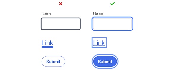
1. Adjacent contrast
The focus indicator must have a contrast ratio of 3:1 against its adjacent elements, or be at least 2px wide.

An offset border with a sufficiently contrasting color meets the requirement for a 3:1 contrast ratio against adjacent elements. A thick border meets the requirement for being at least 2px wide, even if its color is not sufficiently contrasting with adjacent colors.
2. Change of contrast
To meet level AA, the focus indicator has a 3:1 contrast ratio between its focused and unfocused states. To meet level AAA, the contrast ratio is increased to 4.5:1.

Inverting the color scheme of a sufficiently contrasting button meets the requirement for change of contrast.
3. Minimum area
To meet level AA, the area of the focus indicator must be at least as large as either:
- 1px × the perimeter of the element
- 4px × the length of the shortest side of the element
To meet level AA the area of the focus indicator must be at least as large as 2px × the perimeter of the element.

The red areas for each link indicates the areas that makes up a 1px perimeter and 4px × the length of the shortest side.

An arrow icon with a sufficient area meets the minimum area requirement.
Beyond WCAG
While the WCAG 2.2 requirements are not yet official recommendations, they're sensible guidelines to keep in mind when designing focus indicators. At the same time, WCAG requirements should be treated as minimum requirements. Here are a few more things to keep in mind when designing focus indicators.
Prominent
It is technically possible to create very subtle focus indicators that meet all the WCAG 2.2 working draft requirements, but we should still strive to create focus indicators that are highly visible.

Recognizable
It's a good idea to use focus indicators that are easily recognizable, such one similar to the default style found in browsers: a border around the focused element.

Consistent
Similarly, it would be beneficial to keep focus styles fairly consistent within the app so that the focused element is easy to spot.
That's not to say that you can't add some flair! But it's a good idea to apply more stylistic focus indicators in combination with a more standard focus indicator.
Resources
- WCAG 2.1 Understanding Success Criterion 1.4.11: Non-text Contrast
- WCAG 2.1 Understanding Success Criterion 2.4.7: Focus Visible
- WCAG 2.2 Working Draft Understanding Success Criterion 2.4.11: Focus Appearance (Minimum)
- WCAG 2.2 Working Draft Understanding Success Criterion 2.4.12: Focus Appearance (Enhanced)