
Part 1 of this series delves into the background for this guide. Here in part 2 are the ins and outs.
Wait, hear me out. I know, we just talked about this: Nobody is sheepishly pleading you, “Please, might we have just one more image on the page?” No, I’m not telling you to pick that particular fight. Instead, use a little smoke and mirrors to avoid requests for images that your audience needn’t render right away and might never need at all while loading them asynchronously—only as needed.
Until a few years ago, nothing much had changed about img since its inception back in December 1992. For the most part, if your markup contained an image with an src attribute, the browser wouldn’t give you any choice: It would request and transfer that image ASAP. To avoid or defer an image request the audience might not see in some contexts, removing it from the page was your only option. Even during the earliest days of prototyping potential “responsive images” solutions, it was clear that img would benefit from more flexibility because loading images asynchronously, that is, only when scrolled into view, was a convoluted process. Listening to scroll events is expensive, likewise for listening for the resizing of the browser window. Determining whether an image had scrolled into view would mean doing both while checking and rechecking the position of each image on the page. Such a task was labor-intensive, let alone that the results were always—pardon my candor—pretty janky.
Fast forward to the present day, and we have the experimental Intersection Observer API. As its name implies, IntersectionObserver enables us to efficiently observe if the elements visibly intersect with the browser viewport and, if so, are visible online. When applied to img, the API presents a simple, powerful, and largely seamless way to avoid unnecessary image requests.
With only a few lines of code, we can put together a script that asynchronously requests images only when they intersect with the audience’s viewport. No fuss, no muss, and hardly anything for us to manage:
- Source: https://github.com/Wilto/async-images/blob/master/async.js
- Demo: https://wilto.github.io/async-images/
<img
data-lazy
src="data:image/gif;base64,R0lGODlhAQABAAAAACH5BAEKAAEALAAAAAABAAEAAAICTAEAOw=="
data-src="/img/source-4.jpg"
sizes="(min-width: 1000px) 50vw, 95vw"
data-srcset="
/img/source-1.jpg 320w,
/img/source-2.jpg 450w,
/img/source-3.jpg 640w,
/img/source-4.jpg 820w,
/img/source-5.jpg 1024w"
alt="…">
Code language: HTML, XML (xml)The above script does the following:
Loops through every img on the page with the attribute data-lazy.
Swaps the contents of the data- attributes with the corresponding img attributes. The source specified in data-src replaces the encoded placeholder in the original src. data-srcset, if present, becoming srcset.
Leaves sizes as-is since it only describes how an image appears on the page, initiating no requests at all.
In browsers that support IntersectionObserver, the above logic applies only if some part of the image occupies the audience’s viewport. In browsers that don’t, all that swapping logic applies once DOMContentLoaded acts. After all, we don’t want to leave anyone without those images.
To revive a deeply nostalgic term, that encoded “spacer GIF” is important. Omitting a src value altogether could display only a brief flash of a seemingly-broken image before the new source has finished rendering. Because the content of src is always requested before we have a chance to tinker with our markup, citing an external source there, no matter how small, would mean incurring the extra performance cost of a request to no real benefit. That tiny encoded GIF avoids both traps.
If all that feels like something browsers could be handling for us, I completely agree, and we’re not alone. A lazyload attribute is churning its way through the web-standards refinery as we speak. Granted, lazyload still has a long way to go before it’s cast in concrete, but you can try out an early version of the proposed behavior by toggling the “enable lazy image loading” flag in Chrome Canary:
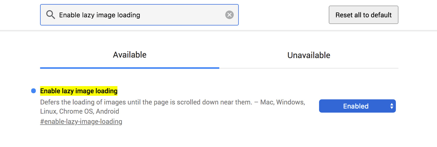
That browser flag applies the asynchronous loading approach to all images, which is a pattern the Chrome team has been experimenting with. Will that turn out to be somewhat aggressive in practice? That’s hard to imagine but only time will tell.
Let me paint a picture for you (no pun intended): You’ve been trying to figure out the perfect level of lossy compression for the images on your site, i.e., a sensible default for all uploaded images. For what feels like ages, you’ve tinkered, uploaded, and reuploaded samples, and squinted at barely-visible compression artifacts. You’ve finally, finally, figured out the perfect compromise between file size and image quality. Now that everything is perfect, increase the compression level and walk away. The thing is, you and I are lousy judges of image quality. We’re too good at it.
See, the magic of JPEG compression is that it was made to exploit flaws in us. We humans aren’t great at processing high-frequency detail. We can recognize a tree, sure, and tell it apart from other trees; and even see a forest for those trees on a good day. But what we can’t see—or we do see, I suppose, but can’t process very well—are the positions of each of the leaves on the tree. At a quick glance, we don’t capture the precise hue of each individual leaf in comparison to the one beside it, but we notice that some parts of the tree are darker than others. We can for sure seek out those high-frequency details by paying attention to them. However, in driving past a row of trees, we’re not looking for each individual leaf in relation to those around them. It’s too much information, none of which we really need in that context. To save mental bandwidth and keep the world from being any more overwhelming than it already is, our brains round down the images around us.
JPEG compression works by discarding details that the audience isn’t likely to notice anyway—something that our brains are already doing with the world around us, all the time. For a photo of a tree, that might mean losing a little distinction between some of the leaves or a slightly-reduced color palette.
You and I make particularly lousy accomplices in this trickery because we’re in on the con. After all, we know what we’re looking for when we choose a level of lossy compression, whether manually saving an image or choosing a “sensible default” for a library of images. We see an artifact here and a tiny missing detail there. With the original right in front of us, we have a basis for comparison. Because we’re looking for the individual leaves on the tree, so to speak, we can tell when they’re a little out of place.
Most users don’t know the difference, though. They just see a tree, with no basis for careful comparison, and any faint artifacts blending in with the tiny details that their lossy psychovisual systems gloss over anyway. In fact, the odds are that, if we weren’t looking for the details, we wouldn’t notice them either even though we’re wise to the trick JPEG tries to play on us.
Don’t believe me? Try this out: Tomorrow morning, take out a good old-fashioned pen and a piece of paper and set them aside. If, during the course of your daily web browsing, you notice an image with a high level of lossy compression, grab your pen and put a checkmark on the paper. At the end of the day, those marks will be few and far between.
We designers and developers are poor judges of good lossy-compression levels because our eyes are too sharp. So, all told, it’s almost always a safe bet to nudge JPEG compression a little higher than you think you can get away with. You might see an artifact or two when you’re looking for them in the compression-options dialog, but if you weren’t—if you were the audience, that is—you probably wouldn’t see a thing.
The RICG had a few goals, some shouted from the rooftops and some not. For example, the goal of finding efficient, preparser-friendly methods of tailoring image requests to browsing contexts was no secret. Paving a path for more designers and developers to become involved in the standards process—we were pretty loud about that one, too. More subtle, however, was a goal many RICG members shared, me included: a day when we would hardly think about responsive images.
It’s no big secret that most responsive-image patterns are information dense. They are terse by necessity. Anything we might have done to make those syntaxes easier for us humans to parse could have made them more complex for a browser to parse. Adding complexity to a parser translates to more potential for bugs or for unintentional differences in behavior among browsers.
But, as much as that density feels like a syntactical weakness when we’re rooting through markups by hand, it’s a strength in practice. Why? Because a syntax more easily read by machines is a syntax more easily written by them.
srcset and sizes have a remarkable amount of flexibility baked in. Together, they make up the markup pattern that solves the most common use case for responsive images: a big stretchy image in the strictest technical terms. In most cases, what we want from a responsive image is what we’ve always wanted from any image in a responsive layout: one that stretches to fit a viewport of any size, the way an img element with a single, gigantic source would. We just want the image to be more performant.
srcset accords the browser a couple of potential sources. sizes passes along information on how to render the sources. Though they seem declarative, as most markups are, in practice, those attributes say, “These sources might be visually appropriate for these contexts,“not “Here is the source to use in this specific context.” The difference is slight in print but huge in implication: Nothing we include in srcset is a command, only a candidate. The spec itself leaves a step explicitly vague so that browsers can select any suitably-sized source based on any number of factors.
When writing this syntax, we’re really just setting the terms of the negotiations between a browser and a web server. Since it acts as a list of potential candidates, srcset enables browsers to introduce user settings like “Always give me low-res images”—something mobile Chrome’s data-saver mode does today. Browsers can make clever use of built-in caching. For example, if someone has already cached a large source, shrinking the browser viewport, Chrome and Firefox don’t request for smaller sources. After all, the greater serves the lesser. That practice even paves the way for future settings, such as “Give me high-resolution images as bandwidth permits,” with no input from us, which means no attributes to add, change, update or, in the worst-case scenario, accidentally omit.
Again, those bandwidth-saving features require no development efforts. Ditto new advancements in the way images are requested and rendered. As soon as those two attributes are in place, we can walk away, mission accomplished.
As a matter of fact, we don’t necessarily have to do that much.
The beauty of a syntax made to be easily read by machines is that it’s a syntax more easily written by them. Most modern content management systems handle the basics of this markup right out of the box, omitting all the image sources, populating a srcset attribute with them, and generating an easily-customized sizes syntax to match. I can personally vouch for Cloudinary in this department, having handled a transition to it for a major publisher’s responsive-image needs. Cloudinary generates all image sources and srcset values on the fly with no tinkering required. In addition, finely-tuned sizes attributes are generated by a handy little bookmarklet.
Thus was the RICG’s quietest goal finally fulfilled: hyper-optimized, responsive images through a markup that takes advantage of the latest—and future—browser features, sans manual additions of attributes. And, best of all, that same markup will benefit from countless new browser-level optimizations as time goes on, with no changes, no planning, and no extra programming efforts. As those new features roll out, one thing will be certain: It all happened exactly the way you’d planned it and you deserve credit for it.
How about stretching the rules somewhat to do the right thing? You’d be in good company and are the sort of person who made the RICG a success. We’re not flying in the face of convention just for kicks, and we’re not neutral. Our methods might be a little “creative,” but they are squarely focused on doing the right thing for those our work stands to affect the most—the web audience who bears all the potential costs of our work. For their sake, I wouldn’t mind getting myself into a little trouble but someone will have to catch me first.
