


This article was created by our friends at Creative Market, the world’s marketplace for ready-to-use design assets.
Also known as a brand book or brand manual, a brand style guide is a document that describes a company’s visual identity so it can be applied cohesively. Offering specific instructions, brand style guides serve as a reference for teams and individuals who need to represent brands in various ways. Individual assets like a logo or color palette can be well considered, but unless their usage is defined, there’s very little chance they’ll be put in action as intended.
These style guides can go from basic brand-at-a-glance one-pagers to more comprehensive multi-page documents that become brand bibles of sorts. Benjamin Oberemok’s BrandBook for UpCrunch, shown below, is a perfect example of a more thorough overview.

GoDaddy’s Brand Style Guide, presented in detail here, is another prime example of a more comprehensive document. It’s 162 pages long and covers everything from logo guidelines to creative direction for paid ads.

On the other hand, it can also be helpful to create a succinct one-pager that is easier to refer to. Such is the case of Ramotion’s visual identity recap for Streamlit. The document includes a quick overview of the brand’s main logo, variations, clear space guidelines, and color codes. If you are applying these assets to your work daily, a guide like this becomes incredibly handy.

Why create a brand style guide
Whether you’re working on a refresh or an identity system for a new brand, outlining how various elements work is key to preserving the look you’ve designed over time. A well-communicated and accessible brand style guide is like an instruction booklet that goes along with your product. And those instructions are particularly essential here: a brand’s visual identity is the kind of product that won’t work if you hack your way through assembly. Examples abound.
Brand style guides help with cohesion, describing how different assets come together in a single visual narrative for this company or product. They also foster consistency, illustrating how the same brand can come to life in different channels. When brand assets are rolled out consistently, target customers can recognize and remember the brand’s distinctive point of view.
Channels and mediums look different for every brand. In this brand style guide for Mataj Architects Inc., Broklin Onjei included clear examples of how the visual identity could be expressed in print pieces like business cards and cylinder boxes where they’d normally package building plans. Because he thought about use cases the brand would typically require, it’s much more likely that the intended look & feel will come through consistently.

What an effective brand style guide should include
Designers and studios offer different levels of depth when it comes to style guides. The list below presents the widest possible range of guidelines to include. Bear in mind that all of these elements may not apply to the brand you’re working on or fall within the scope of the design project.
You may want to start out with an overview of basic brand principles to give readers an idea of the values behind this visual identity. That can mean everything from a simple mission statement to a complete description of the brand’s vision for the future. Some designers will also include a manifesto. Here are some introductory elements to consider including:
- The brand’s core promise
- A brand manifesto
- Core value proposition
- A summary of the company’s history
- Brand values
- Persona description
After you’ve introduced the brand, you can go ahead and outline visual identity elements. Here are some examples of building blocks you’ll want to define in this section:
- Main, alternative, and minified versions of the brand’s logo
- Rules on how to use and not to use the logo. In Kyle Anthony Miller’s words, “Don’t do ridiculous stuff to the logo, keep it consistent.”
- Color palette: This example by Filip Justíc shows how detailed these palettes become, to the point where they become a color system. In designing a brand identity for Wibbitz, he created an extended palette to be used for illustrations, smaller actions, and backgrounds.

- Typography scheme
- Icons, photography, and illustration styles. Brass Hands’ illustration styles for Vinovest, shown below, were based on thorough brand persona research.

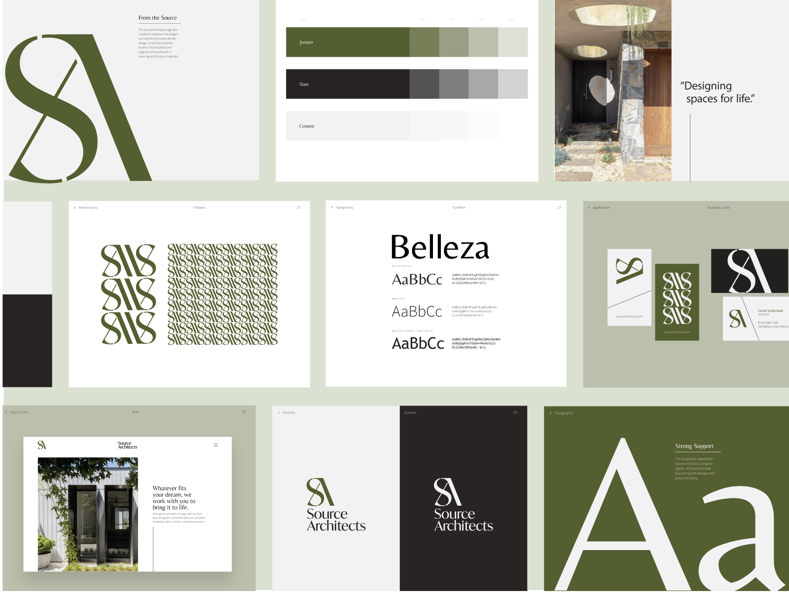
- Patterns, lines border treatments, and textures. Laxalt & McIver, for example, developed some interesting brand patterns for Source Architects:

- Layout and spacing
- Slide deck styling
- Stationary and merchandising applications. Letterhead and business cards are pretty standard applications for corporate brands.
- Motion & sound, including audio-branding
- Packaging (if applicable)
- Scent (if applicable)
- Creative process artifacts like moodboards and research notes
If this brand represents an app or website, its presence might be predominantly digital. In these cases, offering clear user interface guidelines will be key to preserving brand cohesion. You’ll want to consider including:
- Website and app design recommendations
- UI components (styling for buttons, headings, & other common classes)
- Interaction patterns
- Key user views & states
- User experience principles
How you can extend a brand style guide
Some companies are looking for an all-encompassing guide—A one-stop reference book for the brand and its communication. If this is the type of project your client would like to pursue, consider including:
- Voice and Tone Guidelines
- Brand applications for earned, owned, and paid channels (e.g. ad treatments)
Longer documents like these can be easier to build in software like Adobe InDesign. If that’s your preference, take a look at these ready-to-use templates that you can adapt to fit a certain brand aesthetic. In providing layouts that have been specifically designed for brand style guides, they can save you hours of work.

Odessa Brand Guidelines by Circular on Creative Market
How you can make the guide even more accessible
If we’re serious about seeing this brand represented well, our work goes far beyond handing off a document. Successful brand style guides are accessible, and that means doing our homework about how teams actually work with them. Making the style guide friendly and easy to update are needs we should accommodate as we create it.
Why easy to update? Because style guides, like the brands they capture, are not static. They are living references that can and should evolve over time. Discuss this with your client. Could they accomplish more if this content was available and modifiable in Google Slides or some kind of website? Are always up-to-date files available to those who need them? Where do individual assets live and how are they organized? Will you use a file hosting service like Dropbox or a specialized brand asset management tool? In Steve Jobs’ famous words, design is not just what it looks like — it’s how it works.
If you’d like to make your style guides easier to update, there are some thoughtfully designed templates based on Keynote, Google Slides, and PowerPoint.

CHLOVIA - Keynote Brand Guidelines by Elokka Std. on Creative Market
Which brings us to the point: how do these brand assets work? Not in our plans, or our (designer) laptops, but how do they actually unfold in the real world? We often see companies misusing the assets they’re handed and tend to blame it on them. But, in addition to design source files, have we provided more accessible, practical formats?
Appropriation is key. Whenever you see brand assets being applied incorrectly by certain teams within an organization, there’s usually a flaw in how these assets are made available to them and how accessible they are to use. Will a certain team need transparent .pngs instead of vector files to apply this logo effectively? Will a smaller version of the logo be used in the context of a social media avatar or favicon? Make it your goal to provide that.
Not everyone is familiar with specialized design tools, but that shouldn’t prevent them from applying assets in fulfillment of their mission. Think about slide decks, letters, and office signage. If needed, talk to your client about the benefits of crafting these additional applications and make it part of the scope of the project.
Even just knowing who to reach out to in the in-house or external design team is key to brand style guide appropriation and accessibility. As a non-designer, you know what you need in order to complete a project and this guide should point you to whoever can help you create it. Happy designing! ■
 About the author: Laura Busche is the author of the Lean Branding book. Her approach to branding is blended, combining insights from an undergraduate degree in business, master’s degree in design management, and Ph.D. in consumer psychology. Laura is a Brand Content Strategist at Creative Market.
MORE BRANDING RESOURCES
- Brand Discovery: 10 key questions to ask clients before you start designing
- What is the role of a Brand Strategist?
- How to not screw up a logo design: 6 tips from the experts
Find more Process stories on our blog Courtside. Have a suggestion? Contact stories@dribbble.com.


