The Atari 2600 was probably the first mainstream example, and we've seen countless variants since, from Xboxes to PlayStations to Mac Minis running Front Row), Plex or other software.
If you've bought a TV in the last few years, it probably runs apps as well. Mine does. I don't use them, because they're terrible. But, when Apple says apps are the future of television, I believe them. The new Apple TV runs a different breed of apps — we're likely to see apps that are on-par or exceed the best iOS has to offer. We're likely to see more Apple TV apps than any other TV-based app platform in the past, because tvOS shares so much with iOS, including the ability for anyone to develop apps for it.
Before you do, there's some subtle and not-so-subtle differences when designing apps for TV.
Resolution and viewing distance
TVs come in a variety of resolutions, but we're in a strangely stable time for TV formats — widescreen high definition TVs are by far the most common, and it's the only format Apple TV supports for apps. This is good news, as it means Apple TV apps don't have to cater for anything other than a 16:9 aspect ratio and a resolution of 1920×1080 pixels (4K TVs will scale the 1920×1080 pixel image up). And, unlike iPhones and iPads, TVs usually aren't rotated, so landscape is the only orientation you need to design for.
However, TVs vary greatly in size, as does viewing distance. Your TV app has no way of knowing what it's running on, or how close the viewer is sitting. You should be extremely conservative with type size, contrast, and make focused elements obvious.
Apple's documentation considers Apple TV's resolution of 1920×1080 pixels to be "@1x resolution", which makes a lot of sense. The DCI 4K standard is 3840×2160 pixels — exactly double 1920×1080. This would let Apple adopt 4K and use the same trick previously used for the non-Retina to Retina display transition for iOS and OS X — double the resolution of image assets, and add an "@2x" suffix to file names.
I don't know if or when 4K support will come to Apple TV, but Apple has already done a lot of the hard work needed to support it for TV apps.
Safe areas
The very first TVs used cathode ray tubes (CRTs). If you're old enough to remember, those are the extraordinarily heavy, non-flat-panel variety of TVs.
CRTs would typically enlarge the picture to draw past the edge of the screen, hiding some of the deficiencies of the technology and allowing metadata in off-screen areas of analog broadcasts. This is called overscan.
Even though CRTs and analog broadcasts are a thing of the past, overscan is still with us today — many new LCD, OLED and Plasma screens ship with default settings that enlarge and crop the picture. You really can't be sure if an element close to the edge will be cut or not.
The TV and film industry solved this by conservatively determining some areas of the screen title and action safe).

Apple suggests important elements should be kept 90 pixels from the sides and 60 pixels from the top and bottom of the screen.
If you're interested in turning off overscan on your TV, the setting could be called "1:1 pixel mapping", "Just", "Dot for Dot" or "PC mode". The setting isn't present on all TVs, unfortunately.
Colors
Colors vary wildly from TV to TV, and even the same model of TV can vary wildly due to different settings. Previewing your design in the sRGB color space will likely mimic the final result as closely as possible on a Mac.
If you're using Adobe Photoshop, choosing View → Proof Setup → Internet Standard RGB (sRGB) will preview the current document as sRGB.

Adobe Illustrator has a similar feature.

If you're using Sketch or another design tool, changing your Mac's display profile to "sRGB IEC61966-2.1" in System Preferences → Displays will yield a similar result. Just make sure to change it back when you're done — you probably want it set to "Color LCD", or whatever your Mac shipped with. If you have any Adobe apps installed, you may see two sRGB profiles in System Preferences. Selecting either is okay.

It is advisable to spend as much time as possible viewing your app on a real TV, or multiple TVs, if that's an option.
Parallax icons
Apple TV apps contain parallax icons — when an item is in focus it gently gyrates a few independent layers, giving a sensation of depth. It's a cool effect, and thankfully not too much additional work on the design side.
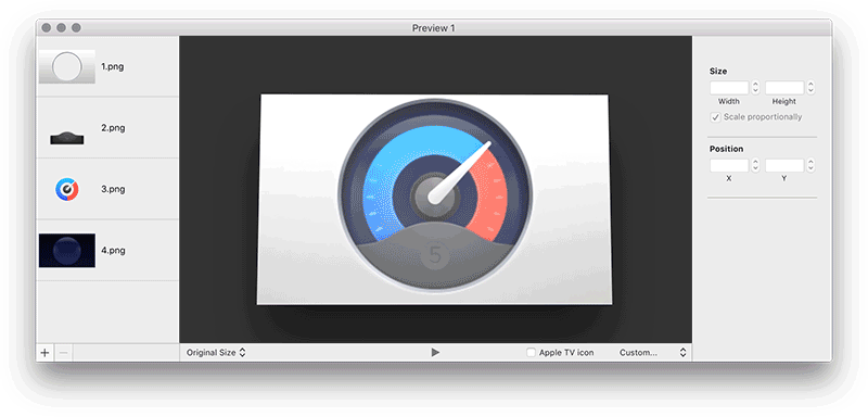
Apple's Parallax Previewer takes 2 to 5 images with transparency and turns them into an LSR file (which is a ZIP archive containing PNG images and some JSON for metadata).
Splitting your app icon into layers is a creative decision that will vary from icon to icon, but you'll probably want the bottom layer to be solid colour or simple gradient, with square finished corners (tvOS rounds the corners for you, so you shouldn't include them in your icon).
If you're a Photoshop user, Apple's Parallax Exporter plugin can also be used to create icons from layered Photoshop documents.
More information
For for even more information about designing Apple TV apps, check out Apple's tvOS Human Interface Guidelines{.nofollow}.