
Keep Your Users in the Know With the New Xamarin ProgressBar

The Telerik UI for Xamarin ProgressBar is designed to display progress information to the users during a long-running operation. The control has an indeterminate mode and segments support. In addition, you can customize it using the Flexible Styling API.
Telerik UI for Xamarin R2 2022 is here with a brand new control—the Xamarin ProgressBar. This control gives you the option to add a progress indicator to your mobile and UWP applications. A progress bar can be used in various scenarios—to notify the users that some process is in action or to inform the users about the status of ongoing progress such as loading an app and images, downloading files, saving updates, submitting a form request, etc. 👌
Features of the Telerik ProgressBar for Xamarin
Let’s review the features the Telerik UI for Xamarin ProgressBar provides. 🧐
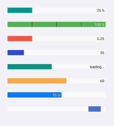
✔ Two States Representing Progress—Determinate and Indeterminate
The determinate state represents how long the progress will take, while the indeterminate expresses an unspecified amount of wait time (in cases where the progress cannot be detected or it’s not necessary to indicate how long the activity will take). Of course, you can switch between the two modes using the IsIndeterminate (bool) property. By default, the Xamarin ProgressBar state is determinate.
<telerikPrimitives:RadLinearProgressBar Value="25"
                                        IsIndeterminate="True"/>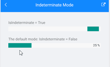
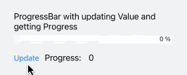
✔ Options To Define Progress Value and Range
Use the Value and Progress properties to set and report, respectively, to show the progress of a task inside the Xamarin ProgressBar control.<telerikPrimitives:RadLinearProgressBar x:Name="progressBar"/>
<StackLayout Orientation="Horizontal" Spacing="10">
<Button Text="Update" Clicked="ProgressBarUpdateClicked"/>
<Label Text="Progress: " VerticalOptions="Center"/>
<Label Text="{Binding Progress, Source={x:Reference progressBar}}" VerticalOptions="Center"/>
</StackLayout>And implement updating the progress value on button click with:
private void ProgressBarUpdateClicked(object sender, EventArgs e)
{
    this.progressBar.Value = 75;
}
Use the Minimum and Maximum properties to add a range to the ProgressBar.
✔ Choose Whether To Display the Progress Value
You can decide whether to display the progress value in the Xamarin ProgressBar. The ValueDisplayMode property gives you the option to display the progress as Percent (range from minimum to maximum), Value (progress value) or custom text through the Text option, and, of course, if you do not want to display the text at all— the None option.
✔ Horizontally Align the Label That Shows Progress
Horizontally align the label using the LabelHorizontalOptions(Xamarin.Forms.LayoutOptions) property.
<telerikPrimitives:RadLinearProgressBar Value="55"
                                        LabelHorizontalOptions="Center"/>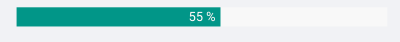
✔ Segments Support
Divide the ProgressBar into segments using the SegmentCount(int) property. In addition you can style the segments using the SegmentSeparatorFill(Brush) and SegmentSeparatorThickness(double).
<telerikPrimitives:RadLinearProgressBar Value="25"
                                        SegmentCount="10"
                                        SegmentSeparatorFill="Black"
                                        SegmentSeparatorThickness="2"/>
✔ Customization Options Using the Flexible Styling API🤩
Benefit from the flexible styling API, which the ProgressBar control provides. Customize the progress fill, indeterminate fill, label text color, font size and more.
Styling the ProgressBar for Determinate Mode
- Apply TrackFill(Brush) and ProgressFill(Brush) properties.
<telerikPrimitives:RadLinearProgressBar Value="20"
                                        TrackFill="LightBlue"
                                        ProgressFill="Blue"/>
- Customize the text displayed in the ProgressBar.
<telerikPrimitives:RadLinearProgressBar Value="90"
                                        AlternateTextColor="Black"
                                        TextColor="#019688"
                                        FontSize="20"
                                        HeightRequest="30"/>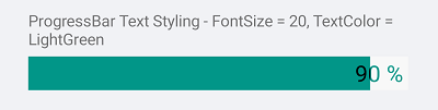
Styling for Indeterminate Mode
Use the IndeterminateFill(Brush) property to style the indeterminate indicator.
<telerikPrimitives:RadLinearProgressBar Value="25"
                                        IsIndeterminate="True"
                                        IndeterminateFill="Yellow"/>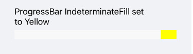
✔ Set Animation Easing and Animation Duration During Progress Change
Customize the animation duration and easing through ProgressAnimationDuration and ProgressAnimationEasing properties.
<StackLayout>
    <Label Text="Progress AnimationDuration and AnimationEasing can be viewed when the Value of the ProgressBar changes"/>
    <StackLayout Orientation="Horizontal">
        <Label Text="{Binding Value, Source={x:Reference progressBar}}"/>
        <Stepper Minimum="0"
                 Maximum="180"
                 Increment="20"
                 Value="{Binding Value, Source={x:Reference progressBar}}"/>
    </StackLayout>
    <StackLayout>
        <Label Text="ProgressAnimationDuration = 1000 and ProgressAnimationEasing = CubicIn"/>
        <telerikPrimitives:RadLinearProgressBar x:Name="progressBar"
                                                Minimum="0"
                                                Maximum="180"
                                                Value="20"
                                                ProgressAnimationDuration="1000"
                                                ProgressAnimationEasing="CubicIn"/>
    </StackLayout>
</StackLayout>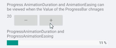
What about an Indeterminate state? We have thought about this and provide properties for customizing the animation easing and duration when the control is in an indeterminate state (IndeterminateAnimationDuration and IndeterminateAnimationEasing properties).
<telerikPrimitives:RadLinearProgressBar Value="25"
                                        IndeterminateAnimationDuration="1000"
                                        IndeterminateAnimationEasing="CubicIn"
                                        IsIndeterminate="True"/>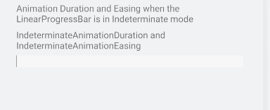
Examples With Telerik ProgressBar for Xamarin😍
There are various examples with the ProgresBar control inside the Telerik UI for Xamarin Sample Application and SDK Browser Application.
The Telerik Sample App for Xamarin is in the App Store, Google Play Store and Windows Store:


Your Feedback Is Important—Let Us Know What You Think
We hope the new Xamarin ProgressBar control will have its place in your mobile and UWP applications.
As always, we encourage you to share your ideas or opinions on the controls and play a role in shaping our roadmap. You can write in the Telerik UI for Xamarin Feedback Portal or raise a ticket.
If you have not yet tried the Telerik UI for Xamarin suite, take it for a spin with a 30-day free trial, offering all the functionalities and controls at your disposal at zero cost.
Happy coding with our controls! ❤

Dobrinka Yordanova
Dobrinka Yordanova is a Technical Support Engineer, part of the Progress Telerik UI for Xamarin & UWP team in Sofia, Bulgaria. She holds a master's degree in Computer Systems and Technologies. Her passion is traveling around the world and exploring multicultural environments. In her spare time she likes making sushi, playing console games and hanging out with friends.
Related Posts
Comments
All articles
Topics

Latest Stories
in Your Inbox
Subscribe to be the first to get our expert-written articles and tutorials for developers!
All fields are required