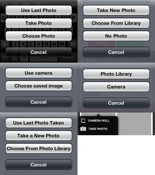
You’re building an iPhone app. There’s a button that lets the user upload a photo. When they tap it, a sheet comes up, offering two* choices: take the picture now, or picking an existing photo. How should those two buttons be labeled?
I looked at six random apps on my phone:

Yikes.
Does it matter if apps are consistent on matters of this sort? Decades of UI theory seems to indicate so. Having the same button say the same thing in all situations means the user has to do less parsing of the text, and can simply rely on quick-glance recognition. No one really “reads” buttons labeled “OK” and “Cancel”; we recognize them by the mere shape of the words. Let’s try doing the same with these two buttons, used very frequently.
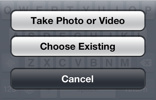
So what should the labels be? It’s not a bad idea to see what Apple does (and consistently, in all their apps, as far as I can tell):

(If your app only deals with photos, the first button would read “Take Photo”)
The point is not to blindly follow Apple’s lead, but to figure out why they arrived at their wording. A few things to keep in mind about menus of this sort:
- Use Title Case: Capitalize Most Words. This is a longstanding convention from menubar menus.
- If all the options (“verbs”) operate on the same target (“object”), mention the object only in the first option. So, the first button says “Take Photo”, and the subsequent buttons drop the word “photo”. This removes redundancy and makes the options visually distinct.
- Avoid technical references; “camera” and “library” are implementation details the user needn’t worry about.
It’s a small change, but if everyone made it, everyone would benefit.
* Of course, you could also consider adding a third option: Use Latest Photo. How exactly you word this button depends on where you place it. If it’s the first button in the list, one option is: 1. Use Latest Photo, 2. Take Photo, 3. Choose Existing”. The word “photo” is repeated, but I’m not sure if “Take Photo” can be worded without mentioning the object. “Take New” sounds a bit off to me.
P.S. Jim Cervone has a good solution to the three-option problem. Ideally, the “Use Latest” button would stand out by including a preview thumbnail of the photo in question.