
Many ecommerce sites are moving away from traditional pagination controls to opt for design patterns with slightly lower interaction cost. Should you adopt these patterns? It depends on the number of products you offer.
Traditional pagination involves splitting a list of items into multiple pages, each containing a fixed number of items. To see more options, users must navigate to the next page — typically by clicking or tapping a Next button at the top or bottom of the screen. Each page is numbered, and users can move to specific number pages by selecting their corresponding buttons.

Mega retailers like Amazon should stick with traditional pagination controls, because these offer precise control as shoppers explore their enormous product sets. Additionally, sites with few products or good loading performance may be able to simply load all products on the page at once.
However, if your site has a small- or medium-size product selection, you can consider infinite loading or Show More buttons as an alternative to traditional pagination controls.
Infinite Loading
Some ecommerce sites present a single product-listing page that continuously loads more items as users scroll down the page. Infinite scrolling or lazy loading (loading more items as users scroll to the bottom of a page) can work well for ecommerce sites that have:
- A relatively small number of products (typically fewer than 40 per page)
- Good filters to help users narrow down results sets
- A clear count of the number of items returned (“42 items”)
One customer on Christian Louboutin’s site noticed that every time she scrolled to the bottom of the page, more products loaded — an infinite-loading approach. She said she didn’t mind it, because the loading times were very fast.
“As long as it loads, it’s fine. Like if I got down here and it took another 30 seconds to load, I’d lose interest. But this pace is fine. And I’m a pretty quick shopper. I just pretty much eyeball stuff and see what catches my eye.”
While this solution can work well for sites with categories that contain a limited number of products, infinite scroll should be avoided for sites with large inventories for two reasons (discussed in detail in the following sections):
- Users may not be able to access important information in the footer navigation.
- People may become disoriented and not understand how far they are in the list of products when the page includes a large number of products.
Access to Footer Navigation
Because new items are commonly appended automatically once the user has scrolled down to the bottom of the page, users cannot reach the footer area. Sites that used an infinite scrolling often frustrated users, as the footer was constantly pushed off the page each time they attempted to navigate to it.
This issue is partly why infinite loading should not be used for large numbers of products — users shouldn’t have to scroll for 15 minutes before they can reach the footer, especially when the footer is the easiest way to access return- or shipping-policy information.
Number of Products
If it is not reasonable to review all items within a category on a single page, it will also not be reasonable to offer infinite scrolling.
Instead of offering pagination controls, the Tory Burch site automatically loaded additional products onto product-listing pages as the user scrolled. Most of the time, products loaded fast enough that the user did not see a loading indicator or have to wait for the products to be visible. The single page worked well due to the site’s limited number of products.
One user shopping on the Tory Burch site appreciated that product listings were always shown on a single page, so she could simply scroll to browse all the available items.
“I like the layout where you can just scroll through everything. Some places make it pages after pages. Where here it’s a really easy website to get through.”

It is important to display the total number of products available when implementing infinite loading. The Tory Burch site included the total number of products at the top of the product list, near the Filter link on the left side of the page. Unfortunately, that number was not very noticeable.

Ann Taylor took a more noticeable approach to displaying the total number of products. This number remained fixed on the page while scrolling and additionally animated to show the user’s current location down the long page — the dark black border increased in size to show completion as the user scrolled further down the page. This indicator helped users keep track of their current location and understand how many items they had already viewed and how many were left to be seen.
Infinitely scrolling pages break the standard browser scrollbar so users cannot rely on it to determine their place on a page. As new items are appended to the bottom of the list, the page is lengthened, thus changing the standard scroll indicator’s location. What was once the middle a page can quickly become the top eighth of a now longer page. Displaying a custom indicator to convey current location gives users a sense of context.
Show More Buttons
Instead of traditional pagination or infinite loading, some ecommerce sites place Show More buttons at the bottom of their listing pages. For example, trendy clothing retailer Aritzia used this pattern. Shoppers had no problems using this implementation.

In addition to Show More, some sites used similar labels such as:
- See More
- Load More
- View More Products
This approach makes logical sense compared to traditional pagination, because the vast majority of people move linearly through product listings anyway. Additionally, a large Show More button is an easier click or tap than little caret icons or than page numbers.
The essential difference between this approach and infinite loading is that customers must take action to load the next set of products, rather than having them load automatically. Thus, compared to infinite loading, Show More buttons allow access the site footers, which may have otherwise been unreachable.
Show More buttons are likely to continue to grow in popularity, particularly because Google began using them in place of pagination on its mobile results pages. We often warn designers not to copy big companies, but Google is a special exception for search results. Purely because they are so extremely widely used, Google’s designs often set user expectations for site search as well as web search.
Allowing users to choose whether to load more items is especially nice for mobile shoppers, who may be on limited data plans and not want to continuously load additional products. Additionally, items may load more slowly on mobile if users are not connected to Wi-Fi.
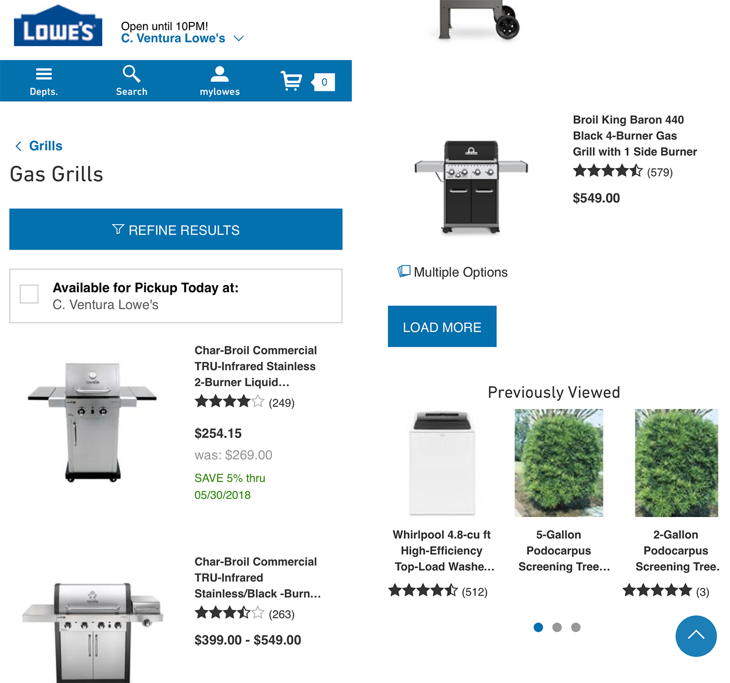
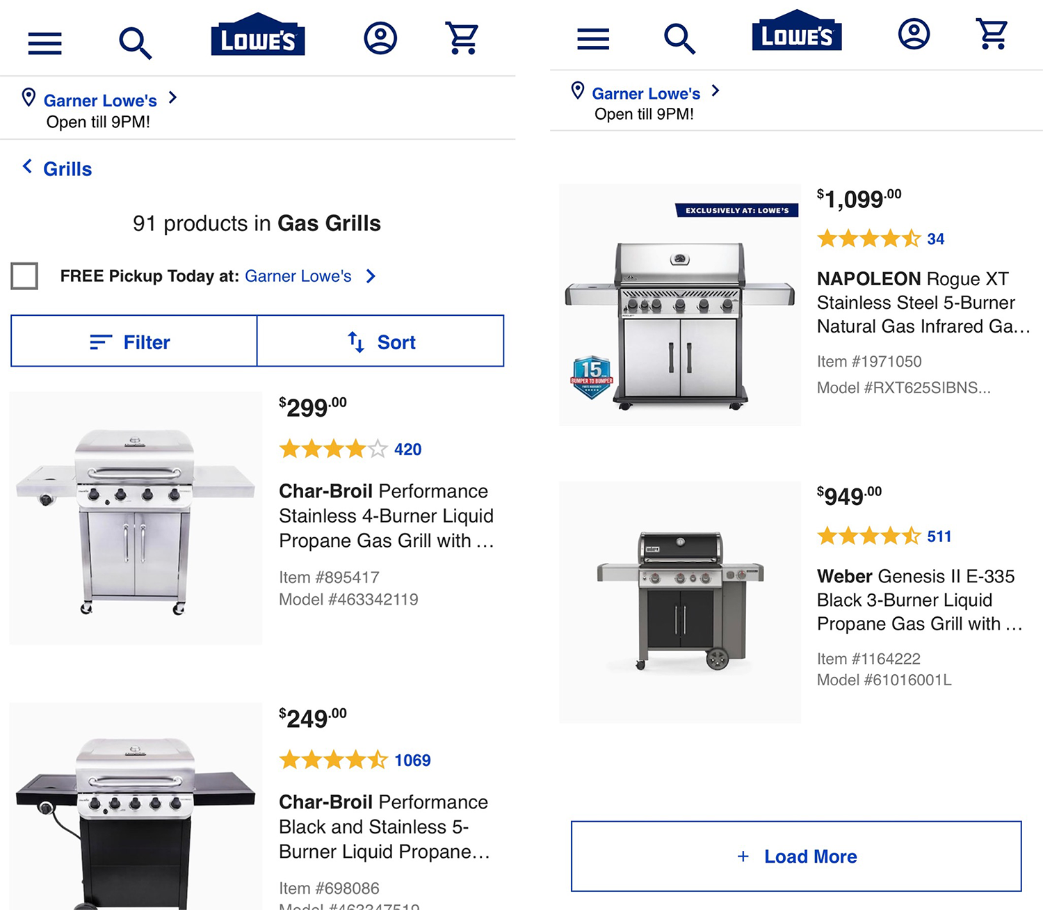
The Lowes mobile site presented users with a Load More button to view additional items on its product-listing pages. This design helped users view more than one page’s worth of products and also easily navigate back to any products that had been loaded in a previous batch, without then needing to reload the previous page.
However, the site failed to display the total number of items available in the category and did not indicate how many products had already been viewed, nor how many would be loaded. Without this information. some users may be hesitant to load additional items, because they have no sense of when they would reach the end of the product list.
If your site will adopt a Show More approach, ensure that you communicate to users:
- The total number of items in the set
- How many products have been loaded
- How many products remain to be loaded in the set
Lululemon’s implementation worked better than Home Depot’s because it provided the number of products already displayed as well as the total number in the product set.

When users reach the end of a listing page and there are no more products to be loaded, simply show the total number of products, as Lululemon did.

Save the Shopper’s Spot
Whether you choose an infinite-scroll or a Show more design, ensure that your listing pages support pogo sticking — a common browsing behavior, particularly on mobile devices but also on desktop among users who do not use page parking. This behavior occurs when a shopper opens a link to a product from a listing page, assesses the product, and then presses the Back button to return to the listing page.
Some sites fail to support this behavior — when customers return to the listing page, they have to scroll up or down to refind their place on the page. This issue can arise with traditional pagination, but is particularly common (and painful) when sites implement infinite scrolling or Show More approaches.

Conclusion
If you have a relatively small- or medium-sized product set, infinite loading or Show More buttons might help your users explore your products more easily. Remember to run usability tests to catch any potential problems in the design — like not being able to access the footer or not noticing the Show More button.
For more advice on how to design ecommerce user experiences, explore our Ecommerce User Experiencereport series.

