
✎ If you see a UI walkthrough, they blew it
Clear, Rise and Solar are three examples of a trend of “gesture driven” apps with a flat UI. These are novelty apps for people lusting for the very latest in app design. Besides using a more flat UI style, which is a topic for a different discussion, all apps contain non-standard interactions. This means users don’t know how to use them beforehand, and all start with a multi-step UI walkthrough before you get to use the app.


These apps have chosen to reduce details to achieve a minimal UI, but in the process the UI has also become harder to use. Unfortunately a UI walkthrough is quite an inelegant way to explain the core functionality of an app. It can be a frustrating obstacle before you can dive into an app, and you have to remember all of those new ways of using it once you get in.
The problem is mainly the lack of visual cues; there is no way to tell that sliding the main screen to the left will toggle the alarm on in Rise, or pinching a list in Clear will minimize it and take you up a level in the hierarchy. It’s not obvious, and what’s often called mystery meat.
Arguably a less intrusive way compared to a walkthrough is to guide the user in the situation with UI hints. This can be done through slight visual cues and animations. A hint should not be a popup (it’s probably even more disruptive than a tutorial).
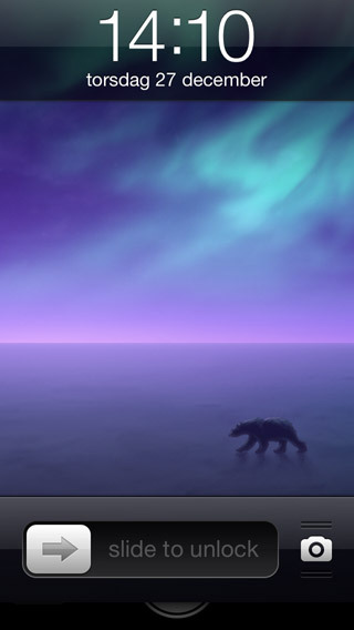
Some examples of clever explanation of UI gestures include Apple’s own camera lock screen sliders. Just tapping on the camera icon makes the screen jump, briefly revealing the camera UI behind the lock screen. This combined with the ridges above and below the camera tells the user to slide the lock screen up. Before this behavior the camera was activated by a mystery meat action; double tap the home button and a camera button would appear to the right of the Slide to unlock well. There was no way to find it unless you knew that double tapping the home button was possible in this screen.
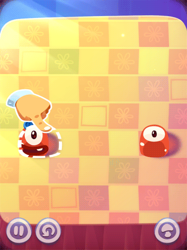
A more hands on approach can be found in games which often deals very well with progressive disclosure, revealing game mechanics as you move further into a game. In Pudding Monsters, if you sit idly by when facing a new scenario, an animated hand will appear and make a sliding motion. It’s inherent in humans to mimic actions we see and it immediately becomes clear how to proceed.
In our own iPad cooking app Filibaba Meals, which is soon to be updated for the iPhone, we have adapted the recipes to work equally well on the smaller screen. To do so effectively we have the ingredients in a separate layer to the left of the description. To make it obvious that there is something more to the left of the current screen, there is a subtle animation that moves a piece of paper into the left part of the screen each time you pick a recipe. It’s subtle enough not to get annoying over time, but still serves as a UI hint the first time. We allow both tapping the piece of paper, as well as a horizontal swipe anywhere on the screen to move to the ingredients view.

When it comes to teaching users to use your UIs, I would recommend to do so mainly by progressive disclosure with slight visual cues and subtle animations - only use a walkthrough as a final resort.
Update 2012-12-28:
I just wanted to clarify my thoughts a little. It’s easy to pick on a few apps and present a few solutions that worked in other cases.
First off, the headline I picked for this article is a nod to late Steve Jobs “If you see a stylus, they blew it” and there is a disconnect between it and what I present in the article. I used it because I thought it would provoke a reaction, which it clearly did. If I were to do it again, I’d probably pick something more descriptive of my point.
I like Clear and understand the need for a walkthrough in that app. Clear brings many innovative features and tries to improve on the foundation of iOS through a more gesture based navigation that minimizes UI elements. And that’s a hard thing for a single app to do without giving the users some pointers. So I think the walkthrough is justified in Clear’s case, although perhaps given some iteration it could be transformed into a more gradual discovery. They already have an excellent starting to-do list that teaches the user basic functionality of the app.
Phill Ryu, from Impending, said:
“I … consider it a suboptimal solution we rushed in to fix a more broken situation (without [the walkthrough])”
“I agree with your point Max btw, it’s just extra tricker to do! I hope we can improve on it someday”
I don’t have any solutions for Clear and consider myself a fan, so if anyone can do a good job improving on an already excellent app, it’s them.
What’s ironic is that Rise and Solar so closely follows Clear’s formula. Without the walkthrough, they are hard to explore on your own.
Phill Ryu agrees of the irony:
“… It’s definitely a weaker spot. those apps taking inspiration should try to innovate there!”
Jeremy Olson of Tapity has an interesting follow up article; “Are UI walkthroughs evil?”


