
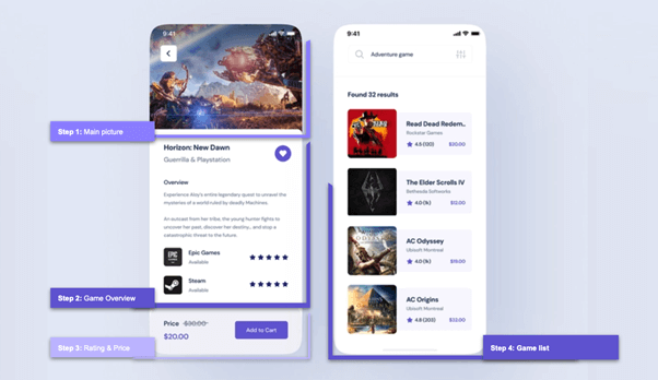
Howdy! In this blog post, we’ll be replicating a game store UI based on this Dribbble design.
We are going to break down this UI, and I’ll explain implementing different segments of the app in the following structure.
Note: We will be using the Syncfusion Xamarin Rating control.
Let’s start coding!
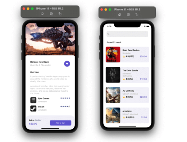
Step 1: The main picture.
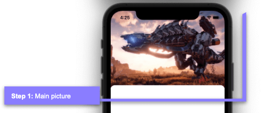
In this step, in addition to designing the main image, we will also work on the design of the white frame with rounded edges that slightly overlap the main image.
Let’s start by creating this first screen. I’m naming it GamePage.xaml.
<!-- Main layout-->
  <Grid RowDefinitions="280,*,Auto">
    <!-- You must write here what is explained from the steps 1 to 4. -->
  </Grid>
Let’s add the image.
<!-- Step 1.  Main Picture-->
 <Image Grid.Row="0" Aspect="AspectFill" Source="MainGame.jpeg"/>

 <!-- You must write here what is explained in the next code block. -->
Now, let’s add the body of the frame. Following are some important points to highlight:
- I used the Margin property with a negative value in the Top position to create the overlap between the main image and the frame (Margin=”0,-15,0,0″).
- As part of the frame, I will add a grid that structures the visual information this frame will be receiving.
<!-- Step 2.  Game Overview-->
 <Frame Grid.Row="1" HasShadow="False" CornerRadius="15" Margin="0,-15,0,0">
   <Grid ColumnDefinitions="*,Auto" RowDefinitions="Auto,Auto,Auto,Auto,Auto,Auto,Auto" Padding="20">
       <!-- You must write here what is explained in step 2. -- >
   </Grid>
 </Frame>

 <!-- You must write here what is explained in step 3. -- >
Step 2: Game overview.
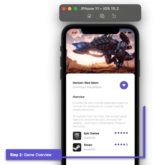 The second step is made up of the following components:
- Title
- Description
- Like button.
<!--Title, description, and favorite button-->
   <Label  Grid.Column="0" Grid.Row="1" Text="Horizon: New Dawn" FontAttributes="Bold"/>
   <Label  Grid.Column="0" Grid.Row="2" Text="Guerrilla &  Playstation" FontAttributes="Bold" TextColor="Silver"/>
   <Button Grid.Column="1" Grid.Row="1" Grid.RowSpan="2" VerticalOptions="Center" ImageSource="HeartIcon" HeightRequest="50" WidthRequest="50" CornerRadius="25" BackgroundColor ="#695dd4"/>

   <!-- You must write here what is explained in the next code block. -- >
- Overview and its description.
 <!--Overview & description-->
   <Label  Grid.Column="0" Grid.Row="3" Margin="0,30,0,10" Text="Overview" FontSize="16" FontAttributes="Bold"/>
   <Label Grid.Column="0" Grid.ColumnSpan="2" Grid.Row="4" TextColor="Silver" Text="Experiencia Aloy's entire legendary quest to unravel the mysteries of a world ruled by  deadly Machines.

 An outcast from her tribe, the young hunter fights to uncover her past, discover her destiny... and stop a catastrophic threat to the future." />

   <!-- You must write here what is explained in the next code block.-- >
- Rating game list.
We will use a CollectionView to add the game list, and then we will add the Rating control inside the CollectionView. To create this, we will use the Syncfusion Xamarin Rating control, as we said earlier in this blog post. Add the Syncfusion.Xamarin.SfRating NuGet package to all your projects. (You can read more information about it in this control documentation.)
I’m going to take a moment to explain the implementation of this Rating control, which you’ll see implemented in the second block of code, inside the CollectionView.
First, add the NuGet package.
 Then, add the following namespace in your XAML file.
xmlns:rating="clr-namespace:Syncfusion.SfRating.XForms;assembly=Syncfusion.SfRating.XForms"
And done! To add the Rating control, you just have to use the alias given to the namespace.
Refer to the following code example for the complete implementation of the CollectionView and the components inside it.
  <!--Step 3. Rating and Price-->
   <!-- Rating game list-->
   <CollectionView  VerticalScrollBarVisibility="Never" Margin="0,15,0,0"
                       Grid.Column="0" Grid.ColumnSpan="2" Grid.Row="5"
                       ItemsSource="{Binding Games}" >
   <CollectionView.ItemTemplate>
     <DataTemplate>
       <Grid ColumnDefinitions="Auto,Auto,*" RowDefinitions="Auto, Auto" Margin="0,0,0,20">
         <Frame Grid.Row="0" Grid.Column="0" Grid.RowSpan="2" Margin="0,0,10,0" BorderColor="Transparent" HorizontalOptions="Start" VerticalOptions="Start"  WidthRequest="50" HeightRequest="50" HasShadow="False" CornerRadius="8" Padding="0" IsClippedToBounds="True">
            <Image Source="{Binding Picture}" Aspect="AspectFill"/>
         </Frame>
         <Label Grid.Row="0" Grid.Column="1" Text="{Binding Title}" FontAttributes="Bold"/>
         <Label Grid.Row="1" Grid.Column="1" Text="{Binding Status}" FontAttributes="Bold" TextColor="Silver"/>
         <!--Rating component-->
         <rating:SfRating Grid.Row="0" Grid.RowSpan="2" Grid.Column="2" ItemCount="5" Value="{Binding Rating}" ReadOnly="true" ItemSize="15" ItemSpacing="2" HorizontalOptions=" End">
           <rating:SfRating.RatingSettings>
             <rating:SfRatingSettings RatedStroke="Transparent" RatedFill="#242077"/>
           </rating:SfRating.RatingSettings>
         </rating:SfRating>

      </Grid>
    </DataTemplate>
   </CollectionView.ItemTemplate>
  </CollectionView>
Step 3: Rating and price.
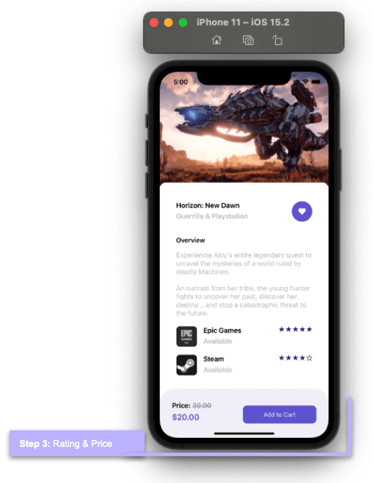 Do you remember the frame created in step 1? Now, we are going to add the code outside of that frame.
Note: Here, we have used FormattedString to add more than one style to text of the same label.
<!-- Price-->
<Frame Grid.Row="2" BackgroundColor="#f2f1f8" CornerRadius="35" VerticalOptions="End" HasShadow="False" HeightRequest="80" Margin="0,-10,0,0">
 <Grid RowDefinitions="Auto,Auto" ColumnDefinitions="*,Auto" Padding="10,5">
   <Label Grid.Column="0" Grid.Row="1">
    <Label.FormattedText>
      <FormattedString>
        <Span Text="Price: " FontAttributes="Bold"/>
        <Span Text="30.00" TextColor="#9099aa" TextDecorations="Strikethrough" FontAttributes="Bold"/>
      </FormattedString>
   </Label.FormattedText>
  </Label>
  <Label Grid.Column="0" Grid.Row="2" Text="$20.00" FontSize="20" TextColor="#695cd4" FontAttributes="Bold"/>
  <Button Grid.Column="1" Grid.Row="1" Grid.RowSpan="2" BackgroundColor="#695cd4" Margin="0,10" TextColor="White" Text="Add to Cart" CornerRadius="10" WidthRequest="180"/>
 </Grid>
</Frame>
Our first screen is done!
Step 4: Game list.
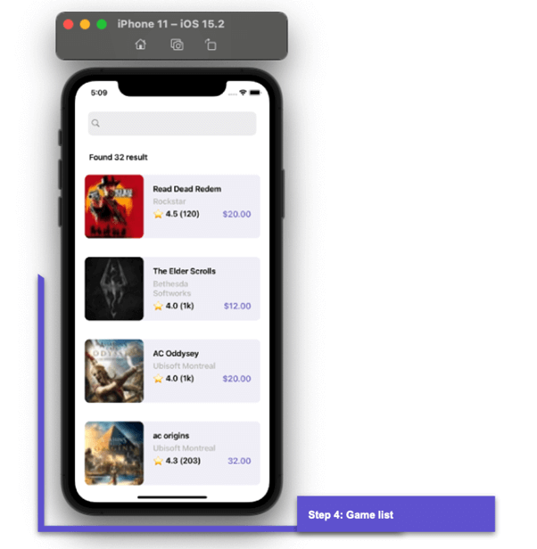 Since we are building a new screen, let’s start with the name of our XAML. I am naming it FavoritePage.xaml. Then, let’s continue with the main layout.
<!-- Main layout-->
  <Grid RowDefinitions="Auto,Auto,*" Padding="20,55,20,0">
     <!-- You must write here what is explained in the step number 4 -- >
  </Grid>
SearchBar
This screen has a search bar, followed by a label that displays the total results in the list. Let’s start to code these components.
<SearchBar Grid.Row="0" BackgroundColor="Transparent" />
  <Label Grid.Row="1" Text="Found 32 result" FontAttributes="Bold" Margin="10,20,0,0"/>
  <!-- You must write here what is explained in the next code block. -- >
CollectionView and Rating control
Finally, add the structure of the list using a CollectionView. We will use the Syncfusion Xamarin Rating control to display the stars.
 <!-- 4.  Game list-->
  <CollectionView VerticalScrollBarVisibility="Never" Grid.Row="2"
                  ItemsSource="{Binding Favorites}" >
    <CollectionView.ItemTemplate>
      <DataTemplate>
        <Grid ColumnDefinitions="*" Padding="0,20" VerticalOptions="Center">
           <Frame Grid.Column="0" HorizontalOptions="Fill" HasShadow="False" BackgroundColor="#f2f1f8" CornerRadius="10">
              <Grid ColumnDefinitions="*,Auto" RowDefinitions="Auto,Auto,Auto" Padding="125,0,0,0">
                  <Label Grid.Column="0" Grid.ColumnSpan="2" Grid.Row="0" Text="{Binding Title}" FontAttributes="Bold"/>
                  <Label Grid.Column="0" Grid.Row="1" Text="{Binding Description}" FontAttributes="Bold" TextColor="Silver"/>
                  <Label Grid.Column="0" Grid.Row="2" Text="{Binding Rating}" FontAttributes="Bold" />
                  <Label Grid.Column="1" Grid.Row="2" Text="{Binding Price}" FontAttributes="Bold" FontSize="18" TextColor="#8079c4"/>
              </Grid>
           </Frame>
           <Frame Grid.Column="0" BorderColor="Transparent" HorizontalOptions="Start" VerticalOptions="Start" WidthRequest="125" HeightRequest="135" HasShadow="False"  CornerRadius="10" Padding="0" IsClippedToBounds="True">
              <Image Source="{Binding Picture}" Aspect="Fill"/>
           </Frame>
         </Grid>
       </DataTemplate>
     </CollectionView.ItemTemplate>
  </CollectionView>
And our second UI is done! Here, you can see the full screens we have built.
Resource
To see the complete code structure of this project, refer to the Replicating a Game Store UI in Xamarin.Forms demo on GitHub.
Conclusion
Thank you for reading this blog! I hope you find this useful in developing a UI for a game store mobile app in Xamarin.Forms. The Syncfusion Xamarin.Forms Rating control made it easy to implement the rating section in the app. Try replicating these steps and share your feedback.
Syncfusion’s Xamarin suite offers over 150 UI controls, from basic editors to powerful, advanced controls like Charts, ListView, and Rich Text Editor. Use them to build elite applications!
You can contact us through our support forum, support portal, or feedback portal. We are always happy to assist you!