Want to stay up-to-date? Check out React Native Now, the bi-weekly React Native newsletter
In the original design and flows of our React Native apps, we utilized the native Alert for a few different needs - but primarily they were error, confirmation, and success notifications.
These worked well in most cases for the past year for most every case we had ever needed them - the only issue we ever had was a lack of styling flexibility, so items in a list for instance would end up center aligned on iOS, which was less than ideal.
Success notifications were used most often - the alerts would usually appear following a successful API response after filling out a form, which historically had been built as single screens. When these success notifications were triggered, we would also kick our navigation back a screen or two so our users would be where we wanted them.
The problem
As our design team begun to share mocks of screens with us that had a fresh coat of paint on them, they also had a major change in many of our original flows. The idea is to move away from scrolling, single screen forms to a more mobile-friendly, multi screen flow. In addition, these new designs replaced our native alerts with full screens that was more consistent with our branding and enabled us to style them with greater flexibility.
While our engineering team liked the look of these new flows and success screens, replacing our native alerts with them proved to be more work than we expected - by making the alert into a separate screen, we now lost the ability to trigger a navigation "behind the scenes" while the user was interacting with our alert. And, since we were also moving from single screen to multi screen forms, we couldn't simply replace the current screen in the stack with a success screen.
The solution
Because of this "behind the scenes" magic we were introducing, we wanted to avoid having the modal as part of our navigation stack completely. To handle this, we created a modal store within Redux and a Modal component at the root of our app - which we'll walk through the basics of how to create in this tutorial. This same pattern could be applied to your choice of state management solution if Redux doesn't work for you.
To start, we'll initialize a new React Native project. Then, add React Navigation with a couple dummy screens and Redux. In our Redux store, we'll setup a modal reducer that has an id field. I used the React Native CLI to start, but you may be able to simplify things by utilizing Expo. To see what our project looks like so far, check it out here.
Great, now that we have a baseline project setup, let's discuss the main steps involved in building this out:
- Create a connected-RootModal component at the root of our App
- Create unique views within the parent Modal
- Let the store drive the visibility of the RootModal (and specific view)
- Add support for props
Alright, let's get started.
1. Create a connected-RootModal component at the root of our App
First step, we'll create a file called RootModal.js that will look like this:
import * as React from 'react';
import {Modal, Button, View} from 'react-native';
import {connect} from 'react-redux';

export class RootModal extends React.Component {
  render() {
    return (
      <Modal visible={true} animationType="fade" testID="modal">
        <View
          style={{
            flex: 1,
            padding: 20,
            justifyContent: 'space-between',
          }}>
          <View />
          <Button onPress={() => {}} title="Close" color="blue" />
        </View>
      </Modal>
    );
  }
}

const mapStateToProps = state => {
  return {
    id: state.modal.id,
  };
};

export default connect(mapStateToProps)(RootModal);
Here, we've created a very simple connected-component that displays a native Modal with a button at the bottom.
Then, we will import it into our App.js and drop it in.
import RootModal from './src/modals/RootModal';

export default class App extends React.Component {
  render() {
    return (
      <Provider store={store}>
        <Navigation />
        <RootModal />
      </Provider>
    );
  }
}
Now when we refresh our app, we should see something like this:
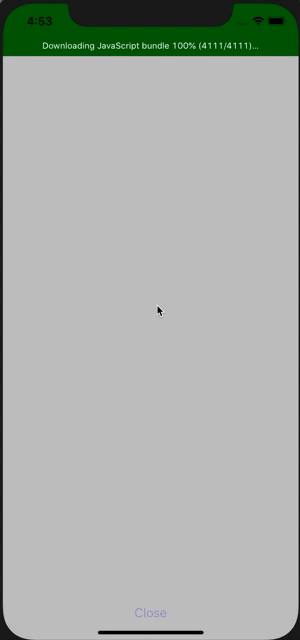
Exactly what we want, a root-level Modal that covers up the rest of our app. Click here to see what our project currently looks like.
2. Create unique views within the parent Modal
Next, we're going to create some unique views / components that the root modal can display. For simplicity sake in this tutorial, we aren't going to make anything too fancy - but it should be enough to spark your understanding of the concept.
Let's make two new files - Success.js and Error.js
import * as React from 'react';
import {Text, View} from 'react-native';

export default class Success extends React.Component {
  render() {
    return (
      <View
        style={{
          flex: 1,
          justifyContent: 'space-between',
        }}>
        <View />
        <Text style={{fontSize: 20, textAlign: 'center'}}>
          Congratulations. The thing you wanted to happen has happened.
        </Text>
        <View />
      </View>
    );
  }
}
import * as React from 'react';
import {Text, View} from 'react-native';

export default class Error extends React.Component {
  render() {
    return (
      <View
        style={{
          flex: 1,
          justifyContent: 'space-between',
        }}>
        <View />
        <Text style={{fontSize: 25, color: 'red', textAlign: 'center'}}>
          There has been an error.
        </Text>
        <View />
      </View>
    );
  }
}
Now, we want to import them into our RootModal file and test out displaying them - so we'll replace that placeholder empty View we had.
import Error from './Error';
import Success from './Success';

const Modals = {
  Error: Error,
  Success: Success,
};

export class RootModal extends React.Component {
  render() {
    return (
      <Modal visible={true} animationType="fade" testID="modal">
        <View
          style={{
            flex: 1,
            padding: 20,
            justifyContent: 'space-between',
          }}>
          <Modals.Success />
          <Button onPress={() => {}} title="Close" color="blue" />
        </View>
      </Modal>
    );
  }
}
Let's take a look and see what this looks like now when using Modals.Success and Modals.Error
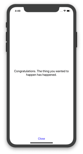
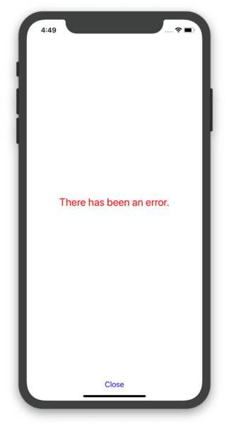
Perfect. Click here to see what our project currently looks like.
3. Let the store drive the visibility of the RootModal
Now for the fun part. What we want to do setup our store to set and unset a specific id. Our RootModal component will then look at that id and then determine which modal to display. If the id is empty, no modal will be shown.
First, we'll create a ModalActions.js and create two actions - one that will set an id and another that will clear it out.
const showModal = ({id}) => {
  return dispatch => {
    dispatch({
      type: 'MODAL__SET_ID',
      payload: id,
    });
  };
};

const hideModal = () => {
  return dispatch => {
    dispatch({
      type: 'MODAL__SET_ID',
      payload: '',
    });
  };
};

export const ModalActions = {
  showModal,
  hideModal,
};
Then, we'll update our ModalReducer to support these actions:
export const id = createReducer(ID_INITIAL_STATE, {
  ['MODAL__SET_ID'](state, {payload}) {
    return payload;
  },
});
Next, we need to update our RootModal. First we need to add mapDispatchToProps to our Redux-connection and import our new hideModal action. Then, we'll create a constant that assigns to a component based on the id in our store and update the native Modal component to be displayed only if that id is truthy. And finally, inject the custom view into the Modal. All together, it should look like this:
import * as React from 'react';
import {Modal, Button, View} from 'react-native';
import {connect} from 'react-redux';
import Error from './Error';
import Success from './Success';

// import our new actions
import {ModalActions} from '../store/modules/Modal/ModalActions';

const Modals = {
  Error: Error,
  Success: Success,
};

export class RootModal extends React.Component {
  render() {
    const {id, hideModal} = this.props;

    // assign a constant that is either one of our custom views or a noop function if the id is not set
    const ModalView = Modals[id] || function() {};

    return (
      // show the Modal if the id is set to a truthy value
      <Modal visible={Boolean(id)} animationType="fade" testID="modal">
        <View
          style={{
            flex: 1,
            padding: 20,
            justifyContent: 'space-between',
          }}>
          {/* inject the custom view */}
          <ModalView />
          <Button onPress={hideModal} title="Close" color="blue" />
        </View>
      </Modal>
    );
  }
}

const mapStateToProps = state => {
  return {
    id: state.modal.id,
  };
};

// add hideModal action to props
const mapDispatchToProps = {
  hideModal: ModalActions.hideModal,
};

const ConnectedRootModal = connect(
  mapStateToProps,
  mapDispatchToProps,
)(RootModal);

export default ConnectedRootModal;
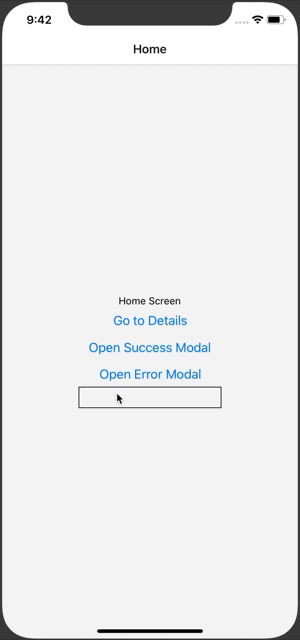
Lastly, we'll update one of our screens to support our new showModal action and add a couple buttons to support displaying our RootModal.
<Button
  title="Open Success Modal"
  onPress={() => {
    this.props.showModal({id: 'Success'});
  }}
/>
<Button
  title="Open Error Modal"
  onPress={() => {
    this.props.showModal({id: 'Error'});
  }}
/>
All wrapped up - here's what this looks like (and here's our project at its current stage):

4. Add support for props
How can we make this pattern a little more flexible? For one, we should setup an additional reducer that takes in some custom props that will be passed through to our custom views. All we have to is create the action and reducer to support it and spread those props in on our RootModal.
To handle this, we'll first update our showModal and hideModal actions
// add to showModal
dispatch({
  type: 'MODAL__SET_MODAL_PROPS',
  payload: modalProps,
});

// add to hideModal
dispatch({
  type: 'MODAL__SET_MODAL_PROPS',
  payload: {},
});
Then, we'll add a modalProps reducer to our ModalReducers file
const MODAL_PROPS_INITIAL_STATE = {};

export const modalProps = createReducer(MODAL_PROPS_INITIAL_STATE, {
  ['MODAL__SET_MODAL_PROPS'](state, {payload}) {
    return payload;
  },
});

export const ModalReducer = combineReducers({
  id,
  modalProps,
});
Next, we'll modalProps to our mapStateToProps in the RootModal file and spread those props in:
<ModalView {...this.props.modalProps} />
And finally, when we are calling our showModal action, we'll be able to pass along any additional props that may be relevant, and update those unique views to support them.
// HomeScreen.js
<Button
  title="Open Error Modal"
  onPress={() => {
    this.props.showModal({
      id: 'Error',
      modalProps: {errorMessage: this.state.errorMessage},
    });
  }}
/>

// Error.js
<Text style={{fontSize: 20, color: 'green', textAlign: 'center'}}>
  {this.props.errorMessage}
</Text>
Our project now looks like this, and here's a preview of how everything looks all wrapped up:
Final thoughts
Hopefully this tutorial has given you enough context to help use this concept as a starting point for however you may need to utilize a custom store-backed root-level modal. In our apps, our RootModal is a little more "dumb" than this example - and we leave all actions, including closing, to the Redux-connected inner views. Also, we eventually ran into an issue related to this long-standing bug when building out this pattern - which led us to replace our use of a native Modal with the react-native-root-modal library. Hopefully you don't need that extra step, but it is worth mentioning.


Top comments (2)
Thanks for your sharing, but i think we should add some extra code to handle back button on android for case user want to dismiss modal on back button pressed :D
Nice article!
I have worked in some similar with MST instead of redux. A package with a agnostic state manager could be a good idea ;)