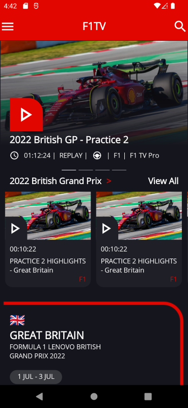
For .NET MAUI UI July, I decided to replicate another app using .NET MAUI. The choice this time landed on the F1TV app, the official app to watch all Formula 1 races on.
Here’s a screenshot of the F1TV app running on Android:
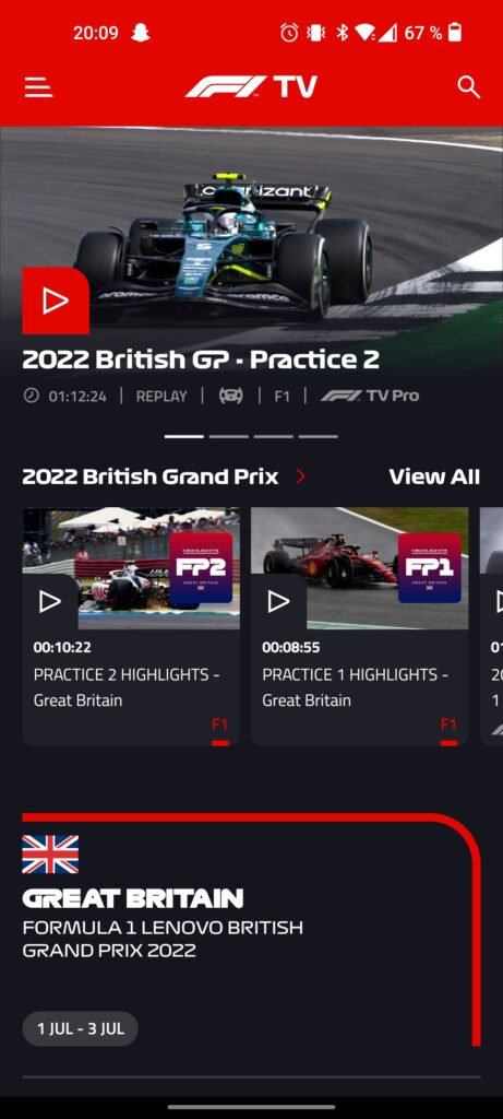
Although there are other pages in this app, this main page is the one that I will be replicating in this post. For purposes of demonstration I haven’t gotten the correct logos and fonts, but focused primarily on the layout and the controls.
Getting started
For the icons I decided to use the Material design font icons, since they have pretty similar icons to the ones in the app. I used this video by Karl Searl on how to easily use the icons in a .NET MAUI app.
Since I’m primarily testing on an Android emulator, I had to edit the Android specific styling for the status bar in colors.xml under Platforms -> Android -> Resources -> values. I set this to the same color as the top section:
<?xml version="1.0" encoding="utf-8"?>
<resources>
    <color name="colorPrimary">#e10600</color>
    <color name="colorPrimaryDark">#e10600</color>
    <color name="colorAccent">#e10600</color>
</resources>
In the MAUI XAML page, I’ve set the background color for the ContentPage to be that of the design. I’ve also set an implicit style to set the text color of all labels to white.
At the top level, I have a ScrollView with a VerticalStackLayout inside that.
<ScrollView>
        <VerticalStackLayout>
        ...
        </VerticalStackLayout>
</ScrollView>
Top section
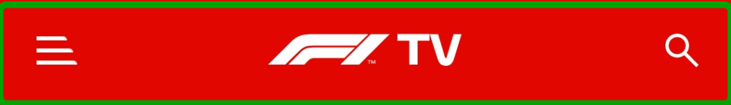
The top section consists of a menu button, a logo and a search button. We’ll use a FlexLayout here with SpaceBetween to position the child elements at the start and end. We’ll use Image at the start and end to show the icons and a Label in the middle to show the logo. Had I done this properly, this probably would also be an Image.
<FlexLayout
    Padding="20"
    Background="#e10600"
    HeightRequest="60"
    HorizontalOptions="CenterAndExpand"
    JustifyContent="SpaceBetween"
    VerticalOptions="CenterAndExpand">
    <Image
        Margin="0,10,0,0"
        HeightRequest="32"
        VerticalOptions="Center"
        WidthRequest="32">
        <Image.Source>
            <FontImageSource
                FontFamily="IconFontTypes"
                Glyph="{x:Static helpers:IconFont.Menu}"
                Size="32"
                Color="White" />
        </Image.Source>
    </Image>
    <Label
        FontAttributes="Bold"
        FontSize="22"
        Text="F1TV"
        VerticalOptions="Center" />
    <Image
        Margin="0,10,0,0"
        HeightRequest="32"
        VerticalOptions="Center"
        WidthRequest="32">
        <Image.Source>
            <FontImageSource
                FontFamily="IconFontTypes"
                Glyph="{x:Static helpers:IconFont.Magnify}"
                Size="32"
                Color="White" />
        </Image.Source>
    </Image>
</FlexLayout>
Carousel section

The carousel section shows the four most relevant races/videos in a carousel. I must admit that I cheated a bit here, since the most natural choice here would be to use a CarouselView. I opted to fake it for purposes of demonstration, but the layout would be very much reused for the item template if I had done it properly.
Nonetheless, this section consists of a few things: the image, the play button, the title, the “tags” and the indicator. Since there is a lot of overlapping elements here, we start with a Grid, which allows us to stack controls on top of each other.
The first element will be the Image background. Since the image seems to fade into the background color, we’ll add a gradient to the image. One of the ways to do this is to add a Frame on top of the image and set a LinearGradientBrush on it.
<Image
    HeightRequest="220"
    HorizontalOptions="Center"
    Source="leclerc.jpg" />
<Frame
    BorderColor="#15151d"
    CornerRadius="0"
    HeightRequest="220">
    <Frame.Background>
        <LinearGradientBrush EndPoint="0,1">
            <GradientStop Offset="0.1" Color="Transparent" />
            <GradientStop Offset="1.0" Color="#15151d" />
        </LinearGradientBrush>
    </Frame.Background>
</Frame>
For the play button, we’ll use a Border with a font icon as a child element. With the Border control we can set individual corner radius for each corner using the StrokeShape.
<Border
    Margin="20,30"
    Padding="0"
    Background="#e10600"
    HeightRequest="70"
    HorizontalOptions="Start"
    StrokeThickness="0"
    VerticalOptions="End"
    WidthRequest="70">
    <Border.StrokeShape>
        <RoundRectangle
            CornerRadius="0,30,0,0" />
    </Border.StrokeShape>
    <Image
        HeightRequest="50"
        VerticalOptions="Center"
        WidthRequest="50">
        <Image.Source>
            <FontImageSource
                FontFamily="IconFontTypes"
                Glyph="{x:Static helpers:IconFont.PlayOutline}"
                Size="50"
                Color="White" />
        </Image.Source>
    </Image>
</Border>
The title is just a Label that we stick to the bottom left.
<Label
    Margin="20,0"
    FontAttributes="Bold"
    FontSize="20"
    HorizontalOptions="Start"
    Text="2022 British GP - Practice 2"
    VerticalOptions="End" />
The “tags” are contained in a HorizontalStackLayout which is outside of the Grid, since they’re below the picture, and they consist of a combination of Image and Label controls.
<HorizontalStackLayout Margin="20,10,20,20">
    <Image
        Margin="0,0,10,0"
        HeightRequest="20"
        VerticalOptions="Center"
        WidthRequest="20">
        <Image.Source>
            <FontImageSource
                FontFamily="IconFontTypes"
                Glyph="{x:Static helpers:IconFont.ClockOutline}"
                Size="20"
                Color="White" />
        </Image.Source>
    </Image>
    <Label Text="01:12:24 | " />
    <Label Text=" REPLAY | " />
    <Image
        Margin="6,0,6,0"
        HeightRequest="20"
        VerticalOptions="Center"
        WidthRequest="20">
        <Image.Source>
            <FontImageSource
                FontFamily="IconFontTypes"
                Glyph="{x:Static helpers:IconFont.Steering}"
                Size="20"
                Color="White" />
        </Image.Source>
    </Image>
    <Label Text=" | " />
    <Label Text=" F1 | " />
    <Label Text=" F1 TV Pro" />
</HorizontalStackLayout>
The indicators were made able by some Line controls inside a centered HorizontalStackLayout. If I were to do it the correct way, I would have used an IndicatorView which would be connected to the CarouselView.
<HorizontalStackLayout HorizontalOptions="Center" Spacing="4">
    <Line Stroke="White" X2="30" />
    <Line Stroke="#949398" X2="30" />
    <Line Stroke="#949398" X2="30" />
    <Line Stroke="#949398" X2="30" />
</HorizontalStackLayout>
Middle section
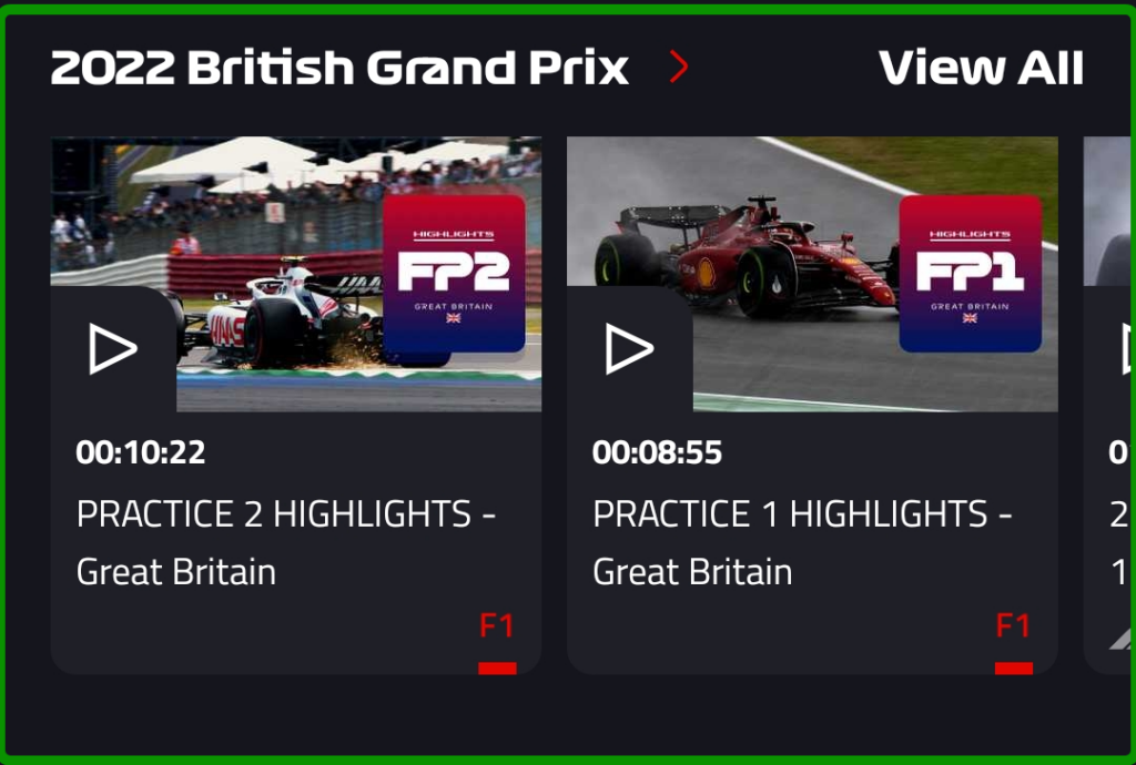
The middle section shows the current Grand Prix along with the option to view all videos and swipe among a few of them.
The header part was achieved with a FlexLayout along with some labels inside that.
<FlexLayout
Margin="20,10,20,0"
JustifyContent="SpaceBetween">
<HorizontalStackLayout>
<Label
FontAttributes="Bold"
FontSize="18"
HorizontalOptions="Start"
Text="2022 British Grand Prix" />
<Label
Margin="10,0"
FontAttributes="Bold"
FontSize="18"
Text=">"
TextColor="#e10600" />
</HorizontalStackLayout>
<Label
Margin="0,0"
FontAttributes="Bold"
FontSize="18"
HorizontalOptions="EndAndExpand"
Text="View All" />
</FlexLayout>For the horizontal list, I used a CollectionView with ItemsLayout set to HorizontalList. The item template for the list uses a Border as the parent element. With this we can set the rounded corners at the bottom of the view. Inside that, we have a Grid with two rows where the top part consists of the image and play button and the bottom part contains some text.
<CollectionView ItemsLayout="HorizontalList">
    <CollectionView.ItemTemplate>
        <DataTemplate>
            <Border
                Margin="10,10,0,0"
                Background="#1f1f27"
                HeightRequest="200"
                StrokeThickness="0"
                WidthRequest="180">
                <Border.StrokeShape>
                    <RoundRectangle CornerRadius="0,0,15,15" />
                </Border.StrokeShape>
                <Grid RowDefinitions="*,*">
                ...
                </Grid>
            </Border>
        </DataTemplate>
    </CollectionView.ItemTemplate>
</CollectionView>
The top part of the template:
<Grid>
    <Image
        Margin="0"
        HeightRequest="110"
        HorizontalOptions="Center"
        Source="leclerc.jpg" />
    <Border
        Margin="-3,0,0,-2"
        Padding="0"
        Background="#1f1f27"
        HeightRequest="50"
        HorizontalOptions="Start"
        StrokeThickness="0"
        VerticalOptions="End"
        WidthRequest="50">
        <Border.StrokeShape>
            <RoundRectangle CornerRadius="0,20,0,0" />
        </Border.StrokeShape>
        <Image
            HeightRequest="38"
            VerticalOptions="Center"
            WidthRequest="38">
            <Image.Source>
                <FontImageSource
                    FontFamily="IconFontTypes"
                    Glyph="{x:Static helpers:IconFont.PlayOutline}"
                    Size="38"
                    Color="White" />
            </Image.Source>
        </Image>
    </Border>
</Grid>
Note that I had to set some negative values for the margins, since the image didn’t seem to fill the parent element fully without it.
The bottom part of the template:
<VerticalStackLayout
    Grid.Row="1"
    Margin="10">
    <Label
        Margin="0,0,0,6"
        Text="00:10:22" />
    <Label Text="PRACTICE 2 HIGHLIGHTS - Great Britain" />
    <Label
        HorizontalOptions="End"
        Text="F1"
        TextColor="#e10600" />
</VerticalStackLayout>
For the sake of this example I hardcoded a list as the items source for the CollectionView. The easiest way to do this was to add dummy items directly into the XAML.
<CollectionView.ItemsSource>
    <x:Array Type="{x:Type x:String}">
        <x:String>test</x:String>
        <x:String>test</x:String>
        <x:String>test</x:String>
    </x:Array>
</CollectionView.ItemsSource>
Bottom section

The bottom section is a bit of a info section regarding the current Grand Prix.
For the red line, I thought about trying to recreate it with some LineGeometry or PathGeometry, but I took the easy way out and saved it as a transparent PNG instead. I then used a Grid to set the image as the background and a VerticalStackLayout on top of that. The “pill” thing at the bottom was achieved with the Border control (yes I really like the Border control!).
<Grid Margin="0,20,0,0">
    <Image Source="redoutline.png" />
    <VerticalStackLayout Margin="20,30,0,0">
        <Label
            FontSize="26"
            Text="🇬🇧" />
        <Label
            FontAttributes="Bold"
            FontSize="22"
            Text="GREAT BRITAIN" />
        <Label Text="FORMULA 1 LENOVO BRITISH" />
        <Label Text="GRAND PRIX 2022" />
        <Border
            Margin="0,20,0,0"
            Padding="4"
            Background="#38393e"
            HeightRequest="30"
            HorizontalOptions="Start"
            StrokeThickness="0"
            VerticalOptions="End"
            WidthRequest="110">
            <Border.StrokeShape>
                <RoundRectangle CornerRadius="15,15,15,15" />
            </Border.StrokeShape>
            <Label
                HorizontalOptions="Center"
                Text="1 JUL - 3 JUL" />
        </Border>
    </VerticalStackLayout>
</Grid>
Done!
That concludes the replication of the F1TV app! Here’s a short video of the thing running on an Android emulator:
That’s it for my contribution to the MAUI UI July, which was initiated by Matt Goldman. Stay tuned on Twitter this month for all the contributions to come! The sample code for the F1TV app is located on my GitHub if you want to check it out.
Amazing content Andreas! Thank you for the resources!