No products in the cart.
Design Management, Design System
Design Tokens 101
14
Sep
Sep
Table of contents:
What are Design tokens?
How to set up design tokens and where to use them?
Naming Conventions
Handoff process
The powerful features of the Figma Tokens Plugin
Workshop
Resources
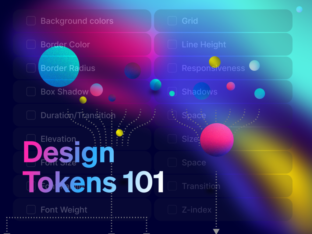
What are Design Tokens?
Imagine you own a cat. Your cat’s name is “Lola.” But you also call her “Lolita,” “Loly,” and “Cutie.”

It is the same with design tokens.
Instead of using hard-coded values (such as hex values for color or pixel values for spacing), you give values names.
Later, you can connect these decisions with others and create a theme. Using design tokens makes it very easy to scale design and use the same foundations on all platforms (Web, iOS, Android).
Everything started with Salesforce’s Design System in 2014, where Jina Anne coined the term.
The design token is the tiniest element of the design system. Design tokens are named entities that store visual design attributes in an agnostic, human-readable abstraction of visual styles that sync with all the style files in the system. This allows you to create a scalable and consistent visual system for UI development.
With design tokens, we achieve:
- Use of the same language (better communication)
- Synced files (one source of truth, consistency on all platforms)
- Easy maintenance (edit in one place, update all at once)
- Solid foundations (steady design system which brings value)
However, we need a standard if we want to adopt design tokens in multiple apps. The good news is that W3C Design Tokens Standard is coming up! When the standard is published, it will allow other tools to communicate in the same “language.” Imagine taking colors from the Figma Tokens plugin and plugging them into Adobe Illustrator or Pitch. Exciting times. 😅
If you want to learn more about the standard, you can visit the Official Design Tokens Community Group.
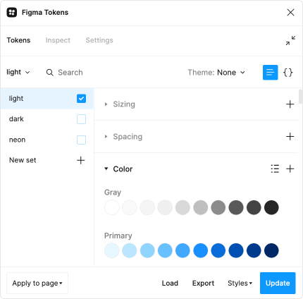
How to set up design tokens and where to use them?
The most advanced plugin at the moment for Figma is Figma Tokens Plugin. Storing design tokens in the Figma Tokens plugin gives you one central place for product foundations. With the plugin, all your design decisions become centralized and available to any product designer or developer in an easy-to-use predictable format. Tokens can be exported as JSON and transformed into other types of files too.
But first, let’s start with basics – design token types.
Design token types
Usually, we divide them in 3 categories:
- Global tokens are the primitive values.
blue-700 - Alias tokens relates to specific context.
cta-bg-color - Component-specific tokens relates to a component.
button-cta-background-color
These categories are our guidance for naming.
Naming Conventions
Naming takes time. Usually, teams spend a lot of brain power finding the perfect logic. You can find inspiration in other open design systems, but that doesn’t mean it will work for you. I recommend a workshop to find the most optimal structure for your use case. 😊
Names should be:
- short
- meaningful
- easy-to understand
- modular
- consistent
Let me go through some basic examples for naming colors, typography, and levels.
🌈 Colors
Some teams love names like mystery blue, fresh pink, and sunshine yellow, but this only works when you have a limited set of colors. It is memorable and easily understood by non-designers, but it is tough to memorize 50+ crazy names.
The solution is to use abstract names based on tonal values and then combine them with semantic, component-specific tokens (remember the cat above 😅).
Global names, no context

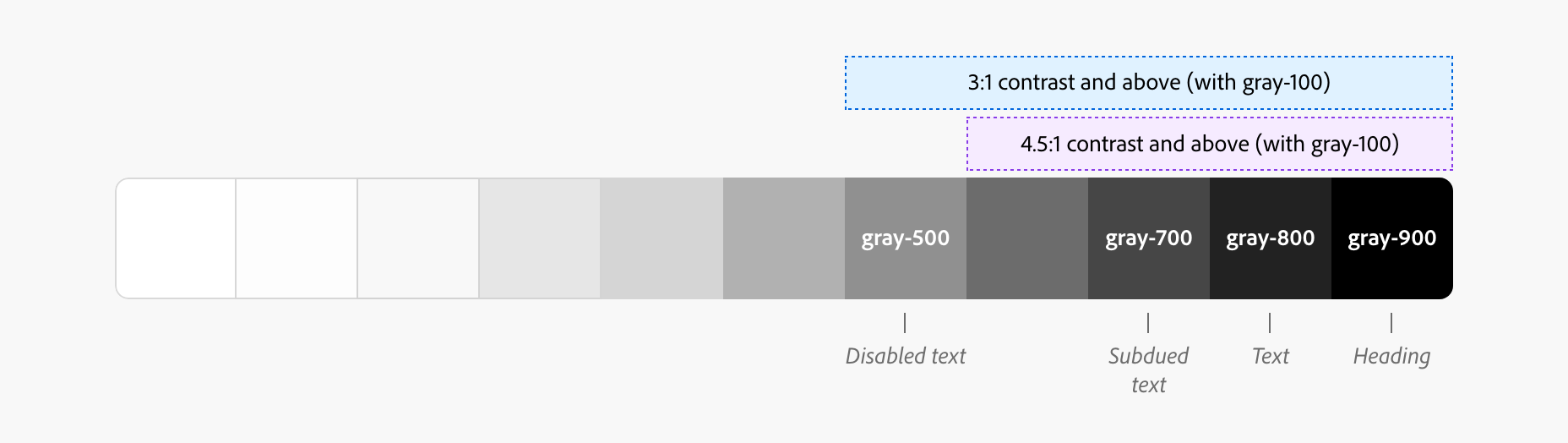
Naming colors with values from 1-100 (or 1-9). Every tone value between 0 and 100 expresses the amount of light present in color. The 100 tone is always 100% white, the lightest tone in the range; the 0 tone is 100% black, the darkest tone in the range.
Please remember that this doesn’t mean you should add all the colors in the world. Strive for a simple, minimal palette. Brand colors should be meaningful, and neutral and secondary colors are there to make connections.

Alias names, some context
primaryBackgroundColor: $blue-400
primaryTextColor: $blue-500
We are using a combination of descriptive (specific) tokens with a purpose (color name –color-blue-1)
These two examples can serve as connectors and are a reference to the colors above.
Component-specific names
$color-link: #000000
$color-link-visited: #000000
$color-link-dark-bg: #000000
$button-color-label-focus: #000000
Or with alias tokens:
primaryButtonBackgroundColor: primaryBackgroundColor;
primaryButtonBackgroundColor: primaryTextColor;
You can use alias tokens and create different themes if you have a multi-brand design system. For example:
- Brand A will use –color-orange-100 as a primary color;
- Brand B will use –color-blue-400 as a primary color;
If you want to see some other examples, I created a list of fantastic design systems here.
↕️ Sizes
The easiest way for technical or non-technical person is using T-shirt sizes. We all heard about small, medium, large. The default size is always medium.
Examples: xx-small, x-small, small, medium, large, x-large, xx-large
You can also use numeric scales, for example, 0-1000, 1-10, etc. The easiest way is to follow same pattern and steps between numbers once you decide on multiplayer.
For example: If you use number 1 for 2px, and you want to multiply it by 2, then number 2 should be 4px.
↕️ Categories
- color
- font
- spacing
- elevation
- duration
- shadows
↕️ States
In Figma, these are also your variants.
- default
- hover/mouseover
- focused
- active
- selected
- visited
- disabled
- enabled
↕️ Levels
Now that you understand the basics, we can move on to the more sophisticated names. Complex, multi-brand design systems need many levels for naming because they need to include multiple themes.
Examples:
2 level naming:
CATEGORY – CONCEPT
$color-action
3-level naming:
CATEGORY – COMPONENT – VARIANT
$background-button-primary
4-level naming:
CATEGORY – COMPONENT – VARIANT – STATE
$background-button-primary-hover
5-level naming:
SYSTEM – CATEGORY – COMPONENT – VARIANT – STATE
$cat-background-button-primary-hover
➡️ Below you can find a design system checklist Figma template with the list of design tokens.
Handoff
Handoff is a crucial step in the design process. Unfortunately, it is often skipped. Yeah, it takes time, and to be honest – it can be very dull. Why is it so?
The most common handoff process:
- The designer finishes the User Interface Design in Figma.
- The designer prepares the file with handoff notes.
- The designer has a call with the development team and shares the specifics.
- Developers start inspecting files and coding.
- Over time, the brand evolves, and colors change. The designer needs to update the design and communicate with developers, and then developers update the code.
- Sometimes, developers make changes and need to inform the designer, so the changes are seen in the design too. With more steps, there are more options for mistakes.
That’s too much communication for only one color alone.
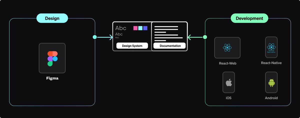
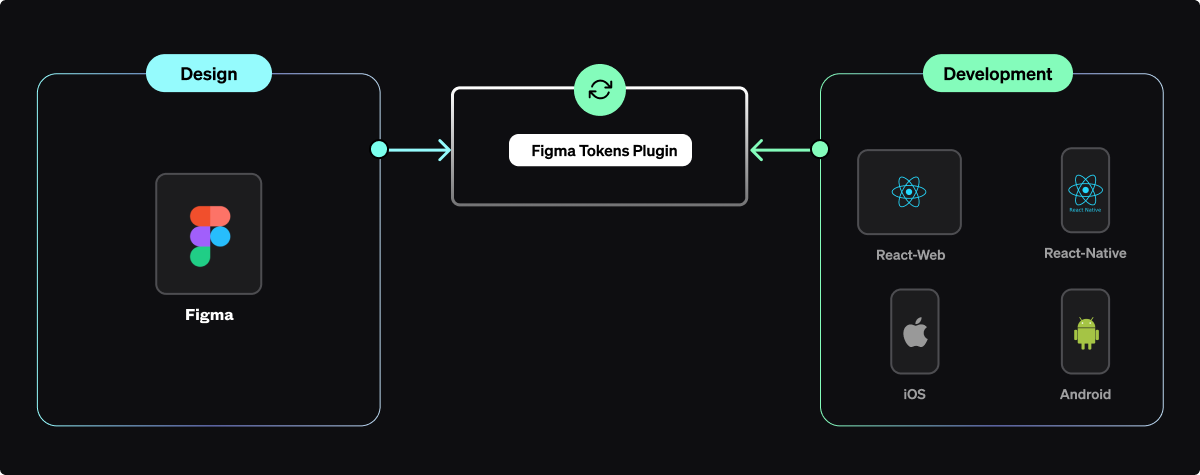
We want the process as smooth as this diagram above.
So, why would we utilize design tokens?
1 Scalability
It’s much easier to maintain your (multi-brand) design system because you only have one source of truth. Also, you will be waaaaay faster.
2 Up-to-date communication
Improved communication between teams.
3 Platform agnostic
They are a shortcut to cross-platform for consistent communication between platforms.
4 Brand consistency
Creating new products, maintaining uniformity, and managing a brand are becoming more accessible, faster, and cheaper with a transparent visual hierarchy system.
To get design tokens from Figma you can use:
- Figma Tokens plugin
- Specify app
- Supernova
- Style Dictionary
- CSS Custom Properties
I find Figma Tokens plugin the most advanced and useful, that’s why I will focus on this flow today. If you don’t know how to use the plugin, read on.
PS. Have in mind that this is not everything we need to do to create a design system. I will describe how to connect other departments in one of the following blog posts.
From Figma to code with the Figma Tokens plugin
- Download Figma Tokens plugin.
- Define styles in the plugin or import your .json
- Export .json, push to Github or GitLab.
- Token Transformation
Let’s go through each step.
1. Download Figma Tokens plugin.
2. Define styles in the plugin or import your .json
3. Export .json, or connect to Github or GitLab, Azure, URL.
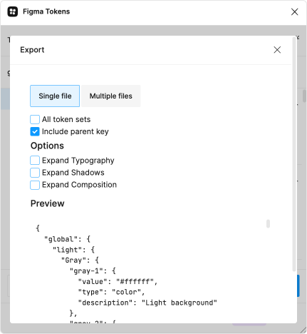

4. Token Transformation
If you want to use design tokens across all the platforms, you will need a token transformer to transform design tokens values. The most popular is Style Dictionary from Amazon.

Style Dictionary translates raw JSON data into a platform-specific format. It is available as a CLI through NPM, but can also be used like any normal node module if you want to extend its functionality. It can generate different output formats like variables for the common CSS preprocessors like Sass, Stylus, and Less. But it also generates an XML version for Android or a JSON version for iOS (which you don’t get by using only the Figma Tokens plugin).
For example, you will use Style Dictionary, when you want to translate values from RGB in .css (web) to RGBA in .json (iOS) to 8-digit Hex AARRGGBB as .xml (Android).
Design Tokens in action
Let’s compare “the usual” design process in Figma and one with the Figma Tokens plugin.
I will start with steps for creating a “Submit” button in Figma.
- Create an artboard.
- Write “Submit”
- Choose font family
- Define auto-layout rules
- Apply border-radius
- Apply primary color
- Create component
- Add variants (hover, active, disabled)
Now, whenever I want to update the style of this button, I need to go to the main component, change it, and it will update all the instances. Easy peasy.
What about changing the spacing between titles and paragraphs or all the gaps between cards? Whoops, not so easy. In Figma, you must change values hand by hand (even if you use auto-layout). With the plugin, you can edit the token, or add a new one, apply it, and that’s it. Or, if you are comfortable coding, use the .json tab and bulk edit all the tokens.
I just wanted to illustrate one of the simple examples. But the sad truth is that, at the moment, many other “shortcuts” are not possible with Figma alone. That’s when the Figma Tokens plugin comes in handy.
Figma Tokens Plugin time-saver features
Radius Tokens
Change all corners or individual corners.
Spacing Tokens
You can define values for spacings (for example, spacing.small is 8px) and then apply this rule to the auto layout. The plugin will automatically change the spacing between two layers to 8px. It’s possible to use the same logic for defining paddings.

Type Styles
You use one definition of font family and combine it with styles (again, semantically).

Shadow tokens with multiple levels
Define multiple shadows as in Figma and easily connect them with other styles.
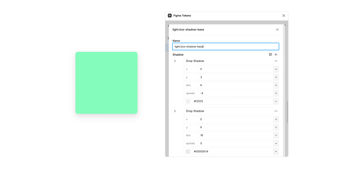
Reference Shadow/Type
Create type decisions and then connect them with multiple themes, so you don’t have to recreate anything.
Multiple sync options
- Local,
- JSONBin.io,
- GitHub,
- GitLab
- URL
Now you have one (the same) source of truth as developers. The designer is now able to can change a style and trigger a build on Github.
Annotate Tokens
Create annotation for design tokens with one click.
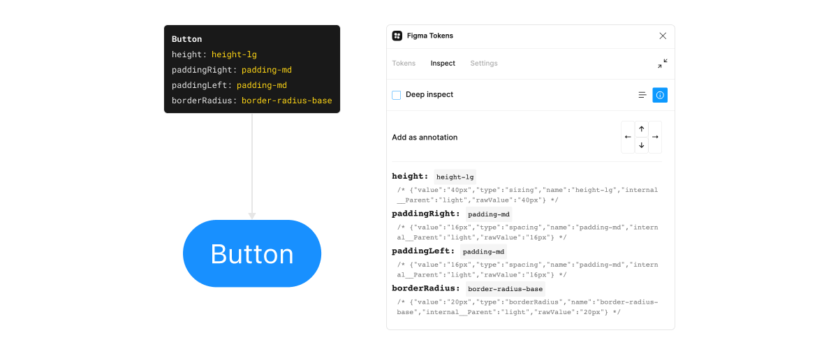
Documentation tokens
You can create an artboard with the list of your tokens. Everything will be updated whenever you update the name, raw value, value (with all aliases resolved), and description.
Using math with other tokens
Perhaps you are using scale 2x, and when you change it to 4x, you also want your styles to adapt. For example: spacing.sm = {spacing.xs} * {spacing.scale}
All in all, you are way faster with the use of the Figma Tokens plugin. Explore other features like Composition tokens, Multi-file sync, Token Sets, and Branch switching. (I will describe each of them in one of the next blog posts.)
Token Sets/Themes
You can change fonts, colors, spacings, border radisus… actually everything. With just a click, everything on your layout changes.
Recordings from the workshop with Jan Six

There is still so much to learn about using Figma Tokens plugin and if you want learn more, I recommend you to check recordings the extended workshop from Jan Six (co-creator of the Figma Tokens plugin).
Visualize the design tokens tree structure in a few seconds 💥
If you have difficulty understanding the hierarchical structure of your design tokens from .json, you can use this tool to see the connections (even if you are entirely non-technical.)
How to do it?
- Open jsoncrack.com
- Copy your .json file to the editor.
- Voilà, you can see the whole structure.
Resources and Tools
Latest news about Design Tokens
Into Design Systems Conference
Short summary
- You optimize designers’ and front-end developers’ work using design tokens.
- Don’t overcomplicate.
- Try out the Figma Tokens plugin.
- Enjoy the design token magic.
Treat your design system as a product. It’s a marathon, not a sprint 🌈
If you enjoyed this article and would like more design, strategy, and business tips, subscribe to my newsletter below and I’ll deliver them straight into your inbox.
Get Exclusive Design Strategy Tips
That I Only Share With Email Subscribers
 Hey, I’m Romina.
I am a Design Strategist who holds a Master of Business Administration. I have 15+ years of career experience in design work and consulting across tech startups and several marquee tech unicorns such as Stellar.org, Outfit7, Databox, Xamarin, Chipolo, NIVEA, Zemanta, etc. I currently advise, coach, and consult with companies on design strategy and design systems. I received numerous awards for my designs, but I’m much happier when I prove that the right design decisions increase your ROI. 🔥
My personal page * Let’s connect on Linkedin * Twitter
Increase revenue and save costs
with the Design System.
In-house Remote Design Systems Workshops and Coaching
Learn more or send me an email on hey@romina.design
Comments
Romina Kavčič
Explore more
