Big improvements to UIButton in iOS 15
Predefined styles. Trailing images! Loading style and much more.
Published: June 9, 2021 Sponsored
Create a professional Press Kit for your app with ImpressKit. The solution for all things press. Manage Press Releases & learn best practices with guides.
I think this is one quite a welcome surprise. The UIButton got a lot of improvements with iOS 15. There is a new API to allow configuration with predefined styles, unified way to update state, option to finally have image in the trailing position and even loading style.
UIButton also support Dynamic Type and multiline text by default!
Let's look at all this new goodness.
Predefined styles
Prior to iOS 15 we had to manually customize our buttons, unless we were satisfied with the default "blue label" style.
With iOS 15 we have three new styles and these are Tinted, Filled and Gray. To use them, we have the UIButton.Configuration as a configuration struct that we can pass to new initializer.
It may look like this:
var tinted = UIButton.Configuration.tinted()
tinted.title = "Tinted button"
tinted.buttonSize = .large

let tintedButton = UIButton(configuration: tinted, primaryAction: nil)
What is great about this approach is that we can predefine our own configurations and then use them thorough the app to have unified buttons without the needing of subclassing and all the issues that may bring.
As you can see above, we can specify the buttonSize. The .large option will get you height of 50pt. Other sizes are .medium which results in 34pt tall button and finally .small with the height of 28pt.
Below are all the three styles with .large sizing in a stack view:
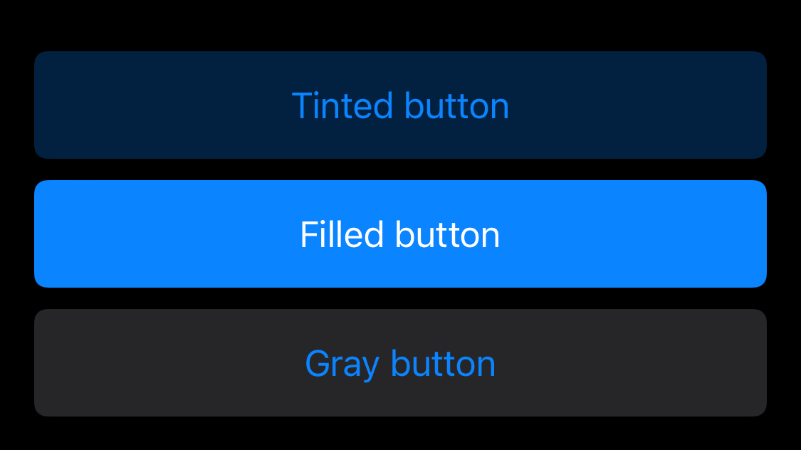
I think this is pretty good improvement already. The buttons also have nice touch feedback effect that dims the background a bit.
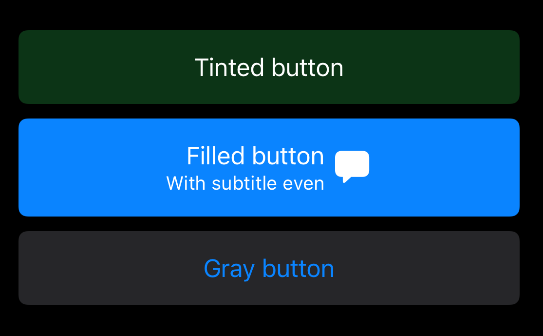
The colors are not set in stone. You can use the properties baseBackgroundColor and baseForegroundColor on the configuration to customize this:
var tinted = UIButton.Configuration.tinted()
tinted.title = "Tinted button"
tinted.buttonSize = .large
tinted.baseBackgroundColor = UIColor.systemGreen
tinted.baseForegroundColor = UIColor.white
Subtitles and images
And we are just getting started. Buttons can now have subtitle. You can set it via the configuration. This applies also to images which were already supported, but now we can position them after the text label.
var filled = UIButton.Configuration.filled()
filled.title = "Filled button"
filled.buttonSize = .large
filled.subtitle = "With subtitle even"
filled.image = UIImage(systemName: "bubble.left.fill")
filled.imagePlacement = .trailing
filled.imagePadding = 5

let button = UIButton(configuration: filled, primaryAction: nil)
And the result:
Updating buttons based on state
There is new and centralized way to update the button to reflect the current state of the app. You can also this to provide custom touch feedback.
For example the "pressed in" effect:
tintedButton.configurationUpdateHandler = { button in
    button.transform = button.isHighlighted ? CGAffineTransform(scaleX: 0.95, y: 0.95) : .identity
}
Above I used the button directly, because of the transform. In cases where the modifications can be done on the configuration, you should use something like this:
tintedButton.configurationUpdateHandler = { button in
        var config = button.configuration
        config?.title = button.isHighlighted ? "Pressed button" : "Tinted button"
        button.configuration = config
}
Also keep in mind to use unowned self when you need to access external state from this handler:
tintedButton.configurationUpdateHandler = { [unowned self] button in
        button.isEnabled = !self.inProgress
}
This will disable the button when our state indicates that something is in progress. It won't work just yet, because the UIButton has no idea that something changed.
In these cases we need to call the method setNeedsUpdateConfiguration() on the appropriate button to request update.
tintedButton.setNeedsUpdateConfiguration() // 🎉
Showing activity indicator
This is another small thing that will collectively save so much time 😃 We won't have to manually add UIActivityIndicator to buttons. Instead we can toggle single property on the configuration:
buttonConfig.showsActivityIndicator = true
Sure, we don't get absolute control, but I think this is huge win nonetheless. It also seems that the button will be smart enough to replace image (if it is in the leading position) or even an entire content if the size is too small to accommodate all the elements 🎉
I am really looking forward to using these new APIs!
See Meet the UIKit button system from WWDC21 for more details.
Uses: Xcode 13 & Swift 5.5

iOS blogger and developer with interest in Python/Django. Want to see most recent projects? 👀