I'm happy to announce the official release of DevExpress Grid for Blazor. Our most recent release (v21.2.6) includes several key Grid enhancements that I'll briefly describe in this post.
Migration Guide and Maintenance Mode
We recommend using the new Grid for Blazor instead of the previous component (Data Grid). Our team has created a detailed migration guide document that will help you: Migrate from Data Grid to Grid.
Our previous grid component is now in maintenance support mode. Therefore, we do not plan to add new features or capabilities to this component. However, our support team will address any issues you may encounter with it.
Server Mode Data Source
Our Blazor Grid now supports Server Mode data binding. Use this mode when working with large data collections in Server-based applications. Server mode allows you to quickly execute data operations against millions of records, typically within a few seconds. The following code demonstrates how to bind DevExpress Grid for Blazor to a large data source in Server mode.
<DxGrid Data="InstantFeedbackSource">
  <Columns>
    <DxGridDataColumn FieldName="ShipName" />
    <DxGridDataColumn FieldName="ShipCity" />
    @*...*@
  </Columns>
</DxGrid>

@code {
  EntityInstantFeedbackSource InstantFeedbackSource { get; set; }
  NorthwindContext Northwind { get; set; }

  protected override void OnInitialized() {
    Northwind = NorthwindContextFactory.CreateDbContext();
    InstantFeedbackSource = new EntityInstantFeedbackSource(e => {
      e.KeyExpression = "OrderId";
      e.QueryableSource = Northwind.Orders;
    });
  }

  public void Dispose() {
    InstantFeedbackSource?.Dispose();
    Northwind?.Dispose();
  }
}
Demo | Documentation
Support for Observable Data Collections
You can bind the Blazor Grid to a data collection that implements the INotifyCollectionChanged or IBindingList interface. This collection notifies the Grid about relevant changes (when items are added or removed, when the entire collection is refreshed, etc.). The Grid will update its data automatically to reflect appropriate changes.
<DxGrid Data="@WeatherForecastData">
  <Columns>
  @*...*@
  </Columns>
</DxGrid>

@code {
  ObservableCollection<WeatherForecast> WeatherForecastData { get; set; }
  // ...
}
Demo | Documentation
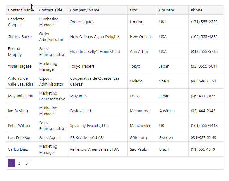
Master-Detail View
Our Blazor Grid component allows you to create hierarchical layouts of any complexity and depth. For example, you can use a nested grid to visualize a master-detail relationship between two data tables or to display preview sections under each grid data row across all columns.
The following code demonstrates how to create two grids with Masted-Detail relationship. Start by creating a Master Grid :
<DxGrid @ref="Grid" Data="MasterGridData" AutoCollapseDetailRow="true">
  <Columns>
    <DxGridDataColumn FieldName="ContactName" SortIndex="0" />
    <DxGridDataColumn FieldName="CompanyName" />
    <DxGridDataColumn FieldName="Country" />
    <DxGridDataColumn FieldName="City" />
  </Columns>
  <DetailRowTemplate>
    <Grid_MasterDetail_NestedGrid_DetailContent Customer="(Customer)context.DataItem" />
  </DetailRowTemplate>
</DxGrid>
@code {
  IGrid Grid { get; set; }
  object MasterGridData { get; set; }

  protected override async Task OnInitializedAsync() {
    MasterGridData = await NwindDataService.GetCustomersAsync();
  }
  protected override void OnAfterRender(bool firstRender) {
    if(firstRender) {
        Grid.ExpandDetailRow(0);
    }
  }
}
Note that the Master Grid includes a DetailRowTemplate which contains a custom Blazor Grid_MasterDetail_NestedGrid_DetailContent component. This component encapsulates a Phone data field and additional Detailed Grid :
<div class="mb-2">
    Contact Phone: @Customer.Phone
</div>

<DxGrid Data="DetailGridData"
        PageSize="5"
        AutoExpandAllGroupRows="true">
  <Columns>
    <DxGridDataColumn FieldName="OrderId" DisplayFormat="d" GroupIndex="0" />
    <DxGridDataColumn FieldName="ProductName" Width="40%" />
    <DxGridDataColumn FieldName="UnitPrice" DisplayFormat="c" />
    <DxGridDataColumn FieldName="Quantity" />
    <DxGridDataColumn FieldName="Discount" DisplayFormat="p0" />
    <DxGridDataColumn FieldName="ExtendedPrice" DisplayFormat="c" />
  </Columns>
  <GroupSummary>
    <DxGridSummaryItem SummaryType="GridSummaryItemType.Sum"
                       FieldName="ExtendedPrice"
                       FooterColumnName="ExtendedPrice" />
  </GroupSummary>
</DxGrid>

@code {
  [Parameter]
  public Customer Customer { get; set; }
  object DetailGridData { get; set; }
  protected override async Task OnInitializedAsync() {
    var invoices = await NwindDataService.GetInvoicesAsync();
    DetailGridData = invoices
      .Where(i => i.CustomerId == Customer.CustomerId)
      .ToArray();
  }
}

Demo | Documentation
Row Preview
The Grid now allows you to show preview sections for data rows. These sections can display any content, including tables, values from data source fields, custom text, etc. Add the required content to the DetailRowTemplate and set the DetailRowDisplayMode equal to GridDetailRowDisplayMode.Always. This setting allows the Blazor Grid to expand the detailed rows without an end-user accidentally collapsing them.
<DxGrid Data="GridData"
        DetailRowDisplayMode="GridDetailRowDisplayMode.Always">
  <Columns>
      @* ... *@
  </Columns>
  <DetailRowTemplate>
    @{
      var employee = (Employee)context.DataItem;
        <text>@employee.Notes</text>
    }
  </DetailRowTemplate>
</DxGrid>
Demo | Documentation
Column Resize
The Grid now supports different resize modes for columns. Use the ColumnResizeMode property to specify whether and how users can resize Grid columns.
<DxGrid Data="@Data"
        ColumnResizeMode="GridColumnResizeMode.NextColumn">
  <Columns>
    @_..._@
  </Columns>
</DxGrid>
Demo | Documentation
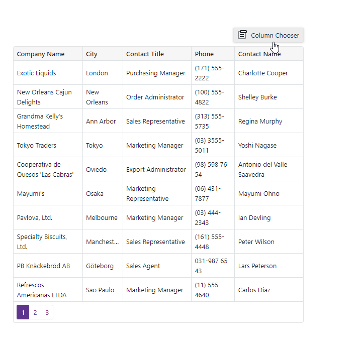
Column Visibility and Column Chooser
We implemented an API to manage column visibility in code. Use the new Visible and VisibleIndex properties to manage column visibility and order.
The Grid also allows users to display, hide, and reorder columns with its integrated Column Chooser. You can invoke the Column Chooser from any area of the Razor page that contains our Grid.
<DxButton Text="Column Chooser"
          RenderStyle="ButtonRenderStyle.Secondary"
          CssClass="column-chooser-button"
          Click="OnClick" />
<DxGrid Data="@Data" @ref="Grid">
  <Columns>
    <DxGridDataColumn FieldName="Country" />
    <DxGridDataColumn FieldName="Phone" Visible="false" />
    @*...*@
  </Columns>
</DxGrid>

@code {
  // ...
  DxGrid Grid { get; set; }
  void OnClick() {
    Grid.ShowColumnChooser(".column-chooser-button");
  }
}
Demo | Documentation
Grid in DevExpress Project Templates
DevExpress project templates for Blazor now include the Grid component. Use these templates to save time by quickly creating a fully-functional Blazor application that contains our Grid component pre-configured and ready-to-use
Free DevExpress Products - Get Your Copy Today
The following free DevExpress product offers remain available. Should you have any questions about the free offers below, please submit a ticket via the
DevExpress Support Center at your convenience. We'll be happy to follow-up.