How Thumbtack structures their design system


Staff Software Engineer Daniel O'Connor peels back the layers of the home service platform's design system, Thumbprint, to show how they built it for flexibility and efficiency.
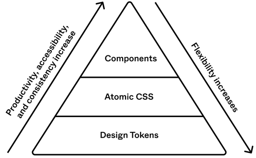
When it comes to design systems, organization is key. As a front-end engineer working on Thumbtack’s design system, Thumbprint, I spend a lot of time thinking about how to organize it in a way that works best for our team. Our current approach is one of layers, dividing our design system up into three levels: Thumbprint Tokens, Thumbprint Atomic, and Thumbprint Components. This approach has transformed the way we build and maintain our design system, and made it easier to deliver a great experience to our consumers and end users.
How the layers work
Thumbprint's layer-based architecture is the foundation of our design system, with each layer playing a specific role in its success. Our design tokens sit at the bottom, our atomic CSS library is in the middle, and our UI components are at the top. (A few of these layers even have layers of their own—but I’ll get to that later.) Each layer is unique and has sub-layers that make it more granular, flexible, and efficient.
1. Thumbprint Tokens
At the bottom of the system sits Thumbprint Tokens, our collection of design tokens serves both web and native clients and is the foundation for our entire system. As our lowest level of abstraction, tokens are the most granular and flexible layer in the system. Representing variables such as colors, typography, radii, spacing, sizing, and shadows, these tokens stand in for minute design properties that can be applied to other elements across our system.
2. Thumbprint Atomic
Each layer above it trades this granularity and flexibility for improvements in both quality and productivity. Thumbprint Atomic, our atomic CSS library, is built on top of Thumbprint Tokens and allows developers to build UIs without writing custom CSS. For instance, our “aspect ratio” class allows developers to lock elements with background images into a desired proportion, such as fluid media embedded from third-party sites like YouTube or Vimeo.
3. Thumbprint Components
Finally, at the top of the system is Thumbprint Components, which provides accessible solutions to our most common UI patterns, such as alerts, buttons, date pickers, and the beloved star rating. These pre-built components save developers time and effort, allowing them to focus on building the core product features. If they need a component that doesn't exist, Thumbprint Atomic allows them to build their own. And if that's not sufficient (or if they're working on a native platform), they can use Thumbprint Tokens.

Layers on layers
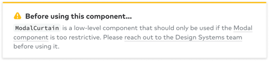
The layers within a design system can have layers of their own, making them more versatile. This approach works particularly well for components and design tokens. Thumbprint's React component library, for example, features a layered modal component. The bottom layer, a component called ModalCurtain, is entirely focused on usability and lacks any visual styling. Conversely, the layer above, Modal, is dedicated to visual style and is built with ModalCurtain, which inherits all of the underlying functionality of a top-tier modal.
React developers using Thumbprint will almost always use the Modal component directly. Occasionally, there may be a use case where the Modal component is too prescriptive. When this happens, we encourage developers to use ModalCurtain. We can later add the requested feature or functionality to the Modal component if needed.
Design tokens can also be layered. For example, Adobe's Spectrum design system includes up to three layers of abstraction in their design tokens. The button-cta-background-color token, for instance, inherits from cta-background-color, which itself inherits from blue-400. Developers working with these tokens would typically use the highest layer that applies to their use case. With this approach, design systems can offer maximum flexibility and adaptability, ensuring they can accommodate a range of different product needs.
Peeling back the layers
Before building Thumbprint, I’m sure that this layered architecture would’ve sounded overly complicated and time consuming. Instead, I’ve found the opposite to be true: It has simplified our system and saved time for everyone involved, including our end users.
Before building Thumbprint, I’m sure that this layered architecture would’ve sounded overly complicated and time consuming. Instead, I’ve found the opposite to be true.
Unblocking our team with flexible workarounds
If a developer needs a feature that we either can't or aren't ready to support, we encourage them to use a lower level of abstraction. For instance, if the Modal component doesn't fit their needs, they can use ModalCurtain instead. If the Button won’t work for them, they can build a button with Thumbprint Atomic and Thumbprint Tokens. These workarounds allow us to help, even if we don't have the exact solution someone's looking for; we can step into the role of enabling teams, not blocking them. This also allows us to create slack in our system, discouraging us from introducing bespoke API changes for one-off requests. Instead, we can keep an eye on these workarounds and build the functionality into our components if they become popular.
Increasing adoption and streamlining maintenance
Each layer in our system increases our reach and adoption across the organization. A team within Thumbtack might not have the bandwidth or resources to adopt the entire system all at once, so may start by only implementing our tokens layer. This is better than the alternative—adopting nothing at all—while also putting them on the path to adopting the entire system. In turn, greater adoption makes it easier for us to roll out changes to Thumbtack’s brand, allowing us to ship small tweaks across multiple platforms.
This approach also helps us build and maintain complex components. By separating functionality from visual style, our team can focus on one aspect of a component at a time without getting distracted by the others. Changing the hover state of a button, for example, can be as easy as editing a token in one codebase. If a team has even just our tokens layer adopted, they’ll also receive those updates—staying in lockstep with the greater system.
More layers, more problems—and some solutions!
Monorepo refers to a software development approach where multiple projects or components are stored within a single repository.
While layered design systems offer significant benefits, as with any solution, there are also some challenges. Additional infrastructure (specific to each layer) is required for documentation and publishing. At Thumbprint, we tackled this challenge by adopting a monorepo and using tools like Yarn Workspaces and Lerna. However, documenting a multi-layered design system can become more complex when the layers exist in different codebases. To work around this for our Thumbprint Tokens codebase, for example, we created a GraphQL API for Thumbprint Tokens which allows our documentation codebase to access data from our design tokens codebase. As a result, we have been able to reap the benefits of a layered design system while managing the associated risks.
In the context of software or information modeling, a happy path (sometimes called happy flow) is a default scenario featuring no exceptional or error conditions. For example, the happy path for a function validating credit card numbers would be where none of the validation rules raise an error, thus letting execution continue successfully to the end, generating a positive response.
As part of that documentation, maintainers can add notices to specific components in the documentation, prompting developers to contact them before using them. They can also document the “happy path” prominently and the “escape hatch” subtly, as we did with our Modal component that includes built-in padding. To encourage collaboration and conversation between developers, designers, and system maintainers, our documentation for ModalCurtain, for example, has a note asking developers to reach out before using the component if the “happy path” doesn't work.

Part of any good design system is also a healthy feedback loop. This loop should encourage developers to reach out to system maintainers when they receive designs that feature components that differ from those already in the system. If the maintainers make it too easy for developers to deviate, the feedback loop weakens, and they may miss out on valuable input. However, the benefit of layered design systems is that they keep the system from becoming a “blocker” via helpful workarounds. Feedback and culture often go hand in hand: The goal should be to create a culture where engineers and designers feel comfortable reaching out when the system doesn't work for them. Office hours, one-on-ones with consumers, encouraging contribution, and regular system updates are all tools for fostering that type of culture.
Falling into the “pit of success”
The pit of success
“In stark contrast to a summit, a peak, or a journey across a desert to find victory through many trials and surprises, we want our customers to simply fall into winning practices by using our platform and frameworks. To the extent that we make it easy to get into trouble we fail.” —Rico Mariani
In computer science, separation of concerns is a design principle for separating a computer program into distinct sections. Each section addresses a separate concern, a set of information that affects the code of a computer program.
Systems work best when their consumers fall into the “pit of success,” a term coined by software engineer Rico Mariani. Jeff Atwood, founder of StackOverflow, expanded upon this, stating that systems should make it “easy to do the right things and annoying (but not impossible) to do the wrong things.” Building a design system in layers helps designers and engineers do just that. The layers provide flexibility, increasing adoption and reducing the pressure on our team. This, in turn, creates space for us to roll out brand changes and make more thoughtful architecture decisions. Additionally, the layers create a separation of concerns, simplifying the way we to build and maintain the system.
At Thumbtack, this three-layered system works well. Individually, each layer of this system improves product quality and developer productivity. Together, they allow our small team to maximize its impact and deliver the best experience to our consumers and, most importantly, Thumbtack’s end users. If you're interested in learning more about our approach, we invite you to check it out and let us know what you think.
Daniel O'Connor is a Staff Software Engineer working on frontend infrastructure and design systems at Thumbtack. He is on an infinite mission to build systems that improve product quality and developer productivity. Outside of work, he enjoys running, cooking, and entertaining his cats.
Related articles