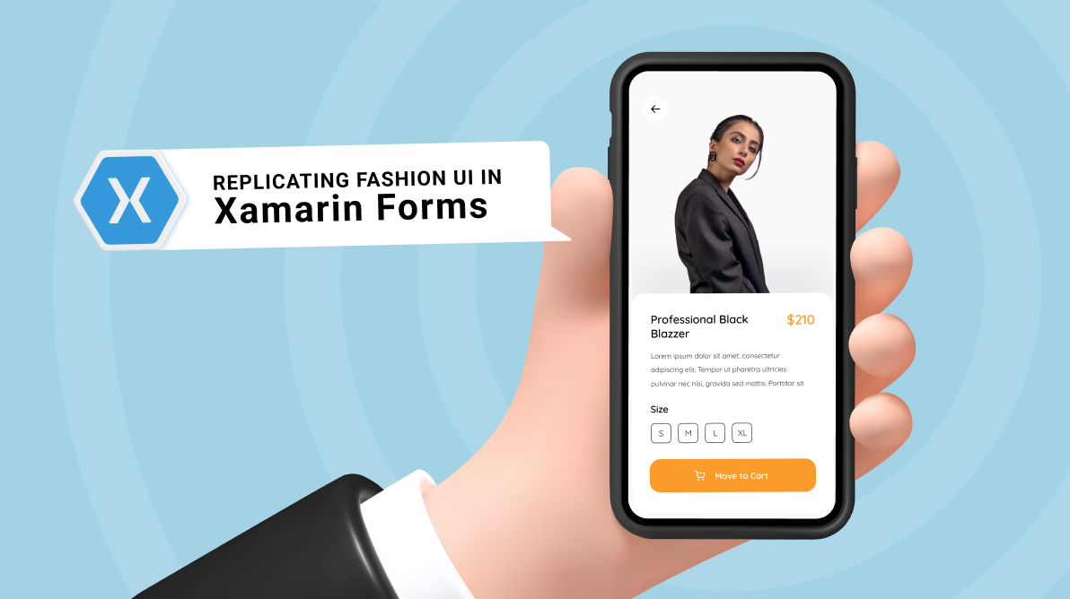
Howdy! In this blog post, we are going to replicate a fashion app UI based on this Dribbble design.
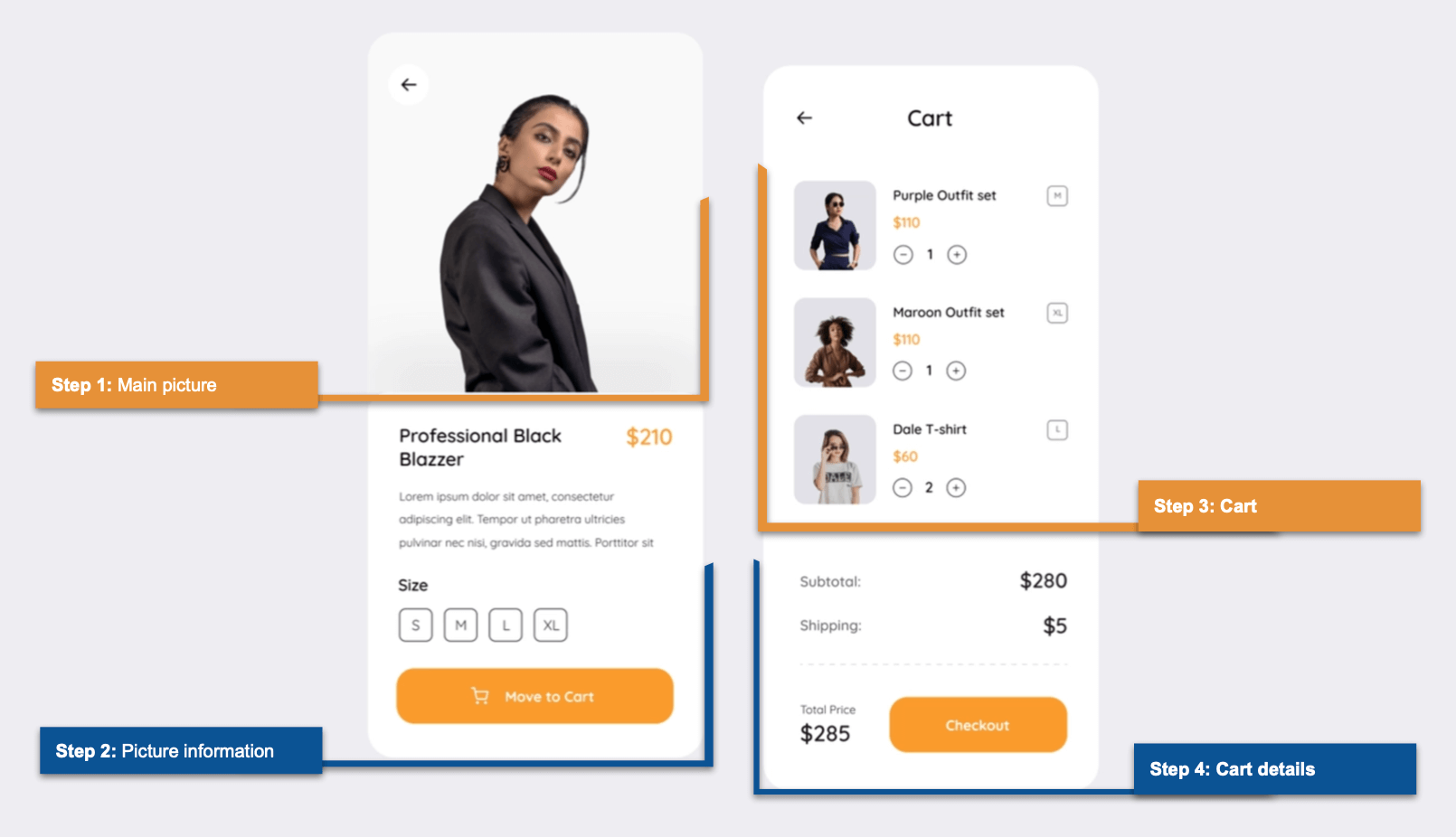
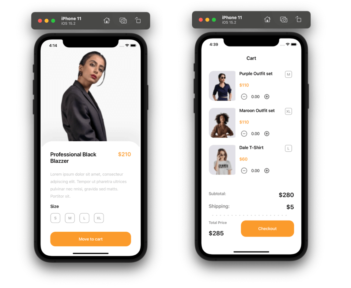
Our UI contains two screens: fashion details and cart. We are going to develop the UI based on the steps specified in this image:
Before starting, I’d like to establish the specific points that we will be learning:
- You will continue to enhance your XAML skills.
- You are going to implement Syncfusion Xamarin.Forms controls such as Button and NumericUpDown.
Let’s code!
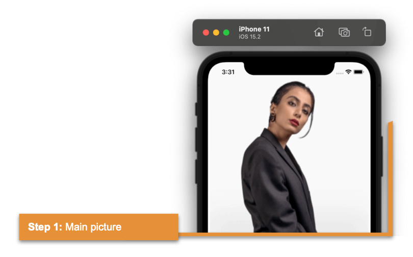
Step 1: Main picture
First, let’s work on the main layout structure of the fashion details page. Here, we are going to use the DataGrid component.
For a better understanding of how to use the DataGrid, refer to the blog 5 Tips to Easily Use the Grid for Layouts in Xamarin.Forms.
Refer to the following code example:
<!-- Main layout-->
<Grid RowDefinitions="*,*" >
    <!-- You must write here what is explained in steps 1.1 and 2 -->
</Grid>
Now, as a next step 1.1, add the main image that makes up our UI. Refer to the following code example.
<!-- Main picture-->
<Image Grid.Row="0" VerticalOptions="Start" Source="Model01"/>
<!-- You must write here what is explained in step 2 -->
Step 2: Picture information
Let’s design the frame information block. We will use a set of controls to present the required information.
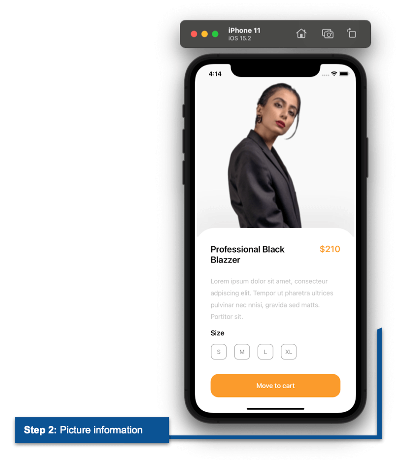
Frame
To present the container for detailed information, we will use a Frame and slightly overlap the Frame on the image using the Margin property.
Refer to the following code example.
<!-- Picture information-->
<Frame Grid.Row="1" Background="White" Margin="0,-30,0,0" HasShadow="False" CornerRadius="50" VerticalOptions="FillAndExpand">
    <Grid RowDefinitions="Auto,Auto,Auto,Auto,Auto" ColumnDefinitions="*,Auto" Padding="20">
    <!-- You must write here what is explained in the next section -->
    </Grid>
</Frame>
Labels
Then, we design the Labels to show information such as title, price, description, and size.
Refer to the following code example.
<!-- Title -->
<Label Grid.Row="0" Grid.Column="0" Text="Professional Black
Blazer" FontAttributes="Bold" FontSize="23"/>
<!-- Price-->
<Label Grid.Row="0" Grid.Column="1" Text="$210" FontAttributes="Bold" FontSize="23" TextColor="#fb9c2c"/>
<!-- Description-->
<Label Grid.Row="1" Grid.Column="0" Grid.ColumnSpan="2" LineHeight="1.5" TextColor="Silver" Margin="0,15" Text="Lorem ipsum dolor sit amet, consecteur
adpiscing elit. Tempor ut pharetra ultrices
pulvinar nec nnisi, gravida sed matts. Portitor sit."/>
<!-- Size Title-->
<Label Grid.Row="2" Grid.Column="0" Text="Size" FontAttributes="Bold" FontSize="18"/>
<!-- You must write here what is explained in the next section -->
CollectionView
To continue with the sizes, we have a set of information that should be displayed as a list. For this, use the CollectionView to create a single design. We can replicate this design to represent as many records as we have in the source.
We have four sizes—S, M, L, and XL—so the button will be painted four times automatically.
Refer to the following code example.
<!-- Size options-->
<CollectionView Grid.Row="3" Grid.Column="0" Grid.ColumnSpan="2" Margin="0,10,0,20" HorizontalScrollBarVisibility="Never"
ItemsSource="{Binding sizes}"
ItemsLayout="HorizontalList"
HeightRequest="60">
    <CollectionView.ItemTemplate>
        <DataTemplate>
            <StackLayout Padding="0,0,20,0">
                <buttons:SfButton Text="{Binding SizeDescripcion}" WidthRequest="40" HeightRequest='40' HorizontalOptions="StartAndExpand" BackgroundColor="Transparent" BorderColor="#898989" TextColor="#898989" CornerRadius="10" BorderWidth="1"/>
            </StackLayout>
        </DataTemplate>
    </CollectionView.ItemTemplate>
</CollectionView>
<!-- You must write here what is explained in the next section -->
Button
Then, add the Move to Cart button using the Syncfusion Xamarin.Forms Button.
For more details, refer to the Getting Started with Xamarin.Forms Button (SfButton) documentation.
Refer to the following code example.
<!-- Move to cart button-->
<buttons:SfButton Grid.Row="4" Grid.Column="0" Grid.ColumnSpan="2" BackgroundColor="#fb9c2c" TextColor="White" FontAttributes="Bold" CornerRadius="20" HeightRequest="60" FontSize="17" Text="Move to cart" />
We have finished the construction of our first screen! Let’s focus on the second screen!
Step 3: Cart
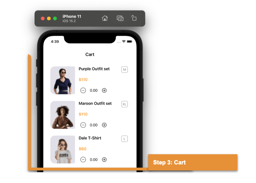
Let’s design the Cart page. Like the first screen, we are going to use the Grid component to design the main layout of the Cart page. This is followed by adding the main Label.
Refer to the following code example.
<!-- Main Layout-->
<Grid RowDefinitions="Auto,Auto,Auto,Auto,Auto,Auto,Auto" ColumnDefinitions="*,Auto" RowSpacing="20" Margin="30,70,30,10">
    <!-- Cart main label-->
    <Label Grid.Row="0" Grid.Column="0" Grid.ColumnSpan="2" Text="Cart" FontSize="20" HorizontalTextAlignment="Center" FontAttributes="Bold"/>
    <!-- You must write here what is explained in the next section -->
</Grid>
CollectionView
Let’s display the list of items added to the cart using the CollectionView.
Inside this, add the set of labels and images required to present the cart details.
<!-- Cart information-->
<CollectionView Grid.Row="1" Grid.Column="0" Grid.ColumnSpan="2" HorizontalScrollBarVisibility="Never" Margin="0,20,0,0"
ItemsSource="{Binding CartDetails}"
HeightRequest="480">
    <CollectionView.ItemTemplate>
        <DataTemplate>
            <Grid RowDefinitions="Auto,Auto,Auto" ColumnDefinitions="Auto,*,Auto" RowSpacing="20" Padding="0,0,10,0" Margin="0,0,0,30">
                <!-- Rounded image-->
                <Frame Grid.Row="0" Grid.Column="0" Grid.RowSpan="3" Padding="0,0,10,0" WidthRequest="110" HeightRequest="110" VerticalOptions="FillAndExpand" HorizontalOptions="Start" HasShadow="False" IsClippedToBounds="True" CornerRadius="20" >
                    <Image Source="{Binding Picture}" Aspect="AspectFill" />
                </Frame>
                <!-- Article name-->
                <Label Grid.Row="0" Grid.Column="1" Text="{Binding Name}" FontSize="18" FontAttributes="Bold"/>
                <!-- Article size-->
                <Button Grid.Row="0" Grid.Column="2" Text="{Binding Size}" HorizontalOptions="End" BorderColor="#828282" TextColor="#828282" FontSize="15" CornerRadius="6" HeightRequest="28" WidthRequest="28" BorderWidth="1" />
                <!-- Article price-->
                <Label Grid.Row="1" Grid.Column="1" Text="{Binding Price}" FontAttributes="Bold" FontSize="18" TextColor="#fb9c2c"/>
                <!-- You must write here what is explained in the next section -->
            </Grid>
        </DataTemplate>
    </CollectionView.ItemTemplate>
</CollectionView>
NumericUpDown
Now, add the Syncfusion Xamarin.Forms NumericUpDown control to replicate the counter for each item in the cart and display the pricing details.
For more details, refer to the Getting Started with Xamarin.Forms NumericUpDown documentation.
Refer to the following code example.
<!-- Article counter - Syncfusion's NumericUpDown control-->
<updown:SfNumericUpDown x:Name="upDown" Grid.Row="2" Grid.Column="1" BorderColor="Transparent" Margin="0,0,50,0" SpinButtonAlignment="Both" TextAlignment="Center">
    <updown:SfNumericUpDown.IncrementButtonSettings>
        <updown:UpDownButtonSettings ButtonImage="More" ButtonHeight="40" ButtonWidth="40" />
    </updown:SfNumericUpDown.IncrementButtonSettings>
    <updown:SfNumericUpDown.DecrementButtonSettings>
        <updown:UpDownButtonSettings ButtonImage="Less" ButtonHeight="40" ButtonWidth="40" />
    </updown:SfNumericUpDown.DecrementButtonSettings>
</updown:SfNumericUpDown>
Step 4: Cart details
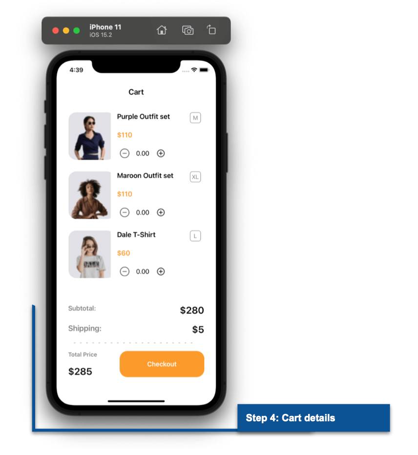
Finally, include the labels and the Checkout button to display the final details of the total amount counted.
Refer to the following code example.
<!-- Article pricing-->
<Label Grid.Row="2" Grid.Column="0" Text="Subtotal:" TextColor="#828282" FontAttributes="Bold"/>
<Label Grid.Row="2" Grid.Column="1" Text="$280" FontSize="25" HorizontalTextAlignment="End" FontAttributes="Bold"/>

<Label Grid.Row="3" Grid.Column="0" Text="Shipping:" FontSize="20" TextColor="#828282" FontAttributes="Bold"/>
<Label Grid.Row="3" Grid.Column="1" Text="$5" FontSize="25" HorizontalTextAlignment="End" FontAttributes="Bold"/>
<!-- Divisor line-->
<Line Grid.Row="4" Grid.Column="0" Grid.ColumnSpan="2" HorizontalOptions="Center" StrokeDashArray="1,7" X2="320" StrokeLineCap="Square" Stroke="Silver" StrokeThickness="2"/>

<Label Grid.Row="5" Grid.Column="0" Text="Total Price" TextColor="#828282" FontSize="15" FontAttributes="Bold"/>
<Label Grid.Row="6" Grid.Column="0" Text="$285" FontSize="25" FontAttributes="Bold"/>

<buttons:SfButton  Grid.Row="5" Grid.RowSpan="2" Grid.Column="1" BackgroundColor="#fb9c2c" TextColor="White" FontAttributes="Bold" CornerRadius="20" HeightRequest="60" FontSize="17" Text="Checkout" WidthRequest="220"/>
And our UI is done! Now you can see the full screens we have built.
GitHub reference
You can check out our full example of replicating a fashion app UI in Xamarin.Forms on GitHub.
Conclusion
Thanks for reading! In this blog, we have seen how to replicate a fashion app UI using Syncfusion Xamarin.Forms UI controls. Try it out and leave your feedback in the comments section below.
Syncfusion’s Xamarin suite offers over 150 UI controls, from basic editors to powerful, advanced controls like Charts, ListView, and Rich Text Editor. Use them to build elite applications!
You can contact us through our support forum, support portal, or feedback portal. We are always happy to assist you!