"Pure" Xamarin.Forms tabs: bottom bar tabs, underlined tabs, custom tabs, egg and tabs, tabs bacon sausage and tabs

TABS! TABS! TABS! TABS! [1]
We love tabs.
Since we learnt that hamburger menu was the master of UIvil, every one is embracing tabs for their app navigation. Android added bottom bar navigation in their supports libs years ago, and iOS apps stole the android tab layout.
Admit it: you can't get enough tabs.
Here at sharpnado, we thrive at delivering top quality material for the community (I don't even know if this a proper english sentence, but it feels very professional).
So I present you Sharpnado Pure Xamarin Forms Tabs (aka SPXFT).
It's available in the v2.0 of the Sharpnado.Tabs nuget packages.
Source code can be found here:
https://github.com/roubachof/Sharpnado.Tabs
Why pure Xamarin Forms UI
The term "Pure Xamarin Forms" doesn't really mean much. What I mean by that is that there is no renderers, the tabs I will present you are only implemented with Xamarin.Forms views, so it makes them really easy to extend, animate, place anywhere, rotate, change color, change font, well you get the idea.
I saw that Xamarin was pushing Visual and Material theming to ease our pain, which is great! I love consistent UI and plaftorm specific UI.
Unfortunately (or not) most of the designers I worked with don't care about platform rules, they have a specific design in mind and they want the same design on both platforms. And as a developer, you end up implementing some crazy custom controls with gradients.
The tabs architecture I will now present you was conceived in this context: it let you really change anything about them, and even implement your own custom tabs easily.
We will cover two kinds of UI scenarios:
1. Top tabs UI
| iOS | Android |
|---|---|
 |
 |
2. Bottom tabs UI
| iOS | Android |
|---|---|
 |
 |
Well I am a very big fan of composition (don't forget folks, composition vs inheritance), so I tried to isolate each responsability as much as I can.
You can find all the architecture code at: https://github.com/roubachof/Sharpnado.Tabs.
TabItem
The TabItem is a base abstract class for all tabs.
It has several bindable properties:
    public bool IsSelected
    {
        get => (bool)GetValue(IsSelectedProperty);
        set => SetValue(IsSelectedProperty, value);
    }

    public string Label
    {
        get => (string)GetValue(LabelProperty);
        set => SetValue(LabelProperty, value);
    }

    public double LabelSize
    {
        get => (double)GetValue(LabelSizeProperty);
        set => SetValue(LabelSizeProperty, value);
    }

    public Color UnselectedLabelColor
    {
        get => (Color)GetValue(UnselectedLabelColorProperty);
        set => SetValue(UnselectedLabelColorProperty, value);
    }

    public Color SelectedTabColor
    {
        get => (Color)GetValue(SelectedTabColorProperty);
        set => SetValue(SelectedTabColorProperty, value);
    }

    public string FontFamily
    {
        get => (string)GetValue(FontFamilyProperty);
        set => SetValue(FontFamilyProperty, value);
    }
Two concrete classes implement this abstract class:
1. UnderlinedTabItem
This is a classic "Android" tab, with text.
When the tab is selected, the text is underlined.
2. BottomTabItem
This is a classic "iOS" bottom tab.
It has an icon and is not underlined.
It adds several more bindable properties:
    public string IconImageSource
    {
        get => (string)GetValue(IconImageSourceProperty);
        set => SetValue(IconImageSourceProperty, value);
    }

    public double IconSize
    {
        get => (double)GetValue(IconSizeProperty);
        set => SetValue(IconSizeProperty, value);
    }

    public Color UnselectedIconColor
    {
        get => (Color)GetValue(UnselectedIconColorProperty);
        set => SetValue(UnselectedIconColorProperty, value);
    }
TabHostView
The TabHostView has the responsability of bringing tabs together in a horizontal layout, managing the states of the tabs (basically which one is selected).
    public int SelectedIndex
    {
        get => (int)GetValue(SelectedIndexProperty);
        set => SetValue(SelectedIndexProperty, value);
    }

    public ShadowType ShadowType
    {
        get => (ShadowType)GetValue(ShadowTypeProperty);
        set => SetValue(ShadowTypeProperty, value);
    }
ViewSwitcher
The ViewSwitcher selects the view linked to the matching tab.
You can see it as a stack of views, hiding the ones not selected.
Remark: you can totally use a ViewSwitcher without a TabHostView.
    public int SelectedIndex
    {
        get => (int)GetValue(SelectedIndexProperty);
        set => SetValue(SelectedIndexProperty, value);
    }

    public bool Animate { get; set; } = true;
Putting it all together
We'll see now two different examples of layout with the Silly! App (https://github.com/roubachof/Xamarin-Forms-Practices).
UnderlinedTabItem with ViewSwitcher
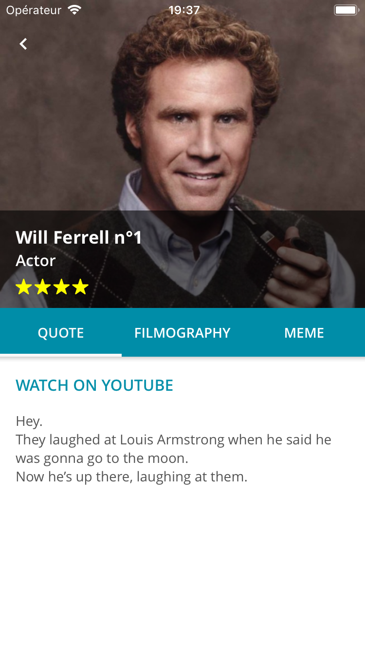
Let's consider this view:
And let's have a look at its code:
<Grid Padding="{StaticResource StandardThickness}"
      ColumnSpacing="0"
      RowSpacing="0">
    <Grid.RowDefinitions>
        <RowDefinition Height="200" />
        <RowDefinition Height="40" />
        <RowDefinition Height="30" />
        <RowDefinition Height="30" />
        <RowDefinition Height="50" />
        <RowDefinition Height="Auto" />
    </Grid.RowDefinitions>

    <!-- first 4 rows then... -->

    <tabs:TabHostView x:Name="TabHost"
                      Grid.Row="4"
                      Margin="-16,0"
                      BackgroundColor="White"
                      SelectedIndex="{Binding Source={x:Reference Switcher},
                                              Path=SelectedIndex,
                                              Mode=TwoWay}"
                      ShadowType="Bottom">
        <tabs:UnderlinedTabItem Style="{StaticResource TabStyle}"
                                Label="{loc:Translate Tabs_Quote}" />
        <tabs:UnderlinedTabItem Style="{StaticResource TabStyle}"
                                Label="{loc:Translate Tabs_Filmography}" />
        <tabs:UnderlinedTabItem Style="{StaticResource TabStyle}"
                                Label="{loc:Translate Tabs_Meme}" />
    </tabs:TabHostView>

    <ScrollView Grid.Row="5">
        <tabs:ViewSwitcher x:Name="Switcher"
                           Animate="True"
                           SelectedIndex="{Binding SelectedViewModelIndex,
                                                   Mode=TwoWay}">
            <details:Quote Animate="True" BindingContext="{Binding Quote}" />
            <details:Filmo Animate="True" BindingContext="{Binding Filmo}" />
            <details:Meme Animate="True" BindingContext="{Binding Meme}" />
        </tabs:ViewSwitcher>
    </ScrollView>
</Grid>
The TabHostView and the ViewSwitcher are really two independent components, and you can place them anywhere. They don't need to be next to each other (even if it would be weird I must admit).
Since they don't know each other, you just need to link them through their SelectedIndex property. You will bind the ViewSwitcher to your view model, and the TabHostView to the ViewSwitcher's SelectedIndex property.
You can see a ShadowType property. It adds a nice little shadow "à la Material" to bring you the nice and fancy elevation effect.
For top tabs, we want the shadow at the Bottom of our tabs.
You can also see a mysterious Animate property. It just adds a nice appearing effect. It's really just a little bonus.

View model
    public ViewModelLoader<SillyDudeVmo> SillyDudeLoader { get; }

    public QuoteVmo Quote { get; private set; }

    public FilmoVmo Filmo { get; private set; }

    public MemeVmo Meme { get; private set; }

    public int SelectedViewModelIndex
    {
        get => _selectedViewModelIndex;
        set => SetAndRaise(ref _selectedViewModelIndex, value);
    }

    public override void Load(object parameter)
    {
        SillyDudeLoader.Load(() => LoadSillyDude((int)parameter));
    }

    private async Task<SillyDudeVmo> LoadSillyDude(int id)
    {
        var dude = await _dudeService.GetSilly(id);

        Quote = new QuoteVmo(
            dude.SourceUrl,
            dude.Description,
            new TapCommand(url => Device.OpenUri(new Uri((string)url))));
        Filmo = new FilmoVmo(dude.FilmoMarkdown);
        Meme = new MemeVmo(dude.MemeUrl);
        RaisePropertyChanged(nameof(Quote));
        RaisePropertyChanged(nameof(Filmo));
        RaisePropertyChanged(nameof(Meme));

        return new SillyDudeVmo(dude, null);
    }
Well I won't go into details it's pretty obvious.
If you want to know more about the mystery ViewModelLoader, please read this post (https://www.sharpnado.com/taskloaderview-async-init-made-easy/).
Styling
The tab style is defined in the content page resources, but we could put it the App.xaml since most of the time we will have one type of top tabs (well it's up to your crazy designer really :)
<ContentPage.Resources>
    <ResourceDictionary>
        <Style x:Key="TabStyle" TargetType="tabs:UnderlinedTabItem">
            <Setter Property="SelectedTabColor" Value="{StaticResource White}" />
            <Setter Property="FontFamily" Value="{StaticResource FontSemiBold}" />
            <Setter Property="LabelSize" Value="14" />
            <Setter Property="BackgroundColor" Value="{StaticResource Accent}" />
            <Setter Property="UnselectedLabelColor" Value="White" />
        </Style>
    </ResourceDictionary>
</ContentPage.Resources>
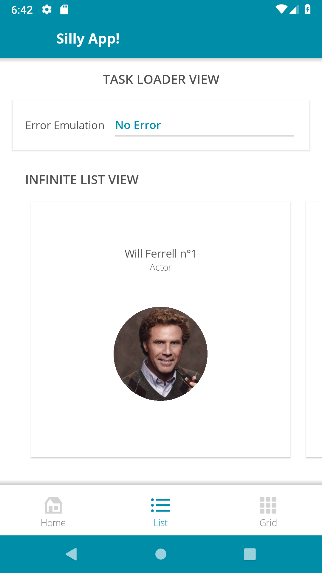
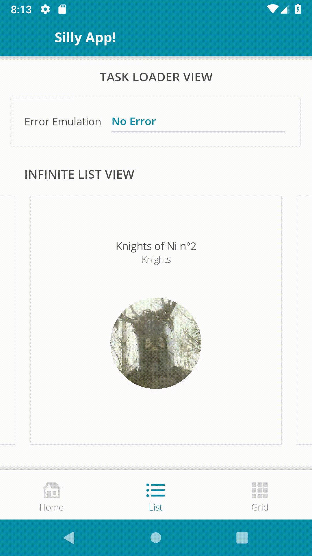
BottomTabItem with ViewSwitcher
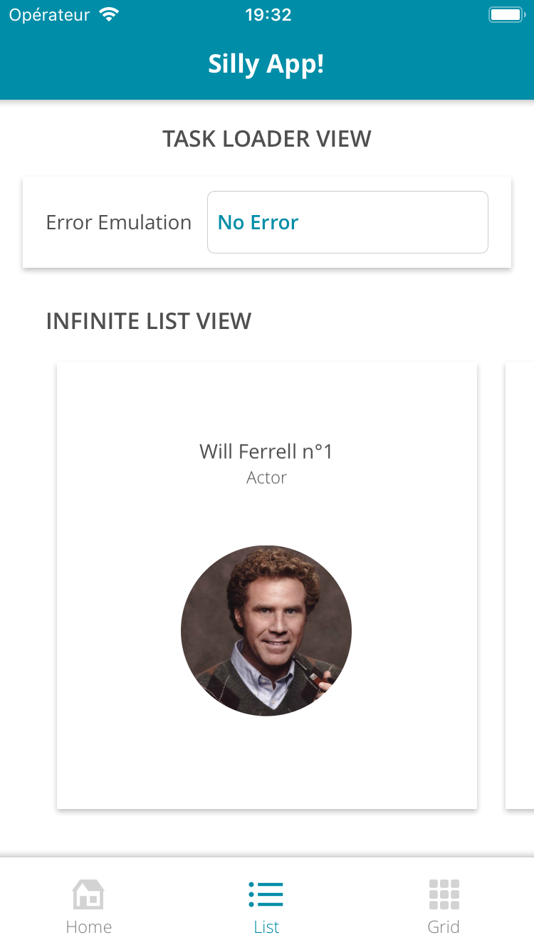
Now let's consider this view:
And let's have a look at its xaml:
<Grid ColumnSpacing="0" RowSpacing="0">
    <Grid.RowDefinitions>
        <RowDefinition Height="{StaticResource ToolbarHeight}" />
        <RowDefinition Height="*" />
        <RowDefinition x:Name="BottomBarRowDefinition"
                       Height="{StaticResource BottomBarHeight}" />
    </Grid.RowDefinitions>

    <tb:Toolbar Title="Silly App!"
                BackgroundColor="{StaticResource Accent}"
                ForegroundColor="White"
                HasShadow="True" />

    <tabs:ViewSwitcher x:Name="Switcher"
                       Grid.Row="1"
                       Animate="False"
                       SelectedIndex="{Binding SelectedViewModelIndex,
                                               Mode=TwoWay}">
        <tabsLayout:HomeView BindingContext="{Binding HomePageViewModel}" />
        <tabsLayout:ListView BindingContext="{Binding ListPageViewModel}" />
        <tabsLayout:GridView BindingContext="{Binding GridPageViewModel}" />
    </tabs:ViewSwitcher>

    <tabs:TabHostView x:Name="TabHost"
                      Grid.Row="2"
                      BackgroundColor="White"
                      SelectedIndex="{Binding Source={x:Reference Switcher},
                                              Path=SelectedIndex,
                                              Mode=TwoWay}"
                      ShadowType="Top">
        <tabs:BottomTabItem Style="{StaticResource BottomTabStyle}"
                            IconImageSource="house_96"
                            Label="{localization:Translate Tabs_Home}" />
        <tabs:BottomTabItem Style="{StaticResource BottomTabStyle}"
                            IconImageSource="list_96"
                            Label="{localization:Translate Tabs_List}" />
        <tabs:BottomTabItem Style="{StaticResource BottomTabStyle}"
                            IconImageSource="grid_view_96"
                            Label="{localization:Translate Tabs_Grid}" />
    </tabs:TabHostView>

</Grid>
It's exactly the same thing as our top tabs sample, but we used BottomBarItem instead of UnderlinedTab. And our ViewSwitcher is standing above our TabHostView.
Simple.
Styling
<ContentPage.Resources>
    <ResourceDictionary>
        <Style x:Key="BottomTabStyle" TargetType="tabs:BottomTabItem">
            <Setter Property="SelectedTabColor" Value="{StaticResource Accent}" />
            <Setter Property="UnselectedLabelColor" Value="Gray" />
            <Setter Property="UnselectedIconColor" Value="LightGray" />
            <Setter Property="FontFamily" Value="{StaticResource FontLight}" />
            <Setter Property="LabelSize" Value="14" />
            <Setter Property="IconSize" Value="28" />
        </Style>
    </ResourceDictionary>
</ContentPage.Resources>
Custom SPAM tabs !
As I said, your designer can go cuckoo and you won't even sweat it.
Just extend the abstract TabItem and fulfill the wildest dreams of your colleagues.
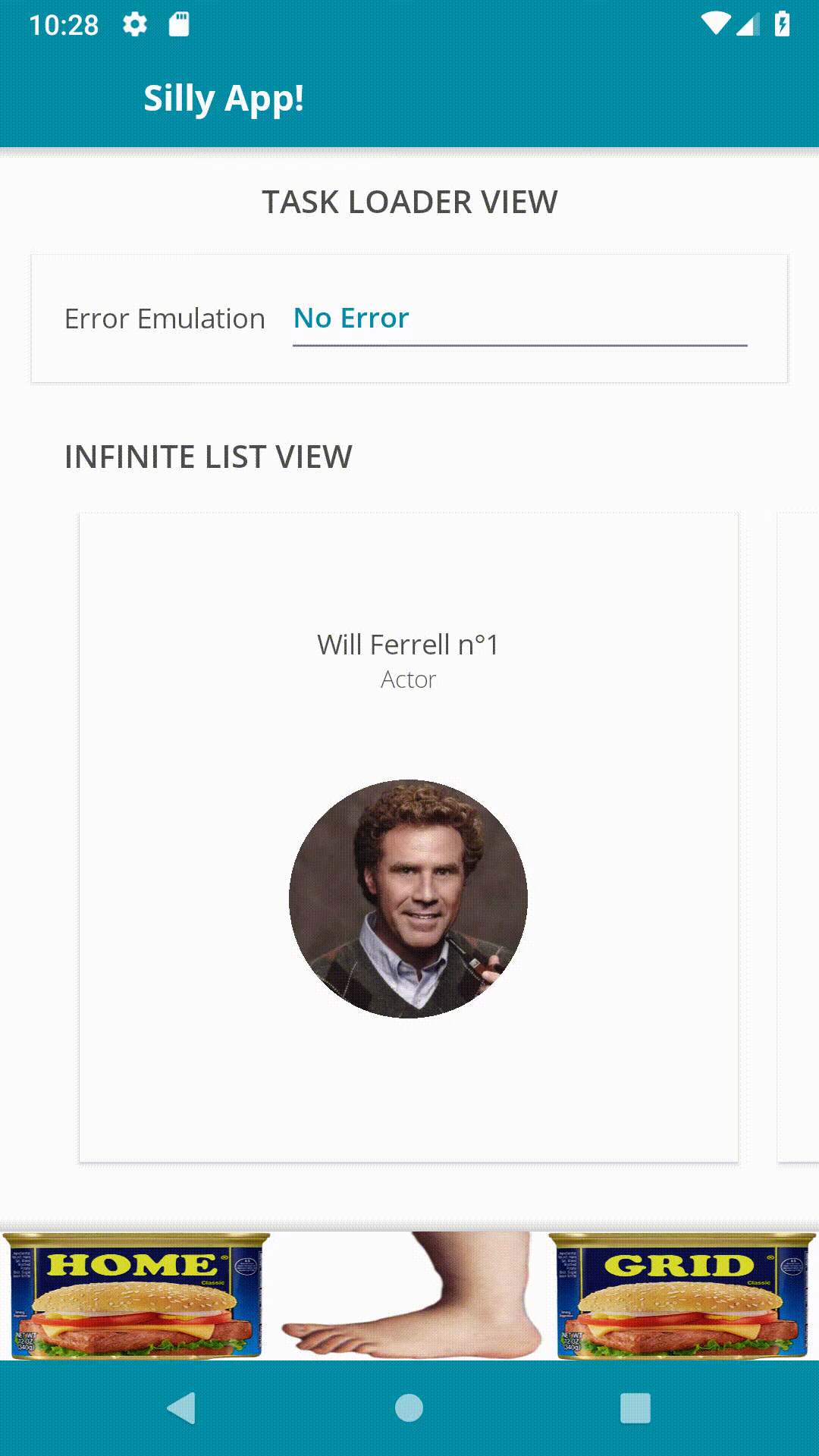
<tabs:TabItem x:Class="SillyCompany.Mobile.Practices.Presentation.CustomViews.SpamTab"
              xmlns="http://xamarin.com/schemas/2014/forms"
              xmlns:x="http://schemas.microsoft.com/winfx/2009/xaml"
              xmlns:tabs="clr-namespace:Sharpnado.Presentation.Forms.CustomViews.Tabs;assembly=Sharpnado.Presentation.Forms"
              x:Name="RootLayout">
    <ContentView.Content>
        <Grid ColumnSpacing="0" RowSpacing="0">
            <Image x:Name="Spam"
                   VerticalOptions="End"
                   Aspect="Fill"
                   Source="{Binding Source={x:Reference RootLayout},
                                    Path=SpamImage}" />
            <Image x:Name="Foot"
                   Aspect="Fill"
                   Source="monty_python_foot" />
        </Grid>
    </ContentView.Content>
</tabs:TabItem>

...

<tabs:TabHostView x:Name="TabHost"
                  Grid.Row="2"
                  BackgroundColor="White"
                  SelectedIndex="{Binding Source={x:Reference Switcher},
                                          Path=SelectedIndex,
                                          Mode=TwoWay}"
                  ShadowType="Top">
    <tb:SpamTab SpamImage="spam_classic_home" />
    <tb:SpamTab SpamImage="spam_classic_list" />
    <tb:SpamTab SpamImage="spam_classic_grid" />

...
Please don't be shy with Xamarin.Forms animations, it's so easy to use and so powerful thanks to the amazing C# Task api.
USE.
THEM.
private void Animate(bool isSelected)
{
    double targetFootOpacity = isSelected ? 1 : 0;
    double targetFootTranslationY = isSelected ? 0 : -_height;
    double targetHeightSpam = isSelected ? 0 : _height;

    NotifyTask.Create(
        async () =>
        {
            Task fadeFootTask = Foot.FadeTo(
                targetFootOpacity, 500);
            Task translateFootTask = Foot.TranslateTo(
                0, targetFootTranslationY, 250, Easing.CubicOut);
            Task heightSpamTask = Spam.HeightRequestTo(
                targetHeightSpam, 250, Easing.CubicOut);

            await Task.WhenAll(fadeFootTask, translateFootTask, heightSpamTask);

            Spam.HeightRequest = targetHeightSpam;
            Foot.TranslationY = targetFootTranslationY;
            Foot.Opacity = targetFootOpacity;
        });
}