From our sponsor: Leverage AI for dynamic, custom website builds with ease.
Hello everyone, introducing myself a little bit first, I’m Luis Henrique Bizarro, I’m a Senior Creative Developer at Active Theory based in São Paulo, Brazil. It’s always a pleasure to me having the opportunity to collaborate with Codrops to help other developers learn new things, so I hope everyone enjoys this tutorial!
In this tutorial I’ll explain you how to create an auto scrolling infinite image gallery. The image grid is also scrollable be user interaction, making it an interesting design element to showcase works. It’s based on this great animation seen on Oneshot.finance made by Jesper Landberg.
I’ve been using the technique of styling images first with HTML + CSS and then creating an abstraction of these elements inside WebGL using some camera and viewport calculations in multiple websites, so this is the approach we’re going to use in this tutorial.
The good thing about this implementation is that it can be reused across any WebGL library, so if you’re more familiar with Three.js or Babylon.js than OGL, you’ll also be able to achieve the same results using a similar code, when it’s about shading and scaling the plane meshes.
So let’s get into it!
Implementing our HTML markup
The first step is implementing our HTML markup. We’re going to use <figure> and <img> elements, nothing special here, just the standard:
<div class="demo-1__gallery">
  <figure class="demo-1__gallery__figure">
    <img class="demo-1__gallery__image" src="images/demo-1/1.jpg">
  </figure>

  <!-- Repeating the same markup until 12.jpg. -->
</div>
Setting our CSS styles
The second step is styling our elements using CSS. One of the first things I do in a website is defining the font-size of the html element because I use rem to help with the responsive breakpoints.
This comes in handy if you’re doing creative websites that only require two or three different breakpoints, so I highly recommend starting using it if you haven’t adopted rem yet.
One thing I’m also using is calc() with the size of the designs. In our tutorial we’re going to use 1920 as our main width, scaling our font-size depending on the screen size of 100vw. This results in 10px at a 1920px screen, for example:
html {
  font-size: calc(100vw / 1920 * 10);
}
Now let’s style our grid of images. We want to freely place our images across the screen using absolute positioning, so we’re just going to set the height, width and left/top styles across all our demo-1 classes:
.demo-1__gallery {
height: 295rem;
position: relative;
visibility: hidden;
}
.demo-1__gallery__figure {
position: absolute;
&:nth-child(1) {
height: 40rem;
width: 70rem;
}
&:nth-child(2) {
height: 50rem;
left: 85rem;
top: 30rem;
width: 40rem;
}
&:nth-child(3) {
height: 50rem;
left: 15rem;
top: 60rem;
width: 60rem;
}
&:nth-child(4) {
height: 30rem;
right: 0;
top: 10rem;
width: 50rem;
}
&:nth-child(5) {
height: 60rem;
right: 15rem;
top: 55rem;
width: 40rem;
}
&:nth-child(6) {
height: 75rem;
left: 5rem;
top: 120rem;
width: 57.5rem;
}
&:nth-child(7) {
height: 70rem;
right: 0;
top: 130rem;
width: 50rem;
}
&:nth-child(8) {
height: 50rem;
left: 85rem;
top: 95rem;
width: 40rem;
}
&:nth-child(9) {
height: 65rem;
left: 75rem;
top: 155rem;
width: 50rem;
}
&:nth-child(10) {
height: 43rem;
right: 0;
top: 215rem;
width: 30rem;
}
&:nth-child(11) {
height: 50rem;
left: 70rem;
top: 235rem;
width: 80rem;
}
&:nth-child(12) {
left: 0;
top: 210rem;
height: 70rem;
width: 50rem;
}
}
.demo-1__gallery__image {
height: 100%;
left: 0;
object-fit: cover;
position: absolute;
top: 0;
width: 100%;
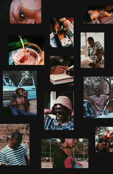
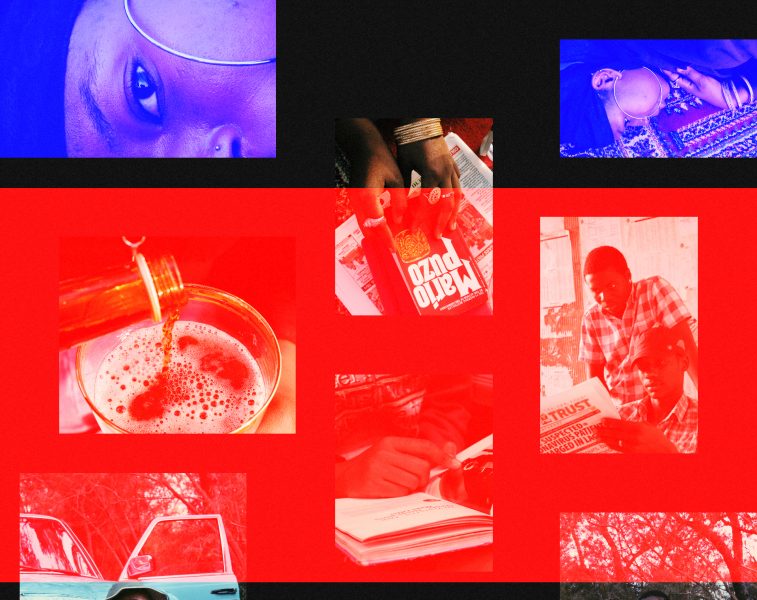
}Note that we’re hiding the visibility of our HTML, because it’s not going to be visible for the users since we’re going to load these images inside the <canvas> element. But below you can find a screenshot of what the result will look like.
Creating our OGL 3D environment
Now it’s time to get started with the WebGL implementation using OGL. First let’s create an App class that is going to be the entry point of our demo and inside of it, let’s also create the initial methods: createRenderer, createCamera, createScene, onResize and our requestAnimationFrame loop with update.
import { Renderer, Camera, Transform } from 'ogl'

class App {
  constructor () {
    this.createRenderer()
    this.createCamera()
    this.createScene()

    this.onResize()

    this.update()

    this.addEventListeners()
  }

  createRenderer () {
    this.renderer = new Renderer({
      alpha: true
    })

    this.gl = this.renderer.gl

    document.body.appendChild(this.gl.canvas)
  }

  createCamera () {
    this.camera = new Camera(this.gl)
    this.camera.fov = 45
    this.camera.position.z = 5
  }

  createScene () {
    this.scene = new Transform()
  }

  /**
   * Wheel.
   */
  onWheel (event) {

  }

  /**
   * Resize.
   */
  onResize () {
    this.screen = {
      height: window.innerHeight,
      width: window.innerWidth
    }

    this.renderer.setSize(this.screen.width, this.screen.height)

    this.camera.perspective({
      aspect: this.gl.canvas.width / this.gl.canvas.height
    })

    const fov = this.camera.fov * (Math.PI / 180)
    const height = 2 * Math.tan(fov / 2) * this.camera.position.z
    const width = height * this.camera.aspect

    this.viewport = {
      height,
      width
    }
  }

  /**
   * Update.
   */
  update () {
    this.renderer.render({
      scene: this.scene,
      camera: this.camera
    })

    window.requestAnimationFrame(this.update.bind(this))
  }

  /**
   * Listeners.
   */
  addEventListeners () {
    window.addEventListener('resize', this.onResize.bind(this))

    window.addEventListener('mousewheel', this.onWheel.bind(this))
    window.addEventListener('wheel', this.onWheel.bind(this))
  }
}

new App()
Explaining some part of our App.js file
In our createRenderer method, we’re initializing one renderer with alpha enabled, storing our GL context (this.renderer.gl) reference in the this.gl variable and appending our <canvas> element to our document.body.
In our createCamera method, we’re just creating a new Camera and setting some of its attributes: fov and its z position.
In our createScene method, we’re using the Transform class, that is the representation of a new scene that is going to contain all our planes that represent our images in the WebGL environment.
The onResize method is the most important part of our initial setup. It’s responsible for three different things:
- Making sure we’re always resizing the
<canvas>element with the correct viewport sizes. - Updating our
this.cameraperspective dividing thewidthandheightof the viewport. - Storing in the variable
this.viewport, the value representations that will help to transform pixels into 3D environment sizes by using thefovfrom the camera.
The approach of using the camera.fov to transform pixels in 3D environment sizes is an approach used very often in multiple WebGL implementations. Basically what it does is making sure that if we do something like: this.mesh.scale.x = this.viewport.width; it’s going to make our mesh fit the entire screen width, behaving like width: 100%, but in 3D space.
And finally in our update, we’re setting our requestAnimationFrame loop and making sure we keep rendering our scene.
Create our reusable geometry instance
It’s a good practice to keep memory usage low by always reusing the same geometry reference no matter what WebGL library you’re using. To represent all our images, we’re going to use a Plane geometry, so let’s create a new method and store this new geometry inside the this.planeGeometry variable.
import { Renderer, Camera, Transform, Plane } from 'ogl'

createGeometry () {
  this.planeGeometry = new Plane(this.gl)
}
Select all images and create a new class for each one
Now it’s time to use document.querySelector to select all our images and create one reusable class that is going to represent our images. (We’re going to create a single Media.js file later.)
createMedias () {
  this.mediasElements = document.querySelectorAll('.demo-1__gallery__figure')
  this.medias = Array.from(this.mediasElements).map(element => {
    let media = new Media({
      element,
      geometry: this.planeGeometry,
      gl: this.gl,
      scene: this.scene,
      screen: this.screen,
      viewport: this.viewport
    })

    return media
  })
}
As you can see, we’re just selecting all .demo-1__gallery__figure elements, going through them and generating an array of `this.medias` with new instances of Media.
Now it’s important to start attaching this array in important pieces of our setup code.
Let’s first include all our media inside the method onResize and also call media.onResize for each one of these new instances:
if (this.medias) {
  this.medias.forEach(media => media.onResize({
    screen: this.screen,
    viewport: this.viewport
  }))
}
And inside our update method, we’re going to call media.update() as well:
if (this.medias) {
  this.medias.forEach(media => media.update())
}
Setting up our Media.js file and class
Our Media class is going to use Mesh, Program and Texture classes from OGL to create a 3D plane and attribute a texture to it, which in our case is going to be our images.
In our constructor, we’re going to store all variables that we need and that were passed in the new Media() initialization from index.js:
import { Mesh, Program, Texture } from 'ogl'

import fragment from 'shaders/fragment.glsl'
import vertex from 'shaders/vertex.glsl'

export default class {
  constructor ({ element, geometry, gl, scene, screen, viewport }) {
    this.element = element
    this.image = this.element.querySelector('img')

    this.geometry = geometry
    this.gl = gl
    this.scene = scene
    this.screen = screen
    this.viewport = viewport

    this.createMesh()
    this.createBounds()

    this.onResize()
  }
}
In our createMesh method, we’ll load the image texture using the this.image.src attribute, then create a new Program, which is basically a representation of the material we’re applying to our Mesh. So our method looks like this:
createMesh () {
  const image = new Image()
  const texture = new Texture(this.gl)

  image.src = this.image.src
  image.onload = _ => {
    texture.image = image
  }

  const program = new Program(this.gl, {
    fragment,
    vertex,
    uniforms: {
      tMap: { value: texture },
      uScreenSizes: { value: [0, 0] },
      uImageSizes: { value: [0, 0] }
    },
    transparent: true
  })

  this.plane = new Mesh(this.gl, {
    geometry: this.geometry,
    program
  })

  this.plane.setParent(this.scene)
}
Looks pretty simple, right? After we generate a new Mesh, we’re setting the plane as children of this.scene, so we’re including our mesh inside our main scene.
As you’ve probably noticed, our Program receives fragment and vertex. These both represent the shaders we’re going to use on our planes. For now, we’re just using simple implementations of both.
In our vertex.glsl file we’re getting the uv and position attributes, and making sure we’re rendering our planes in the right 3D world position.
attribute vec2 uv;
attribute vec3 position;

uniform mat4 modelViewMatrix;
uniform mat4 projectionMatrix;

varying vec2 vUv;

void main() {
  vUv = uv;

  gl_Position = projectionMatrix * modelViewMatrix * vec4(position, 1.0);
}
In our fragment.glsl file, we’re receiving a tMap texture, as you can see in the tMap: { value: texture } declaration, and rendering it in our plane geometry:
precision highp float;

uniform sampler2D tMap;

varying vec2 vUv;

void main() {
  gl_FragColor.rgb = texture2D(tMap, vUv).rgb;
  gl_FragColor.a = 1.0;
}
The createBounds method is important to make sure we’re positioning and scaling our planes in the correct DOM elements positions, so it’s basically going to call for this.element.getBoundingClientRect() to get the right position of our planes, and then after that using these values to calculate the 3D values of our plane.
createBounds () {
  this.bounds = this.element.getBoundingClientRect()

  this.updateScale()
  this.updateX()
  this.updateY()
}

updateScale () {
  this.plane.scale.x = this.viewport.width * this.bounds.width / this.screen.width
  this.plane.scale.y = this.viewport.height * this.bounds.height / this.screen.height
}

updateX (x = 0) {
  this.plane.position.x = -(this.viewport.width / 2) + (this.plane.scale.x / 2) + ((this.bounds.left - x) / this.screen.width) * this.viewport.width
}

updateY (y = 0) {
  this.plane.position.y = (this.viewport.height / 2) - (this.plane.scale.y / 2) - ((this.bounds.top - y) / this.screen.height) * this.viewport.height
}

update (y) {
  this.updateScale()
  this.updateX()
  this.updateY(y)
}
As you’ve probably noticed, the calculations for scale.x and scale.y are going to stretch our plane to make it the same width and height of the <img> elements. And the position.x and position.y takes the offset from the element and makes our translate our planes to the correct x and y axis in 3D.
And let’s not forget our onResize method, which is basically going to call createBounds again to refresh our getBoundingClientRect values and make sure we keep our 3D implementation responsive as well.
onResize (sizes) {
  if (sizes) {
    const { screen, viewport } = sizes

    if (screen) this.screen = screen
    if (viewport) this.viewport = viewport
  }

  this.createBounds()
}
This is the result we’ve got so far.
Implement cover behavior in fragment shaders
As you’ve probably noticed, our images are stretched. It happens because we need to make proper calculations in the fragment shaders in order to have a behavior like object-fit: cover; or background-size: cover; in WebGL.
I like to use an approach to pass the images’ real sizes and do some ratio calculations inside the fragment shader, so let’s adapt our code to this approach. So in our Program, we’re going to pass two new uniforms called uPlaneSizes and uImageSizes:
const program = new Program(this.gl, {
  fragment,
  vertex,
  uniforms: {
    tMap: { value: texture },
    uPlaneSizes: { value: [0, 0] },
    uImageSizes: { value: [0, 0] }
  },
  transparent: true
})
Now we need to update our fragment.glsl and use these values to calculate our images ratios:
precision highp float;

uniform vec2 uImageSizes;
uniform vec2 uPlaneSizes;
uniform sampler2D tMap;

varying vec2 vUv;

void main() {
  vec2 ratio = vec2(
    min((uPlaneSizes.x / uPlaneSizes.y) / (uImageSizes.x / uImageSizes.y), 1.0),
    min((uPlaneSizes.y / uPlaneSizes.x) / (uImageSizes.y / uImageSizes.x), 1.0)
  );

  vec2 uv = vec2(
    vUv.x * ratio.x + (1.0 - ratio.x) * 0.5,
    vUv.y * ratio.y + (1.0 - ratio.y) * 0.5
  );

  gl_FragColor.rgb = texture2D(tMap, uv).rgb;
  gl_FragColor.a = 1.0;
}
And then we also need update our image.onload method to pass naturalWidth and naturalHeight to uImageSizes:
image.onload = _ => {
  program.uniforms.uImageSizes.value = [image.naturalWidth, image.naturalHeight]
  texture.image = image
}
And createBounds to update the uPlaneSizes uniforms:
createBounds () {
  this.bounds = this.element.getBoundingClientRect()

  this.updateScale()
  this.updateX()
  this.updateY()

  this.plane.program.uniforms.uPlaneSizes.value = [this.plane.scale.x, this.plane.scale.y]
}
That’s it! Now we have properly scaled images.
Implementing smooth scrolling
Before we implement our infinite logic, it’s good to start making scrolling work properly. In our setup code, we have included a onWheel method, which is going to be used to lerp some variables and make our scroll butter smooth.
In our constructor from index.js, let’s create the this.scroll object with these variables:
this.scroll = {
  ease: 0.05,
  current: 0,
  target: 0,
}
Now let’s update our onWheel implementation. When working with wheel events, it’s always important to normalize it, because it behaves differently based on the browser, I’ve been using normalize-wheel library to help on it:
import NormalizeWheel from 'normalize-wheel'

onWheel (event) {
  const normalized = NormalizeWheel(event)
  const speed = normalized.pixelY

  this.scroll.target += speed * 0.5
}
Let’s also create our lerp utility function inside the file utils/math.js:
export function lerp (p1, p2, t) {
  return p1 + (p2 - p1) * t
}
And now we just need to lerp from the this.scroll.current to the this.scroll.target inside the update method. And finally pass it to the media.update() methods:
update () {
  this.scroll.current = lerp(this.scroll.current, this.scroll.target, this.scroll.ease)

  if (this.medias) {
    this.medias.forEach(media => media.update(this.scroll.current))
  }
}
After that we already have a result like this.
Making our smooth scrolling infinite
The approach of making an infinite scrolling logic is basically repeating the same grid over and over while the user keeps scrolling your page. Since the user can scroll up or down, you also need to take under consideration what direction is being scrolled, so overall the algorithm should work this way:
- If you’re scrolling down, your elements move up — when your first element isn’t on the screen anymore, you should move it to the end of the list.
- If you’re scrolling up, your elements move to down — when your last element isn’t on the screen anymore, you should move it to the start of the list.
To explain it in a visual way, let’s say we’re scrolling down and the red area is our viewport and the blue elements are not in the viewport anymore.
When we are in this state, we just need to move the blue elements to the end of our gallery grid, which is the entire height of our gallery: 295rem.
Let’s include the logic for it then. First, we need to create a new variable called this.scroll.last to store the last value of our scroll, this is going to be checked to give us up or down strings:
this.scroll = {
  ease: 0.05,
  current: 0,
  target: 0,
  last: 0
}
In our update method, we need to include the following lines of validations and pass this.direction to our this.medias elements.
update () {
  this.scroll.current = lerp(this.scroll.current, this.scroll.target, this.scroll.ease)

  if (this.scroll.current > this.scroll.last) {
    this.direction = 'down'
  } else if (this.scroll.current < this.scroll.last) {
    this.direction = 'up'
  }

  if (this.medias) {
    this.medias.forEach(media => media.update(this.scroll.current, this.direction))
  }

  this.renderer.render({
    scene: this.scene,
    camera: this.camera
  })

  this.scroll.last = this.scroll.current

  window.requestAnimationFrame(this.update.bind(this))
}
Then we need to get the total gallery height and transform it to 3D dimensions, so let’s include a querySelector of .demo-1__gallery and call the createGallery method in our index.js constructor.
createGallery () {
  this.gallery = document.querySelector('.demo-1__gallery')
}
It’s time to do the real calculations using this selector, so in our onResize method, we need to include the following lines:
this.galleryBounds = this.gallery.getBoundingClientRect()
this.galleryHeight = this.viewport.height * this.galleryBounds.height / this.screen.height
The this.galleryHeight variable now is storing the 3D size of the entire grid, now we need to pass it to both onResize and new Media() calls:
if (this.medias) {
  this.medias.forEach(media => media.onResize({
    height: this.galleryHeight,
    screen: this.screen,
    viewport: this.viewport
  }))
}
this.medias = Array.from(this.mediasElements).map(element => {
let media = new Media({
element,
geometry: this.planeGeometry,
gl: this.gl,
height: this.galleryHeight,
scene: this.scene,
screen: this.screen,
viewport: this.viewport
})
return media
})And then inside our Media class, we need to store the height as well in the constructor and also in the onResize methods:
constructor ({ element, geometry, gl, height, scene, screen, viewport }) {
  this.height = height
}
onResize (sizes) {
if (sizes) {
const { height, screen, viewport } = sizes
if (height) this.height = height
if (screen) this.screen = screen
if (viewport) this.viewport = viewport
}
}Now we’re going to include the logic to move our elements based on their viewport position, just like our visual representation of the red and blue rectangles.
If the idea is to keep summing up a value based on the scroll and element position, we can achieve this by just creating a new variable called this.extra = 0, this is going to store how much we need to sum (or subtract) of our media, so in our constructor let’s include it:
constructor ({ element, geometry, gl, height, scene, screen, viewport }) {
    this.extra = 0
}
And let’s reset it on resizing the browser, to make all values consistent so it doesn’t break when users resizes their viewport:
onResize (sizes) {
  this.extra = 0
}
And in our updateY method, we’re going to include it as well:
updateY (y = 0) {
  this.plane.position.y = ((this.viewport.height / 2) - (this.plane.scale.y / 2) - ((this.bounds.top - y) / this.screen.height) * this.viewport.height) - this.extra
}
Finally, the only thing left now is updating the this.extra variable inside our update method, making sure we’re adding or subtracting the this.height depending on the direction.
const planeOffset = this.plane.scale.y / 2
const viewportOffset = this.viewport.height / 2

this.isBefore = this.plane.position.y + planeOffset < -viewportOffset
this.isAfter = this.plane.position.y - planeOffset > viewportOffset

if (direction === 'up' && this.isBefore) {
  this.extra -= this.height

  this.isBefore = false
  this.isAfter = false
}

if (direction === 'down' && this.isAfter) {
  this.extra += this.height

  this.isBefore = false
  this.isAfter = false
}
Since we’re working in 3D space, we’re dealing with cartesian coordinates, that’s why you can notice we’re dividing most things by two (ex:
this.viewport.heighht / 2). So that’s also the reason why we had to do a different logic for thethis.isBeforeandthis.isAfterchecks.
Awesome, we’re almost finishing our demo! That’s how it looks now, pretty cool to have it endless right?
Including touch events
Let’s also include touch events, so this demo can be more responsive to user interactions! In our addEventListeners method, let’s include some window.addEventListener calls:
window.addEventListener('mousedown', this.onTouchDown.bind(this))
window.addEventListener('mousemove', this.onTouchMove.bind(this))
window.addEventListener('mouseup', this.onTouchUp.bind(this))

window.addEventListener('touchstart', this.onTouchDown.bind(this))
window.addEventListener('touchmove', this.onTouchMove.bind(this))
window.addEventListener('touchend', this.onTouchUp.bind(this))
Then we just need to implement simple touch events calculations, including the three methods: onTouchDown, onTouchMove and onTouchUp.
onTouchDown (event) {
  this.isDown = true

  this.scroll.position = this.scroll.current
  this.start = event.touches ? event.touches[0].clientY : event.clientY
}

onTouchMove (event) {
  if (!this.isDown) return

  const y = event.touches ? event.touches[0].clientY : event.clientY
  const distance = (this.start - y) * 2

  this.scroll.target = this.scroll.position + distance
}

onTouchUp (event) {
  this.isDown = false
}
Done! Now we also have touch events support enabled for our gallery.
Implementing direction-aware auto scrolling
Let’s also implement auto scrolling to make our interaction even better. In order to achieve that we just need to create a new variable that will store our speed based on the direction the user is scrolling.
So let’s create a variable called this.speed in our index.js file:
constructor () {
  this.speed = 2
}
This variable is going to be changed by our down and up validations we have in our update loop, so if the user is scrolling down, we’re going to keep the speed as 2, if the user is scrolling up, we’re going to replace it with -2, and before that we will sum this.speed to the this.scroll.target variable:
update () {
  this.scroll.target += this.speed

  this.scroll.current = lerp(this.scroll.current, this.scroll.target, this.scroll.ease)

  if (this.scroll.current > this.scroll.last) {
    this.direction = 'down'
    this.speed = 2
  } else if (this.scroll.current < this.scroll.last) {
    this.direction = 'up'
    this.speed = -2
  }
}
Implementing distortion shaders
Now let’s make everything even more interesting, it’s time to play a little bit with shaders and distort our planes while the user is scrolling through our page.
First, let’s update our update method from index.js, making sure we expose both current and last scroll values to all our medias, we’re going to do a simple calculation with them.
update () {
  if (this.medias) {
    this.medias.forEach(media => media.update(this.scroll, this.direction))
  }
}
And now let’s create two uniforms for our Program shader: uOffset and uViewportSizes, and pass them:
const program = new Program(this.gl, {
  fragment,
  vertex,
  uniforms: {
    tMap: { value: texture },
    uPlaneSizes: { value: [0, 0] },
    uImageSizes: { value: [0, 0] },
    uViewportSizes: { value: [this.viewport.width, this.viewport.height] },
    uStrength: { value: 0 }
  },
  transparent: true
})
As you can probably notice, we’re going to need to set uViewportSizes in our onResize method as well, since this.viewport changes when we resize, so to keep this.viewport.width and this.viewport.height up to date, we also need to include the following lines of code in onResize:
onResize (sizes) {
  if (sizes) {
    const { height, screen, viewport } = sizes

    if (height) this.height = height
    if (screen) this.screen = screen
    if (viewport) {
      this.viewport = viewport

      this.plane.program.uniforms.uOffset.value = [this.viewport.width, this.viewport.height]
    }
  }
}
Remember the this.scroll update we’ve made from index.js? Now it’s time to include a small trick to generate a speed value inside our Media.js:
update (y, direction) {
  this.updateY(y.current)

  this.plane.program.uniforms.uStrength.value = ((y.current - y.last) / this.screen.width) * 10
}
We’re basically checking the difference between the current and last values, which returns us some kind of “speed” of the scrolling, and dividing it by the this.screen.width, to keep our effect value behaving correctly independently of the width of our screen.
Finally now it’s time to play a little bit with our vertex shader. We’re going to bend our planes a little bit while the user is scrolling through the page. So let’s update our vertex.glsl file with this new code:
#define PI 3.1415926535897932384626433832795

precision highp float;
precision highp int;

attribute vec3 position;
attribute vec2 uv;

uniform mat4 modelViewMatrix;
uniform mat4 projectionMatrix;

uniform float uStrength;
uniform vec2 uViewportSizes;

varying vec2 vUv;

void main() {
  vec4 newPosition = modelViewMatrix * vec4(position, 1.0);

  newPosition.z += sin(newPosition.y / uViewportSizes.y * PI + PI / 2.0) * -uStrength;

  vUv = uv;

  gl_Position = projectionMatrix * newPosition;
}
That’s it! Now we’re also bending our images creating an unique type of effect!
Explaining a little bit of the shader logic: basically what’s implemented in the newPosition.z line is taking into consideration the uViewportSize.y, which is our height from the viewport and the current position.y of our plane, getting the division of both and multiplying by PI that we defined on the very top of our shader file. And then we use the uStrength which is the strength of the bending, that is tight with our scrolling values, making it bend based on how faster you scroll the demo.
That’s the final result of our demo! I hope this tutorial was useful to you and don’t forget to comment if you have any questions!
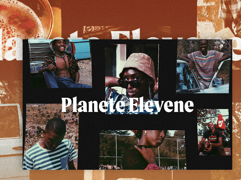
Photography used in the demos by Planete Elevene and Jayson Hinrichsen.


I can’t see the images in the demos.
This seems to be a problem with ad blockers. We fixed it now, could you please test it again? Thanks!
the images are not showing up on mobile
Images are not displayed on Safari, macOS and iOS.
Display is normal on Chrome and Edge.
Hello again.
I’ve tried Chrome, Firefox, Opera and Edge, and I still can’t see the images.
images doesn’t load in OS and IOS.
Images doesn’t appear in safari !
Great work!
Do you know how to make it work on Safari?
Hey, Demo looks awesome on chrome! But it doesn’t work on safari 🙁
All fixed, thank you for letting us know! 🙂
Thanks for this great tutorial.
I had an idea. Can we make this bi-directional?
Scrolling in vertical and horizontal both directions, so that it looks like you inside the sphere of photos.
That would look awesome.
Hello,
First, congratulations for this amazing Infinite Auto-Scrolling Gallery, I’m really impressed ! That’s why I want to remake it on my own and not just copy the code. I have to confess that it’s a bit complicated for me ( only using html, css, javascript ). If someone could help me it would be awesome. I’m stuck at the end of the section “Setting up our Media.js file and class” . I’ve begun by using create-react-app but know I don’t know how to connect my demo.js and media.js file. I’ve tried something like this in my html file :
But it’s not working. Do I have to use webpack ?
I know it seems basic but if someone can answer me, that would be awesome!
Thank you very miuch
Hello, The gallery is wonderful!
I am a beginner web designer and I am trying to learn.
I Download the source files, but when running it locally, the gallery doesn’t work.
Should I install a special webgl or script library to see it correctly?
Please excuse me if this is a dumb question, but I have tried other tutorials and never
had this problem.
The demo on the Codrops site looks great, the problem is to see it on my
computer.
Thank you so much!
Hi Raul, did you follow the installation steps?
Hi!
Yes I follwed the steps but I couldn’t make the gallery work, maybe it’s a too much for me, I’m a beginner, but I wanted to try with the downloaded source files, but it doesn’t work either, it’s like it doesn’t take the libraries, not even the css styles.
Any help would be appreciated
Thanks!
Hello, images still not showing up. Can you please fix it? 🙂
you just have to go into the css codes and change the visibility
Hello,
I have a problem because when I download the file with all the resources and that I change the visibility of the photos, there is no gallery scrolling and the photos do not move at all.
So if anyone would like to make the photos move, you’d be very kind to let me know.
Thank you
Hello, please have a problem launching the index.html file
how can I install the npm?
Thanks
Hello,
I’d like to use index2. It works good on my localhost. I need to place additional content below the gallery. How to scroll or link to display it?
Thank you,
Alex
Hello,
i downloaded files but they don’t work …
Is it restricted to 12 images?