Content, Editorial & Employee Communications Leader | Recovering Journalist | Storyteller | The Editor | Unpopular Opinion Podcast Host | Incurably Cheerful
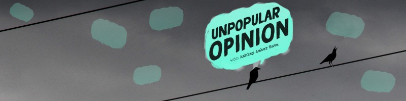
Don’t you dare hold back! I NEED your thoughts on these three cover art options for my new show. But first, what is “Unpopular Opinion?” Unpopular Opinion is a podcast where I will interview professionals from all walks of life who have succeeded thanks to going against the grain. These rebels stuck to their guns despite warnings from the naysayers, threats to their careers and colossal obstacles. The title is a play off the LinkedIn trend where someone baits you with the hook: “unpopular opinion”…and then says something sleepy like “marketers should talk to customers.” 🙄 Audience Ops crafted three cover art illustrations for me, and we want your feedback! Here are some things you should know about the samples: 🎙The color scheme is based on my own personal website since it will be hosted there. 🎙We are going for a zine vibe based on my journalism background and the underlying show themes. 🎙Any of these options can be edited. I promised to “build in public,” so please drop a note and let me know how you feel about the artwork presented. Gut reactions, in-depth analysis and pros/cons are all welcome. To keep things competitively interesting, I will send a $50 Amazon gift card to the person who delivers the most useful feedback. The winner will either convince me to change my mind thanks to their suggested tweaks (yes, I do have a secret🤫favorite), or they will solidify my number one choice thanks to their savvy explanation. I will select the winner tonight around 8 p.m. CST. May the odds be ever in your favor. #podcast #unpopularopinion #ThatAshleyAmber
Thank you everyone for your feedback! I have absorbed it all like a sponge. I appreciate everyone who took the time to respond. Bob Kline is the winner of the gift card. It was VERY challenging selecting a winner as so many of you contributed advice that really made me think. 💬 I look forward to giving you all sneakpeeks as the debut to unleashing this beast approaches.
📌Here is a link to my website! 📌 www.ashleyambersava.com
I’d love to hear your thoughts, Erin Balsa !
The third one. No offense to the others, they have different vibes for different uses, but the third one gives off more of a zine feel, the text is cleaner, more professional, and does not make me blink multiple times because it feels blurry (looking at the first one specifically for that). Where and how you've used the blue makes it pop (fun fact, I believe that blue, at least at my monitor's resolution, is called Amalfi Coast haha, I have painted a few pieces in my house with it). It has a very clean look for the background so it isn't overly busy, and there's something about the bird on a wire that I'm really enjoying. I think if this square showed up in my podcast list, I'd be more drawn to click it than the other two.
You have a tough job here, Ashley, choosing from some great options. I'm going to put my (4) designer's eyes do some work here and what they see is this: 1. This option has the biggest impact on me due to the imagery of a real human being used and the white on black text. I wouldn't mind if the person wasn't distorted like it is right now and the rest of the background still was. 2. This looks a bit more simple and I would see it easily used by other podcasts as well. The idea is good, but it does not have the same visual impact as the first one. 3. A great concept again, but the bird on the wire fades away at a quick squint test and you're left with just a speech bubble. I would go ahead and throw in a fourth concept to think of starting from your background in journalism. Think of a 1950's paper boy, a newsletter headline in bold letters, and a bold, impactful look that ties everything together. 🍿 😎
The first one because of… a retro vibe? I dunno, but it attracts my eye more. Have you thought about blowing that trumpet yourself? You have a strong personal brand, and many people would give it a listen just because it’s #ThatAshleyAmber 😉
Oh number 1 for sure. Its giving a fat guy going through a town shouting "hear ye hear ye" with a bell and making an announcement 😂
The one on the left. I have an untested theory that including the person in the thumbnail will improve performance. Especially since following the person’s gaze leads the viewer to the title text. The middle image text is too hard to read. The image on the right is good but it lacks the aforementioned person. My vote is for the left image.
I really like the bird on a wire and thought cloud Ashley Amber Sava. For me, it's the strongest, cleanest, and most readable, plus it jumps out at me more than the others with that splash of color bursting through the black and white photo backdrop. I also like the whole bird on a wire motif which I find both clever and evocative. It's a clear winner for me. Anyway, that's my story and I'm sticking to it!
Content, Editorial & Employee Communications Leader | Recovering Journalist | Storyteller | The Editor | Unpopular Opinion Podcast Host | Incurably Cheerful
1yFor additional context, here is more information on my show 📌 https://www.linkedin.com/posts/ashleyambersava_podcast-unpopularopinion-thatashleyamber-activity-6998652413188456448-e1ZH/?utm_source=share&utm_medium=member_desktop📌