Configurable button with different states in SwiftUI
Some time ago, I wrote a post about creating a reusable button in SwiftUI and how it can help you keep your code reusable without having to create a new button every time you need one.
We'll take that same approach to build a new configurable button with different states and a different design for each state.
Imagine you're implementing a feature to claim a coupon. User enters a coupon in the text field and taps the button. You want your button to have different states during the claim process that reflects the network call.
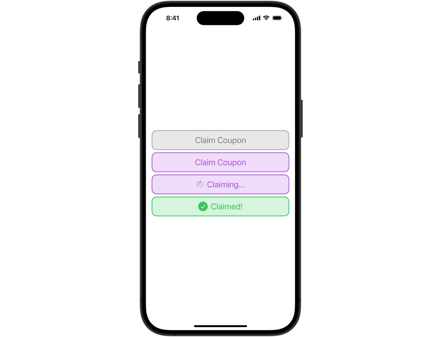
It starts in a normal state. Once the user taps the button, the claim process begins and the button changes to loading state. When the network call succeeds, the button is in the confirmed state. The disabled state can be triggered for the network error or unsuccessful claim.
You can create any number of states for your specific use case.
Create a button
First, we need to create a ClaimButton view:
struct ClaimButton: View {
    var body: some View {
        Button {
            // action
        } label: {
            // label
        }
    }
}
We'll come back and more details here once we define the configuration properties.
Create configuration properties
Add the Configuration as an extension on the ClaimButton:
extension ClaimButton {
    struct Configuration {
        let icon: String?
        let text: String
        let textColor: Color
        let backgroundColor: Color
        let borderColor: Color
        let isLoading: Bool
        let disabled: Bool

        // Initializer with default values
        init(
            icon: String? = nil,
            text: String,
            textColor: Color = .purple,
            backgroundColor: Color = .purple.opacity(0.2),
            borderColor: Color = .purple,
            isLoading: Bool = false,
            disabled: Bool = false
        ) {
            self.icon = icon
            self.text = text
            self.textColor = textColor
            self.backgroundColor = backgroundColor
            self.borderColor = borderColor
            self.isLoading = isLoading
            self.disabled = disabled
        }
        ...
    }
}
Configuration defines all the properties we need to create the button states. It can be edited at any time if you need to add more properties for your use case.
You can create an initializer and provide default values or pass them all in when creating the state to make sure you don't forget anything. I've added default values that correlate with the normal state.
Create button states
Now we define different states for the button as static computed properties and return the configuration we need. Add the following states to Configuration below the initializer:
// Default (normal) state
static var normal: Configuration {
    Configuration(
        text: "Claim Coupon"
    )
}

// Loading state
static var loading: Configuration {
    Configuration(
        text: "Claiming...",
        isLoading: true,
        disabled: true
    )
}

// Disabled state
static var disabled: Configuration {
    Configuration(
        text: "Claim Coupon",
        textColor: .secondary,
        backgroundColor: .secondary.opacity(0.2),
        borderColor: .secondary.opacity(0.7),
        disabled: true
    )
}

// Confirmed state
static var confirmed: Configuration {
    Configuration(
        icon: "checkmark.circle.fill",
        text: "Claimed!",
        textColor: .green,
        backgroundColor: .green.opacity(0.2),
        borderColor: .green,
        disabled: true
    )
}
Here, we've defines values for all the properties based on the above designs. Some properties have default values in the initializer so I don't have to define them multiple times.
Add configuration to the button
Now that we have the configuration properties defined, we can go back and expand our configurable button:
struct ClaimButton: View {
    let configuration: Configuration
    let action: () -> Void

    var body: some View {
        Button {
            action()
        } label: {
            HStack(spacing: 8) {
                if let icon = configuration.icon {
                    Image(systemName: icon)
                        .resizable()
                        .frame(width: 25, height: 25)
                }
                if configuration.isLoading {
                    ProgressView()
                        .progressViewStyle(.circular)
                        .tint(configuration.textColor)
                }
                Text(configuration.text)
            }
            .padding(12)
            .font(.title2)
            .foregroundColor(configuration.textColor)
            .frame(maxWidth: .infinity)
            .background {
                RoundedRectangle(cornerRadius: 12)
                    .stroke(configuration.borderColor, lineWidth: 2.0)
                    .background {
                        RoundedRectangle(cornerRadius: 12)
                            .fill(configuration.backgroundColor)
                    }
            }
        }
        .disabled(configuration.disabled)
    }
}
With all that done, we can finally see our button in action.
Seeing it in action
In practice, you'd want to use the button in a network call to reflect different states based on the response. Or you can use it in some other way that requires different states where it would make sense.
For most user interactions, a button with different states would be an overkill. Make sure it makes sense to use a button like this.
Create a ViewModel and add ClaimButton.Configuration with the default state set to normal:
@Observable class ViewModel {
    var claimButtonConfiguration: ClaimButton.Configuration = .normal

    // Testing function
    func claimCoupon() {
        DispatchQueue.main.asyncAfter(deadline: .now() + 1) {
            self.claimButtonConfiguration = .loading
            DispatchQueue.main.asyncAfter(deadline: .now() + 2) {
                self.claimButtonConfiguration = .confirmed
                DispatchQueue.main.asyncAfter(deadline: .now() + 1) {
                    self.claimButtonConfiguration = .disabled
                    DispatchQueue.main.asyncAfter(deadline: .now() + 1) {
                        self.claimButtonConfiguration = .normal
                    }
                }
            }
        }
    }
}
For the purpose of this post, we created a testing function that uses DispatchQueue.main.asyncAfter() method and added a slight delay between each state so we can see it working and changing states.
We'll call the function when the button is tapped in ContentView:
struct ContentView: View {
    @State private var viewModel = ViewModel()

    var body: some View {
        VStack {
            ClaimButton(configuration: viewModel.claimButtonConfiguration) {
                viewModel.claimCoupon()
            }
        }
        .padding()
    }
}
The final result:
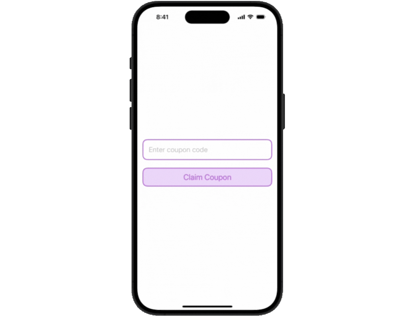
Pretty cool!
Final Thoughts
I've implemented something like this recently for a redemption button and it works really well, state changes are seamless. It's really awesome how SwiftUI makes it easy to create a reusable button and add additional configuration. I love it!
Have you implemented something like this in your app? Let me know, I'm interested to hear about different approaches.
Please feel free to reach out on X (Twitter) or Mastodon if you have any questions, comments, or feedback.
Thank you for reading!