
The Journey to Accessible Apps: Making Visual Text Accessible
In my last blog post, I talked about screen readers, a key assistive technology that provides an alternative to the visual user experience for app users. While screen readers may entirely replace the visual user interface for some, it is important to remember that they are complementary in many cases. Therefore, the visual user interface must be accessible to the wide range of sighted users, even without screen readers and related assistive tools.
Let’s take a closer look by investigating this example.
Note: For the purpose of this exercise, I will be showing screenshots of a .NET Multi-platform App UI (MAUI) app running on an Android mobile device. However, the tips in this post pertain to all mobile and desktop app frameworks and platforms.
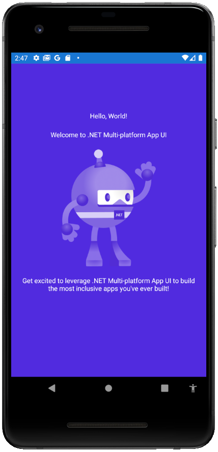
The screenshot above shows the first iteration of an app with three labels which read “Hello, World!”, “Welcome to .NET Multi-platform App UI”, and “Get excited to leverage .NET Multi-platform App UI to build the most inclusive apps you’ve ever built!” with an image of a dotnet bot positioned above the last label. Seems simple enough. Turning on a screen reader reveals that this app is already screen reader accessible as well; on Android, TalkBack reads back the text of all the labels and the semantic description set on the image.
However, a screen reader accessible app is not the equivalent of an app that is accessible and inclusive overall. While it is important for visual elements to also be audible and tactile, visual elements are not accessible to sighted users by their visual nature alone. After all, building inclusive, accessible apps is all about being able to support the incredibly wide ranging experiences of your app’s users.
Making visual text accessible
There are a ton of ways in which visual elements can be made more accessible in the way they are visually rendered. Considerations are incredibly wide-ranging, and for text alone, include readability, contrast ratios, sizing, text in images, and more, as specified by the Web Content Accessibility Guidelines (WCAG).
A quick look at this snippet of WCAG 2.1 for level AA conformance proves to be enormously helpful.
Success Criterion 1.4.3 Contrast (Minimum)
(Level AA)
The visual presentation of text and images of text has a contrast ratio of at least 4.5:1, except for the following:
- Large Text: Large-scale text and images of large-scale text have a contrast ratio of at least 3:1;
- Incidental: Text or images of text that are part of an inactive user interface component, that are pure decoration, that are not visible to anyone, or that are part of a picture that contains significant other visual content, have no contrast requirement.
- Logotypes: Text that is part of a logo or brand name has no contrast requirement.
Success Criterion 1.4.4 Resize text
(Level AA)
Except for captions and images of text, text can be resized without assistive technology up to 200 percent without loss of content or functionality.
Success Criterion 1.4.5 Images of Text
(Level AA)
If the technologies being used can achieve the visual presentation, text is used to convey information rather than images of text except for the following:
Customizable: The image of text can be visually customized to the user’s requirements;
Essential: A particular presentation of text is essential to the information being conveyed.
NOTE
Logotypes (text that is part of a logo or brand name) are considered essential.
Depending on what components make up your visual user interface, different criteria may be more or less relevant.
For our app, we can glean from these guidelines that our app can be made more accessible by:
- Improving the text’s font styles, sizes, and color contrast
- Ensuring the text can be resized
- Ensuring support of relevant assistive technologies
Now, let’s put these learnings into action!
In-app improvements to text
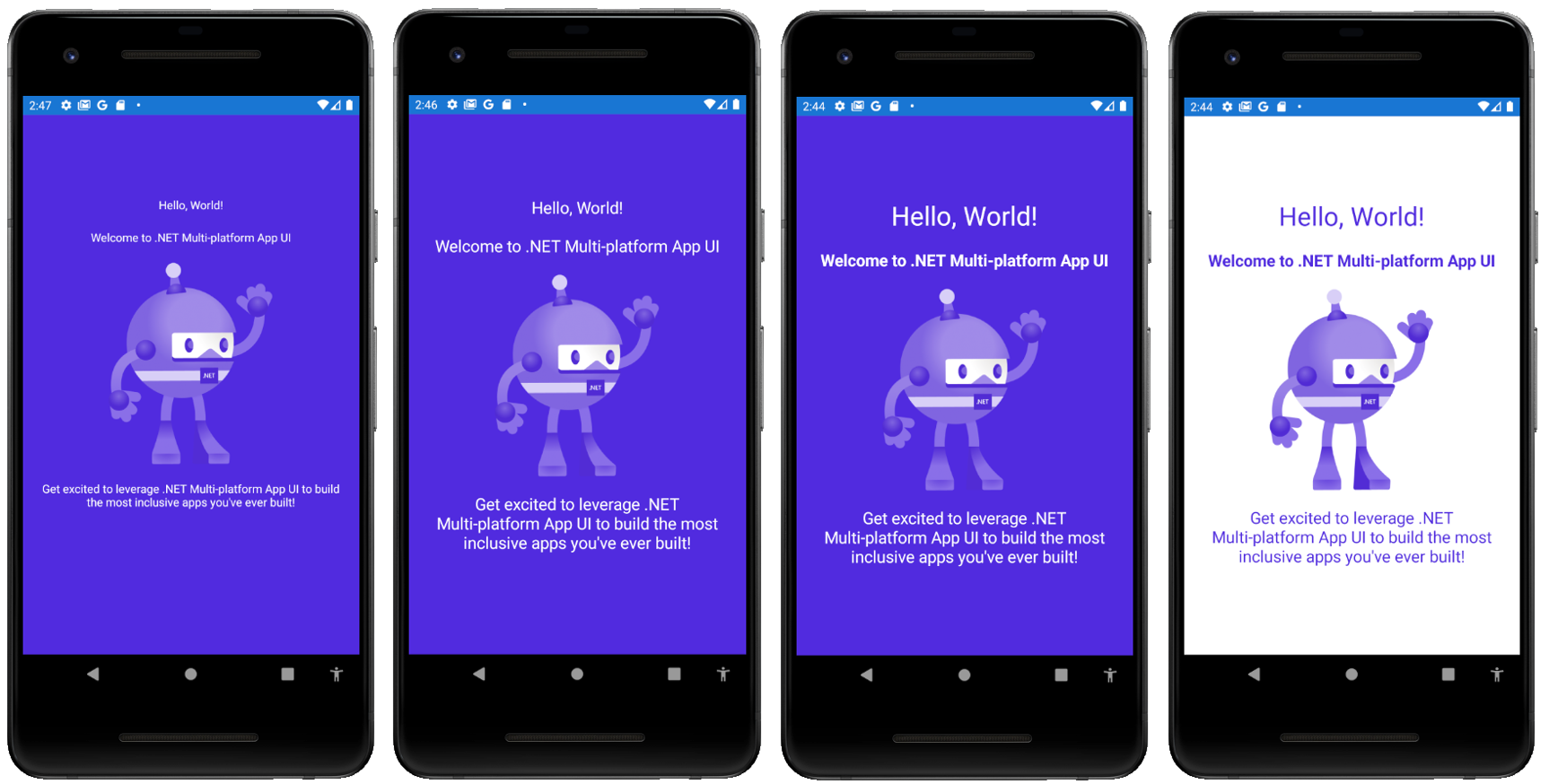
The screenshot above shows a series of small changes that were made to the app in order to improve its accessibility.
-
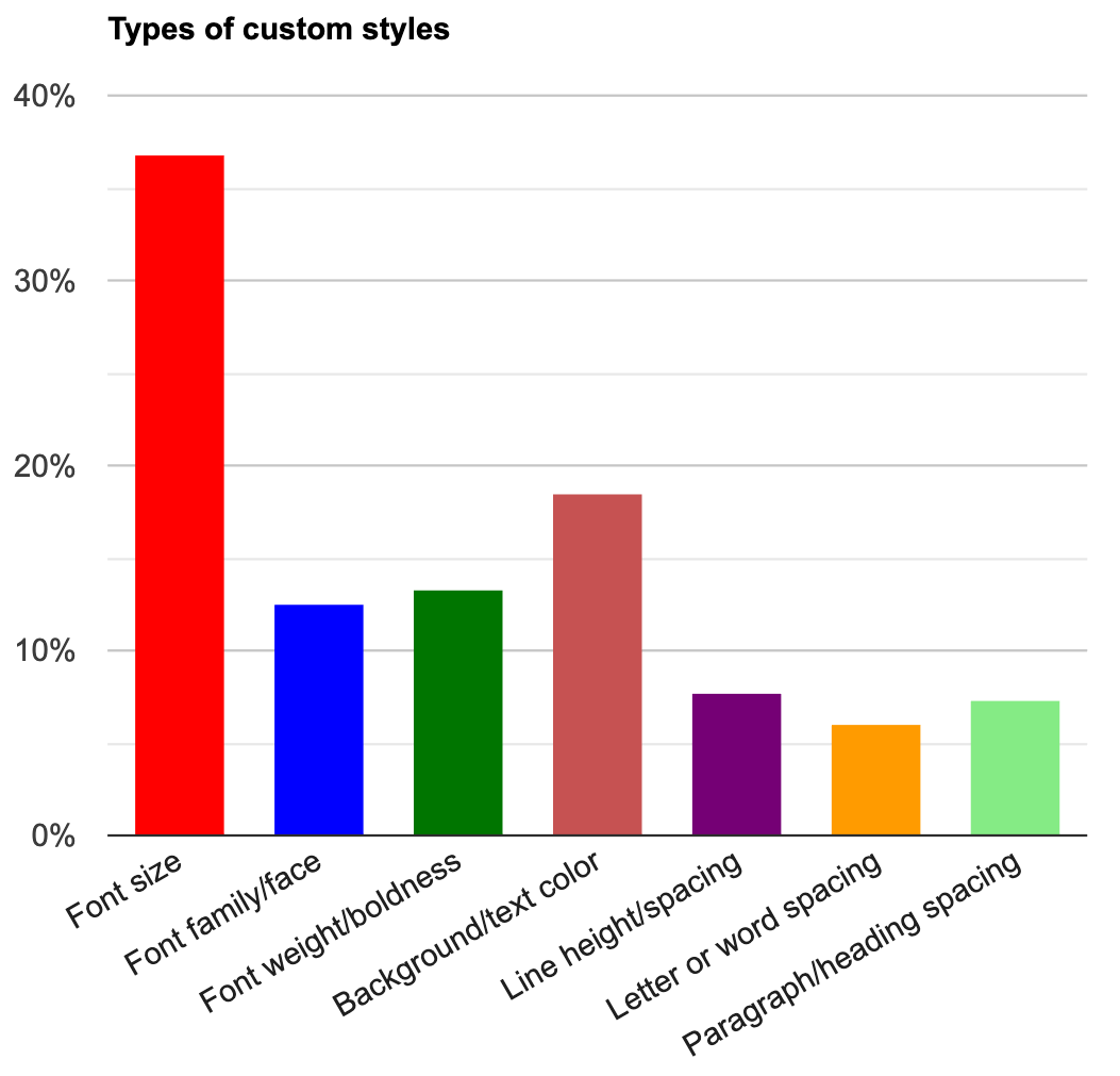
First, I increased the font size for all of the text labels. While the text may have previously met minimum text size requirements, the larger font size is now readable and more accessible to the large range of sighted users. According to Web Accessibility in Mind (WebAIM)’s Survey of Users with Low Vision #2, among users with low vision who opt for custom styles, 36.7% make changes to the font size. Increasing the font size wherever possible is one of the most critical ways in which visual text can be made more accessible.
-
Next, I emphasized the first two labels by increasing the font size further and making the font bolder, respectively. With these changes, the desired text will stand out more to users. By creating a greater sense of focus and precedence, the text becomes even more accessible.
-
Last but not least, I inverted the colors. The previously white on purple text is now purple on white. Although this doesn’t actually change the color contrast of the text at all, it makes a huge difference in the overall accessibility of the app.
-
The purple image, which previously did not have sufficient color contrast against the purple background, now meets color contrast requirements.
-
There tends to be a much greater preference for light text on dark background (71.2% according to the WebAIM survey) as opposed to dark text on light background. That being said, all high contrast modes and system themes should be supported.
-
Testing for accessibility
As always, when making improvements for accessibility, it’s crucial to test your app for accessibility not only manually, but also with the help of available tools. Accessibility Insights is one such tool we use at Microsoft, and that you can use to test your apps against as well! As shown in the screenshots below, the tool is able to catch accessibility issues like the one we just saw with color contrast.
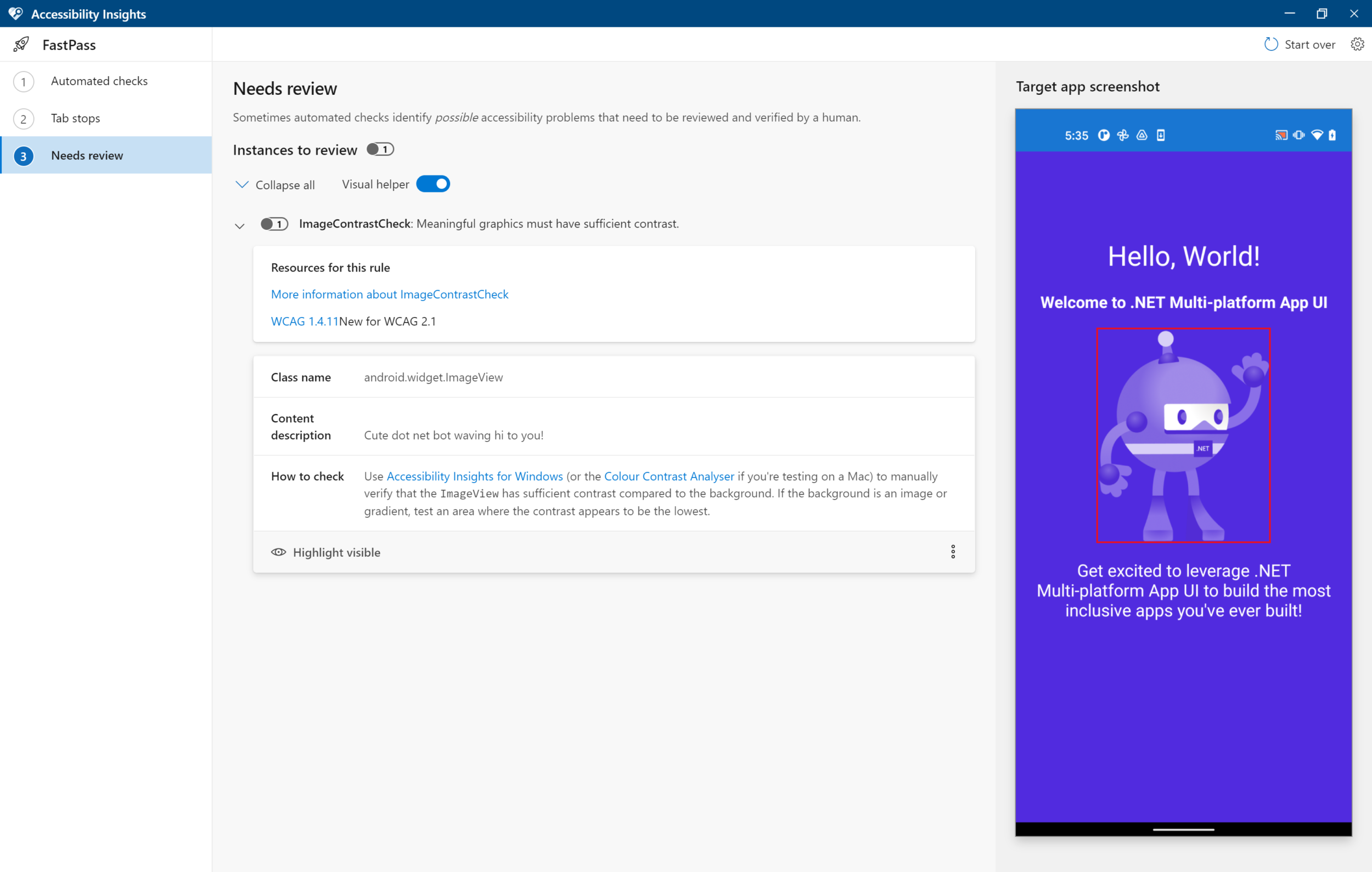
It highlights the image presenting the accessibility issues and informs us that it is lacking in sufficient contrast.
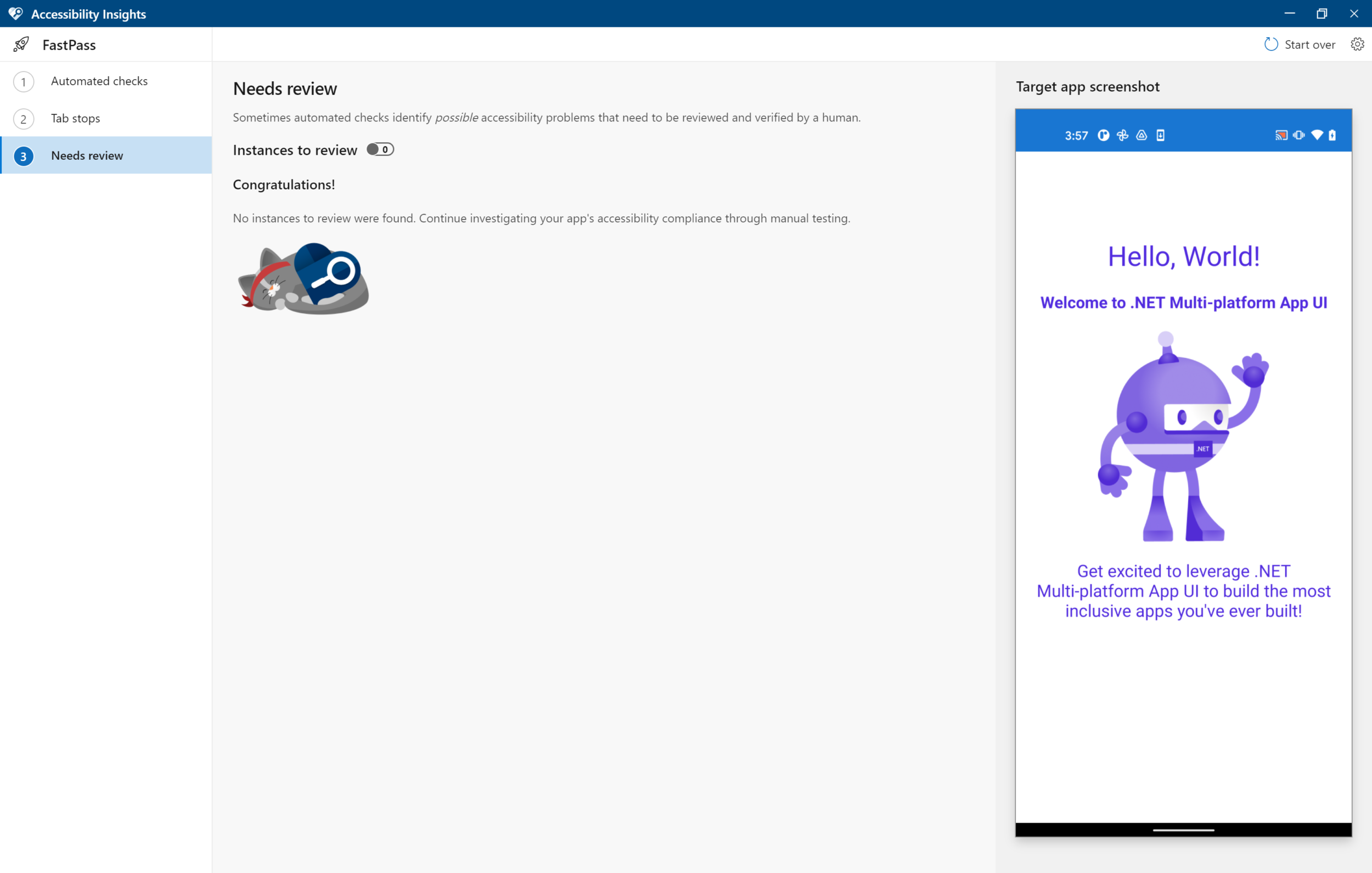
Once the appropriate fixes are made, the tool lets us know we’re good to go! As you can see, tools like Accessibility Insights make developing accessible apps a much more seamless experience.
Check out my last blog post on screen readers for more tools and tips on testing the accessibility of your apps.
Resizing dynamic text
Managing text size is another huge aspect of ensuring that visual text is accessible. In addition to meeting minimum text size requirement, and providing larger text where possible, it is also important to ensure that text can be resized according to users’ specific preferences.
When using your device, it is likely that you’ve switched the color theme, adjusted the brightness, or modified the display resolution before. These are just a few ways in which you may have manipulated your device to attain a visual user experience that better suits you and your circumstances.
Similarly, users have the capability of increasing font size from their device settings. (On Android, these settings can be adjusted under Settings > Display > Advanced > Font size or Settings > Accessibility > Display > Font size.)
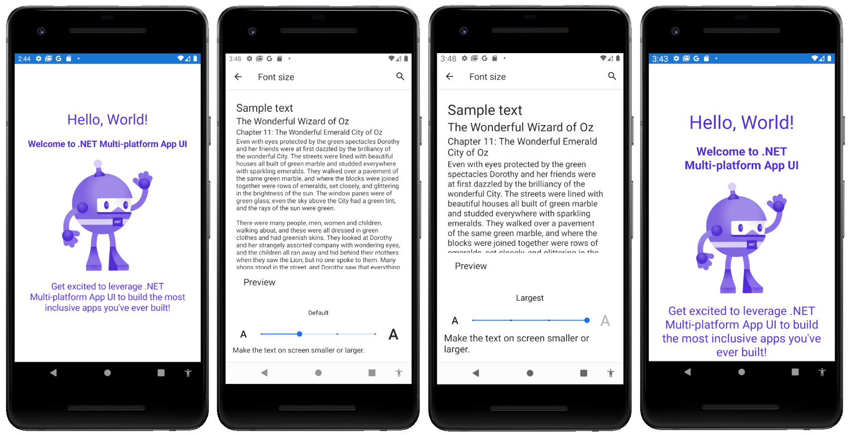
As shown above, adjustments made to these font size settings should be reflected in your app. The text labels dynamically update with the font size changes. While this is the default behavior we offer in .NET MAUI for both Android and iOS, it is still something that can be disabled and is a capability that is not automatically supported by all frameworks and platforms. As nifty as our device settings are, they only work as well as our apps allow them to. For WCAG compliance, you must ensure that your apps listen for each of your user’s individual preferences and also make adjustments where the settings may fall short.
Support with and without assistive technologies
As I’ve already reiterated in this post many times, screen reader accessibility is not to be conflated with general accessibility. While assistive technologies like screen readers can enhance the user experience, we as developers cannot rely on them. Assistive technologies are meant to be simply that: assistive.
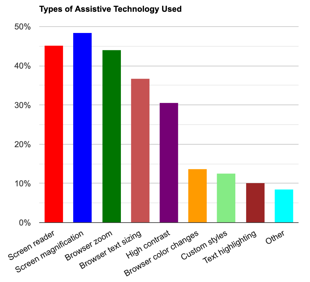
As captured in the above bar chart from WebAIM’s survey results, 45.2% of low vision users use screen readers, which means that the remaining 54.8% do not. Surpassing screen reader usage among low vision users is screen magnification or software settings.
As shown below, these features can be used to assist users in navigating apps that are already sufficiently accessible.

However, it simply would not be enough to rely on the fact that users can use magnification/zoom features to access in-app text. While it appears to be the most widely used assitive technology among low vision users at 48.4%, it still remains unused by an overwhelming 51.6%. It would be wrong to leave accessibility issues as they are just because assistive technologies appear to offer workarounds, especially as many users do not use any whatsoever. (With that logic, developers would be able to offer a visually blank screen filled with invisible elements that are still screen reader accessible!)
In short, developers should never justify their app’s shortcomings for any reason, and should always actively work to fix them instead.
Looking Forward to .NET MAUI
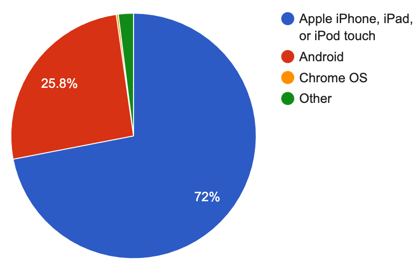
Among the various improvements to accessibility coming to .NET MAUI, our work with make visual text more accessible is one that I want to highlight. From our developer community’s experiences, we learned about how much Xamarin developers care about ensuring visual text is made more accessible by making them resizable. Whereas the dynamic text was automatically scalable on Android, this was not previously the case for iOS, due to differences in how the native platforms manage and calculate these properties. However, we realized the importance of supporting this capability on iOS, especially as according to WebAIM, “Apple dominates the mobile space for users with low vision” and “respondents who use iOS devices are more likely to use accessibility settings or software”.
In a recent PR, whose changes we are particularly excited about, the .NET MAUI team was able to work around native differences to offer a solution. All visual text rendered on both Android and iOS will now automatically scale; users of both platforms will see their font size settings accurately reflected in .NET MAUI apps. (And for the niche cases in which certain components may be more accessible when not scaled, the autoscaling can be disabled via a new FontAutoScalingEnabled property can be set to false.) .NET MAUI developers will not need to put in any extra work to make their text font sizes dynamically scale and with these updates, will be able to develop accessible apps much more seamlessly.
If you haven’t already, be sure to check out .NET MAUI Preview 7 to experiment with the various improvements to accessibility that our team is working on every day. And as always, stay tuned for the next blog posts in this accessibility series, reach out to join our monthly accessibility calls, and share all your thoughts and ideas with us in the comments, the .NET MAUI repo, Discord, and Twitter (@therachelkang)!
 Light
Light Dark
Dark
0 comments