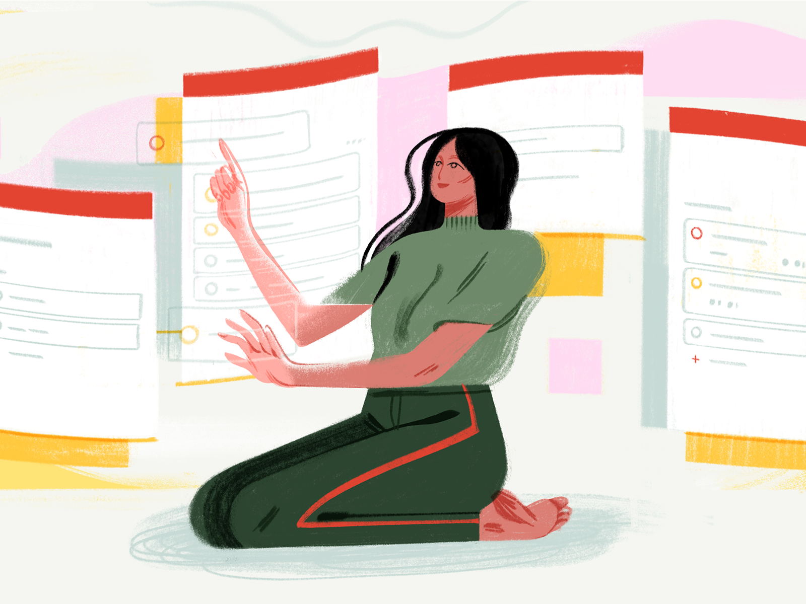
In this guest post, Product Designer at Doist Ben Breckler explains how to design a feature for an existing, popular product with an already active user base. Ben walks us through best practices and shares anecdotes from his time designing Boards, the latest feature for Todoist—a to-do list app with millions of users.
Adding a new feature to an app that people already love is hard. People are used to their existing workflows, they have expectations about how things work, they don’t like any kind of change, and your new feature has to live up to the standard of your previous releases. Early on in your product lifecycle, you can make big pivots without too many repercussions. Improving upon a mature product is another beast entirely. It’s impossible to make everyone happy, so how do you make design decisions that move your product forward to appeal to a wider audience without alienating your current user base?
At Doist, the product design team works through these challenges each time we make a change to Todoist—a to-do list app that 25 million people rely on every day to keep their lives organized. In this guide, I’ll walk you through designing a feature for an existing product with a passionate user base using our recent release of a new board view as an example. Boards is a new card-based view that allows you to switch from Todoist’s traditional task list view to a kanban-style column view.
In this article I’ll share my learnings from our design process, starting from the problem, defining our goals, early design iterations, feedback and research that led our design decisions all the way to shipping our final feature.
Let’s dive in and look at our design learnings and practices along the way, and how you can apply these lessons to your own products.
Step 1: Define the problem you’re trying to solve
With each new major feature, we start off by creating a product spec document to be shared internally. It helps us define the problem that our feature is trying to solve. We use the document as a starting point for our design solution. Our product spec is often made up of the following structure:
- User type
- User feedback
- A problem statement
- A high level outline of the solution
- A success criteria
- Requirements and deliverables

Product Spec snapshot
These details help us clarify what the designs should achieve. For example, our problem statements for Boards looked like this:
- When working with tasks, people didn’t have a way to track the different stages that a task goes through as it’s worked on. For example, it’d be nice to know if a task was in the New, In Progress, or Done stage.
- On a project level, people were missing an effective way to visualize their progress and reorganize tasks as the project evolved.
At Doist, we felt this pain ourselves as we work in small teams that collaborate on specific projects from 1-3 months at a time . While we were able to use filters and labels to stay organized, Todoist didn’t offer a straightforward solution to track the status of a task or progress of a project. We agreed to investigate a solution to this problem, which meant coming up with a significant new feature that wouldn’t get in the way of what people already loved about Todoist.
Step 2: Set clear goals and parameters for the update
With a problem to solve, we typically try to clarify the goals for the product, which we’ll refer back to throughout the process:
- A simple view that maintains the simplicity of Todoist
- The ability to drag and drop tasks wherever you need to
- View your projects grouped by Todoist sections by default
- Easily work with your teammates without complicating single-player use
Your organization may have standards that you follow that help inform how you’ll design your solution. For Boards, here are a few of those parameters we followed to stay in line with Todoist’s standards:
- Consistency and parity across all platforms
- Seamless switching between themes
- Works in every language
With these goals in hand, we start designing our solution.
Step 3: Learn from existing user feedback and metrics
Prior to designing a new feature, we take time to review current product feedback. This helps guide our decisions and eventually finalize our design. Feedback comes from many sources: support tickets, social media comments, analytics tools, user testing, and observations.
Here’s one of countless support tickets that asked us for kanban boards in Todoist:
“Todoist is great at managing individual tasks, but the vast majority of my work is in teams. Kanban boards would be more helpful to view the status of tasks. If each project could have boards that “hold” tasks, that would be awesome!”

User Request Quote
We found that a visual, kanban-style view of people’s projects was one of our most highly requested features, but that’s not enough to implement a feature. We had been considering whether Boards truly fit our product vision for a while, and this simply added one more reason to move ahead with it.
Eventually, the team agreed to move ahead and build the feature.
Step 4: Research the idea
Kanban is a productivity method that we wanted to integrate into Todoist to open up the product to more people who prefer this way of processing tasks. We researched the methodology and looked into the most popular kanban tools to understand and adapt common conventions. We started to think about what aspects of kanban would work well in Todoist. Specifically, we wanted a solution that preserved the simplicity of Todoist while also opening up the possibility to visualise projects and track tasks throughout a variety of workflows.
Step 5: Outline the solution in a low-fi way
In our product spec document, we first define a proposed solution in writing. We clarify the proposed idea, the requirements, and let the design and product teams come in to offer their feedback. Over time, we may include visual explorations, sketches on paper, digital drawings or rough mockups to help clarify the options and overall vision of the feature.
For Boards, our solution went like this:
The board view will provide an effective way to track and visualize the status of a task. As such, it will become easier to track each step of a project, re-arrange priorities if needed and easily stay up-to-date on the project’s progress. At a higher level, board view will help to consolidate Todoist’s position as a top-tier project management tool.


Board Low Fi Solution
Step 6: Test your mockups and get feedback early
Once you have a direction for your design, there’s nothing like a mockup to really bring an idea to life and know whether it feels right.
We started mocking up a design for Todoist Boards for the web platform to see if we could find a UX approach that worked. Once we had a basic understanding of the design language for Web we moved to mobile to see if the design held up on iOS and Android.
Once we were happy with the first design iteration, we shared it internally with the whole design team and other members of the company for the first round of feedback.

Early Board Mockup
It was here that Boards went through a number of detailed changes, from background color values to corner radius to padding changes. These adjustments were in line with our goal to keep consistency between list and board view and align functionality across all platforms.
Iterate designs based on feedback that aligns to the project goals
Throughout the feature development we went through different ways to collect feedback from internal team and users:
- Design reviews
- Development feedback
- Wider feedback from the company
- Individual user testing sessions
- Beta roll out
When we open up our design mockups to the rest of the team, lots of feedback rolls in. We look for patterns in the feedback to help guide the design. For Boards, we used a designated Todoist project to gather all the feedback in one place and then prioritize what we wanted to change and improve.

Feedback Project
To assess the feedback and determine how it fits into our feature, we refer back to the original product spec and check which feedback fits with the original goal of the feature. During the design process, as part of our goals and parameters we set at the start (see list above), we also focus on great platform parity first. Prioritizing for a consistent experience helps us ship a better first version of the feature across platforms.
For example, in the beginning of the project we were discussing the need for a zoom-out feature on mobile to get a birds eye view on smaller devices. The feature would offer great additional functionality but also introduce extra complexity and development time. Our product spec requirements stated that tasks and sections should be moveable, and we already achieved this goal without the zoom-out feature. In the end, we decided it was a nice-to-have feature and we wanted to make sure that we spent enough time to get the core features just right before moving to the nice-to-haves.
Based on the feedback for the internal squad, we chose to drop the zoom-out feature and moved onto refining the core features further. We still captured all relevant ideas and suggestions in a future backlog we could get to after the first version was released.
It’s easy to get overwhelmed and sidetracked by feedback, so it’s good to set certain expectations and goals towards what can or cannot be achieved—what’s core to fulfilling the goals laid out in the spec and what’s just nice-to-have.
Step 7: Create consistent components that work alongside your current product
A new feature is an exciting opportunity to offer additional value to users, but it’s still essential to maintain consistency with the legacy of the product.
For board view, we tried many different styles, components, and variations, but ultimately we wanted people to feel at home when they switched between the classic list view which has been the default for years, and the new board view. We wanted the experience to feel like a natural evolution of Todoist.
So we reused as many elements (colors, sizes, text styles, paddings, shadows) as possible and only introduced new components where absolutely necessary. This allowed us to find the balance between a new feature and a familiar experience.
Document edge-cases and all possible states of interactions
Our initial solution usually documents the most common use cases based on the goal we defined, but people use apps in so many different ways. We try to anticipate all of the possible paths people take with the product to ensure the experience is consistent across the board.
Documenting edge cases in detail helps create a more robust framework for the development team and ultimately makes for a better experience in the end. For Boards, we documented many different cases, from interactive states (idle, hover, pressed, dragged) for task cards, to empty views, edit and scrolled states, and more.


Interactive States
As Todoist supports 18 languages, edge cases can also occur through localisation. Different language strings might not fit into the same space that the designer intended to have. So for boards, we tested with different language strings and made sure that the elements would truncate or wrap onto a new line and that content would reflow nicely.
Test on all platforms and iterate with the development team
Testing designs natively on each platform is essential—you can’t simply eyeball your design from desktop. We use mirror apps from our design tool to preview the latest mockups to spot issues with sizing, color and interaction that weren’t immediately obvious while designing on our computer monitors.
At a later stage when the designs are being brought to life, we also review internal implementations of the live builds to spot any differences from the documented designs or test ideas and values that we were unsure about.

Shadow Values
For Boards, we tested out multiple shadow values of the task card component across platforms to find the right contrast ratio while trying to maintain a minimal aesthetic.
Step 8: Follow the latest platform guidelines and accessibility standards
When designing a new feature, we go back and brush up on the latest platform guidelines. Apple, Google, Microsoft all have well documented resources that help designers create better experiences.
Knowing the latest standards helps us make the right choices for our design solutions and creates a blended solution between the platform and the product. Along with the latest platform guidelines, we also frequently discuss and check accessibility standards in our design process.
In all of our products, we try to find a solution that can be used by anyone—good contrast ratios in color, well-sized text styles, and comfortable touch targets, amongst others should be a default in the anatomy of any new feature.
Step 9: Create consistency across platforms
Our products, Todoist and Twist, work across desktop, web, iOS, and Android. It’s important to create consistency and parity across platforms to provide a reliable and seamless experience to people across different device types.
While we usually start with one platform and define the solution fully, we quickly move on to other platforms to see if the solution holds up. For example, with Boards we went through many different iterations of the ‘Add task’ button, where it should be located and if all platforms should adopt the same solution. In the case of our ‘Add task’ button we moved away from the FAB (Floating Action Button) because we needed to have a dedicated ‘Add task’ button for each column so a task can be added directly inline. On mobile the FAB could still work but on tablet a single FAB would have caused confusion as to which section the task would be added to. We experimented with different colors and stylings to bridge the gap between the FAB and a regular button but in the end we opted for a solution that was most consistent with the inline ‘Add task’ button on desktop. Sometimes trade-offs are made but we try to keep the components the same wherever possible.

Add Task Button ideas.
Step 10: Consider how your designs work in dark mode
Todoist comes with a range of themes that people can select from. Dark mode is one of the themes that has proven very popular with our users.
When we started designing the new board view, we knew it had to work well in dark mode too. We had an existing set of color values for dark mode that we could reuse for board view but some values – like border styles and shadows –needed to be tweaked to work well with the new task card components.
Documenting dark mode and supporting it for new features helps us provide an extra level of polish to the user so they can take advantage of the new feature at any time of day or simply switch to customise the app to their preference.

Designing a new feature is a balancing act. It often requires careful consideration of design intention, development impact, user needs and expectations of the current product. Before diving into your designs too quickly, try to clarify your deliverables and reference your goals whenever a new decision or tradeoff is made, find feedback from existing users, experiment with different ideas and see which one fits the problem best.
There might not be a perfect solution but one that works well enough. Keep iterating the feature and improve it over time. Design is never done ■
 About the author: Ben Breckler, Product Designer at Doist for Todoist & Twist. Ben is based in Luxembourg, working remotely since 2012. He is passionate about brining digital products to life through interactive prototypes and motion design.
Find more Process stories on our blog Courtside. Have a suggestion? Contact stories@dribbble.com.


