
Football Analytics: Using R and FBref Data - Part 1
This is the first part of a series of posts that will illustrate how to install R, set up RStudio, and go from a table with some football-related metrics to a compelling visualisation to analyse English Premier League teams' performance.


I'm by no means an expert either in football or coding, but I've recently started learning R, and I've reached a decent level of proficiency. Given the growing interest in Football Analytics and Football Data Visualisations, I wanted to share my knowledge. Hopefully, this is helpful for your learning too.
This post will walk you through how to install R, set up RStudio, and create a scatter plot to analyse football (or soccer for our American friends) teams' performance.
This is part of a series of posts that will illustrate how to go from a table with some football-related metrics to a compelling visualisation like the one above. Charts usually contain much more insights than a table and they are immediately digestible at first glance.
A bit of theory first
What is a scatter plot? It is a graph in which the values of two variables are plotted on two axes. If you have two numeric variables, plotting them on a scatter diagram is an excellent way to view their relationship and see if there's any correlation between the two.
To create our chart, we will use a programming language named R, which was developed specifically for statistical computing and graphics. If you've ever coded at some point in your life/career, you'll find R relatively easy to pick up. Also, RStudio, the Integrated Development Environment (IDE) we will use to edit and compile the instructions, is great and will do most of the heavy lifting for you.
Our use case is centred around Expected Goals (xG) which will help us to analyse how the different teams perform compared to the results they're getting. Football games are affected by randomness, and xG aims at stripping the component of luck and measure the performance instead of the results. xG is a metric from 0 to 1 that estimates the likelihood (probability) of a particular shot ending up as a goal. Different components are taken into account to compute xG, but the main one is the position on the pitch where the shot was taken.
A more accurate analysis is given by non-penalty xG (npxG), which doesn't account for penalties, and it's only about open play chances. This is the metric that we will focus on. Thus, in our scenario, the two variables that will be part of the scatter plot will be non-penalty Goals (npG) and non-penalty Expected Goals (npxG), respectively.
Setup RStudio
Firstly, you need to install R, which you can download from here: https://cran.r-project.org/mirrors.html depending on where you're based. The installation comes with the base system, which is composed of binaries and standard packages.
Also, very likely you don't want to enter commands in the terminal but a nice visual editor. So, for the next step, you need to download the free version of RStudio available at this link: https://www.rstudio.com/products/rstudio/download/. This is an editor that will make your life incredibly easy-R (sorry, I couldn't resist).
The first time you open RStudio, you are presented with something like the following:
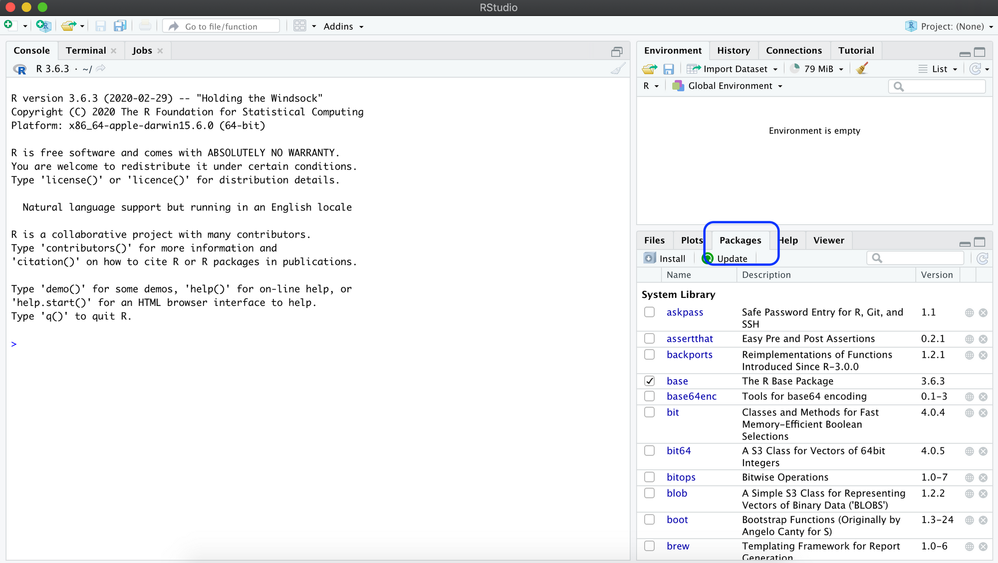
In particular, make sure you can see the "Packages" tab which we will use next to install the tidyverse library. This is actually a collection of packages that allows you to model, manipulate and visualise data. To install it, just click on "Install" and type tidyverse.
At this point, our coding environment is setup, and we're on to the fun part.
Pull data from FBref
We will rely on FBref.com for our dataset. This is a free website that offers a plethora of statistics across all the football leagues, teams and players you can think of. For our specific use case, we are going to retrieve npxG, Goals and Penalties of each team for the current 2021-2022 English Premier League season (7 Gameweeks played so far).
Head to the Squad Shooting table, toggle per90 stats to convert the stats to a per-90 value, sort by npxG and remove non-interesting columns.
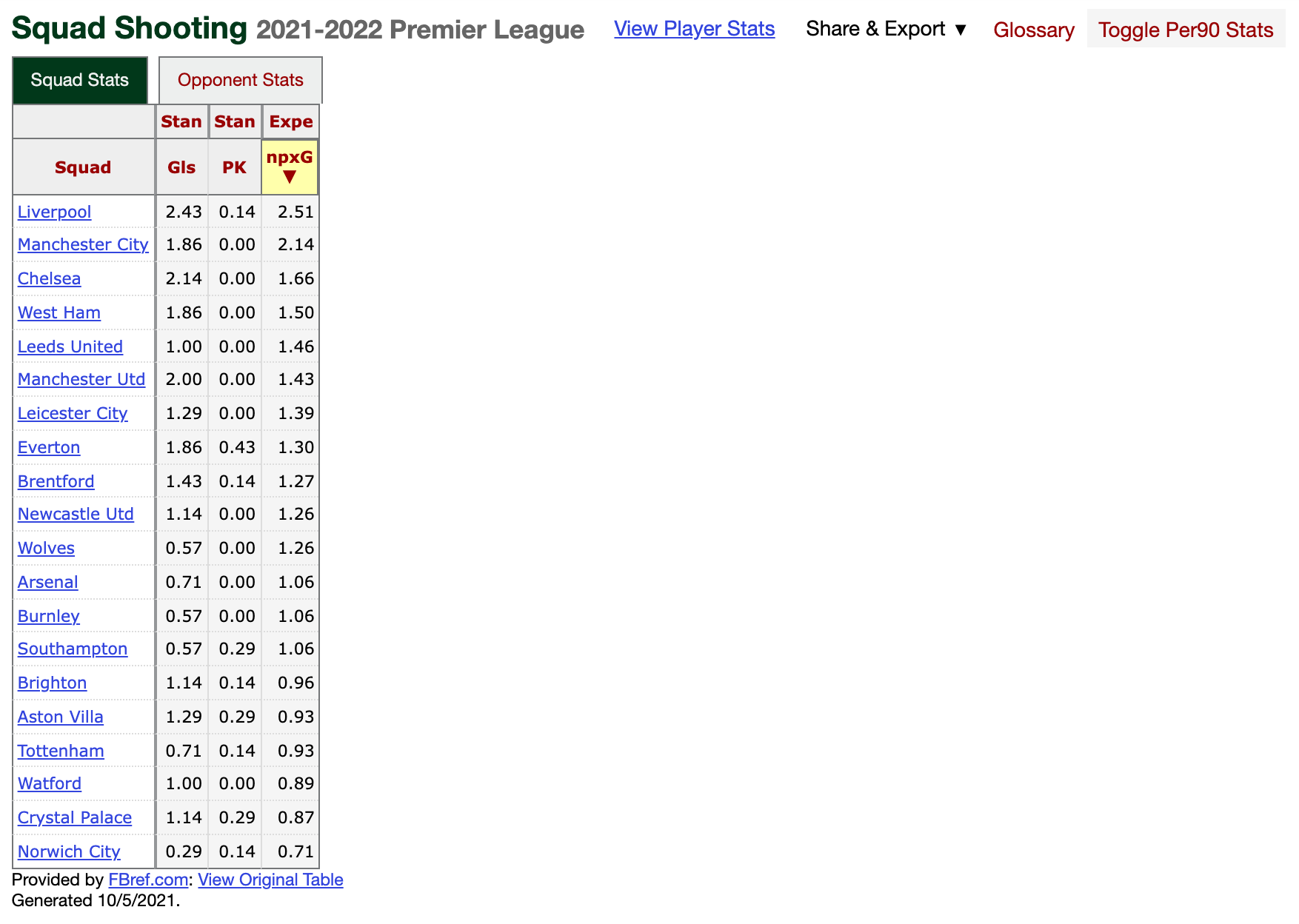
Click on "Share & Export", and save the data as a CSV.
Next is where we can finally get our hands dirty with some coding.
Visualise the data
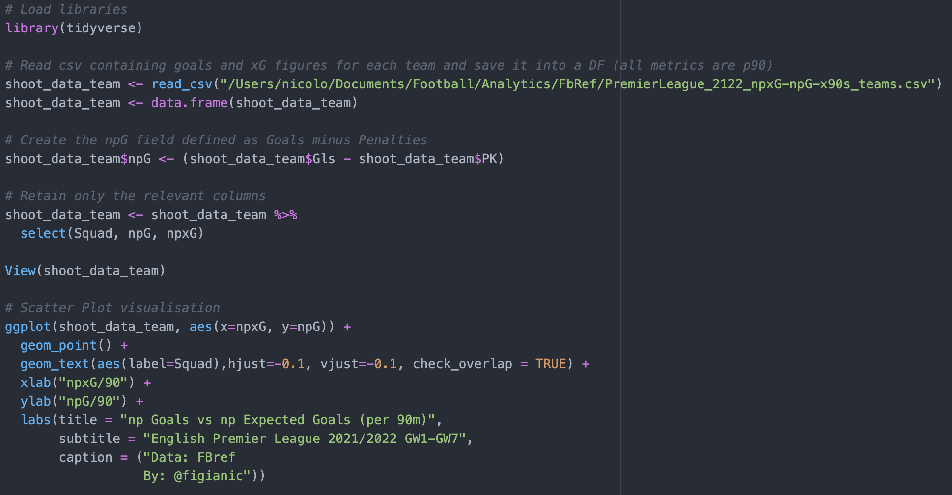
Firstly, we need to load the tidyverse library:
# Load libraries
library(tidyverse)
Then, we import the content of the CSV file we just exported, and we load it into a Data Frame (DF). This is easily done in RStudio with the 2 following instructions:
# Read csv containing goals and xG figures for each team and save it into a DF
shoot_data_team <- read_csv("/Users/nicolo/Documents/Football/Analytics/FbRef/PremierLeague_2122_npxG-npG-x90s_teams.csv")
shoot_data_team <- data.frame(shoot_data_team)
You can review the content of the DF with the following instruction:
View(shoot_data_team)Next, we need to compute the non-penalty Goals (npG) starting from Goals (Gls) and Penalties (PK). Again, this is easily done in R by using the $ operator to access the specific columns of the DF:
# Create the npG field defined as Goals minus Penalties
shoot_data_team$npG <- (shoot_data_team$Gls - shoot_data_team$PK)
Now, the final step. This is where we create the scatter plot to visualise the data:
# Scatter Plot visualisation
ggplot(shoot_data_team, aes(x=npxG, y=npG)) +
  geom_point() +
  geom_text(aes(label=Squad),hjust=-0.1, vjust=-0.1, check_overlap = TRUE) +
  xlab("npxG/90") +
  ylab("npG/90") +
  labs(title = "np Goals vs np Expected Goals (per 90 m)",
       subtitle = "English Premier League 2021/2022 GW1-GW7",
       caption = ("Data: FBref
                  By: @figianic"))
In particular:
- 1st line: This is where the magic happens thanks to ggplot. You need to specify the DF you want to plot along with the field name for x and y coordinates
- 2nd line: This is to draw the actual data points
- 3rd: This is to style the name of the teams you see in the plot. check_overlap=TRUE allows discarding unreadable overlapping text (you will note a few dots without the label, this is why). Try to set it to FALSE, re-run the plot and see what happens
- The other lines are for axis, title and subtitle styling
By running the code above, you should obtain a scatter plot like the one below.
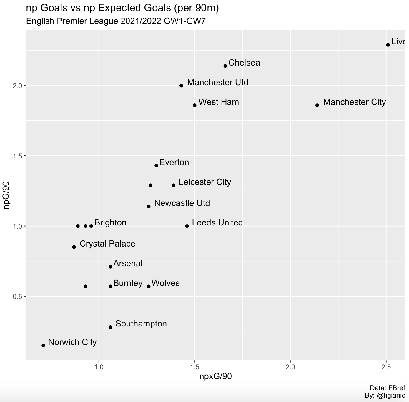
This requires a celebration! You have just plotted the np expected goals and np goals for each Premier League team.
Despite it's a small dataset (only 7 gameweeks), we can still notice some interesting insights from the chart above:
- Most of the team are performing better than their actual results (npxG > npG)
- Liverpool are on another planet with the highest npxG value, and they're not even getting the results they would deserve for the chances they create
- Cristiano Ronaldo's impact is reflected into Manchester United being the most clinical team with +0.57 goals (half a goal) scored per game more than the chances they create
- With more than 1 xG but only 0.28 goals scored per game, it seems Southampton are struggling to convert chances after Danny Ing's departure
- Arsenal and Spurs are not yet consistent in terms of both creativity and scoring
Below, you can see the full code:
Hopefully, this piqued your interest and triggered your curiosity. When it comes to football visualisations, the sky is the limit!
I'm still learning and trying to improve my knowledge as well. My suggestion for you is to inspect the code above, edit it to suit your needs, break things and fix them. This will allow you to learn faster.
In the next post, we'll see how to style the plot we just created to make it more compelling. We'll also see how we can use team logos instead of bland data points.
Stay tuned! Share my work on Twitter (@figianic) if you found it interesting, and reach out if you need any help, and I'll try to assist if I can!