** This is a write up of work in progress talk I gave at the Web London meetup last year. **
I read a book one time called 'Refactoring your wetware'. There was an interesting part about thinking about a problem as if you were looking at it from 10 thousand feet up in the air.
I was driving in Sunday morning traffic one time. I was on my way from San Francisco to a flea market. The GPS in my car told me there was an exit coming up I should take and that I should get into one of the two lanes on the right. About a dozen blinkers turned on at the exact same time and cars started to merge into the right two lanes. From 10k feet up i bet that looks pretty wild. You hear an automated voice. All cars put on their blinker at the same time to break off from the highway to head to the same destination.
Two completely different view points


I'm here to talk about Design systems, Css, Js and of course Css in Js. And what does that look like if we as a community try to think at 10,000 feet?
When I say 10,000 feet I don't just mean think abstractly. I mean actually do it. You should visualize yourself being far above something. But what is the thing? One thing I meditate on is looking at a timeline of history from very far away. And if we look at a timeline of how humans have designed and built things throughout history...how do the problems and the process in which we solve them evolve? Particularly since we started styling digital ui with css?
A guy I collaborate with that goes by the name John Otander (@johno) is pretty good at thinking at 10,000 feet. He comes up with wild ideas. Last year he decided to download the css for top million websites, in 1 month intervals, dating back to 2005 (if available).
My first thought was - that's pretty neat. We can show people their css graphed out over time.
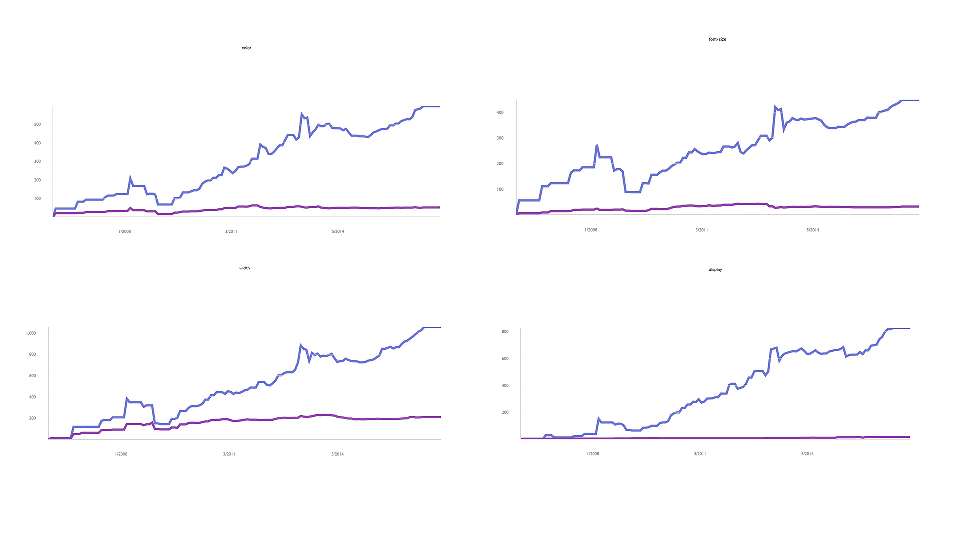

You can learn a bunch just by analyzing your own site. But, what does it look like to see this at 10,000 feet?
[Ask Audience] What do you think you could learn by analyzing this data? What kind of tools could you build with it?
Some possibilities that come to mind for me:
- Can analyze values and look for trends
- Find most common property value rules for given components with common class names
- Identify pattern outliers
- Find common mistakes and try to build automated tools to solve them
- Could overlay other data: Browser usage, timeline of introduction of various technologies (frameworks, addiitons to the spec, etc.)
- We can visualize the history of design systems. We can animate them and watch how they evolve over time!
- Given an array of urls, you could visualize the intersection of common values for things like: type scale, colors, background colors, font-family. This can help show how consistently your brand is implmented across a number of different front-end code bases. Most companies have different code bases for: their marketing site, their blog, their app, docs, external status page, and potentially a number of other micro sites. Having a feedback loop of common values can be helpful when trying to standardize an existing palette, or creating a feedback loop moving forward to see if you are becoming more or less consistent.
Harley Turan, scraped a bunch of data and did exactly this. Here is a collection of color palettes pulled from multiple sites that belong to the same company visualized from 2009 through 2017.

Now those are just a few half-baked ideas around what you can do to analyze static files. And I'd love to do nothing else then to sit and chat about what we can do with all of this data but that's a different story for a different time.
Below is a list of css properties. I often think of css as the styling api for html. At first glance it's a lot of stuff. Especially if you're a beginner.
But you can build a lot of pretty neat UI without worrying about a lot of these properties and how they work. When I am a beginner one of the most difficult things is figuring out what to worry about and what not to. I can confidently say, when styling a button, I've never needed to set caption-side. Or counter-increment, counter-reset, or volume for that matter. This doesn't mean you should never use them, but they aren't common properties attached to button styles.
Can we use this pattern to potentially make front-end code more accessible for new people?
Components could, essentially have all of the necessary visual styling properties exposed, where a designer can configure the values they want to pass in.
Instead of a blank slate, they could discover common things to account for within different components. The pseudo state :focus would be a tough thing to intuitively account for if you've never worked on the web before. Offering it in configuration can at the very least, offer guidance around what to research.
List of Css properties
accelerator
azimuth
background
background-attachment
background-color
background-image
background-position
background-position-x
background-position-y
background-repeat
behavior
border
border-bottom
border-bottom-color
border-bottom-style
border-bottom-width
border-collapse
border-color
border-left
border-left-color
border-left-style
border-left-width
border-right
border-right-color
border-right-style
border-right-width
border-spacing
border-style
border-top
border-top-color
border-top-style
border-top-width
border-width
bottom
caption-side
clear
clip
color
content
counter-increment
counter-reset
cue
cue-after
cue-before
cursor
direction
display
elevation
empty-cells
filter
float
font
font-family
font-size
font-size-adjust
font-stretch
font-style
font-variant
font-weight
height
ime-mode
include-source
layer-background-color
layer-background-image
layout-flow
layout-grid
layout-grid-char
layout-grid-char-spacing
layout-grid-line
layout-grid-mode
layout-grid-type
left
letter-spacing
line-break
line-height
list-style
list-style-image
list-style-position
list-style-type
margin
margin-bottom
margin-left
margin-right
margin-top
marker-offset
marks
max-height
max-width
min-height
min-width
orphans
outline
outline-color
outline-style
outline-width
overflow
overflow-X
overflow-Y
padding
padding-bottom
padding-left
padding-right
padding-top
page
page-break-after
page-break-before
page-break-inside
pause
pause-after
pause-before
pitch
pitch-range
play-during
position
quotes
-replace
richness
right
ruby-align
ruby-overhang
ruby-position
-set-link-source
size
speak
speak-header
speak-numeral
speak-punctuation
speech-rate
stress
scrollbar-arrow-color
scrollbar-base-color
scrollbar-dark-shadow-color
scrollbar-face-color
scrollbar-highlight-color
scrollbar-shadow-color
scrollbar-3d-light-color
scrollbar-track-color
table-layout
text-align
text-align-last
text-decoration
text-indent
text-justify
text-overflow
text-shadow
text-transform
text-autospace
text-kashida-space
text-underline-position
top
unicode-bidi
-use-link-source
vertical-align
visibility
voice-family
volume
white-space
widows
width
word-break
word-spacing
word-wrap
writing-mode
z-index
zoom
Some people jxnblk have told me that Component Styling API is a horrible name for this concept and he's likely correct. Regardless, I think the following descriptions, from a website called wikipedia, are interesting to consider.
API: Application programming interface
"In general terms, it is a set of clearly defined methods of communication between various software components."
"By abstracting the underlying implementation and only exposing objects or actions the developer needs, an API simplifies programming."
"Thus, the design of an API attempts to provide only the tools a user would expect."
https://en.wikipedia.org/wiki/Application_programming_interface
When I'm styling a button, I don't expect to use volume. Or page-break. Or a number of other properties. The goal though is not to eliminate options, it's to narrow focus on the essential, allowing for expansion and exploration if necessary. But this idea defining a component API has benefits extending beyond this.
The most influential tip on how to think about designing a component I've ever seen is from Nicole Sullivan's excellent article The media object saves hundreds of lines of code
"When I’m building a new object, the first thing I do is to figure out which parts are reusable components, and define what I know and do not know about them." "For example: Can be nested, Optional right button, Must clearfix"
I can't recommend this process for designing and developing components enough. One of the things I like about react and css in js, is that it's easy to work within this mental model. It's helpful to actively think and sketch out what you know and what you don't know. This can help you build components that are more resiliant, flexible, and reusable.
So, say we defined some scales, or options to work with for the following properties.
- Font-family
- Line-height
- Type-scale
- Measure (max line length)
- Font Weights
- Text Transform
- Spacing
- Width
- Colors
- Border Widths
- Border Colors
- Border Radii
- Box Shadows
- Animation speed
- Easing Functions
- Movement patterns
Maybe this would look something like this
const theme = {
  breakpoints: [
    36, 48, 64
  ],
  fontFamily:[ '"Gotham", "Avenir Next", "Proxima Nova",  "Helvetica"' ],
  fontSize: [
    12, 14, 16, 20, 24, 32, 48, 64, 96, 128
  ],
  fontWeight: [ 400, 600, 700 ],
  lineHeight: [ 1, 1.25, 1.5 ],
  colors: [
    { text: "#000", bg: "#fff" },
    { text: "#374047", bg: "#f8f9f9" },
    { text: "#7f8a93", bg: "#f8f9f9" },
    { text: "#0077cc", bg: "#f8f9f9" },
    { text: "#005da0", bg: "#f8f9f9" },
    { text: "#00365d", bg: "#f8f9f9" },
    { text: "#00a243", bg: "#fff" },
  ],
  borderStyle: [
    'solid',
    'double',
    'dotted'
  ],
  borderWidth: [ 0, 1, 2, 4 ],
  borderDirection: [
    'all',
    'top',
    'bottom'
  ],
  radii: [
    0, 3, 5, 17, 9999
  ],
  space: [
    0, 2, 4, 8, 16, 32, 64, 128, 256, 512
  ],
  measure: [ '20em', '30em', '34em' ],
  boxShadow: [ '0 0 16px rgba(0,0,0,.2)' ],
}

export default theme
Some of you might have already seen a file like this before. Maybe it was a js file, maybe it was a sass, less, or stylus file. This is pretty boring and there isn't anything new about it. It's just a theme.
Thinking about the previous quote by Nicole Sullivan... What if I had to design a button and I wanted it to use values from our design system. We could define the styling API for a button. (People love buttons.) Potentially, we could define a template for a button styling API. So we'd need to think about which properties we always want exposed. I think it's safe to say that people should be able to set the background color on a button. The default color isn't perfect or anything. It's reasonable for a well designed interface to have buttons with different background colors. As a section in the button API we'd also want to declare which properties should be available to style on hover. I believe it's reasonable to change the background color on hover. So I think that should also be a part of the API. Returning to the base part of the button API, it would be seemingly reasonable to be able to set the font-weight to something other than the default. In all my years of browsing the web I've never hovered on a button and seen the font-weight change and thought "This is so nice." My first thought is generally "Well this must be a bug." So here we could choose to leave font-weight out of the hover, focus, and active sections in the API.
A generic template for a button styling API might look like this:
import theme from './theme'

const buttonThemeTemplate = {

  // Typography
  fontFamily: [ ],
  fontSize: [ ],
  fontWeight: [ ],
  textTransform: [ ],

  // Palette
  colors: [ ],
  backgroundColors: [ ],

  // Borders
  borderColors: [ ]
  borderRadius: [ ],
  borderStyle: [ ],
  borderWidth: [ ],
  borderDirections: [ ],

  // Spacing
  paddingTop: [],
  paddingLeft: [],
  paddingBottom: [],
  paddingRight: [],

  // Hover states
  hoverColor: [ ],
  hoverBg: [ ],
  hoverBoxShadow: [ ],
  hoverBorderColor: [ ],
  hoverSize: [ ],

  // Focus states
  focusColor: [ ],
  focusBg: [ ],
  focusBorderColor: [ ],
  focusBoxShadow: [ ],
  focusSize: [ ],

  // Focus states
  activeColor: [ ],
  activeBg: [ ],
  activeBorderColor: [ ],
  activeBoxShadow: [ ],
  activeSize: [ ],

  transitionProperty: [ ],
  transitionDuration: [ ],
  transitionTimingFunction: [ ],
}

export default buttonThemeTemplate
Then we could define what values we want to pass in. We might pass in an entire array, declare literal values, pass in a filtered array. We have javascript. We can do whatever we want!
import theme from './theme'

const buttonTheme = {
  radii: theme.radii, // Entire scale
  space: [
    // Explicit steps from the scale
    theme.space[3],
    theme.space[4],
  ],
  fontSize: theme.fontSize.slice(0,-8), // Everything but the last 8 steps in the scale
  fontFamily: theme.fontFamily[0], // An explicit step in the scale
  borderStyle: [
    theme.borderStyle[0],
    theme.borderStyle[1]
  ],
  borderWidth: theme.borderWidth,
  fontWeight: theme.fontWeight,
  colors: theme.colors,
  backgroundColors: theme.colors,

  // hover, focus, active states

  hoverColor: [
    theme.colors[0].text,
    theme.colors[1].text
  ],
  hoverBgColor: [
    theme.colors[0].bg,
    theme.colors[0].bg
  ],
  focusColor: [
    theme.colors[1].text,
    theme.colors[1].bg
  ],
  textTransform: ['uppercase', 'capitalized'],
  transitionProperty: ['opacity', 'color', 'background-color'],
  transitionDuration: ['.25s'],
  transitionTimingFunction: ['ease-out'],
}

export default buttonTheme
As a design community, we could make boilerplate config files for common ui components. Over time we could reinvent fewer and fewer wheels. This would allow us to go deeper on other areas that haven't been explored as much as button styles.
This is where I think it gets really interesting.
Now we have a system. We can use combinational logic to generate all possible combinations of buttons given the input provided by a theme file. We could also use this pattern to create a finite state machine, and visualize transitions between any discrete state a given component can be in.
A simple config file like this generates thousands and thousands of button designs. Here is an example of generating avatars and buttons.
https://examples-jchwaftrgo.now.sh
Or we can make this a finite state machine and animate between the options. You know, if you don't like scrolling for days and days and days. (Again, animation created & provided by the one and only Harley Turan).
https://examples-wrjcynrjhj.now.sh
Let's step back and think at ten thousand feet again.
- We can show how many options a design system can generate. This can be helpful because some people feel they might be constrained by working with defined scales. This can help show how varied their visual designs can still be. A lot of people still haven't worked with scales and as a creative person constraint can be scary at first.
- We can quickly identify desirable regions, which can help us quickly discover patterns of inputs needed for a desired output. This can expose properties you might want to couple together and set rules for. Sense of proportion can change dramatically at each end of the scale.
- Could automatically a/b test design options with real user metrics
- Wire up options to an interface that allows for collaborative voting on which component variations feel most on brand. You could even hook this voting up to a neural network.
- One of if not the most difficult part about image classification is coming up with the training data.
The generated data could help train an image classifier which will in turn
help audit existing UI on websites. Imagine being able to input a url and
query the design with questions lke:
- "Show me all of the buttons."
- "Show me all of the orange buttons."
- "Show me all of the buttons that have inaccessible color combinations."
This is an exciting reality to live in. We can more quickly generate lots of design options to test with real users. We can shorten the feedback loop around discovering what matters and what doesn't. This is a stark contrast to our current reality, which is that most designs we ship have not been validated with real users. We don't design multiple options in parallel. We end up designing a single option that is optimized for getting stakeholder signoff in a series of status meetings.
But at the very least this concept is exciting to me because I'm very lazy and I don't want to design buttons anymore.