Making Our Patterns More Accessible

Cloud Four’s accessibility best practices have changed a lot in the last five years. Back then, we focused on crafting semantic markup, writing fallbacks for images and iconography, keeping focus outlines intact, avoiding icon fonts, and using progressive enhancement wherever we could.
In our defense, that’s still a pretty good baseline! But the work of folks like Marcy Sutton, Heydon Pickering and Léonie Watson opened our eyes to how much more we could do.
Today, I’m proud to say we treat accessibility as more than a technical requirement: It’s a consistent acknowledgement of our audience’s diversity that starts with discovery and persists through delivery. It’s become a natural extension of what we believe and the principles that inspired our open device lab.
In honor of Global Accessibility Awareness Day, I thought it might be fun to quantify our evolution by previewing the accessibility improvements we’re in the process of making today to the Cloud Four patterns we debuted four years ago. (These changes haven’t made it to our live site yet, but we’re fans of sharing our works in progress.)
Higher Contrast
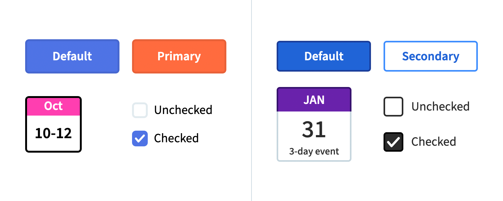
Back in 2016, we arrived at our color palette through a collaborative process of element collaging, but we failed to test our color combinations for contrast. We’ve made some small modifications since then to improve readability of the most common elements, but those one-off changes disrupted our palette’s visual harmony.
Our new palette has been redesigned from the ground up with contrast in mind. Different hues and values are documented with accessibility notes highlighting which are appropriate for text versus purely visual details like accents and illustrations. These constraints have guided us toward patterns more harmonious in value and consistent in readability.
Thoughtful Focus States
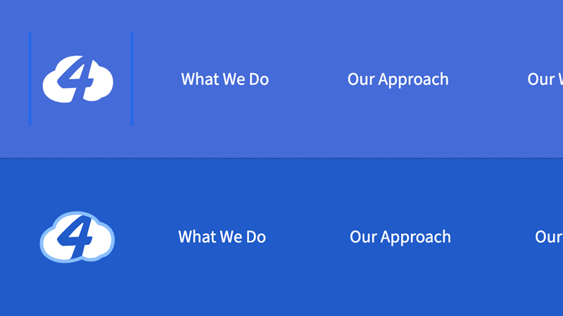
Our current patterns leave the browser’s default focus styles alone, which is good. But sometimes those focus styles are really challenging to perceive: Blue outlines on our blue background are especially challenging!
This time around, we’ve had a lot of fun designing focus styles that are easier to see and more consistent with our brand. When we fear the best keyboard navigation experience will be at odds with pointer events like hover and active, we’ve been using focus-visible (with a polyfill) instead. Hooray!
More Inclusive Markup
Just because code is valid or semantic doesn’t mean it works for everyone. Here are some of the tweaks we’ve been making to our HTML based on real-world needs:
navelements are always labeled so their context will be clear.- We avoid
aria-labelin favor of visually hidden elements to improve compatibility with translation tools. - We use the
aria-currentattribute in navigation elements where appropriate. - If we plan to override a
ulelement’s default styles, we includerole="list"to avoid an issue in Safari/VoiceOver. - If an
svgelement is nested within a link or button, we addfocusable="false"to fix a keyboard navigation issue in IE. - We’re revising the structure of large clickable regions (article summaries, etc.) based on how they’re actually read aloud.
- We now consider the entirety of the document when choosing
h1throughh6(not just the nearest sectioning element) to improve screen reader navigation.
I’m sure this list will grow as we continue!
Improved Tools
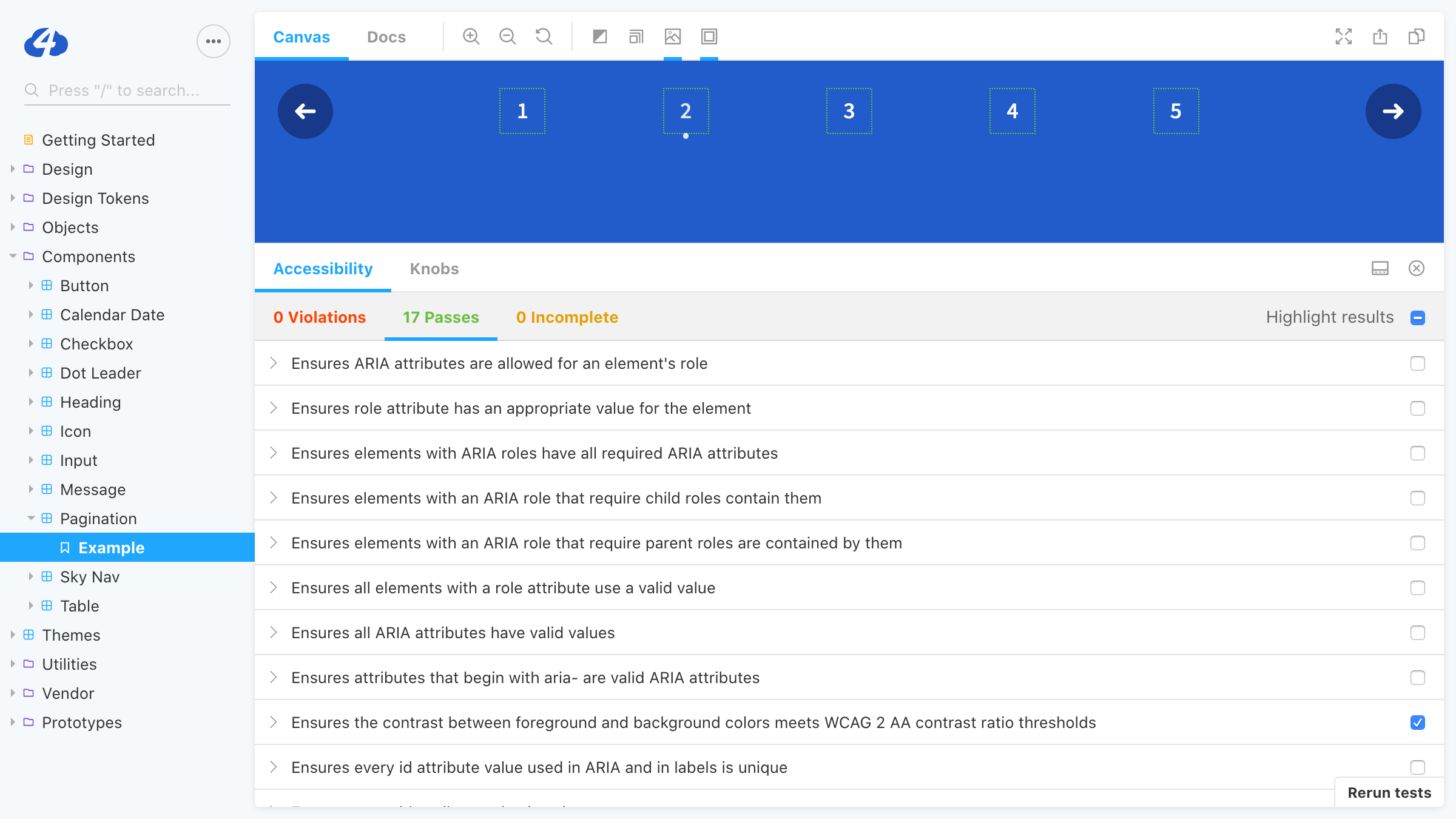
Last time around, we did a bit of VoiceOver testing to confirm visually hidden text was still accessible. Our utility belt is more sophisticated now:
- We test in VoiceOver far more frequently, and specifically using Safari.
- Prior to launch, we’ll be testing full pages in other popular screen readers like NVDA and JAWS (making sure to use the most common browser/platform combinations).
- The Storybook A11y add-on flags aXe test results for us, helping us spot simple mistakes throughout design and development.
- Our new patterns will be more deeply integrated into our projects, reducing the possibility of regressions from copying and pasting markup.
Getting Better
The pace of change in our industry can be overwhelming. When every week seems to bring a new framework or hot take or think piece threatening to table-flip weeks, months or years of your work, it can be tempting to instinctively resist that change.
But accessibility is different! This isn’t a momentary design trend, a developer-facing methodology change, a way to shave a few kilobytes off your initial page load. This is an overdue acknowledgement of a broad continuum of existing user needs, most likely overlapping with your own needs, but previously concealed by our own assumptions and biases. What a gift to lift that veil! What a thrill to solve new problems!
Not sure where to start? Try your project in the WAVE Web Accessibility Evaluation Tool and start fixing some low-hanging fruit. Watch Léonie Watson demonstrate how a screen reader user surfs the web. See if there’s a virtual event happening today that interests you. And if you need a helping hand, please get in touch!
Tyler Sticka has over 20 years of experience designing interfaces for the web and beyond. He co-owns Cloud Four, where he provides creative direction to their multidisciplinary team. He’s also an artist, writer, speaker and reluctant developer. You can follow Tyler on his personal site or on Mastodon.