We arrived in San Francisco in early November to near perfect weather. Californian sunshine graced our days, while the mornings and evenings were cool. Leaving behind Sydney (a city on “construction steroids”) after a year of architectural deadlines, San Francisco was welcome respite.
The city is defined by a grid-based urban map superimposed onto a steep, hilly topography surrounded by water. Tree-lined streets interspersed with verdant parks, three storey walk-ups and a discernible absence of high-rise buildings in the suburbs made the pedestrian experience very pleasant – as did the relaxed and genuinely friendly locals.
We were based in Japantown, a culturally rich and quiet enclave, and enjoyed fantastic walks to Golden Gate Park and Ocean Beach, Haight-Ashbury, Golden Gate Bridge and downtown. Three buildings we took time out to visit are reviewed below.

The Cathedral of Saint Mary of the Assumption by McSweeney, Ryan and Lee, with assistance from Pietro Belluschi and Pier Luigi Nervi.
Image: Virginia Waller
The Cathedral of Saint Mary of the Assumption, 1970.
Glimpsed through the tracery of deciduous trees in “fall”, this sublime monolithic structure had our cameras (and us) in overdrive.
Designed by local architects McSweeney, Ryan and Lee, with assistance from renowned Italian architect Pietro Belluschi and architect and engineer Pier Luigi Nervi, the cathedral’s design reveals its architectural poetics through precast concrete shells and travertine marble cladding. The building form comprises a solid box elevated on a vast podium with an expressive sculptural roof reminiscent of the Sydney Opera House. The podium serves as both a pragmatic and symbolic design solution – it provides for subterranean car-parking and back-of-house accommodation while creating an elevated platform above street level, with stairs ascending to the church proper. Thus, the physical separation above the street serves to reinforce the non-secular nature of the building.

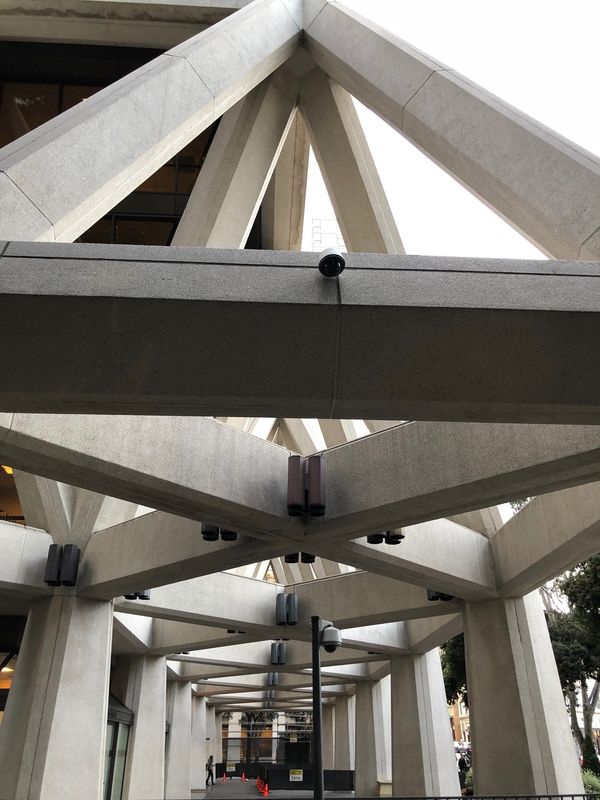
The concrete roof shell structure is a monolithic hyperbolic paraboloid.
Image: Virginia Waller
The concrete roof shell structure is a monolithic hyperbolic paraboloid, the weight of which is distributed down through four formidable piers. The entire structure is clad in travertine marble, while stained glass windows line the four vertical axes of the roof shell. One of the catherderal’s more unique features is a stained glass window in the roof plane, viewable only from below, that forms the shape of a cross.
The solid box is punctuated by discrete door openings positioned on the central axis of each facade. Having passed through these human-scale doors, the congregation is gathered in a cavernous space looking upward at the cruciform skylight. The quality of the natural light – top lit, controlled and minimal – along with the formidable scale of the four piers which bear the weight of the soaring monolithic roof and the absence of further structure reinforce the religious experience for the congregation. The interior design is one of revelation.
The Transamerica Pyramid, 1972.

The Transamerica Pyramid by William Pereira and Associates.
Image: Andrew Vilder
In contrast to the non-secular Cathedral of Saint Mary, the Transamerica Pyramid by William Pereira and Associates is a soaring edifice dedicated to commerce. Opening in 1972, the 48-storey building challenged the typical “elongated box tower form” of the day, and the approval process was not without debate and resistance. The original design was for a 350-metre tower but authorities capped the height at 260 metres.
The building’s pyramid shape may be interpreted as a streamlined version of the 1920s stepped skyscraper. Its four sided, tapered form is an efficient response to the site and planning constraints; it allows light and air to penetrate down into the street and is a clever way to deal with minimum lot-size constraints.
The four-storey podium is open and airy, with the triangular concrete-clad truss frame creating a pleasant transition space when approaching the building from the street. The truss frame is angled so the scale of the podium is not overwhelming. The pyramid form is structurally very stable due to the inherent triangular geometry. The building is a steel and reinforced concrete framed structure and the outer walls are finished in white precast quartz.
The Transamerica Pyramid has become an icon of the San Francisco skyline.
The V.C. Morris Gift Store, 1948.

The V.C. Morris Gift Store by Frank Lloyd Wright.
Image: Virginia Waller
We ventured up a tiny laneway, Maiden Lane, just off the hustle and bustle of Union Square in downtown San Francisco. As we walked up this quiet enclave it reminded me of a scaled down version of the Champs Elysees in Paris – exclusive fashion houses with large glazed shopfronts profiling the latest the fashion world has to offer.
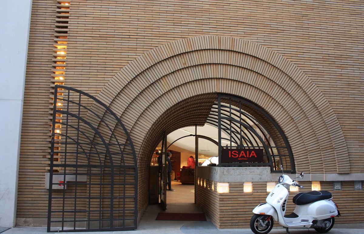
Sitting between two tall rendered facades is a small understated brick façade, the famed V.C. Morris Gift Store, designed by Frank Lloyd Wright in 1948. The more I stood studying this façade, the more I admired the subtle and exquisite detailing.

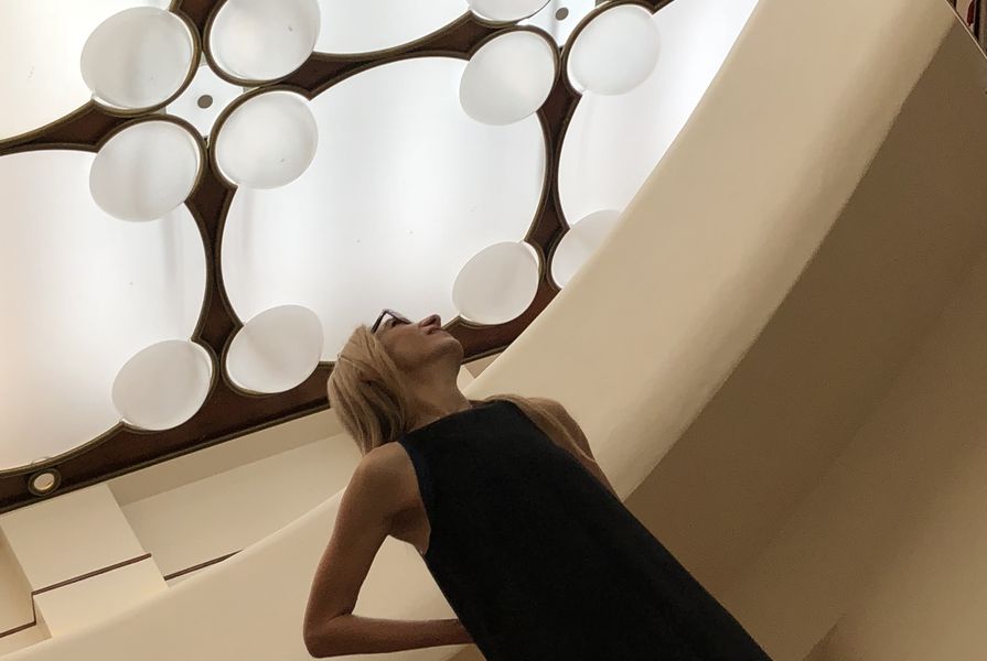
A spiral ramp leads to the mezzanine level, which is capped by the translucent white ceiling.
Image: Virginia Waller
A concrete edge beam approximately one metre above the ground plane supports a step out in the façade plane (not huge, just the depth of a brick). Small recessed lights underscore the beam and a side vent detail runs vertically on the left side, again illuminated by recessed lights. Another concrete slab/edge beam caps this façade, around a metre below the building parapet. A brick archway marks the entry and is articulated with banded soldier courses. A black metal gate serves to close the entry after hours.
You enter from the laneway, passing under the low barrel-vaulted archway, and enter the double-height space of the gallery interior. In contrast to the geometric patterning of the façade, an organic patterning defines the interior, such as in the spiralling ramp and circular motif. The ramp leads to the mezzanine level capped by a translucent white modulated ceiling.

Sitting between two tall rendered facades, the V.C. Morris Gift Store features a small understated brick façade.
Image: Virginia Waller
Wright considered the glazed shopfront “vulgar” and opted for a solid façade to enhance the element of surprise. The concept and the building is in stark contrast to the “in your face” shopping experience that seems so prevalent in western cultures today.
The work of Wright’s master hand is evident throughout, in the colour of the brickwork – a mix of two or three light sandy coloured bricks, offset by the concrete bands that run at the top and bottom of the façade – the placement of the recessed lights, the brick detailing above the archway and in the proportioning of the façade. The game Wright plays in establishing the geometric patterning of the exterior then breaking this and introducing an organic patterning for the interior enriches the architectural experience and creates a most beautiful gallery space.
Operating for a period by Xanadu Gallery – whose owners spent significant money restoring the space – the property has been owned by Italian fashion house ISAIA since 2017.
Postscript
Reflecting on these buildings, so expressive and sculptural, I’m left thinking, is such purity of form a thing of the past, the heyday of “1970s heroic modernism”? I realize the architectural gestures such as the great roof are only applicable to certain building typologies. The design of our health and educational facilities would never consider such gestures when budgets are limited. Would it not be aspirational for some of that heroic modernism to be applied to our current day health and educational facilities?
With the New South Wales government’s introduction of new regulations in relation to combustible cladding, more traditional building materials such as masonry are on the rise. The study of Wright’s V.C. Morris Gift Store illustrates how a façade that is well-proportioned and well designed creates “architecture” rather than mere building.
If you are heading to North America, San Francisco is very much a city to visit.