
Once heralded as a promising sign of Apple’s renewed commitment to the iPad, iOS 9 has begun to feel like a one-hit wonder.
iOS 9 represented a profound change for Apple’s approach to the iPad. After years of stagnation and uninspired imitation of iPhone interface paradigms, iOS 9 allowed the iPad to explore the true potential of its large canvas; for the first time since the original tablet, Apple was creating new iPad-only features rather than adapting them from the iPhone. Split View, Slide Over, and Picture in Picture were drastic departures from the classic iPad interaction model that, however, perfectly fit the device.
As I concluded in my iOS 9 review:
This year, the iPad is getting the first version of iOS truly made for it. After too many unimaginative releases, Apple has understood the capabilities of the iPad’s display and its nature of modern portable computer. Free of dogmas and preconceptions of what an iPad ought to be, iOS 9 fundamentally reinvents what an iPad can become going forward.
In a span of six months, the one-two punch of iOS 9 and iPad Pro redefined the concept of portable computer again, setting Apple on a new path for the iPad ecosystem. Or, at least, it seemingly did.
Since late 2015, Apple hasn’t had too much to show for the iPad. A smaller version of the iPad Pro was released in early 2016, though the new device mostly adapted features from the bigger version to a more compact form factor, introducing inconsistencies to the iPad line in the process, such as the True Tone display (still exclusive to the 9.7” iPad Pro). iOS 10, while a solid upgrade overall, focused on iPhone users and lifestyle enhancements; for iPad users, iOS 10 was a disappointment that failed to build upon iOS 9. The first iPad Pro – launched in November 2015 – has lingered without updates, raising questions on the actual need for one of its marquee features – the Smart Connector that only Apple and Logitech have supported so far. And amid consistently declining sales, the company’s only “new” hardware after the iPad Pro has been a lower-priced and rebranded iPad Air – a solid entry model, but another adaptation.
We haven’t seen something truly new, bold, and transformational happen on the iPad platform in nearly two years. It’s time for Apple to step up their game and continue pursuing the vision for the future of computing set forth in 2015. There’s so much more work to be done with iOS, multitasking, and the redefinition of computing for the multitouch era. The iPad Pro can be a computer for everything, but it needs another leap forward to become the computer for everyone. And that can’t happen without a serious reconsideration of its software.
The iPad needs another bold, daring step towards the future. With iOS 11, Apple has an opportunity to pick up where they left off with iOS 9, forging a new direction for the iPad platform.
Every year ahead of WWDC, I collect some of my thoughts about the current state of iOS and consider where Apple could take their software next. I’ve been doing this for the past several years going back to iOS 6 in 2012. I’ve referred to these stories as “wishes” because they encapsulate all the aspects I’d like Apple to improve in their mobile OS. Last year, we added a concept video to the mix. This year, I wanted to prepare something different and more specific.
iOS for iPhone is, I believe, at a point of sufficient maturity: aside from particular feature additions, I don’t think there’s anything fundamentally missing from the iPhone.1 The iPad now bears the proverbial low-hanging fruit of iOS. There are obvious areas of improvement on iOS for iPad, which is, effectively, two years behind its iPhone counterpart. The iPad’s lack of meaningful software advancements allows us to explore deeper ideas; thus, in a break with tradition, I decided to focus this year’s iOS Wishes exclusively on the iPad and where Apple could take its software next.
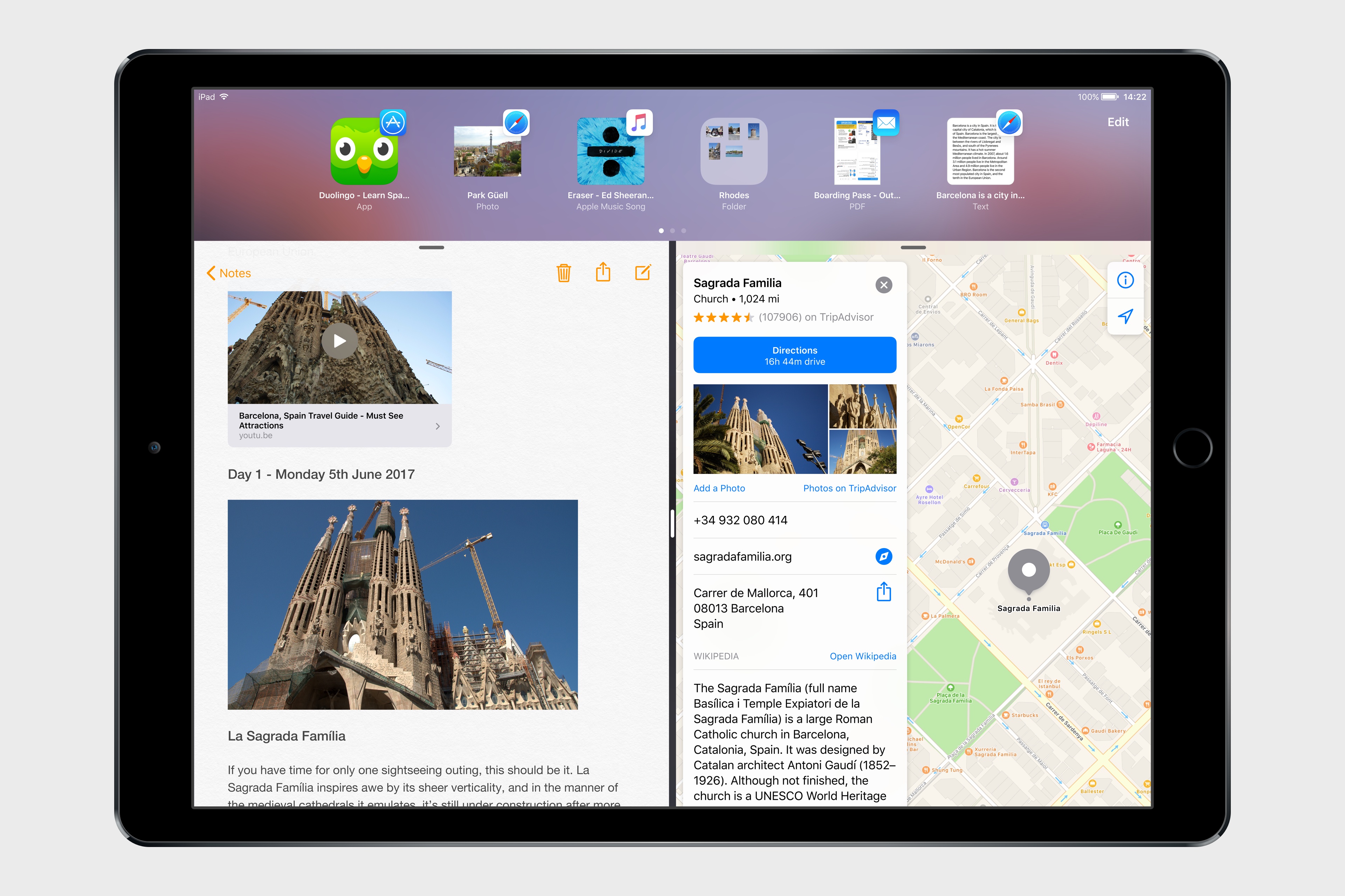
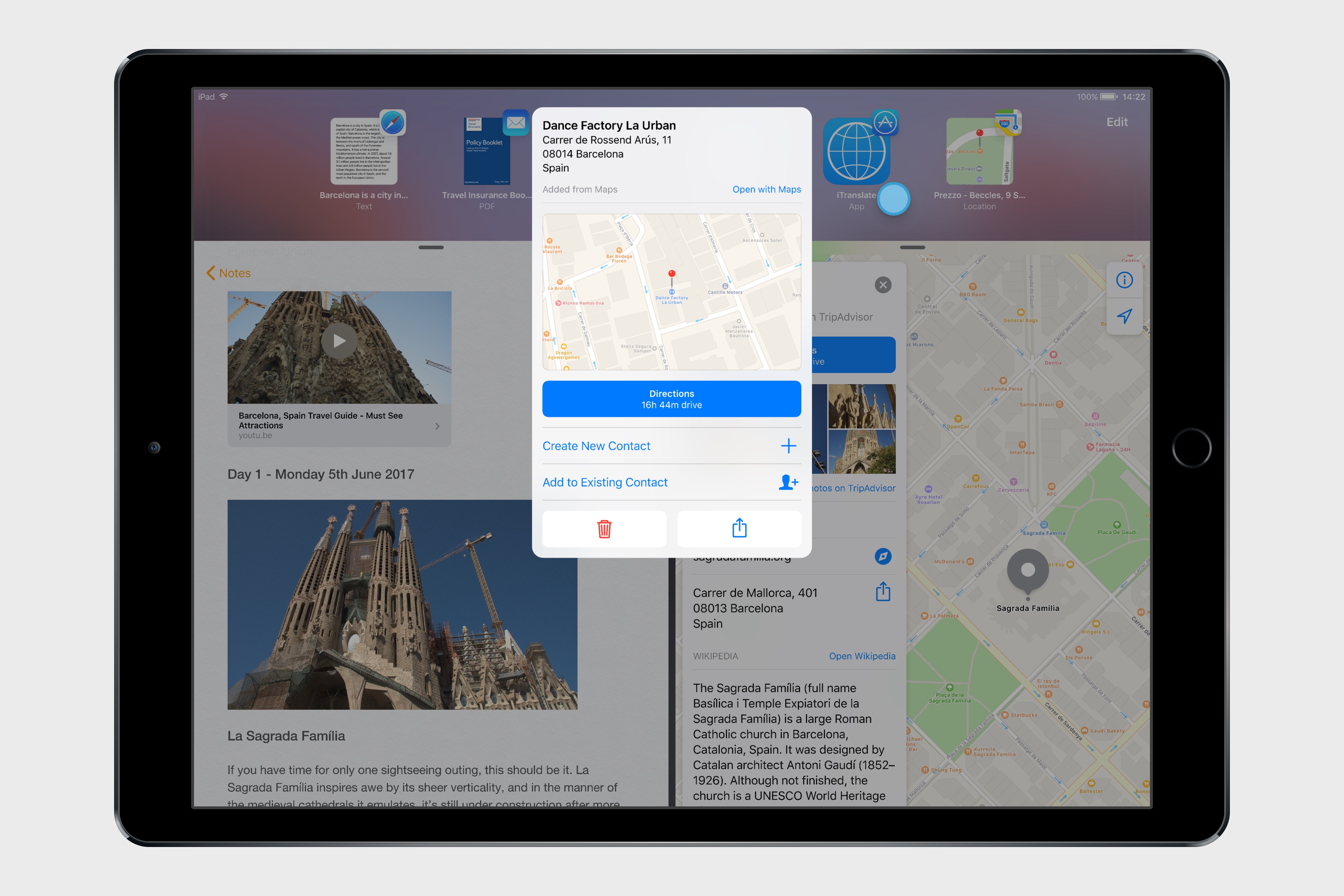
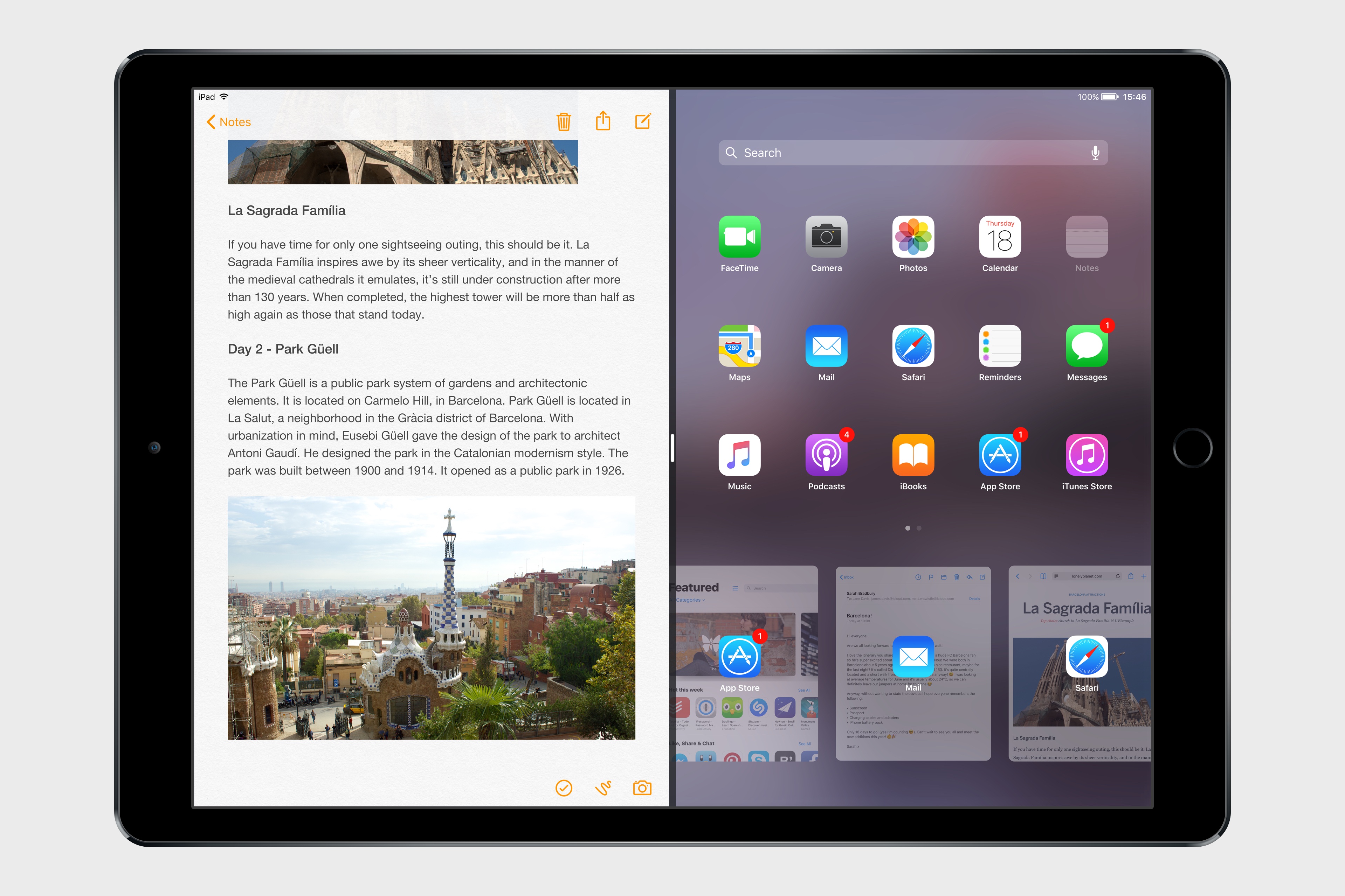
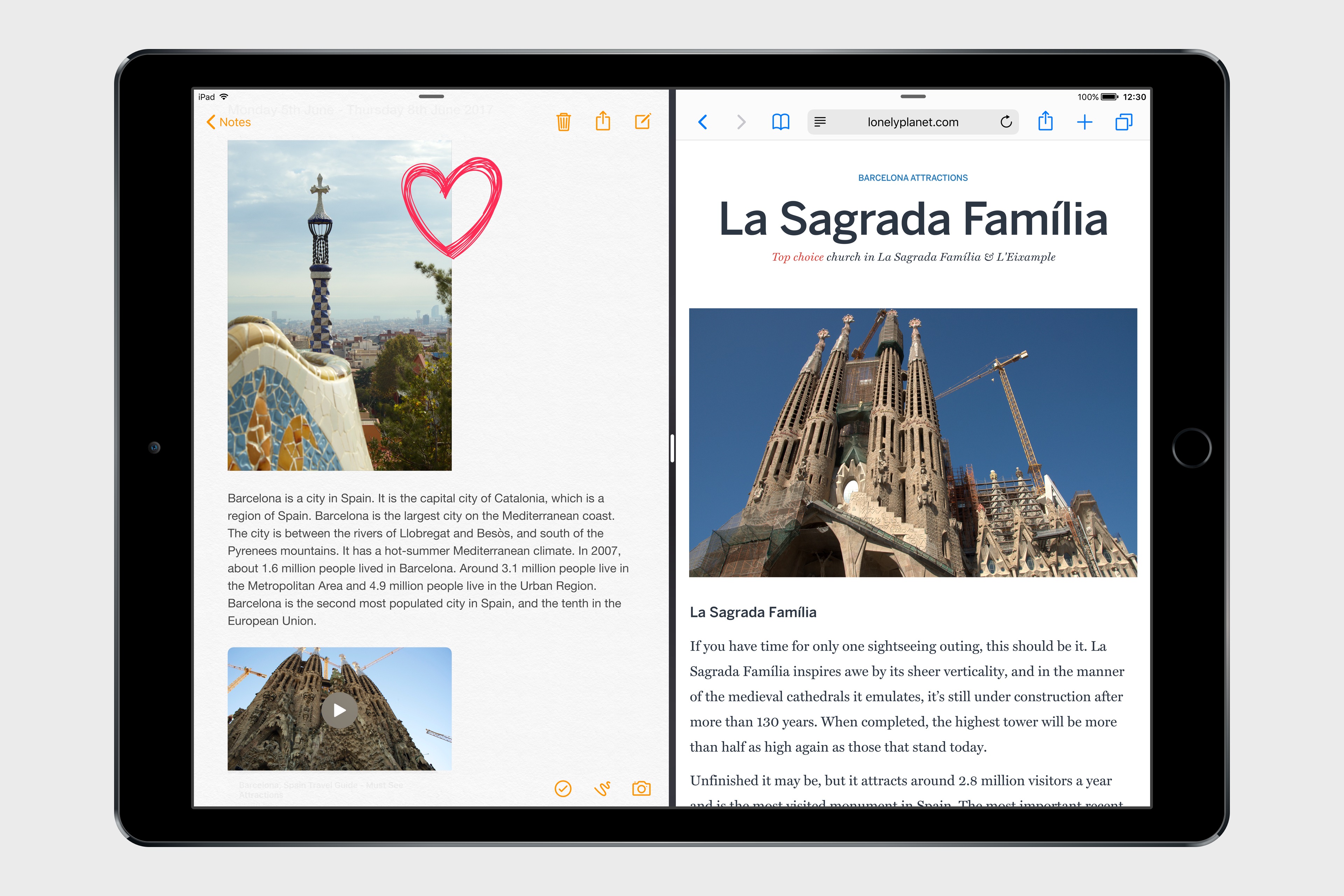
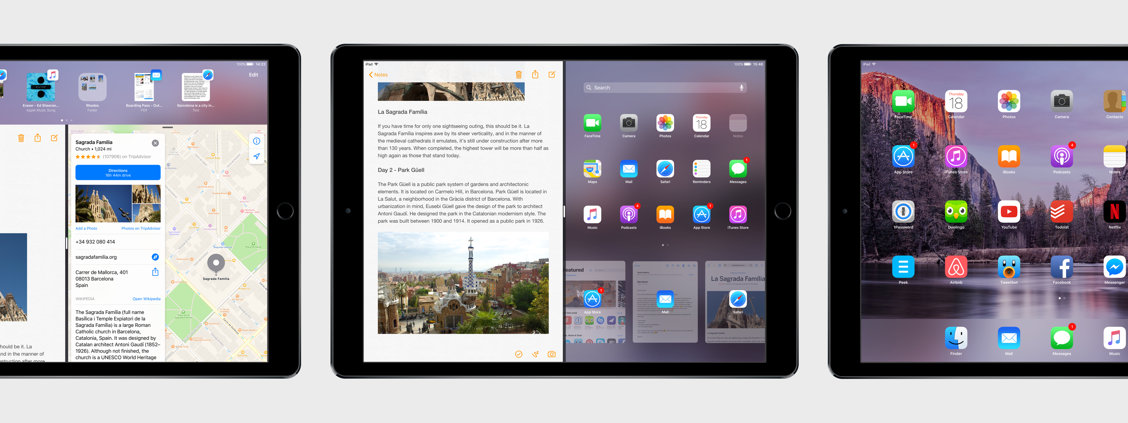
Like last year, I collaborated with Sam Beckett to visualize my ideas for iOS 11 on the iPad with a concept video and detailed mockups. This time, instead of showcasing our ideas as standalone concepts, we imagined a “day in the life” theme for the video, showing how enhancements to iOS for iPad would work in practice. Rather than showcasing random bits of possible features, we imagined an underlying task to be accomplished (planning a vacation in Barcelona) and how better iPad software could help.
I’ve been thinking about some of these ideas since iOS 9 (you can see a thread between my iOS 10 concept and this year’s version), while others would be a natural evolution for iOS on the iPad. Once again, Sam was able to visualize everything with a fantastic concept that, I believe, captures the iPad’s big-picture potential more accurately than last year.
Below, you’ll find our iOS 11 for iPad concept video, followed by an analysis of my iPad wishes with static mockups. I focused on foundational changes to the iPad’s software – tentpole features that would affect the entire OS and app ecosystem.
This isn’t a prediction of what Apple will announce at WWDC; it’s my vision for what the future of the iPad should be.
Making Of: iOS 11 Concept
Exclusively for Club MacStories members, we’ll publish a Behind the Scenes look at our iOS 11 concept video in our MacStories Weekly newsletter later this week. We’ll cover our approach to this year’s iOS wish list, the making of the video, the tools we used, and more.
Club MacStories offers exclusive access to extra MacStories content, delivered every week; it’s also a way to support us directly.
You can subscribe here or by tapping the buttons below.
Concept Video
For the best viewing experience, watch the video at 1080p or 4K on YouTube’s website or mobile app.
Podcast: Special Connected Episode
We have recorded a special episode of Connected about this concept and iOS 11 for iPad. You can listen to the episode here.
Drag & Drop, System-Wide
Drag & drop is widely regarded as a “legacy feature” that was conceived for mouse cursors and desktop computers, but I always thought it’d work well on the iPad. Direct content manipulation is, after all, the iPad’s raison d’être: while on a Mac the cursor is an abstraction of your hand dragging an object across windows, on the iPad your finger could physically swipe across the screen as it holds a selection of content underneath. Existing implementations of drag & drop on iOS have proven the idea’s feasibility (see: Safari tabs, iMessage stickers), and I believe a system-wide drag & drop feature would be a natural and powerful complement to iPad multitasking.
On the surface, native drag & drop between iPad apps would feel immediately intuitive. Users could select any piece of content – an image, some text, a link, or a document – and long-press with one finger until the content lifts up and can be dragged away.
A grabbed item could be dropped somewhere else in the current app, or users could drag it towards another app in Split View and drop it where they want it to be (spring-loading could be used to navigate across app UIs). Because drag & drop would be fully multitouch-enabled, it wouldn’t block the iOS interface: another finger could be used to navigate in a different “drop area” of an app, or a user could keep dragging until the Split View app picker is shown and drop an item onto an app’s icon, opening a contextual action menu.
If Apple wants to bring drag & drop to the iPad, I believe they’d do so by eschewing the complexities of the Mac. If drag & drop comes to iOS 11, it needs to be easier, faster, and safer than any desktop alternative. This would require a massive engineering effort and an intelligent design to rethink drag & drop interactions for the touch era and the iPad’s UI.
Drag & drop on iOS should never lead to accidental data loss or open app screens that users aren’t expecting. By default, dropping an item into another app would create a copy – it wouldn’t move it from the original location. In addition, while anything that can be selected by the user should support drag & drop out of the box (within specific format types), iOS 11 apps would have the ability to mark certain items as not available to drag & drop.2 In any case, it should always be clear to the user what can be dragged and where it can be dropped, with a consistent activation gesture and a behavior that doesn’t yield surprising results.
This also means building a drag & drop feature that offers high performance on any compatible iPad model. Apple’s priority should be to ensure that drag & drop always hits 60 fps when dragging: a selected item must follow the user’s fingertip while in drag & drop mode with no latency or perceptible lag. The combination of multitouch and high frame rates would allow drag & drop to work alongside the iOS interface in a natural way – it would feel like a native extension of the user’s finger and the iOS selection method. Dragged items would fly across the screen smoothly, and users could still navigate app interfaces (and perhaps even hit the Home button) to drop an item wherever they want.
Native drag & drop between apps would require explicit adoption by third-party developers. There are two problems to consider: dragging an item, and dropping it somewhere else. This means understanding what kind of item the user is dragging (an image, some text, a PDF, etc.) and showing where it can be dropped. What happens, for instance, if the user tries to drop an image into the Safari address bar? What happens if a PDF is dropped onto Tweetbot’s compose box?
I imagine that iOS could handle the first set of problems automatically (translating between different file types3), but I suspect that iOS 11 will offer an API that will require developers to support drag & drop by defining what can be dragged, how it can be interpreted, and what can be received as a dropped item in their apps. Moreover, to solve the potential confusion caused by dropping an item into an app that isn’t quite sure what to do with it, developers could provide Quick Look extensions to enable the receiver app to preview the dropped item in their context and display a menu with available options.
Alternatively, apps could provide quick action UIs (as extensions) for dropped content that they support. Reminders, for instance, could offer to create new todos for lines of text dragged from another app; Notes could present a dialog to create a new note from image or save it into an existing note.
Overall, most of these are technicalities that Apple figured out decades ago on the desktop.4 The same system could be extended to iOS and modernized for integration with apps and extensions.
Despite the complexities involved, drag & drop increasingly feels like something that needs to come to the iPad. It just makes a lot more sense to be able to directly manipulate and move content around on a large multitouch screen than it does with a cursor and a smaller trackpad. There would be challenges for Apple and developers, but, after Split View and the large iPad Pro, it seems obvious that the next step is to let users manipulate content further and move it anywhere.
Drag & drop on iPad could become the fastest way to share any piece of data between apps. Users wouldn’t have to rely on the clipboard or the share sheet to slowly move data between apps anymore. With drag & drop, content would be naturally rearranged and dropped as needed, solving one of the biggest problems of working on the iPad.
Shelf
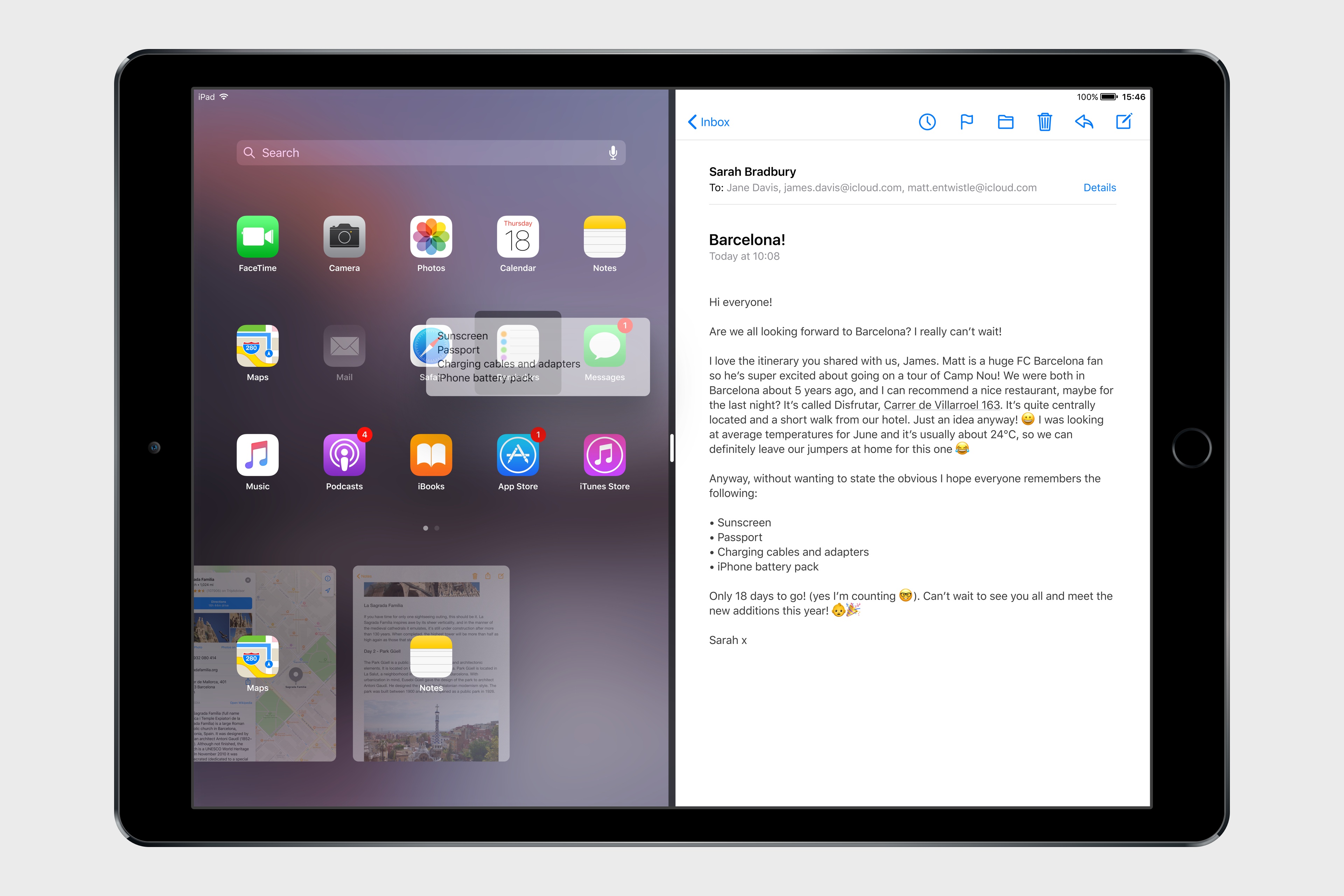
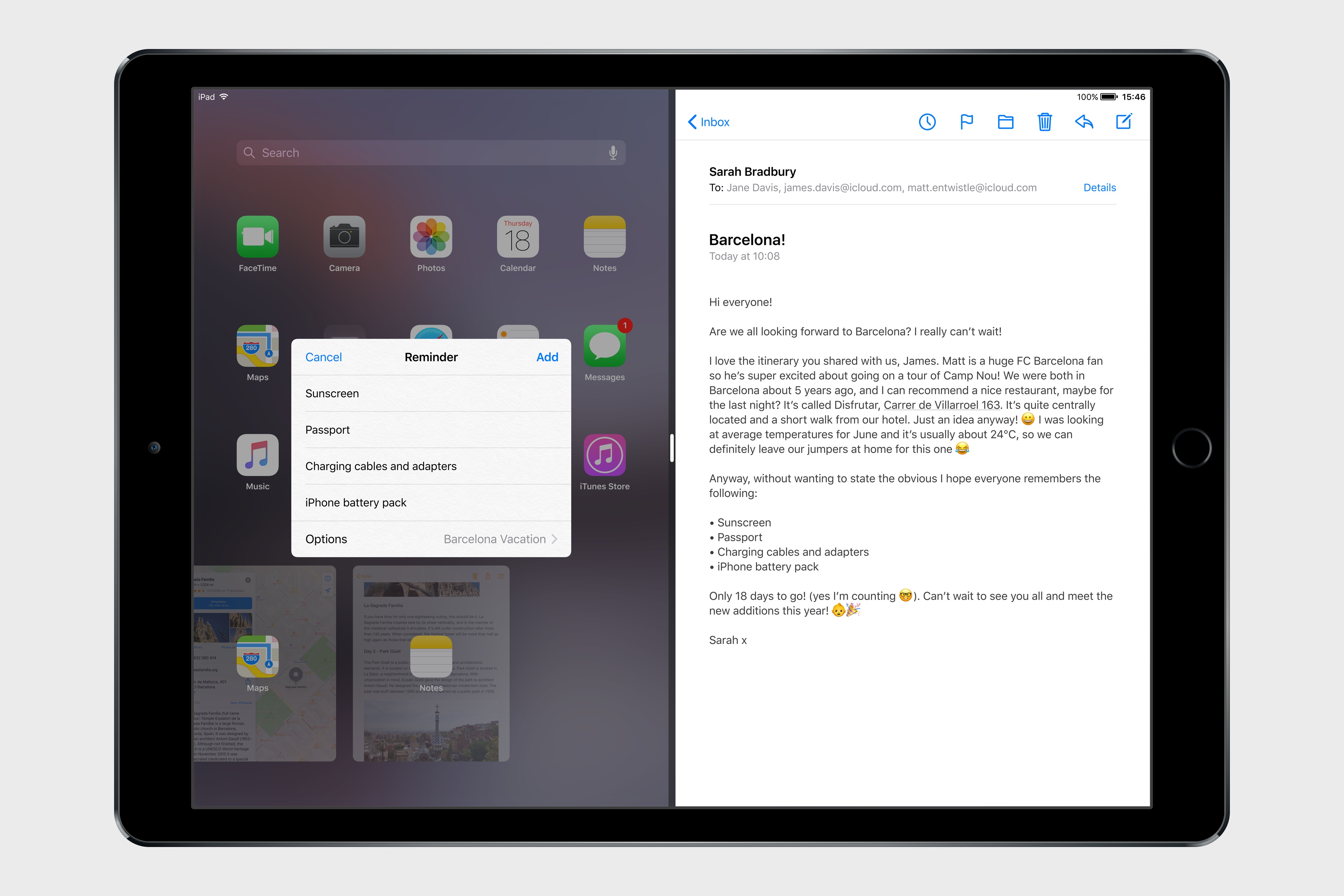
There are times when you want to save something without necessarily dropping it into an app or sharing it with the clipboard or extensions. For better or worse5, macOS users can drag anything they want to reference later on the desktop (or any other Finder window); iOS has no such area that serves as a holding place for bits of content without an immediate destination. I’d like iOS 11 to bring a Shelf feature to the iPad that would let users clip anything with drag & drop.
The Shelf would sit above apps (both in full-screen mode or Split View) and it’d be revealed automatically when the user is dragging an item towards the top of the screen. The Shelf would come down and display previously saved items as thumbnail previews; by default, new items are dropped into the leftmost side of the Shelf, though users could choose to drop an item between existing ones, or on top of another item to create a folder.
The idea behind the Shelf is to make it as effortless as possible to hold something for later without the cognitive load of deciding which app or extension should receive it right away. The Shelf would be heavily tied to the new drag & drop framework and it’d be inspired by previous implementations (such as the NeXTSTEP shelf) and older desktop apps (examples: DragThing and Yoink). Think of it as a transient dock for temporary clippings, or, even better, as a multi-slot clipboard that can hold a variety of items and be consistently available across apps.
The Shelf would be local to each iPad, and it could hold an infinite number of items; the Shelf would be paginated and users could scroll between multiple pages to find the item they’re looking for. Anything could be dropped in the Shelf: from text selections and images to phone numbers and even songs; as long as an item supports drag & drop on iOS 11, the Shelf could hold it for later.
Even in its apparent simplicity, the Shelf would still be a feature for iPad power-users who want a better way to deal with multiple bits of content. As such, the Shelf would require a specific gesture to be activated when users want to pull content from the Shelf and drop it into an app. In our concept, a three-finger swipe opens the Shelf when an item is not being dragged towards it; this gesture wouldn’t conflict with scrolling in apps, text cursor movement, or Notification Center. When the user has identified an item they need, they can grab it from the Shelf and insert it into a compatible app.6
While the Shelf would act primarily as a scrollable tray of temporary clippings, it could also support inline actions for previews and other content-specific shortcuts. By tapping an item in the Shelf, iOS 11 would display a custom Quick Look preview with additional information and actions contextual to the selected item.
With a Quick Look API, items could embed native actions in their preview. For example, a phone number could be called with an iPhone through Continuity, and Maps locations could be previewed and re-opened in the Maps app. This way, the Shelf would be skewed towards exporting clippings via drag & drop, but manual actions on a per-item basis would also be allowed.
The multi-slot nature of the Shelf, combined with its ease of activation facilitated by drag & drop, would dramatically improve any workflow occurring on the iPad. Students writing essays in Pages could drop images, web links, and other source material in the Shelf and later add them to a document with a few swipes; photographers could assemble assets in the Shelf (either as folders or individual items) and easily import them in a graphic editor; even casual note-taking or email processing could be improved by cutting the time normally involved with moving data back and forth between apps.
The Shelf, along with system-wide drag & drop, would rethink the relationship between users and app content. Apple needs to take advantage of the iPad’s large screen to simplify working with bits of content across apps. The Shelf can solve all these problems in a unique, iPad-only way.
New Split View App Picker
As I argued last year, the Split View app picker is the feature that has aged the worst since the launch of iOS 9. Without the ability to manually search for apps or to pin frequently used apps as favorites, the picker has always felt like it had been designed by engineers to ship a barely passable UI at the last minute.
Apple had a chance to rethink the basic traits of the iPad’s multitasking interface; instead, they released a shallow, clumsy picker that should have been fixed years ago and that is still with us today.
The Split View app picker has to be redesigned from scratch. Building on last year’s concept, I envision a picker that would address all the shortcomings of the existing design:
- The picker would allow users to arrange their most-used apps on a grid, similar to a mini Home screen;
- There would be an integrated Spotlight option to search for specific apps (or app content) and launch them directly in Split View;
- The picker could be displayed on either side of Split View, with an option to swap the primary and secondary app (a long-press on the picker “handle” at the top);
- Recently used apps would still be displayed at the bottom of the picker as cards. Unlike iOS 10, every app – not just the most recently used one – would carry a preview of its last-seen state (like in the system multitasking view);
- Every app icon/card displayed in the picker would support spring-loading for items passed via drag & drop, enabling users to quickly open files in different apps or insert discrete data into app views;
- The entire Split View picker UI could be invoked and navigated with an external keyboard, removing the need to touch the screen when an iPad is used on a desk.
A revamped app picker design based on these principles would greatly increase the usability and speed of Split View, but it would also introduce a different set of trade-offs and usability concerns to be addressed by Apple. Specifically, while the picker could be invoked on either side of the screen, it couldn’t be shown simultaneously on both sides, as it would cause issues with users attempting to open the same app in two places. Furthermore, I imagine that Apple could dim an app’s icon in the Split View grid if the app is already active on the other side.
I’m convinced that Split View is the best feature Apple has brought to the iPad in years, but the implementation of its launcher leaves much to be desired. An efficient multitasking UI needs a fast and customizable activation method to be pervasive and scalable; the current Split View misses the mark on all of this. By extending Split View with user-assigned favorites and activation on both sides of the screen, Apple could take the entire iPad multitasking experience to the next level.
Finder
The argument that the iPad doesn’t “need a filesystem” lost its validity when Apple introduced document providers in iOS 8 and the iCloud Drive app in iOS 9. iOS already has a visible filesystem, only it’s been rebuilt with simplicity in mind for the age of apps so it doesn’t expose system information like on macOS. The next logical step for Apple is to turn their scattershot implementation of document pickers and providers into a true Finder layer that can work with every app and be more cohesive and intuitive than what we have today.
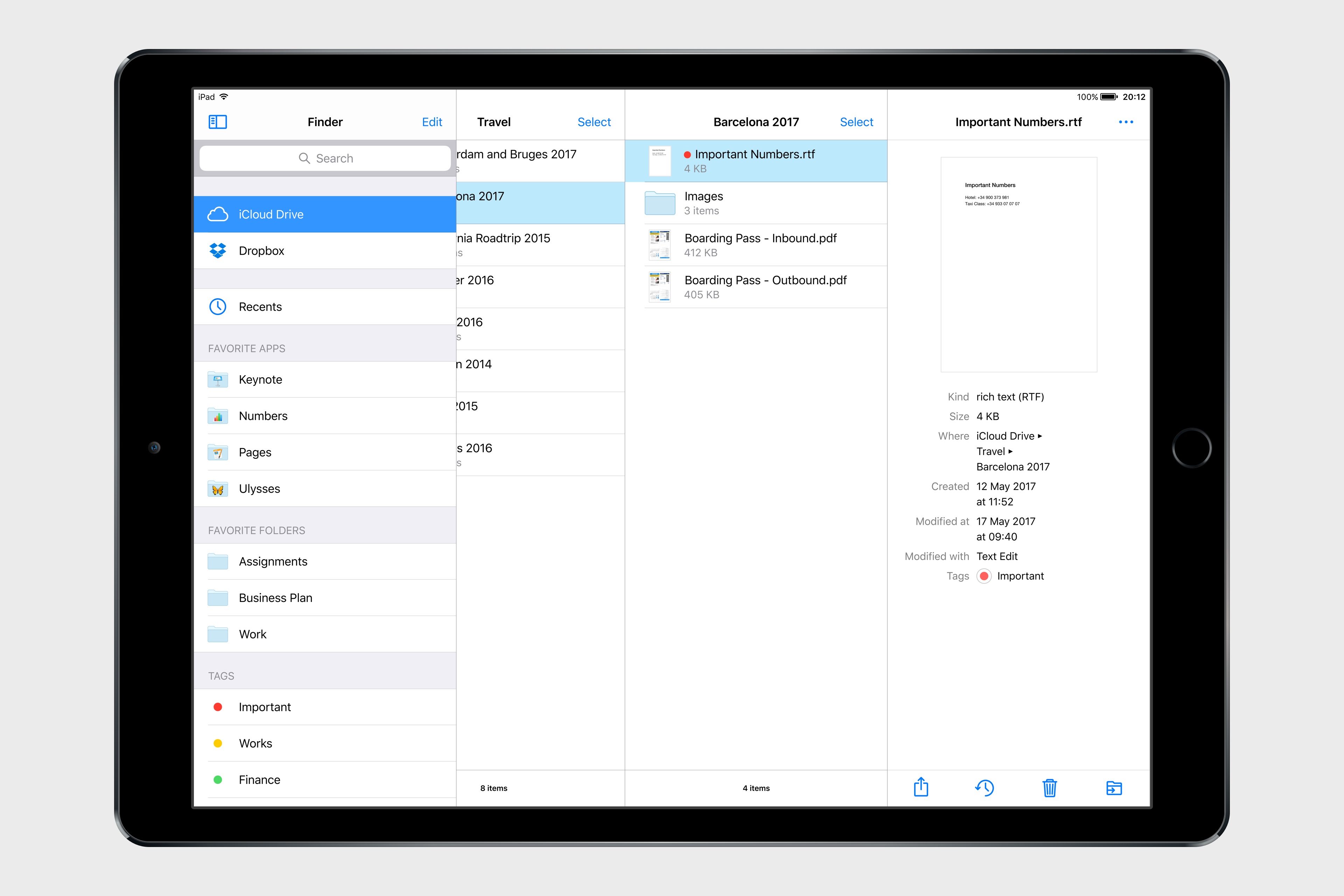
I’m not proposing that Apple brings the Mac’s Finder to iOS, diverting from the app-based approach that has characterized the iPhone and iPad. Instead, I think all the pieces of the current system – iCloud Drive, the document picker, and document providers –should be unified into a single Finder app and system-wide layer available everywhere.
With a dedicated Finder app and Finder view in every app, users would be able to find the files they’re looking for with a consistent interface. Developers of third-party apps, on the other hand, could leverage new APIs to more easily offer documents and data to other apps, enabling them to talk to each other and collaborate on documents without resorting to extensions, flaky document providers, or, worse, duplicate copies of the same file.
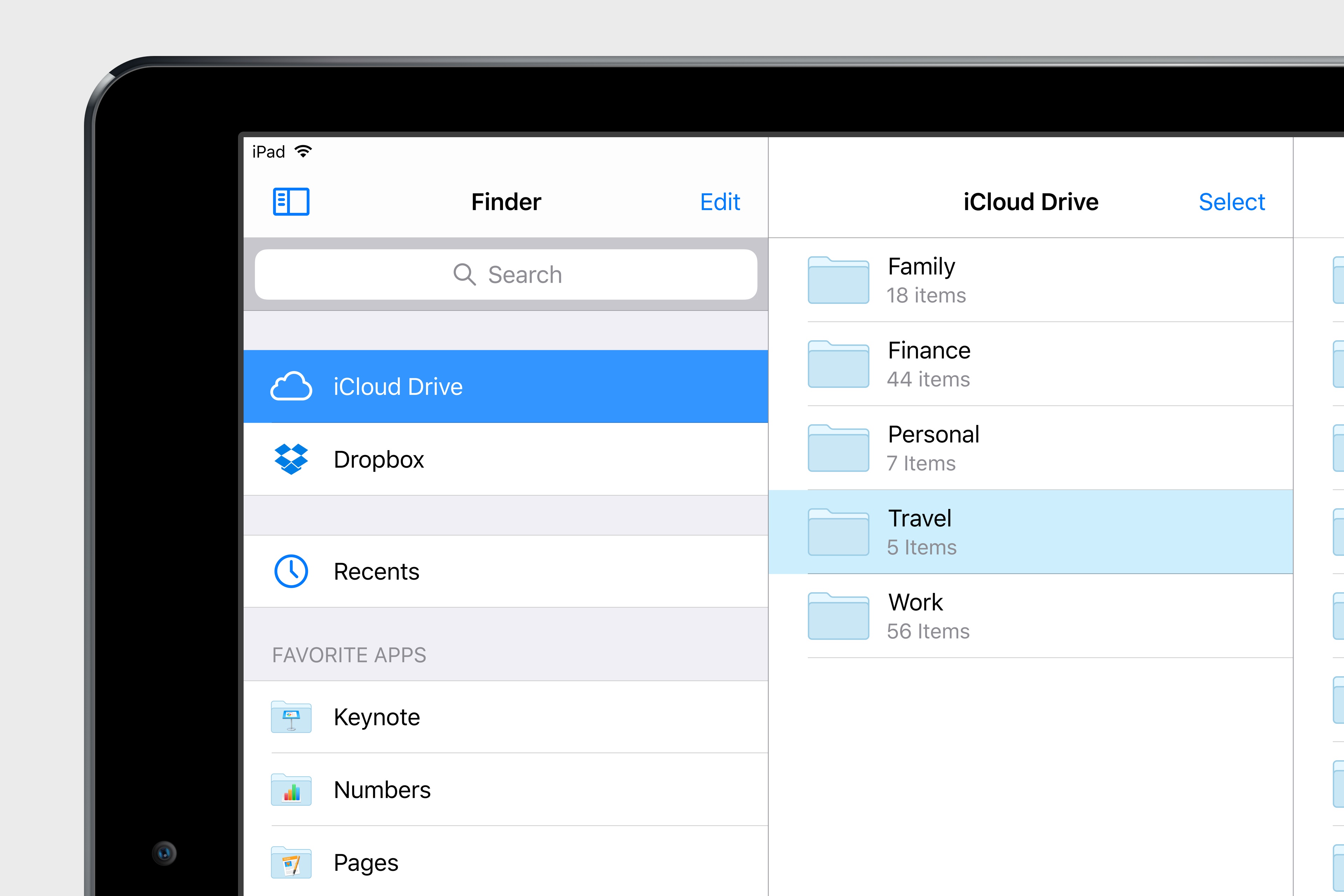
The first step would be a standalone Finder app that blends iCloud Drive and third-party app storage in a powerful file manager that adopts the best aspects of the desktop Finder.
By default, all user-created files would be stored in a top-level iCloud Drive view, eschewing the notion of local-only storage.7 This would be the evolution of the existing iCloud Drive app (one of the worst apps Apple has shipped on iOS in years) and it’d be the place where users could create folders and organize their files.
The Finder app would have all the features you’d expect from a modern file manager: column and grid views, built-in iCloud sharing with permission controls, tags, versions, saved searches, and even Siri integration. These are features that I also envisioned last year, and I continue to believe that iPad users would only applaud a more serious iCloud Drive and file management UI.
The second step involves apps. In the current implementation of the document picker, apps can either be available as “folders” in iCloud Drive, or they can be opened as external document providers that have their own UIs and sync logic. I think Apple should slowly deprecate standalone document providers in favor of native Finder extensions that would let apps take advantage of the Finder’s built-in UI (where Apple has done most of the work) with options to enhance it with sharing/collaboration features and their own sync mechanisms.
An integrated and extensible iOS Finder would accomplish two important goals: it’d let apps become top-level destinations akin to iCloud Drive, and it’d provide a clean and safe way to modify the Finder’s interface for each app’s needs without having to take users out of the Finder environment and into a separate, less powerful document provider UI.
This way, developers of apps that don’t require additional controls could integrate with the Finder and use iCloud Drive as storage8; companies with deeper requirements, such as Dropbox or Microsoft, could still integrate with the familiar, system-wide Finder UI and enhance it for their own services. Ultimately, users would enjoy a consistent, safe, more powerful Finder experience that works with any app rather than having to constantly switch between iCloud Drive, iCloud Drive-enabled apps, and other document providers.
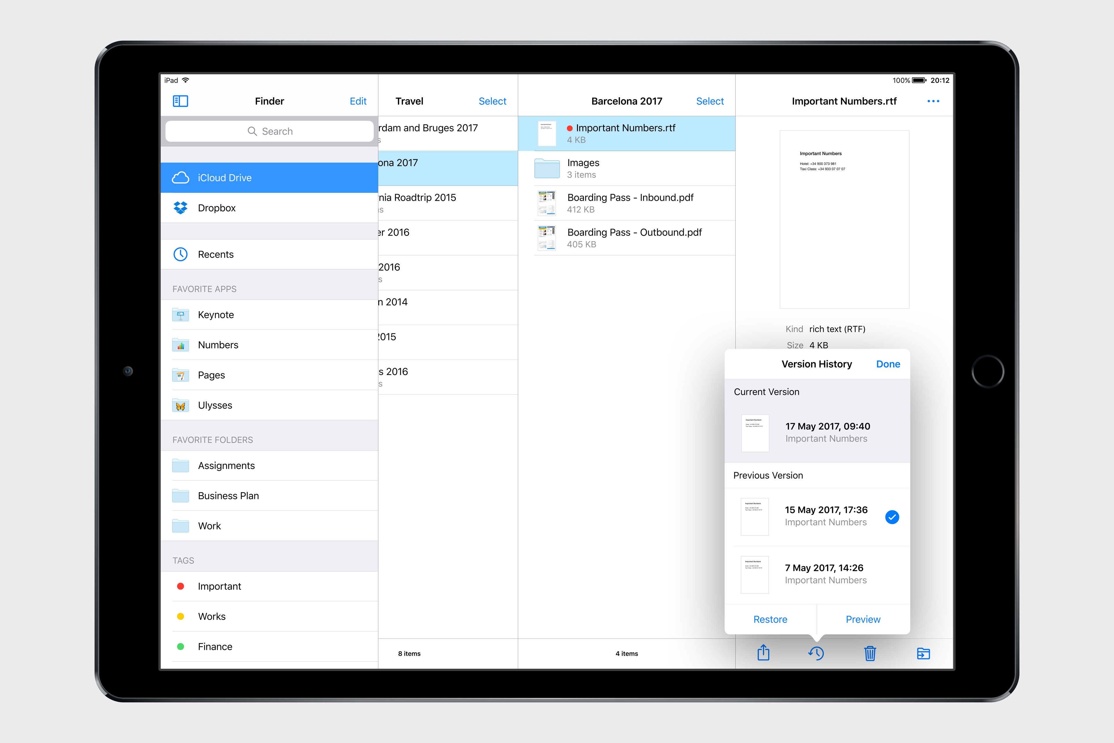
A true Finder for iOS would have ramifications that go beyond a new icon on the Home screen. The Finder would become the new default document picker: instead of a popup listing a bunch of standalone locations, you’d get a full-blown Finder dialog to open files from any folder or app, considerably reducing the time spent remembering where a file can be found. With a new set of APIs and user permissions, iOS 11 could allow apps to more easily open each other’s documents in complex (but intuitive) workflows that aren’t possible today. And, obviously, automation could play a role in this down the road, opening the door to ideas such as folder-monitoring utilities and file automation either via Workflow or Hazel-like apps.
One of the common misconceptions on iOS is that it doesn’t have a file management UI. That stopped being true years ago when Apple launched a new document picker and document providers. iOS has a rudimentary file manager built-in, but its implementation is fragmented, slow, and inconsistent. For the sake of simplicity, Apple ended up creating a system more difficult and prone to errors than the file manager they’ve offered for decades on the Mac.
With iOS 11, Apple has a chance to rebalance file management with a centralized repository that is inspired by the Mac but still entrenched in the core principles and technologies native to iOS. The iPad needs a single Finder for everything – built atop iOS’ vibrant app ecosystem, fully integrated with the Shelf and drag & drop, and without the complexity of the Mac.
Refreshed Design
As you might have noticed from the video and mockups in this story, we’ve imagined a slightly refreshed iOS design language built on the principles of increased visual feedback, context, and bolder typography.
In my iOS 10 review, I noted that Apple appeared to be experimenting with multiple variations of the iOS interface. From the bold headlines of Apple Music to the use of thicker icons and more tappable buttons, Apple seemed to be slowly moving away from the excessively thin, low-contrast aesthetic of iOS 7 to embrace a more approachable, friendly UI optimized for 3D Touch and sloppy swipes.
I don’t think an Apple Music-style interface would work as a system-wide design for every app, but iOS 11 could borrow some of its underlying criteria and apply them elsewhere. The App Store would be a good candidate for an Apple Music-inspired redesign; the company’s storefront is already heavily based on image galleries, product grids, and section titles that would work well alongside the Apple Music style.
Apple could also bring aspects of the watchOS interface to iOS and move beyond the static, inexpressive nature of its UI. Touch-down states for icons and buttons – some of my favorite details of watchOS’ design – would add useful context to iOS toolbar icons and menus as well.
Combined with subtle animations, thicker lines, and a consistent use of colors, app interfaces could become more lively and informative without the need for a major design overhaul.
Other Enhancements
In addition to the major changes I described above, there are more features and improvements I’d like to see in iOS 11 for iPad.
Easier access to frequently used extensions. The share sheet as we know it has run its course: besides discoverability problems for extensions that users don’t know how to activate, it’s a cumbersome feature in that it always adds a step between hitting the Share icon and performing an action.
With iOS 11, the share sheet should become more flexible and allow users to pin their favorite extensions to app toolbars and other UI elements.
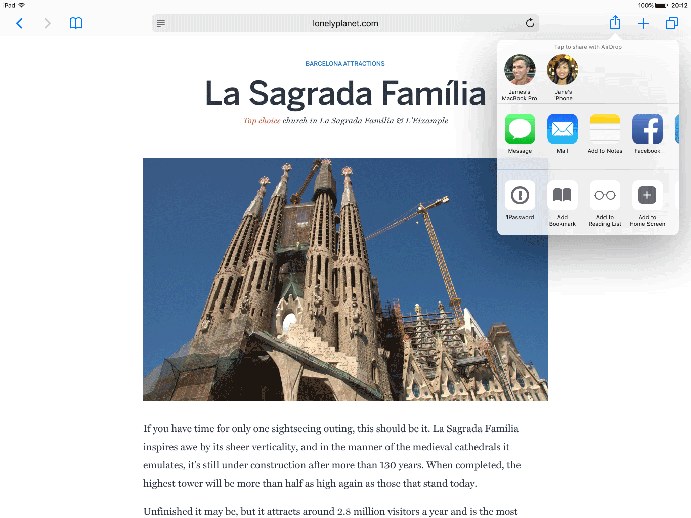
App extensions updated for iOS 11 could include support for a monochrome glyph to be used in “quick access mode”. To pin an extension, a user would only have to drag it out of the share sheet and drop it into an empty spot in a toolbar, which would also include built-in controls to re-arrange pinned extensions and reset them (sending them back to the share sheet).9
Imagine having faster access to the 1Password extension in Safari, or a Todoist button in your favorite news reader to save articles for later. The time savings granted by a more flexible share sheet would add up over time. More importantly, they’d enable power users to be more efficient when working with extensions, and they’d also allow developers to stop building their own app integrations just because they don’t require the share sheet.
A denser Home screen. I’m still not convinced that putting widgets alongside app icons on the Home screen would be a good idea, but one thing’s for certain – the Home screen on the iPad feels like a waste of space.
A single Home screen should display more than 25 apps at once on the 12.9” iPad Pro. By moving from 5 apps to 7 apps per row (in landscape), the Home screen would grow to 35 apps on a single screen – a 40% increase over the existing Home screen design. A more compact Home screen would result in less time spent swiping across pages to find apps, and a faster iPad experience overall.
Multiple audio streams. I find it odd that, on its tenth anniversary, iOS still can’t deal with concurrent audio streams. In the age of live streams, Let’s Plays, and music streaming, being able to keep multiple media streams going at the same time has become the norm on desktop computers, and yet iOS devices still pause background audio when you start watching a video.
I understand why Apple went with this approach years ago, but there’s a deeper discussion here about the need for a revamped audio framework with support for simultaneous audio streams on iOS. Besides allowing users to watch silent live streams while listening to other audio, developers of audio apps could use the more robust system for more complex audio workflows as well.
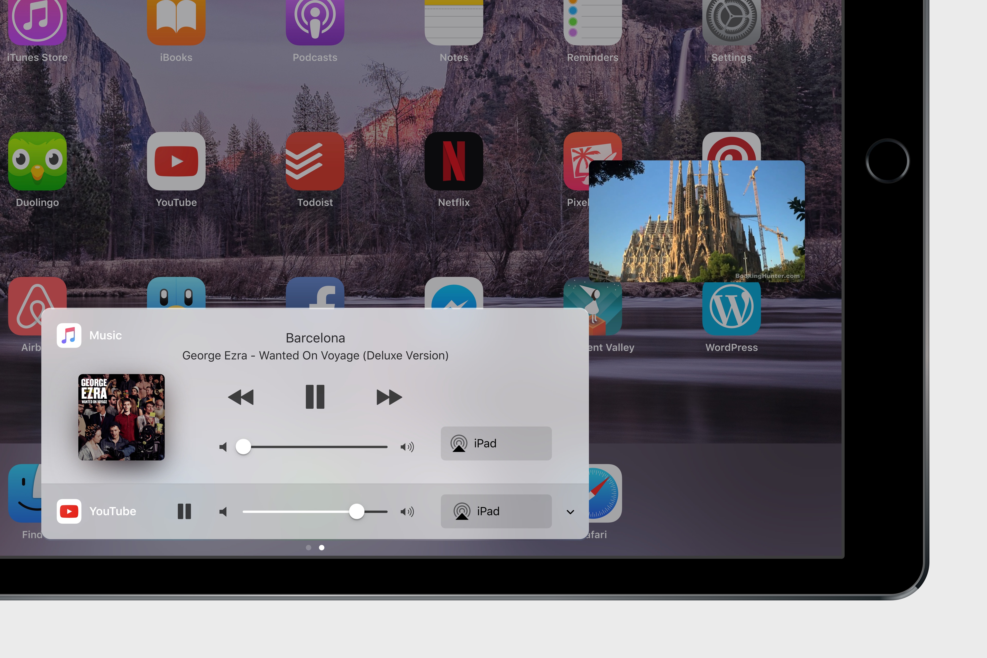
The benefits for podcasting and audio mixing apps would be obvious – GarageBand could record audio from Skype calls, while apps like Audiobus could forgo the SDKs they’ve built to work with simultaneous audio streams. Apple could use the dedicated audio page of Control Center to manage audio sources, which would gain individual playback controls and color highlights to indicate which app is playing audio on iOS 11.
A more versatile Notes. Apple’s revamped Notes app was one of the highlights of iOS 9, but, like other features mentioned in this story, it barely received any attention since. In the meantime, capable alternatives to Notes have appeared on the App Store and bigger players such as Evernote and Microsoft have continued to enhance their apps for casual and power users alike.
I wouldn’t change the core structure of Notes, but I’d improve its capabilities on multiple fronts. Apple Pencil users should have an option to sketch anywhere on a note without having to enter a specific drawing screen. This would turn notes into free-form mixes of typed notes and sketches comparable to apps such as Notability and GoodNotes.10 Like the latter, Notes should support handwriting recognition with OCR and make text searchable.11
In addition to individual notes, there should be support for sharing entire folders with other users. Plus, the iOS app should be able to create nested folders like on the Mac, and rich link snippets should be richer than their current implementation – perhaps borrowing from iMessage’s superior link previews.
Mail becomes pro and modern. Of all system apps, Mail is the most antiquated one. The market of email clients has changed over the past few years: every major player in this space now offers features such as snoozing, smart folders and saved searches, app integrations, and other functionalities that enhance dealing with email without reinventing the protocol behind it. From Outlook to Spark, Newton, Polymail, and dozens of others, there’s clearly demand for apps that modernize and supercharge email.
Apple Mail, on the other hand, feels stuck in the past. Apple has both failed to deliver an iOS version with all the functionalities of their Mac app, and they haven’t kept up with innovation happening in other email clients. At the very least, Mail should gain more powerful (and fast) search features with the ability to create smart folders, and Apple should add a snooze option for messages. But if the company is planning a bigger revamp of Mail, they should reconsider the in-app split screen mode that they almost brought to iOS 10 last year, and they should come up with an API to let other iOS apps integrate with Mail to process and save messages elsewhere.
Nobody likes dealing with email, but that doesn’t mean the tools we use to manage it should be subpar. There’s plenty Apple could bring to Mail if they want to keep up with the competition and offer a modern email experience for iPad users.
iOS 11
iOS 9 was supposed to be a new beginning for the iPad. Two years later, we’re still waiting for what comes next. We were given a taste of the future, and left hoping there would be more.
It’s time for Apple to go back to the iPad and fulfill the promise of a device that can redefine modern computing. iOS 9 seemed to hint at a different Apple – capable of rethinking fundamental traits of the iPad’s software while respecting its legacy and essence. I want to see the same approach and bold vision in iOS 11, with the iPad growing into a computing platform that takes the best features of the Mac and reimagines them for our times. I want to see the iPad ecosystem thrive again, creating new incentives for developers to craft desktop-class apps and for users to invest in the iPad as their primary computer.
iOS 9 was an outstanding update, but there’s so much more the iPad can be.
We’re ready for something new.
- I’d like to see an overall design refresh of the iOS interface, which includes the iPhone, but I don’t consider that as missing functionality. ↩︎
- For example, an app like 1Password could disable drag & drop for login items, but allow users to drop text into a secure note. ↩︎
- If only Apple had a technology capable of intelligently converting between data formats that could be integrated at a system level… ↩︎
- At least since Drag Manager on System 7. ↩︎
- Check out the replies to this question on Twitter for some interesting screenshots. ↩︎
- In my mind, an item pulled from the Shelf and dropped into an app shouldn’t be automatically deleted from the Shelf as I can see the benefit of dropping the same item in multiple locations. Thus, each item would have to be manually deleted from the Shelf, though we also imagined a ‘Delete All’ option for quicker Shelf management. ↩︎
- Of course, an offline mode should be available for users who aren’t always connected to the Internet. There should also be an option to mark important documents as always available for offline access, regardless of the OS’ intelligent caching. And, users could turn off iCloud Drive altogether if they can’t or don’t want to use the service. ↩︎
- Apps could also show up in the Finder without having to integrate with iCloud Drive at all – cloud storage and sync would be optional. ↩︎
- The 12.9” iPad Pro would have plenty of space for additional buttons in toolbars of apps like Safari when in landscape mode. In Split View and on smaller iPads, there could be an overflow menu to display buttons that don’t fit in a single view (just like Safari currently handles bookmarks that don’t fit on the screen). ↩︎
- This might require backtracking on the previously-backtracked decision to use the Pencil for standard touch navigation, but I think Apple will have to make some changes here eventually. I understand that some users prefer to use their Pencils to control the iOS interface, but I think that could become an option under Accessibility. That way, users who have to deal with RSI issues would still be able to navigate iOS with a Pencil, but others could gain new options and features when a Pencil is detected on the screen, such as drawing anywhere in Notes without having to press a dedicated software button. ↩︎
- Egg freckles? ↩︎