Getting Started with the Popup Control for Xamarin.Forms

Popups are widely used in mobile applications to display alerts and notifications that provide the user with specific information, or to receive input. To make your life as a developer easier - our primary goal - I am happy to introduce to you the latest addition to the Telerik UI For Xamarin suite: the Popup control.
In short, the Popup control lets you display content of your choice on top of an existing view. The control includes a few useful configuration options, such as modality, to help you accomplish the scenario per the design you have. This blog post will walk you through the key features of Telerik UI for Xamarin Popup control.
Modal or Not Modal?
When you have a modal popup basically the user cannot interact with the UI behind it. You can decide whether to define your popup as modal by setting the IsModal property.
In addition, RadPopup provides a way to set an overlay background color regardless of whether it is set as modal or not. Still, I assume this option will be more useful in the case of a modal popup to indicate the content behind is inactive.
Below, check out a quick sample of a modal popup with overlay background applied through the OutsideBackgroundColor property:
<telerikPrimitives:RadPopup x:Name="popup"
                    IsModal="True"
                    OutsideBackgroundColor="#6F000000">
    <telerikPrimitives:RadBorder CornerRadius="8" BackgroundColor="White" WidthRequest="300">
        <StackLayout Margin="20">
            <Label Text="Latest Stories in Your Inbox" FontAttributes="Bold" FontSize="18" HorizontalOptions="Center" />
            <Label Text="Sign up to be the first to get our expert written articles and tutorials!" TextColor="#4A4E52" FontSize="14" />
            <telerikInput:RadEntry  WatermarkText="Enter your email address"  Margin="0, 10" BorderStyle="{StaticResource EntryBorderStyle}" />
            <telerikInput:RadButton Margin="10,20,10,20" BackgroundColor="#009EDB" TextColor="White" Text="Subscribe Now" Clicked="SubmitClicked" />
        </StackLayout>
    </telerikPrimitives:RadBorder>
</telerikPrimitives:RadPopup>
Where Should You Position the Popup Control?
RadPopup provides a few useful properties which will help you position it per your preferences. Those include:
PlacementTargetproperty defines an element relative to which the popup is positioned when it is open; if you define RadPopup in XAML, it should be attached to an element which will be treated as placement target.Placementproperty specifies the way the popup aligns to its placement target. Placement can be set to any of the Top, Right, Left, Bottom, Center or Relative options.- Furthermore, you could apply
HorizontalOffsetandVerticalOffsetto set the horizontal/vertical distance respectively between the placement target and the alignment point.
I will take the modal popup defined above and will position it at the center of the screen by directly attaching it to the Page element and setting its Placement to Center:
<ContentPage xmlns="http://xamarin.com/schemas/2014/forms"
xmlns:local="clr-namespace:PopupTest"
...
x:Class="PopupTest.MainPage">
<telerikPrimitives:RadPopup.Popup>
<telerikPrimitives:RadPopup x:Name="popup"
IsModal="True"
OutsideBackgroundColor="#6F000000"
Placement="Center">
...
</telerikPrimitives:RadPopup>
</telerikPrimitives:RadPopup.Popup>
...
</ContentPage>
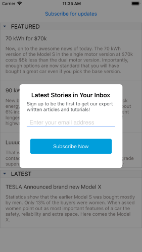
Check how the above defined popup control looks when opened on iOS simulator:

How Can You Configure the Animation?
RadPopup has a default animation applied of type Fade. You could switch it to Zoom type or disable the animation completely to make the popup show as quickly as possible.
Still, if you prefer setting an animation, you could also customize the duration and easing (acceleration over time) through AnimationDuration (in ms) and AnimationEasing (of type Xamarin.Forms.Easing) properties.
I have changed my Popup animation settings as shown below:
<telerikPrimitives:RadPopup.Popup>
    <telerikPrimitives:RadPopup x:Name="popup"
                        AnimationType="Zoom"
                        AnimationDuration="500"
                        IsModal="True"
                        OutsideBackgroundColor="#6F000000"
                        Placement="Center">
      ...
    </telerikPrimitives:RadPopup>
</telerikPrimitives:RadPopup.Popup>
You can see below how the popup is now displayed:

Learn More and Share Your Feedback
I hope I have managed to give you an overview on the basic features of the Popup control in Telerik UI for Xamarin, and feel free to check out the documentation if you're curious for more. We’re preparing a series of blog posts where we’ll take a look at more advanced scenarios with the control, so stay tuned.
In the meantime, we would love to hear your feedback about the Popup control and how we can improve it. If you have any ideas for features to add, do not hesitate to share this information with us on our Telerik UI for Xamarin Feedback portal.
If you have not yet tried the Telerik UI for Xamarin suite, take it out for a spin with a 30-day free trial, offering all the functionalities and controls at your disposal at zero cost.

Yana Kerpecheva
Yana Kerpecheva is a Senior Technical Support Engineer on the Telerik UI for Xamarin team. She has been working with Telerik products since 2008, when she joined the company. Apart from work, she likes skiing and travelling to new places.
