
Bringing new life to Figma’s brand


From typography to colors to illustration, the Figma brand has evolved.
A brand refresh is no small task. Especially when you’re a company that’s rooted in design—there’s an added pressure to get it right. For us to get it right, collaboration was a major theme. In fact, collaboration was the colorful thread that tied the whole process together. From the pushing-the-envelope brainstorms that involved our cross-functional teams, to the methodology behind the new illustrations, to the way we used Figma itself to bring our ideas to life.
Here’s how we landed on Figma’s new look and feel.
Evolving Figma’s brand language
I joined Figma about a year ago with the goal to evolve the brand. Of course, I was familiar with Figma, but as I started dissecting the brand language under this lens, I realized there was a lot of great work that already existed. We didn’t need to start from scratch, we just needed to give Figma a longer runway than it currently had. The foundational brand language already had strong pillars conceptually and value-wise, but when they were established, Figma was a new and smaller company. We needed an expansive brand language that would match how much the company has grown. For example, we have a blog now. If a designer is working on a visual for the blog, what rules should the image follow? We took the limited brand guide that existed and added new pages and chapters.
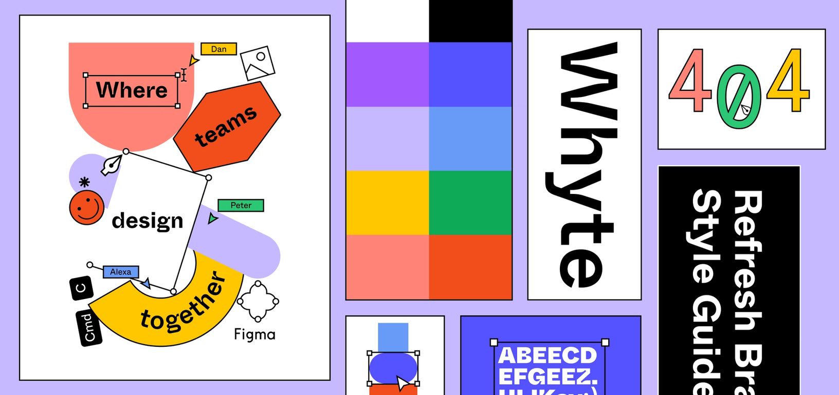
For that reason, what you see in the refresh won’t feel like it’s out of left field. It’ll look and feel like it’s still orbiting the same sun because we took inspiration from what already existed and gave it new wings. We’re taking those original ideas and hitting different angles and points and dialing up certain things. Like the shapes, for example. They’ve always been a part of Figma’s brand, but with the refresh, we found new places they could live and new ways they could be used that still made sense.
Establishing Figma’s personality
Before we designed anything, we started with a lot of research to nail down our strategy. In this process, it helped to think of Figma the brand as a living entity to better bring it to life in our minds. If Figma were a person, how does it walk and talk, and breathe and live? It might wear different clothes every day, but it still has a distinct style. Over the course of weeks, we put together a list of four guidepost personality words, but we included a few detail descriptors to clarify what we mean when we say that Figma is bold, for example.
- Curious — Clever, playful, imaginative. This is your friend with the far-out ideas. They always want to be learning more and considering the things that might not be obvious.
- Vibrant — Dynamic, confident, alive. Figma loves nerding out on certain topics and is proud of it.
- Honest — Inclusive, empathetic, approachable. We’re never afraid to admit that we don’t know everything, but together we can figure it out.
- Bold — Powerful, unexpected, non-conforming. We don’t live in the shoulds, we do what is right and true to us.
We needed a brand that could flex between being reserved and also playful. One that can go from consumers to enterprise, and we felt the words above got us there.
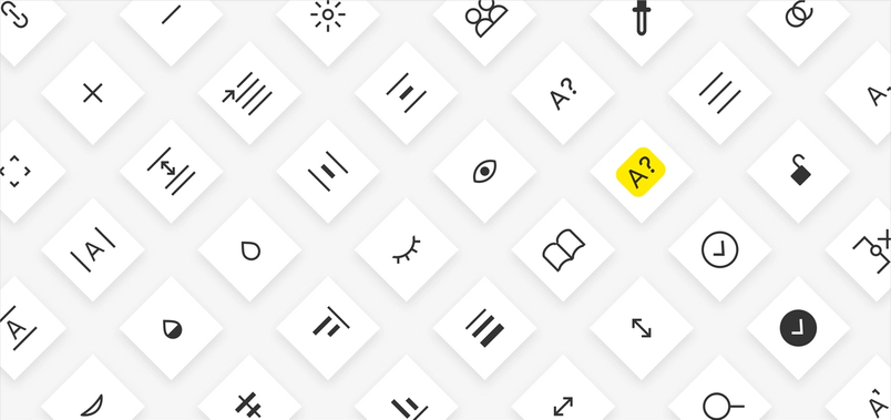
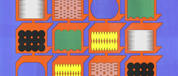
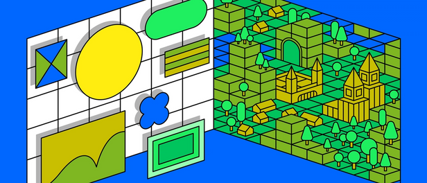
Shapes that show off the process
Some people might think we just made a bunch of fun new shapes, but there’s a clear methodology behind how they interact or collaborate with each other. We like to think about the shapes as people. People talking, working together, sometimes arguing, or just existing. The illustrations show that collaboration. Depending on how you position them, lots of harmonious compositions can be created. Of course, just like people, some shapes work well with others, while others do not.
There are different levels of illustration using the shapes depending on what the moment calls for. If it’s a place where someone is learning and needs absolute clarity, there are no abstract shapes. We include only the illustrations that are simple and straight-forward.
We want design to be more accessible to people, so a lot of our shapes are very simple. They might come together to form something complicated, but they distill down into basic shapes. In the illustrations, we sometimes show that process — how the shape is built.

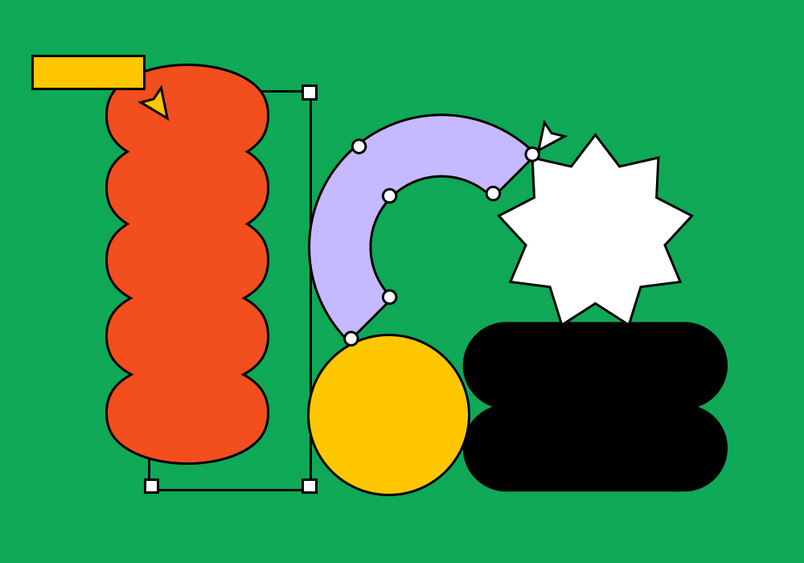
We also wanted the illustrations to feel like they’re still in process. In design, there can be a tendency to share only when it’s complete and perfect. But we wanted to highlight the work that goes into making — it’s often messy, imperfect, changing all the time just like people are. We felt that this realness, this aliveness helped dial up Figma’s vibrancy. You’ll see in the illustrations that at least one element is being manipulated or edited. Nothing feels quite like it’s perfect or complete. We wanted to encourage people to highlight their mess and share how they create. Maybe that way, someone else can learn from your process.
A typography with a few quirks
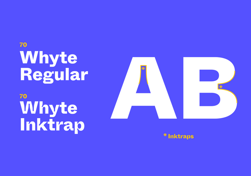
In the search for a new brand typeface, a designer on our team came across one called Whyte from Swiss foundry Dinamo. At first glance, Whyte looks pretty normal, and then you look closer and you start to notice some oddities. Whyte actually comes in two different versions—standard and inktrap. We fell in love with the inktrap version because it references ink traps in design history. Historically, when people were using metal plates to manually print, ink traps were cut in to create a place for the ink to pool. At smaller sizes, it’s difficult to see, but when you blow the letters up, you can clearly see the notches. We loved it because that characteristic adds an illustrative element to the type itself and we actually wanted to highlight this part of the type’s design that is usually invisible. Whyte spoke to what we wanted to achieve — a seamless flex between nonconforming and reserved.

Using Figma to refresh Figma
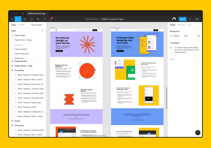
We worked exclusively in Figma for the refresh, which was a stretch to our creative muscles since we grew up doing this type of work in Photoshop and Illustrator. We had to come up with new ways to do things. But because we were already thinking creatively, it led us to some celebratory moments where we took an idea even further because of something Figma allowed us to do. Collaboration was a huge part of that. This wasn’t a project where we could or should divide and conquer. We needed to work together, and often, that meant simultaneously. That’s something we could only do in Figma. Whether it was through the process itself, or the illustrations we were creating, we wanted to find ways to demonstrate Figma’s power. For that reason, we hope that the refresh is a testament to what Figma can do.

See the refresh in action. Check out the all-new homepage, explore the typeface and updated color palette throughout the entire site, and see the redesigned social media graphics for Twitter and Instagram.

About Tori
I’m a designer, creative director, and writer, with a BFA in graphic design from RISD. I’m originally from Florida, did a 10-year-stint in the northeast, and these days I’m on the West Coast. I live in San Francisco, don’t tweet about design, and try to love on people as much and best as I can.
I fight for and believe in the equality of all people, so I started Women of Graphic Design in 2013 in hopes of correcting some of design’s gender bias. It is still the project I am most proud of and passionate about. I’ve written about it and listened to others’ experiences, and am always open to collaboration.