
Crafting better App Icons
Learn the key aspects behind crafting better App Icons on different Apple platforms.
An App Icon is the initial point of contact between users and applications, and it contributes significantly to first impressions. It has to be a distinctive and memorable graphical representation that serves as the visual identity for an app or a game.
They play a pivotal role in shaping user perceptions and interactions. A well-designed app icon goes beyond mere aesthetics; it aids users in quickly locating and identifying the app while also playing a crucial role in the competitive app marketplace, where standing out is key.

Since the App Store is full of games and applications, how can we catch users’ attention through the small artwork that is the App Icon?
The Creation Process
The art of creating App Icons is not just in technicalities. As with every business card, the App Icon should tell something about your application, tell the story behind it, and give a taste of what the user will experience. Infusing an element of fun and playfulness into the design is crucial to establishing an emotional connection with users.
Embarking in the process with the right mindset will help you to find the best way to communicate your intentions through your design.
Going through this creation process requires careful consideration. Although beginning with an empty canvas may appear intimidating, starting the process with initial sketches, even for individuals who may not feel confident in their drawing abilities, can be extremely beneficial. Sketching is a way to freely explore ideas without the immediate concern for perfection.
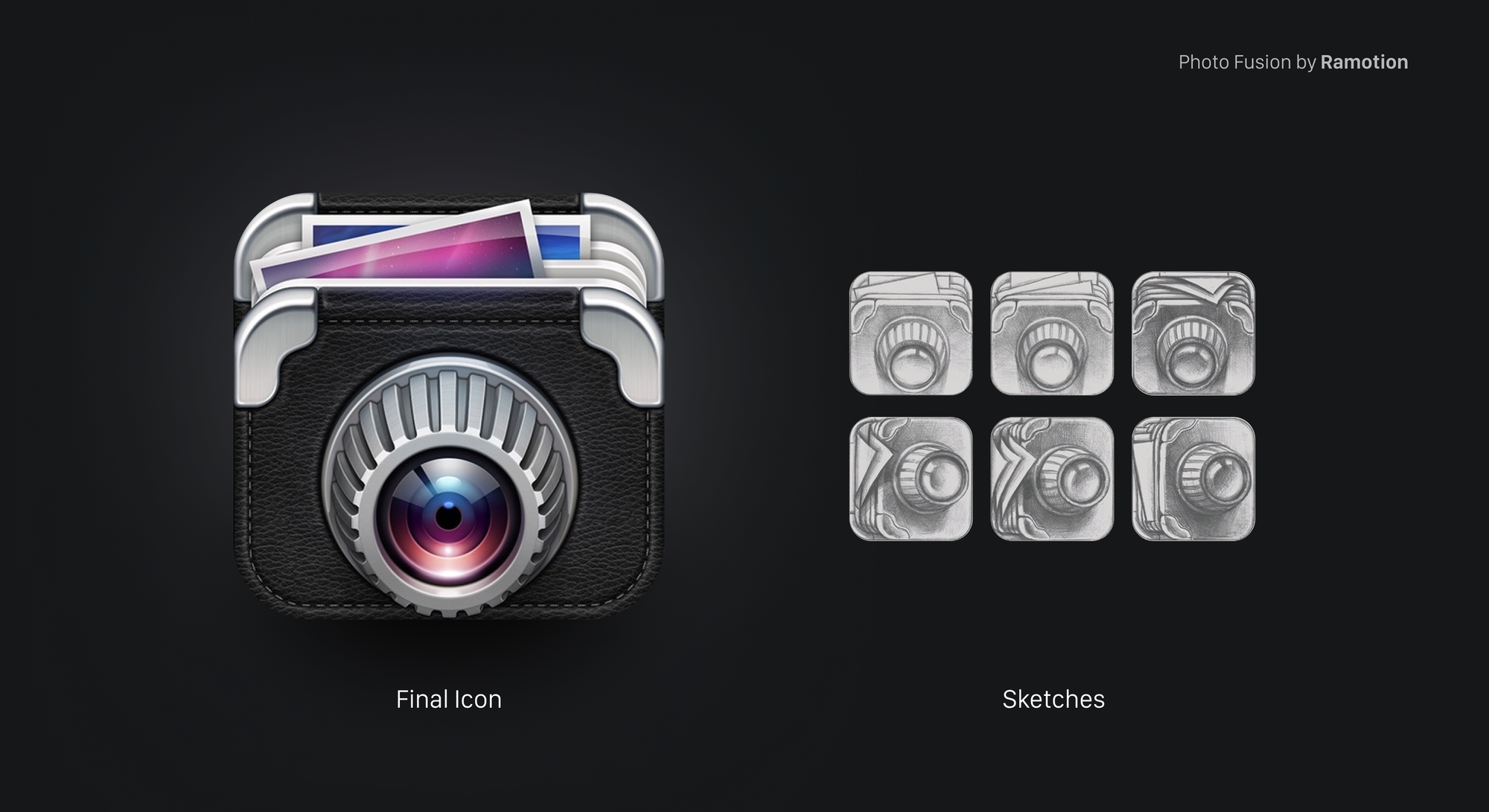
Engaging in doodles and seeking input from peers is essential, as your app icon should be distinctive.
Patience is key. Take the time to explore options, analyze choices, and preserve your work. Solutions may not come immediately, and often, simplicity or an initially discarded direction proves to be the optimal choice.
Testing your ideas it’s crucial. Evaluate how the app icon looks everywhere it will be shown. It will be displayed in many different places, like: on the home screen of the device, within folders, on the App Store product page, and in the Settings app.
Core Aspects
There are some core aspects that you can infuse in your work starting from a preliminary stage of designing your App Icon. Those are not strict rules, they are common visual principles that you can find in the design world, they serve the purpose of achieving a balance between the usability of your design and having a visual that stands out.
Make it Versatile
Ensure the effectiveness of your icon design across various platforms and sizes. The icon will be displayed in multiple locations throughout the platform, emphasizing the importance of maintaining both legibility and uniqueness.
Complex icons that attempt to incorporate too much information often suffer from poor scalability. Prioritize the simplicity of lines and shapes during the conceptual stage and favor ideas that can be conveyed through a singular object.
Avoid the pitfall of attempting to represent diverse functionalities within a single icon, as this can lead to confusion. Using high-contrasted colors and vibrant shades of the same color is a common approach to ensure recognizability even in smaller usages of your design.
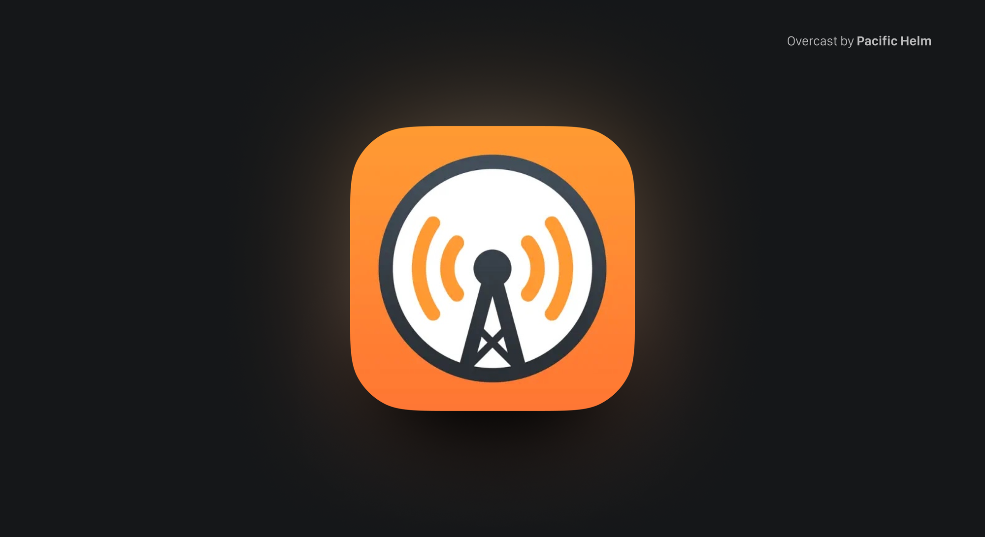
Take the time to create small sketches, even if they are just quick and rough, as this process aids in refining your design. Experiment with removing components from your design to assess the icon's resilience and conceptual integrity.
Versatility and scalability play a crucial role in the visual success of icons, and addressing this aspect early in the design process is key to creating an impactful impression.
Make it Consistent
Establishing a strong and consistent design language is a potent means of leaving a lasting impression on users. Effective app icon design serves as an extension of the application's essence. Ensuring alignment between the app's purpose and visual representation enhances the overall user experience, fostering memorability.
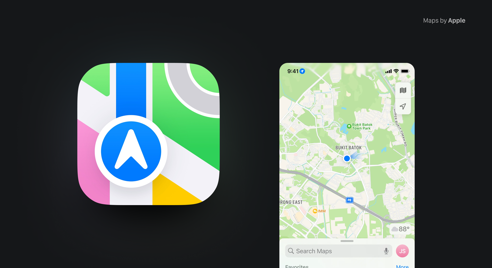
A straightforward approach to achieving this synergy is incorporating dominant colors from the app or branding into the icon, providing a foundational and consistent element. Additionally, consider transforming existing graphic elements into iconography, further reinforcing the cohesive design language. By maintaining consistency in these visual aspects, you enhance the overall effectiveness and impact of your app icon.
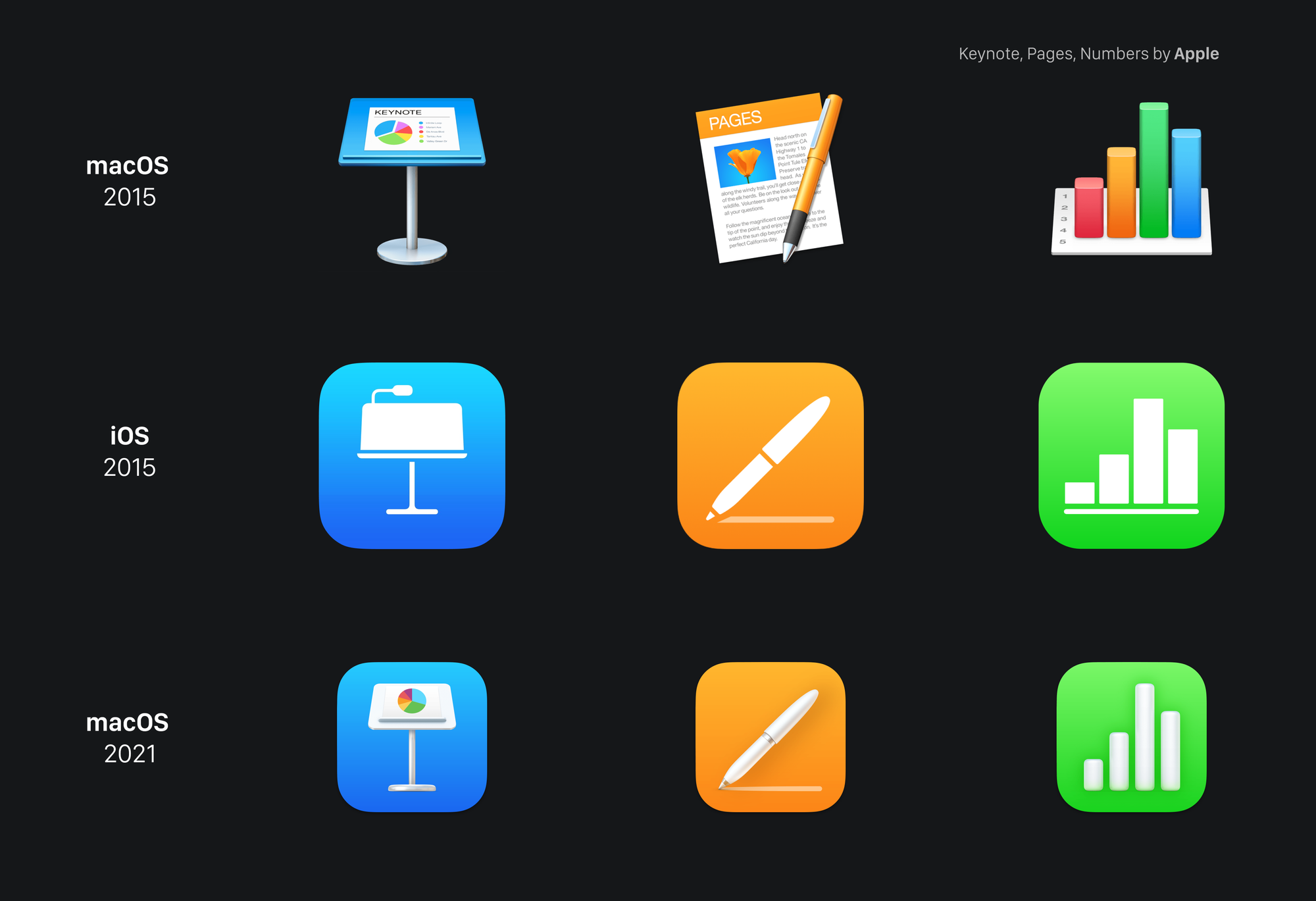
When you have a multiplatform app or a bundle with multiple apps, consistency will play a big role in how effective the App Icon design is. Keeping the same visual language also increases recognizability through platforms and markets. This is crucial also when changes to your icons are applied over time.
Make it Original
Designing presents challenges that depend not only on personal skills but also on the choices made by others facing apparently simple tasks. Despite this complexity, it's crucial to incorporate the factor of originality and uniqueness into our design discussions when evaluating concepts.
While achieving absolute originality is not guaranteed, starting with thorough research and avoiding overused ideas is a prudent approach. Take note of what others are doing in the same space, and deliberately choose a different direction.
An often overlooked method for differentiation is through color. Amidst a sea of blue app icons, exploring alternatives like purple or gradients can provide a distinctive touch.
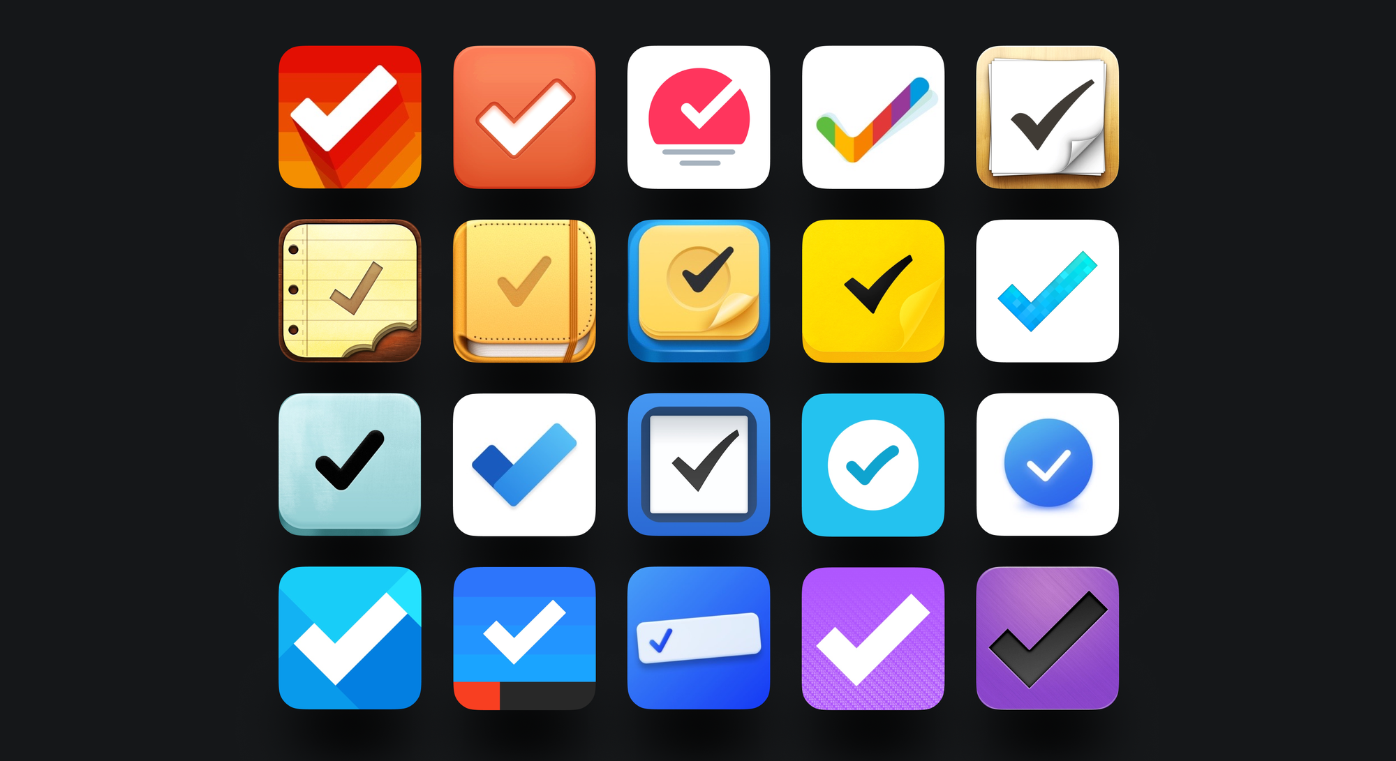
Prioritizing the quest to stand out is a valid reason for design choices, highlighting the importance of moving beyond conventional expectations without becoming overly fixated on immediate comprehension.
Make it Memorable
Recognizability stands as an abstract but game-changing concept, influencing the ability of an icon to establish an emotional connection between the user and your App Icon.
It's all about how easy it is to understand the ideas behind the design and how well the message is conveyed through the execution. Icons boasting high recognizability are characterized by concepts and executions that leave a lasting imprint on users' minds. Designing for recognizability involves considering immediate comprehension and also acknowledging its potential growth over time.
Abstract vs Literal
To quickly convey your app's purpose, especially during the initial interaction on the app store, using familiar symbols and cultural cues is an effective strategy.
This may involve a literal representation of the app's main function, as seen in the Notes app icon. This helps the user to understand upfront what your app is about and what they can get by downloading and using it. However, this could lead to a lack of experimentation with concepts and trials in sketching, sticking to that one literal meaning that is overrepresented.
Abstract representation, on the opposite side, allows you to create a strong identity that lasts over time. Even if there’s no literal meaning behind the icon, a glyph or a unique new symbol can acquire recognizability over time, allowing you to diverge more with concepts, and techniques and strengthen the branding of the App, if it exists.
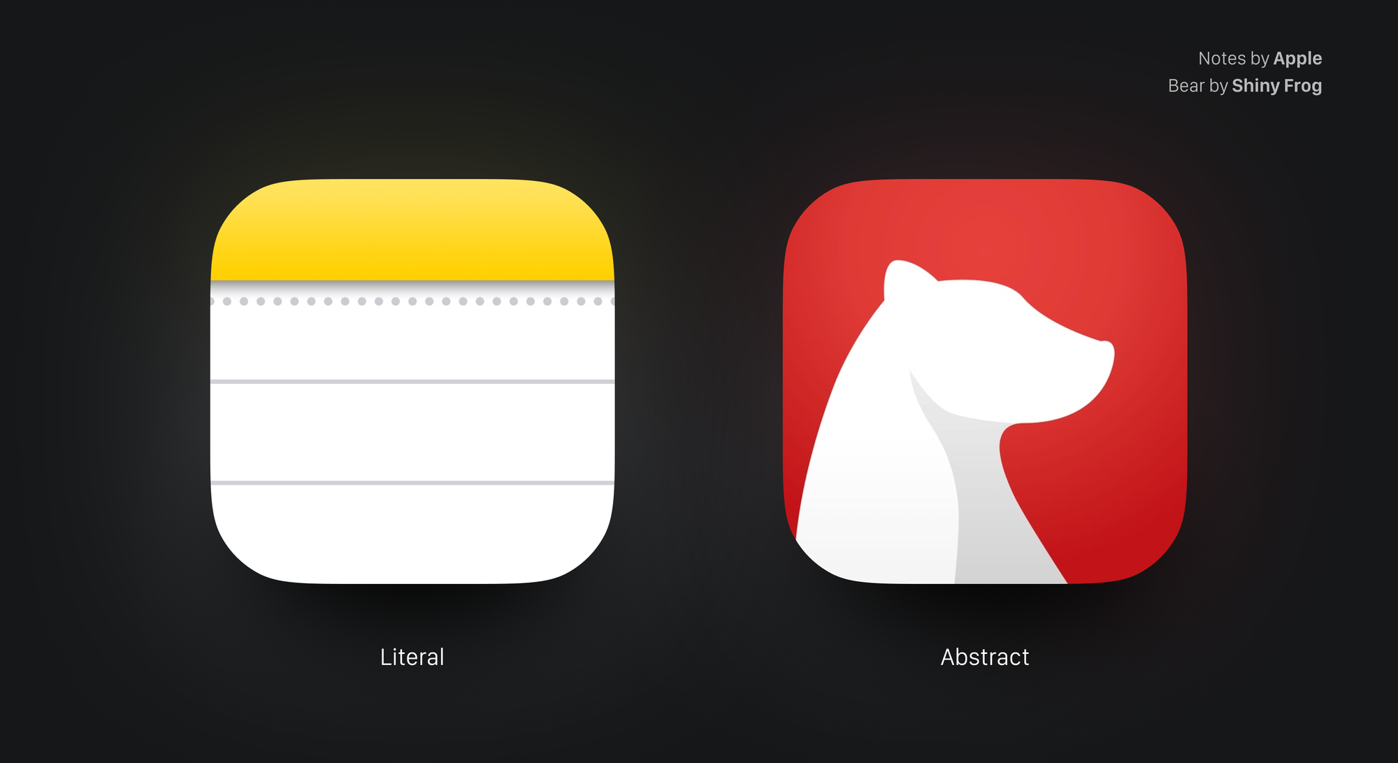
Turning an existing logo, that was designed to be displayed on different platforms and environments is not always a successful strategy. Notably, icons and logos, while related, have distinct attributes, tool sets, deliverables, and constraints.
Alternative App Icons
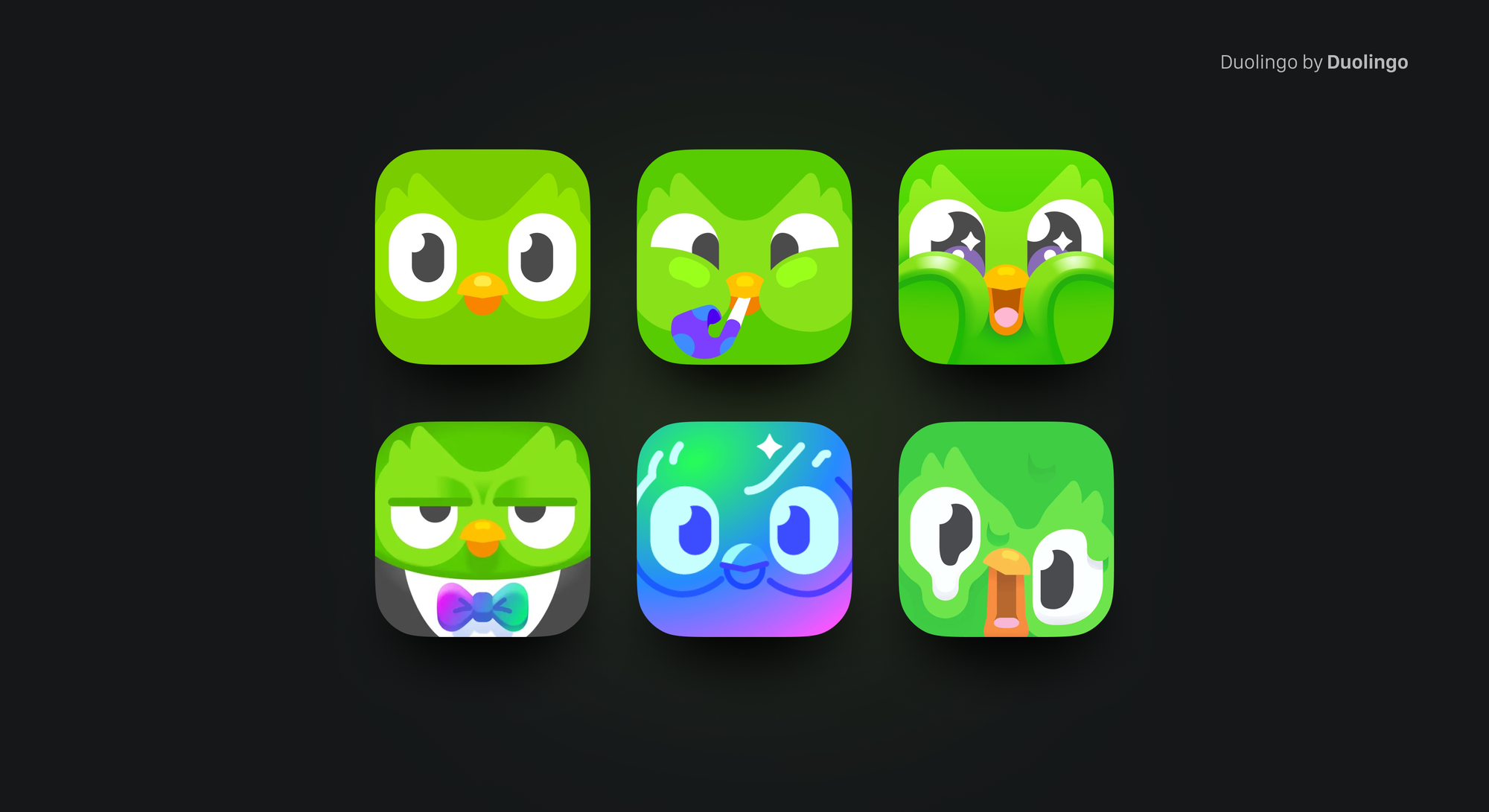
Increasing the number of App Icons shipped and pushing on user customization is a great experience to enjoy both as the designer and as the user. You can have fun with shapes, colors, and materials and let the user have a deeper connection with the design that is displayed on their home screens.
Changing or updating your App Icon can also catch the attention of an everyday user: you can communicate significant updates, and seasonal events and express a refreshed brand identity. Remember to stay consistent with your original design when pushing your icon in offering alternatives, and don’t do it too often otherwise the main render might get lost in time.
Key Guidelines
Following conventions and system guidelines is a good way to kickstart your creation process. Getting core aspects right is the key to achieving a solid and memorable app icon.
App Icons Attributes
Your icon should be designed at the proper resolution to be implemented in Xcode. In iOS and macOS, for example, the icon has to be sized at 1024x1024px.
There are some key attributes that you have to make sure that your file matches:
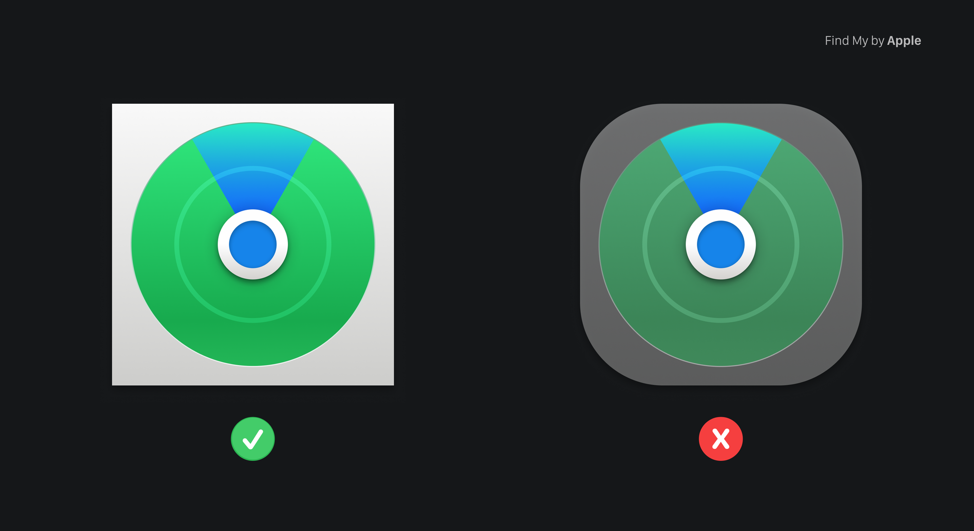
- Always provide a squared image as an App Icon, don’t apply a corner radius. The system will automatically apply a mask for the platform you are designing for.
- Work in sRBG or P3 color space. Xcode runs in P3 color space and sRBG almost matches this spectrum, but working in different spaces will result in an inconsistency in colors applied. Since you are working on display only, remember to work on the resolution of 72 dpis.
- Don’t apply transparency in your background layer. Your app icon will be displayed in different screen scenarios, and having transparency on the background will result in color changes and inconsistency, plus color readability and Xcode errors.
- PNG file format works best with Xcode and raster quality.
Apple Ecosystem
Understanding the platform for which you are developing has a huge impact on the outcome of your Icon. Different devices have different guidelines and requirements to fit the environment in which they will be displayed.
Getting started using the right grid to design your app icon for a specific device helps you match requirements and unlock unique ideas.

iOS and iPadOS
The process of defining your App Icon in Xcode for iOS and iPad has been greatly simplified. You can now choose the 1024x1024px size if you don't require any scaling adjustments for your design. However, you still have the option to manually upload your App Icon in different sizes, considering its appearance in various locations.
For instance, in the Settings application for the iPhone, the icon of your application will be displayed at 58x58px. In this case, iOS automatically adds a 1-pixel stroke to all icons to ensure they maintain a polished appearance against the white background of the Settings interface. Therefore, it is advisable to avoid adding an overlay or border to your Settings icon.
macOS
App Icons in macOS share a common visual language that takes inspiration from real-world objects, adding detailed shadows, lighting, and materials.
You can use the classic Icon shape to define the context, mixed with an angled tool related to it. Let the tool float just above the background and extend slightly past the icon boundaries. Using a strong relation between it and the background shape can help enforce your app’s goal and utility.
For example, the Chess app uses a horse piece as a tool and its environment, the chessboard, as background shape.
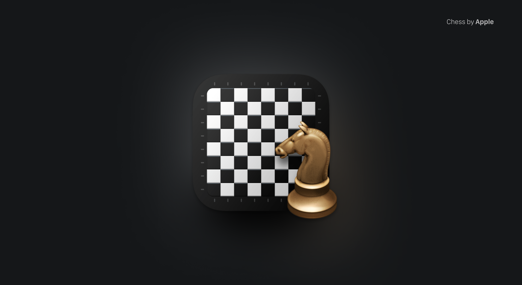
If you choose to represent tangible items in your App Icon, ensure they convey a sense of physicality by resembling authentic materials and have real mass. Replicate the qualities of materials such as metal, glass, paper, or fabric to effectively communicate the weight and texture of the depicted objects.
Using interior shadows and highlights to add realism is a good way to replicate the characteristics of existing materials. Try to do so in a way that implies a light source directed towards the icon from just above the center and with a slight downward tilt.
visionOS
In the context of visionOS, your App Icon will feature a circular design and provide a sense of depth due to the three-dimensional effect applied by the system on your icon when the users look at it. To achieve this goal, you will need to provide the system with a layered icon, made of at least one background image and a non-background image.
For a deeper dive read the following article covering how to translate an existing app icon to visionOS.

watchOS
A watchOS app icon has a circular design and does not display accompanying text. You must avoid having an Icon with complex designs and shadowing because since it will be displayed on a small display, it would make your App Icon hard to read and recognize.
Also, do not use a black background on your Icon, otherwise, it will vanish in the background of the Apple Watch app library view.
tvOS
App Icons in tvOS feature a multi-layer image and rectangular shape. This allows the system to create on the Icon a parallax effect, creating depth and making it feel alive as people bring it into focus.
For this reason, it is crucial to understand which element of your design has to stand out and properly separate the layers of the App Icon between two and five different levels.
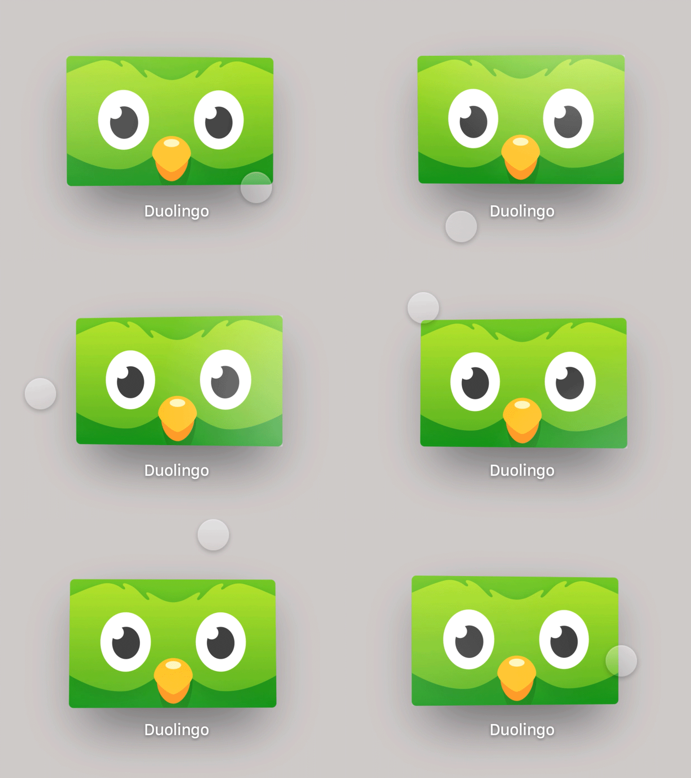
Opacity levels in different layers can make a difference in the overall appearance of your icon. In your background level, using a solid gradient can help you regulate the light and depth of your icon. Choose gradients that go from light to dark, top to bottom.
Make sure the shadows are distinct and well-defined, seamlessly merging them with the background to ensure they aren't noticeable when the app icon is static. Test your layers together to match the look of the complete icon.
Remember to always keep an eye on the safe-area specifications, since while focusing and applying parallax effects, the system might crop content at the edges of your app icon when the icon is scaled or moved.
Conclusion
Crafting a compelling app icon is a nuanced art that goes beyond mere aesthetics. It is a gateway to user engagement, making a lasting first impression in a saturated market.
Adhering to platform-specific guidelines, considering the unique attributes of each device, and maintaining consistency are essential steps in the design process. Simplicity, recognizability, and versatility are key principles that contribute to the effectiveness of an app icon, ensuring its impact across various platforms and sizes.
The journey of creating an app icon involves a blend of technical precision, creative exploration, and a deep understanding of the app's essence. By embracing originality, experimenting with design elements, and keeping an eye on user experience, designers can shape an icon that stands out and resonates with users, fostering a meaningful connection between the application and its audience.
Other Resources
You can find more about App Icons and size specifications on Apple's Human Interface Guidelines:
Michael Flarup, the famous App Icon designer from Denmark, shared his process for the creation of App Icons at the Adobe MAX Conference 2023:

Find inspiration or just discover how unique is your design, have a look at the work of other App Icon designers at App Icon Galleries by Jim Nielsen:

Gallery of iOS app icons
Gallery of macOS app icons

Gallery of watchOS app icons


