Flexbox is well-known for solving common layout problems such as sticky footers and equal-height columns. Beyond those capabilities, it also provides a few other useful features that aren’t so popular. Let’s explore two of them!
Flexbox and z-index
As you probably already know, the z-index property works only on positioned elements. By default, all elements have position: static and aren’t positioned. An element is “positioned” when its position property is set to relative, absolute, fixed, or sticky.
However, an “unpositioned” element, such as a flex item can also receive the z-index property. The CSS Flexible Box Layout spec says:
Flex items paint exactly the same as inline blocks [CSS21], except that order-modified document order is used in place of raw document order, and z-index values other than auto create a stacking context even if position is static.
To understand this behavior, consider the following example:
See the Pen Flexbox and z-index by SitePoint (@SitePoint) on CodePen.
Here we define two elements: the .front element and the .back element. The .front element has one child, a box with a number “1”. The .front element itself is absolutely positioned. Specifically, it has position: fixed and covers the entire viewport.
Our .back element is a flex container. It contains two child elements — boxes with numbers “2” and “3”. Based on what we’ve discussed above, we can set the z-index property of its flex items, even if they aren’t positioned elements (i.e. they have position: static).
Notice that when we add z-index: 2 to the flex items by clicking the button in the demo above, they are positioned on top of the .front element.
Flexbox and Auto Margins
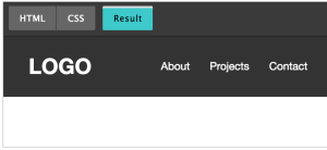
By applying auto margins to flex items, we’re able to solve common UI patterns. To begin with, let’s assume that we want to build this typical header layout:

To build it, we’ll use flexbox. No floats, fixed widths, or anything like that.
Here’s our markup:
<header>
<nav>
<h1 class="logo">LOGO</h1>
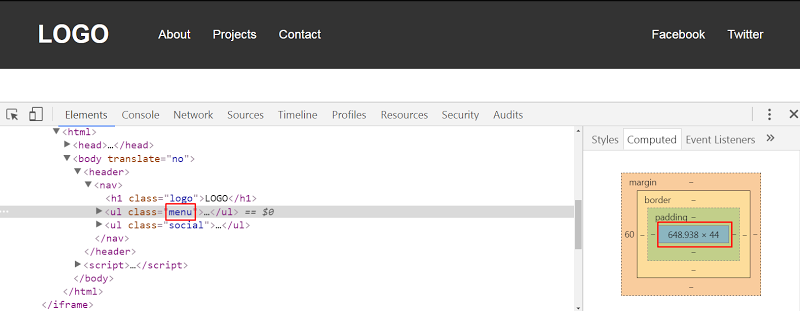
<ul class="menu">
<li>
<a href="">About</a>
</li>
<li>
<a href="">Projects</a>
</li>
<li>
<a href="">Contact</a>
</li>
</ul>
<ul class="social">
<li>
<a href="">Facebook</a>
</li>
<li>
<a href="">Twitter</a>
</li>
</ul>
</nav>
</header>Our CSS looks like this:
header {
  background: #333;
}

nav {
  display: flex;
  align-items: center;
  width: 90%;
  max-width: 1200px;
  margin: 0 auto;
}

.menu {
  margin-left: 60px;
  margin-right: auto;
}
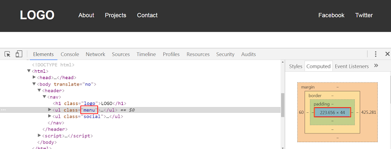
In this example, our nav element is the flex container and the logo, main menu, and social menu the flex items. As you can see from the previous visualization, the first two flex items are aligned to the left side of the flex container along the main axis. On the contrary, the social menu is aligned to the right edge of its parent along the main axis.
One way of achieving this custom alignment is to add margin-right: auto to the main menu. With just one line of code, we’re able to override the default alignment for the social menu and push it all the way to the right of its container. Similarly, we use the align-self property to override the default alignment for a flex item along the cross-axis.
Beyond auto margins, there’s a second method we can use to build the desired layout. First, we remove the margin-right property from the main menu and then, we add flex-grow: 1 to it.
Even though the result in both cases seems the same, there’s one big difference. With the first solution, our menu has its initial calculated width. So for example, when the viewport width is 1100px the menu width would look something like this:
On the other hand, with the second solution, the menu width gets bigger because we specify flex-grow: 1. Here’s its corresponding width when the viewport width is 1100px:
The Codepen demo:
See the Pen Custom Flexbox Alignment With Auto Margins by SitePoint (@SitePoint) on CodePen.
Let’s now assume that we want to modify the header layout. Here’s the new desired one:
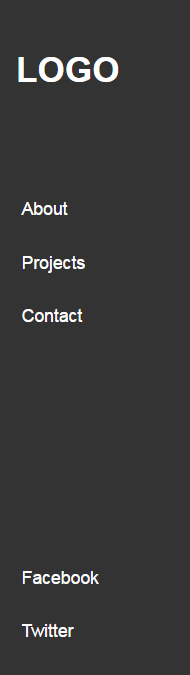
The markup remains the same. We just make a few changes in the CSS:
nav {
  background: #333;
  display: flex;
  flex-direction: column;
  height: 100vh;
  width: 180px;
  padding: 20px;
  box-sizing: border-box;
}

.menu {
  margin-top: 60px;
  margin-bottom: auto;
}
In this example, notice that the social menu is aligned to the bottom edge of its parent. Again, this is done it by adding margin-bottom: auto to the main menu. Of course, we can also use flex-grow: 1, yet this solution will increase the menu height.
See the Codepen demo below:
See the Pen Custom Flexbox Alignment With flex-grow:1 by SitePoint (@SitePoint) on CodePen.
Another thing to keep in mind is that if we define the justify-content property in any of our examples, we won’t see any visual difference. That happens because we use auto margins to align the flex items. Only when we remove the auto margins will the justify-content property take effect. According to the spec:
If free space is distributed to auto margins, the alignment properties will have no effect in that dimension because the margins will have stolen all the free space left over after flexing.
Next, let’s create a new variation of our header:

Undoubtedly, this can be easily achieved by setting justify-content: space-between to the flex container. But once again, we’re able to produce the same layout with auto margins. All we have to do is to apply margin: 0 auto to the main menu.
The Codepen demo:
See the Pen Custom Flexbox Alignment With Auto Margins by SitePoint (@SitePoint) on CodePen.
Conclusion
In this article, we covered two little-known flexbox tips. Before closing, let’s recap:
- We can apply the
z-indexproperty to flex items, even if they haveposition: static. - We can use auto margins to achieve custom alignment for our flex items across the main axis.
If you’ve used any of those tips in your projects, let us know in the comments below.
Frequently Asked Questions (FAQs) about Z-Index and Auto Margins in Flexbox
What is the Z-Index in Flexbox and how does it work?
The Z-Index is a CSS property that controls the vertical stacking order of elements that overlap. In Flexbox, the Z-Index property can be used to control the order of flex items along the z-axis. It’s important to note that the Z-Index only works on positioned elements. The default value is auto, which means the stacking order is equal to its parent. If you assign a positive number to the Z-Index, the element will be on top of the parent element.
Why is my Z-Index not working in Flexbox?
There could be several reasons why your Z-Index is not working in Flexbox. One common reason is that the Z-Index property only works on positioned elements. If your element is not positioned (i.e., it doesn’t have a position value of relative, absolute, or fixed), the Z-Index will not have any effect. Another reason could be that the parent element has a Z-Index value set, which can affect the stacking order of child elements.
How do auto margins work in Flexbox?
In Flexbox, auto margins have a special feature. They can absorb extra space and push adjacent items away. When you set an auto margin on a flex item, it will take up any remaining space along the main axis, effectively pushing other items away. This can be useful for aligning items within a flex container.
Can I use Z-Index to control the order of flex items?
Yes, you can use the Z-Index property to control the order of flex items along the z-axis. However, remember that the Z-Index only works on positioned elements. If your flex items are not positioned, the Z-Index will not have any effect.
Why are my flex items not aligning properly with auto margins?
If your flex items are not aligning properly with auto margins, it could be due to several reasons. One common reason is that the flex container has a fixed height or width, which can limit the space available for margins. Another reason could be that the flex items have a fixed size, which can prevent margins from absorbing extra space.
How can I solve Z-Index issues in Flexbox?
Solving Z-Index issues in Flexbox usually involves ensuring that your elements are positioned and that the Z-Index values are set correctly. If your Z-Index is not working, check to see if your element is positioned. If it’s not, you can position it by setting a position value of relative, absolute, or fixed. Also, check the Z-Index values of parent elements, as they can affect the stacking order of child elements.
Can I use auto margins to center flex items?
Yes, you can use auto margins to center flex items in a flex container. By setting the margin to auto on all sides of a flex item, it will be centered both vertically and horizontally within the flex container.
What is the default value of Z-Index in Flexbox?
The default value of Z-Index in Flexbox is auto. This means that the stacking order of the flex item is equal to its parent. If you want to change the stacking order, you can assign a positive or negative number to the Z-Index.
How does the Z-Index affect the stacking order of elements?
The Z-Index affects the stacking order of elements by determining which elements appear on top of others. Elements with a higher Z-Index will appear on top of elements with a lower Z-Index. If two elements have the same Z-Index, the one that appears later in the HTML will appear on top.
Can I use Z-Index with Flexbox to create overlapping elements?
Yes, you can use the Z-Index property with Flexbox to create overlapping elements. By assigning different Z-Index values to your flex items, you can control which items appear on top of others, creating an overlapping effect. Remember that the Z-Index only works on positioned elements, so you’ll need to position your flex items for the Z-Index to have an effect.
 George Martsoukos
George is a freelance web developer and an enthusiast writer for some of the largest web development magazines in the world (SitePoint, Tuts+). He loves anything related to the Web and he is addicted to learning new technologies every day.