
Testing for accessibility in your apps/websites doesn’t have to be a chore. Making accessible and inclusive content will increase your target audience and reduce your chances of being sued (1, 2, 3).
It’s not like I’m encouraging lawsuit driven development, but it is important to build an inclusive experience.
Other benefits with building with accessibility in mind are known as the Curb-Cut effect. When people first introduced curb cuts (i.e. sloped ramps) at intersections for wheel chair riders they discovered that many other people benefited too; i.e. people pushing strollers/shopping trolleys, people with deliveries and people with walkers all used these new curb cuts to help navigate their urban environments.
Over 4 million people in Australia live with some form of disability. That’s 1 in 5 people (1). Over my lifetime I’ve experienced a number of health issues that have impacted my abilities temporarily. I might not be living with an officially diagnosed disability today but I frequently use features such as the closed captions on YouTube and Audio Books when I feel like changing up how I consume information.
It’s easy to get overwhelmed when thinking about accessibility testing, there’s many different levels of accommodations to consider (7). Getting started with the following is a good step in the right direction;
- Vision Impairment (Can people use screen readers interact with your content?)
- Hearing Impairment (does any linked video content have closed captions?)
- Mental health/Intellectual/Autism spectrum (Does your content overload people’s processing ability? Is it easy to read and follow?)
It’s no wonder people often put this type of testing in the too-hard basket. However if you start with testing with vision impairments in mind you should be able to get a good return on investment towards a more inclusive experience.
Table of Contents
Screen Reader technology
Most vision impaired users will use some sort of screen reader technology to browse the web. Even I use this technology when I feel like listening to a news article online instead of reading. 2.3% of the US population have some sort of vision impairment (2). This statistic is likely to grow with an aging population. The growth of voice interfaces will also grow the use case for this technology. I prefer using iOS’s VoiceOver technology but there are many other tools out there; Windows comes with Narrator and Android has TalkBack, there’s also the paid software JAWS.
Using VoiceOver with mobile apps
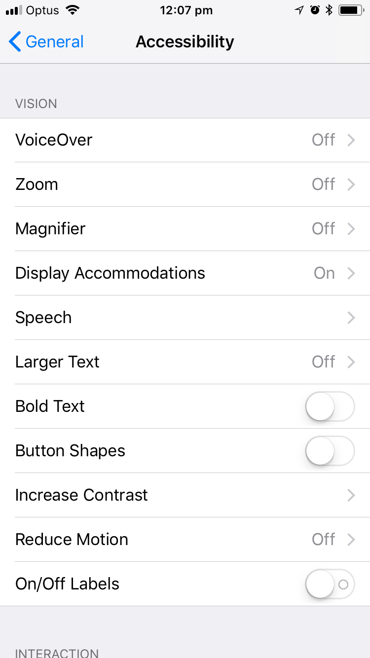
On my iPhone, I can go into Setting > Accessibility > VoiceOver to enable the screen reader:
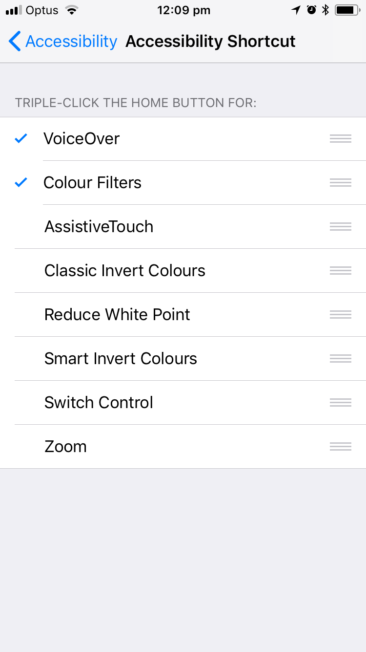
I enable accessibility shortcuts on my mobile device to make it easier to use. When I press the side button 3 times, I can easily switch accessibility features on and off.
When I test using VoiceOver;
- First I’d navigate to the app/site I’d like to test
- Then enable VoiceOver using my shortcut
- Finally flick/scroll two fingers up the screen
This enables the screen reader to read everything on the screen from top to bottom and I can test if the flow makes sense. There are plenty of other guides out there for using VoiceOver (12). I suggest switching on a screen reader on your mobile device and getting familiar with the technology. As a test, can you figure out how to take a photo on your phone using screen reader technology?
Large font accomodations
Jacking up the font size or using a dyslexia font plugin in on chrome is a great way to find ways your UI may break. Watch out for views that don’t scroll and text that doesn’t line wrap.
Alternative text for images
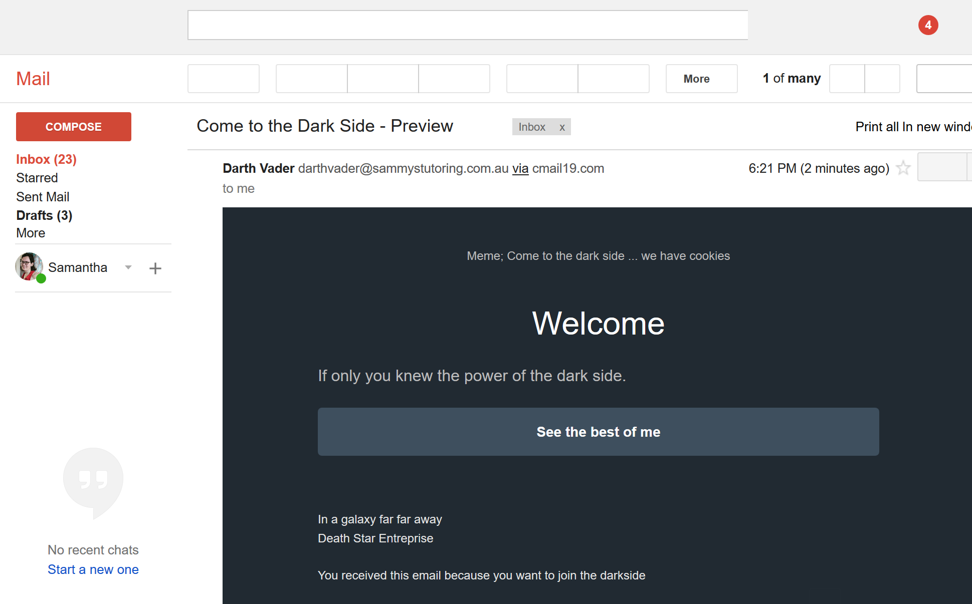
Screen readers will read out the alternative text for images for vision impaired users who can’t see your images. Alt text is an optional field for HTML image tags. For example, using Campaign Monitor’s Email Builder I have included an alt text tag with my image to convey the message of the image for screen readers. Here is the HTML tag for the image;
<img src="darth_vader.jpg" alt="Meme; Come to the dark side ... we have cookies">
This is what this email looks like with images;

I used Firefox’s web developer tools to replace images with their alt text to see this next view of the same email;
It’s considered a web best practice to include alt text (15). You can also read more about the web accessibility initiative at w3.
Tips for Alt text
- Check you have alternative text for your images and that it makes sense
- Check that you have blank strings or no alt text options for decorative images so that screen reader don’t try to read the image or the file name
- Don’t include words like “image of” in your alt text because screen readers will announce it’s an image and then announce the alt text. You will get a double whammy “image. image of blah” from your screen reader, this is super annoying
- Use tools that display the alt text or replace images with their alt text to help test this
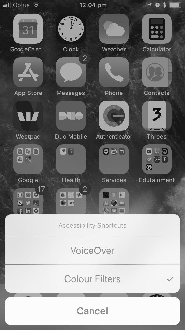
Test your images for colour blindness
About 4.5% of the British population experience some form of colour blindness (3). To help test this I have a grey scale shortcut button set up on my iPhone. On a side note, setting up grey scale for your phone helps make it less addictive too (17).
Hopefully you now realize that testing for accessibility in your apps/websites isn’t that hard. If a screen reader works with your content, you have alternative text fall back options for images and your images are still readable using grey scale you will be most of the way there in providing an awesome, inclusive experience with your online content.
References
- https://www.and.org.au/pages/disability-statistics.html
- https://nfb.org/blindness-statistics
- http://www.colourblindawareness.org/colour-blindness/
- https://ssir.org/articles/entry/the_curb_cut_effect
- https://commons.wikimedia.org/wiki/File:Pram_Ramp.jpg
- https://99percentinvisible.org/episode/curb-cuts/
- https://services.anu.edu.au/human-resources/respect-inclusion/different-types-of-disabilities
- https://www.apple.com/au/accessibility/iphone/vision/
- https://support.microsoft.com/en-au/help/22798/windows-10-narrator-get-started
- https://support.google.com/accessibility/android/answer/6283677?hl=en
- https://www.freedomscientific.com/products/blindness/jawsdocumentation
- https://www.imore.com/how-use-voiceover-iphone-and-ipad
- https://www.campaignmonitor.com/resources/guides/alt-text-in-email/
- https://addons.mozilla.org/en-US/firefox/addon/web-developer/
- https://support.siteimprove.com/hc/en-gb/articles/115000013031-Accessibility-Image-Alt-text-best-practices
- https://www.w3.org/WAI/
- https://www.youtube.com/watch?v=NUMa0QkPzns
- https://www.abc.net.au/news/2019-01-10/commonwealth-bank-settles-discrimination-claim/10702194
Originally posted on medium in 2018
I am big fan of your blog. Informative and clear crystal
Thank you for good post on accessibility testing. I am color blind and I started to wonder, why do you suggest to test color blindness with gray scale mode? I think that that is not an effective way to test color blindness, because “total color blindness” (monochromacy) is very rare and the most common color blindess is with red and green. Otherwise, the post gives good insight for accessibility testing and good ides how to approach it.
Thanks for the comment.
I know full colour blindness is rarer but I think it works the best for picking up on poor contrast issues.
If it works for grey scale it should also work for all of the other forms of colour blindness too.