How to create a reusable button in SwiftUI
We use buttons to interact with apps on our phones. They are an essential component of every app. They are everywhere.
Oftentimes, when developing your apps, you create a specific button style with different labels and actions to keep your UI consistent across different screens. For that reason, you create custom view modifiers. It keeps your code DRY (Don't Repeat Yourself) and if you need to make a change, there's only one place to do so.
But even then, you still have to create a new button view every time to accommodate different labels and actions. This is where you might want to create a reusable button.
ButtonView
First, you create a new ButtonView:
struct ButtonView: View {
    var body: some View {
        Button {
            // Add action
        } label: {
            // Add label
        }
    }
}
It's as simple as that. You can name it as you'd like.
Label and icon
Next, you need to define a label for the button. Depending on your use case, you might need to add an icon as well. It could be a system image or a custom asset in your Bundle.
Let's add both:
struct ButtonView: View {
    let label: String
    let icon: String

    var body: some View {
        Button {
            // Add action
        } label: {
            Image(systemName: icon)
            Text(label)
        }
    }
}
Structs don't need initializers. They get them by default. However, we're creating a reusable button. While we might need a label for our button, the icon image is completely optional. Not every button will have one.
Custom initializer for default parameters
Let's make the icon optional and create a custom initalizer for the button:
struct ButtonView: View {
    let label: String
    let icon: String?

    init(label: String, icon: String? = nil) {
        self.label = label
        self.icon = icon
    }

    var body: some View {
        Button {
            // Add action
        } label: {
            if let icon {
                Image(systemName: icon)
            }
            Text(label)
        }
    }
}
Assign the icon a default value of nil. You'll only change this value if the button requires both text and icon. If there's no icon, only text will show. Since icon is an optional, we need to unwrap it with an if let.
Now, what about an action?
Actions
To keep our button truly reusable, we need to be able to pass any functionality to the button's action. We're going to do that by creating a trailing closure with no parameters and no return value:
struct ButtonView: View {
    let label: String
    let icon: String?
    let action: () -> Void

    init(
        label: String,
        icon: String? = nil,
        action: @escaping () -> Void
    ) {
        self.label = label
        self.icon = icon
        self.action = action
    }

    var body: some View {
        Button {
            action()
        } label: {
            if let icon {
                Image(systemName: icon)
            }
            Text(label)
        }
    }
}
Then just update the init() and call the action() in the button's action.
And voila! Pretty neat. You can now call this button anywhere you want to use it, define a label and pass any functionality to it. You can customize the button to your preference and pass any other properties you might need.
Previews
If you were wondering how to make the Previews work for the ButtonView, you need to define all the properties in your View, including the closure you created:
struct ButtonView_Previews: PreviewProvider {
    static var previews: some View {
        ButtonView(label: "OK") {}
    }
}
You own your Previews. When you want to enable them for the specific View, you need to add everything the View needs to display properly.
Seeing it in action
Let's create two buttons with some styling. One with icon and text, and another with text only:
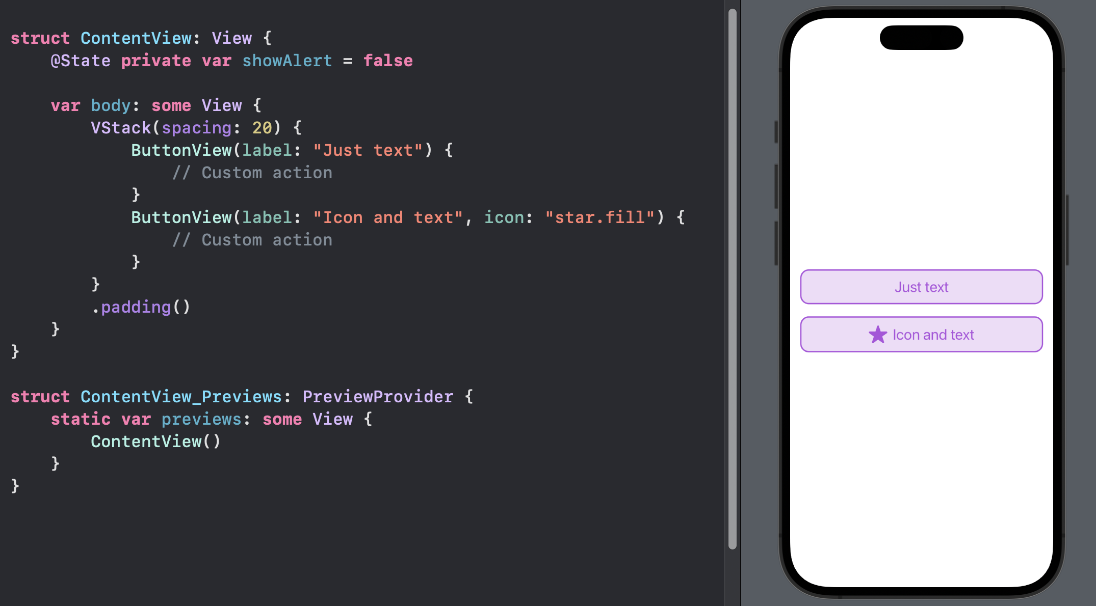
Button UI Code
If you're interested, here's the complete code for the button I've created, including all the styling:
struct ButtonView: View {
    let icon: String?
    let label: String
    let action: () -> Void

    init(
        label: String,
        icon: String? = nil,
        action: @escaping () -> Void
    ) {
        self.label = label
        self.icon = icon
        self.action = action
    }

    var body: some View {
        Button {
            action()
        } label: {
            HStack(spacing: 8) {
                if let icon {
                    Image(systemName: icon)
                        .resizable()
                        .scaledToFit()
                        .frame(width: 28, height: 28)
                }
                Text(label)
            }
            .font(.title2)
            .padding(.vertical, 12)
            .foregroundColor(Color.purple)
            .frame(maxWidth: .infinity)
            .background {
                RoundedRectangle(cornerRadius: 12)
                    .stroke(Color.purple, lineWidth: 2.0)
                  .background {
                      RoundedRectangle(cornerRadius: 12)
                          .fill(Color.purple.opacity(0.2))
                  }
            }
        }
    }
}
Final Thoughts
You can create custom view modifiers and apply the styling to the button. You could also create a custom button style.
There are different ways you can approach building customizable and reusable UI components. There's no definitive approach to take. Use what works for you.
Please feel free to reach out on Twitter if you have any questions, comments, or feedback.
Thank you for reading and happy coding!