From Paint to Pixels
A growing number of artists are using data from self-tracking apps in their pieces, showing that creative work is as much a product of its technology as of its time.
It’s unlikely Claude Monet would have been Claude Monet without the portable paint tube, which allowed him to work outside and experiment with capturing natural light. Andy Warhol wouldn’t have been Andy Warhol without the modern movie star or the mass-produced Campbell’s soup can. Art is as much a product of the technologies available to artists as it is of the sociopolitical time it was made in, and the current world is no exception. A growing community of “data artists” is creating conceptual works using information collected by mobile apps, GPS trackers, scientists, and more.
Data artists generally fall into two groups: those who work with large bodies of scientific data and those who are influenced by self-tracking. The Boston-based artist Nathalie Miebach falls into the former category: She transforms weather patterns into complex sculptures and musical scores. Similarly, David McCandless, who believes the world suffers from a “data glut,” turns military spending budgets into simple, striking diagrams. On one level, the genre aims to translate large amounts of information into some kind of aesthetic form. But a number of artists, scholars, and curators also believe that working with this data isn’t just a matter of reducing human beings to numbers, but also of achieving greater awareness of complex matters in a modern world.
Recommended Reading


Art confronts the uncertainty of human existence: Why am I alive? What makes me different from anybody else? Handprints made some 40,000 years ago, are a common feature of Upper Paleolithic cave art—a kind of prehistoric selfie. National Geographic describes the early artists as sending a timeless message: “Like you, I am human. I am alive. I was here.” So it’s unsurprising that many data artists are responding to an increasingly data-saturated culture. After all, almost every human interaction with digital technology now generates a data point—each credit-card swipe, text, and Uber ride traces a person’s movements throughout the day. The smartphone, as The Economist recently described, is a true personal computer, the defining innovation of the era, on par with the mechanical clock or the automobile in past centuries.
In turn, there’s been what the Pew Research Center calls a self-tracking explosion, whether it’s counting the number of calories or using a mood app to glean patterns in one’s mental state. Like a fingerprint, no two people have the same data set. A couple sharing a bed follow independent sleep cycles. Friends who spend the day together count different steps; their phones connect to different IP addresses. But what’s more remarkable is the idea that within all of these numbers lies a better way of understanding ourselves. The information doesn’t just provide a broad document of a life lived in the early 21st century: It can reveal something deeper and even more essential.
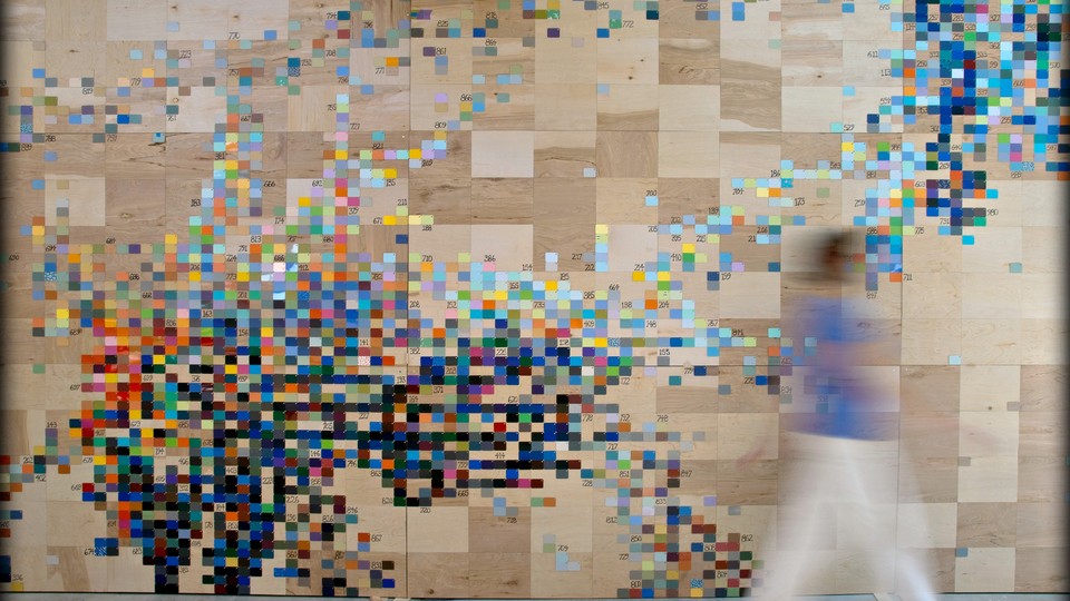
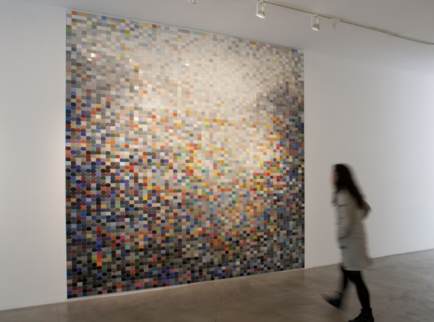
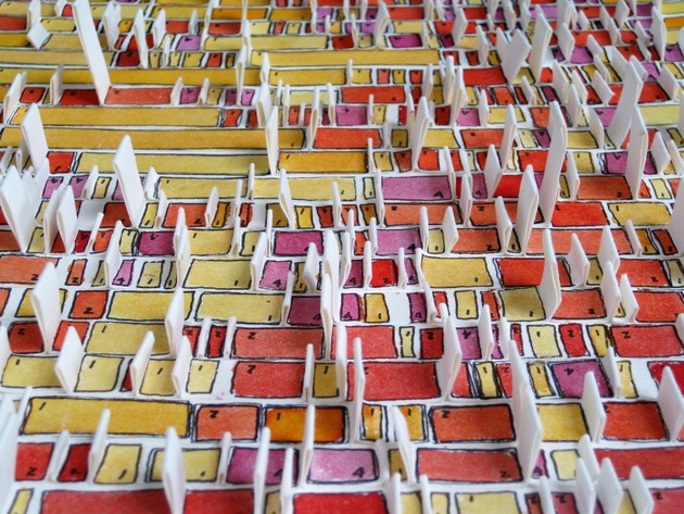
One data artist who believes this is Laurie Frick, who splits her time between Austin and New York City. She came to art circuitously, after spending 20 years in tech working for HP and Compaq and co-founding a software company. Frick believes that while numbers are abstract and unapproachable, human beings respond intuitively—and emotionally—to patterns. Unlike many of her peers, Frick has no assistants. She uses self-tracking data to construct objects and large-scale installations, including one called Floating Data that’s about two stories tall and made from 60 anodized aluminum panels that represent her walking patterns. Frick used her own records, gathering steps on her Fitbit and combining it with location data from the online program OpenPaths and her iPhone’s GPS. “I drew a little track that tries to capture the experience of walking speed, and the feel of walking through a busy neighborhood near my apartment in Brooklyn,” she explained.
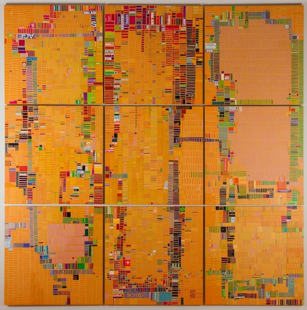
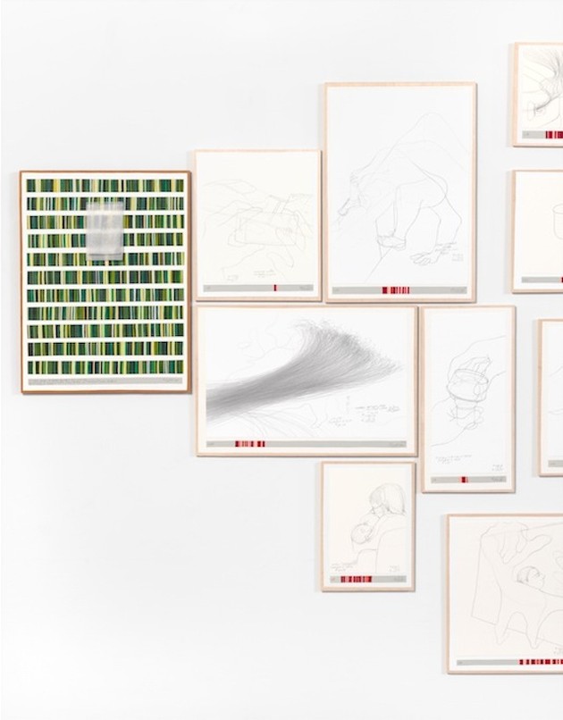
In a series called Moodjam, Frick took thousands of Italian laminate countertop samples from a recycling center and created a series of canvases and billboard-sized murals based on her temperament. For weeks, she manually tracked her feelings, using the online diary Moodjam, which allows users to express their emotions in color patterns. The smaller Moodjam pieces capture only a day’s worth of data, Frick’s ups and downs over a 24-hour period. Larger ones reflect weeks of journal keeping and internal swings. For her upcoming solo exhibition this May, at New York’s Pavel Zoubok Gallery, Frick has made wood, leather, and paper assemblages based on accounts of her daily activities. In several pieces, she used apps like ManicTime on her laptop and Moment on her iPhone to track each click and touch of her screen for almost a month. Frick is adamant that her work is about more than simply visualizing information—that it serves as a metaphor for human experience, and thus belongs firmly in the art world.
The distinction between data presentation and data art is often fuzzy, and the art world still struggles to separate the two. For example, MOMA’s recent show, Scenes for a New Heritage: Contemporary Art from the Collection, included digital prints with images generated from ArcGIS software. The work, Million Dollar Blocks, was designed at Columbia University’s Spatial Information Design Lab and showcased a series of maps based on data from the criminal-justice system. According to the project, of the more than two million incarcerated people in the U.S., a disproportionate number come from a handful of neighborhoods in the largest cities. The maps are meant to pose ethical and political questions about criminal justice reform, and they do that successfully. But Million Dollar Blocks may just be powerfully presented data, rather than conceptual art, which is where the artist’s underlying idea is more important than the execution.
Similarly, the Whitney Museum of American Art’s current show, America is Hard To See, includes a 1971 piece by Hans Haacke, Shapolsky et al Manhattan Real Estate Holdings, A Real Time Social System. The work comprises 146 photographs of Manhattan apartment buildings—mostly tenements—maps of Harlem and the Lower East Side, as well as charts documenting the ownership structures of the buildings. Haacke culled the data from public record, and the art, according to the Whitney’s label, is an “institutional critique” that “chronicles the fraudulent activities of one of New York City’s largest slumlords over the course of two decades.” Yet in a world of enhanced graphics, simply displaying data effectively—with or without photography—won’t constitute compelling art on its own. Nor does every important data pattern raise existential questions.
But by blurring the boundaries, conceptual artists are helping scientists see their research more creatively. The New York Times recently chronicled Daniel Kohn, a Brooklyn-based painter, who spent roughly a year at the Albert Einstein School of Medicine teaching geneticists ways to represent their digital data in more intuitive ways. And while algorithms have seeped into daily life—informing everything from consumer music choices to dating options—they’re also edging into conceptual art. In March, the website Artsy held what it called the world’s first Algorithm Auction, “celebrating the art of code.” Works included Turtle Geometry, an 11-inch stack of programming on dot-matrix printer paper from 1969 made by Hal Abelson, a professor of electrical engineering and computer science at MIT. In fact, many data artists straddle art and science as Leonardo da Vinci did. Curators and historians still disagree about how to classify him: great artist or scientific genius? Or does the divide even matter?
Current tools make self-tracking more efficient than ever, but data artists are hardly the first to express themselves through their daily activities—or to try to find meaning within life’s monotony. The Italian Mannerist painter Jacopo Pontormo kept records of his daily life from January 1554 to October 1556. In it, he detailed the amount of food he ate, the weather, symptoms of illness, friends he visited, even his bowel movements. In the 1970s, the Japanese conceptualist On Kawara produced his self-observation series, I Got Up, I Went, and I Met (recently shown at the Guggenheim), in which he painstakingly records the rhythms of his day. Kawara stamped postcards with the time he awoke, traced his daily trips onto photocopied maps, and listed the names of people he encountered for nearly 12 years.
“Have you ever thought about how much is known about you?” Frick asked in one of our conversations. Not what pops up in Google or on social media, she clarified, but what companies know about your character. If you have a Kindle, Amazon knows how fast you finish a book, and whether you’re a cheater and skip chapters or read the ending first. Netflix knows whether you’re a binge watcher. E-ZPass knows where you go, even on local streets. Frick understands that this type of data collection can cause discomfort. Few of us like the idea that the government or Google is watching our every move. As a data artist, however, she sees her role as convincing people to want more personal data—regardless of who’s tracking.
“In all of these patterns, I do think there is an essential idea of who we are,” Frick said. Data art can’t capture the essence or totality of somebody—if either exists—any more than a handprint on a cave wall can. But she believes personalized data art can accomplish something traditional art forms can’t: It allows a viewer to see her nuances and idiosyncrasies in higher resolution—and to discover things she may have forgotten about herself or perhaps has never known. “I think people are at a point where they are sick of worrying about who is or isn’t tracking their data,” said Frick. “I say, run toward the data. Take your data back and turn it into something meaningful.” To prove her point, she’s developed a free app, Frickbits, which allows anyone to “create the ultimate data-selfie,” by turning personal data into personalized art.
The American artist Hasan Elahi turned to data in the wake of 9/11. A year after the attacks, Elahi, an associate professor at the University of Maryland, was detained at Detroit’s Metro Airport upon his return from the Netherlands. FBI agents suspected him of hoarding explosives in a Florida locker, thanks to an erroneous “tip” called into law enforcement. Elahi was born in Bangladesh and grew up in New York City, but is an extensive traveler. On average, he logs more than 100,000 miles a year, speaking at conferences and displaying his art. After six months of FBI interrogations and nine lie-detector tests, Elahi was finally cleared. But the experience transformed his relationship with personal information and inspired him to create a website site Wired called “the perfect alibi.” As Elahi puts it: When the Feds come after you, you can either resist or turn the tables.
At first, Elahi started calling the FBI every time he would travel to notify them of his itinerary and his general whereabouts (during the investigation, they’d shared their contact info). Then, he began emailing them. “I would just say, hey giving you a heads up, I’m going to be out of town tomorrow,” he described. “Here are my plans. Here’s where I’m staying.” Soon, he began posting minute-by-minute photos of his life—sometimes a hundred a day at TrackingTransience.net—unmade hotel beds, receipts, Starbucks cups, toilets he’s used, the beauty of modern tedium. Elahi uses his iPhone’s GPS to sync his movements to a live map, also on his site. In the past few years, he’s amassed hundreds of thousands of pictures and data points. “It’s economics,” he said. Personal data conforms to supply-and-demand principles. So the best way to protect privacy is to give away as much as possible and “flood the market,” so that the government’s supply is worthless. People can also track themselves much more accurately than a third party. “You have data?” he asked, “Well I’ve got data too. By putting everything out there, the government’s data no longer means very much. I can tell them what I ate, where I slept, exactly what I was doing on every day over the last decade.”
Elahi may be the first artist to track himself in a post-9/11 context, but he’s hardly the first conceptualist to examine people’s unease with surveillance. During our interviews, Elahi pointed to Sophie Calle, who has been called France’s most celebrated conceptual artist. In 1980, Calle met a stranger named "Henri B." at a Paris gallery opening who mentioned he was soon leaving for Italy. Disguised in a blond wig, Calle famously followed him to Venice—without either his knowledge or prior consent. Tracking him throughout the city, Calle secretly documented Henri B.’s comings and goings from his hotel, as well as reportedly sneaking into his room to photograph his possessions. Fans of Calle believe her work treads a delicate balance between stalking and art. For her 1981 project The Shadow, Calle hired a private investigator (through her mother) to follow and photograph Calle for a day. The pictures appear rather mundane—a woman wandering the streets of Paris—and the detective’s notes are dry. In fact, Calle led the man on a tour of places imbued with meaning for her, such as the park where she had her first kiss. What appeared to be a set of trivial data points actually told an emotional and personal narrative about Calle.
But even today, data art isn’t all Google Maps and iPhones—its practitioners embrace traditional mediums too. One of the earliest examples of the genre is Danica Phelps. In July 2008, two months before Lehman Brothers filed for bankruptcy, The New York Times wrote, “For the last decade, Danica Phelps has chronicled her personal and financial lives with an exhaustive system of lists and charts accompanied by diagrams of colored stripes.” Her ongoing project, titled Income’s Outcome, tracks the money generated by each of her drawing’s sales. Every time somebody buys a piece from the series, Phelps creates a new series of drawings, depicting what she bought with the money from the previous transaction. The drawings reflect how consumption and debt are intricate parts of our personal identity. Phelps has also painted every dollar in her bank account, as well as gray strips for every dollar she owes her bank for her mortgage—627,000 grey lines. According to Phelps, Income’s Outcome is meant to question how we assign value and meaning to the purchases we make. In light of the 2008 market crash, the series is a critique of fairly banal activities—buying things and borrowing for a home—but both of which cause anxiety and fear in modern life. Art critics have likened Phelps to On Kawara, as she also documents the passage of time—but in this series she does so through money. “When I started showing my work, I put the price right on the drawing,” she recalled. “In my first exhibition, there were pieces ranging from $7 to $1600, based on how much I liked the drawing.”
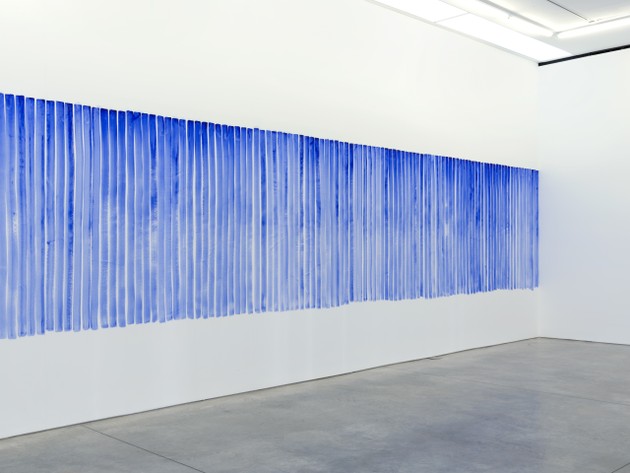
There’s also the Danish artist Jeppe Hein, known for sculptures that frequently use mirrors in a gallery or outdoor space to reflect its visitors. But for his most recent show, All We Need Is Inside, at Chelsea’s 303 Gallery, he experimented with self-tracking and data art as way to reveal himself to the viewer. In Breathing Watercolors, Hein’s breath guides his application of blue stripes painted directly onto a large white wall. As the gallery’s press release explains, “The intensity of color, deep and vigorous at the beginning of each stroke, gradually fades into a pale shade towards the bottom of each stripe, physically recording the process of air gradually escaping from the body.”
Art is a constant march of expansion, according to Harvey Molotch, a professor of sociology and metropolitan studies at New York University, whose research includes the sociology of art. Pop art incorporated comic books and ordinary soup cans. Edvard Munch’s expressionist painting, The Scream captured the anxiety and isolation of modern life. “Now there’s the digital self, the newest kid on the block and so of course, artists are there,” he explained. “Art and environment are very much in cahoots.” In 2007, the Wired editors Gary Wolf and Kevin Kelley proposed a new movement. They called it the Quantified Self and now count over 45,000 members on their website and hold “self-quantifier meet-ups” around the globe.
For example, the Boston Quantified Self chapter describes itself as a “a regular show-and-tell for people who are tracking data about their body and conducting their own personal investigations and research into their bodies, minds, and selves.” “Datification” is a cultural process by which people put enormous faith in data, explained Gina Neff, an associate professor of communication at the University of Washington and the School of Public Policy at Central European University, as well as the co-author of the forthcoming book The Quantified Self, with Dawn Nafus. “What we see in the ‘quantified self,’” Neff explained, “is that people have taken up an N of 1, truly exploring what data means in their own personal lives, or in the artist’s case, as a form of artistic expression.” The line between data and self, she believes, is only where a person chooses to draw it.
Yet the question remains whether data art can endure as much as a simple, striking handprint on a cave wall. On the one hand, data art may just be a link in a chain of artists who record and display their personal movements— some of whom will be displayed at the world’s leading museums decades from now, some who will fall by the wayside. On the other, data art may be the apogee of self-expression—a digital fingerprint that says more about modern man, and the inevitable forward march of time, than anything artists have been able to produce before.