Money
Visualizing the Distribution of Household Wealth, By Country
Article/Editing:
var divElement = document.getElementById(‘viz1647990048405’); var vizElement = divElement.getElementsByTagName(‘object’)[0]; vizElement.style.width=’1200px’;vizElement.style.height=’807px’; var scriptElement = document.createElement(‘script’); scriptElement.src = ‘https://public.tableau.com/javascripts/api/viz_v1.js’; vizElement.parentNode.insertBefore(scriptElement, vizElement);
Visualizing the Distribution of Household Wealth, By Country
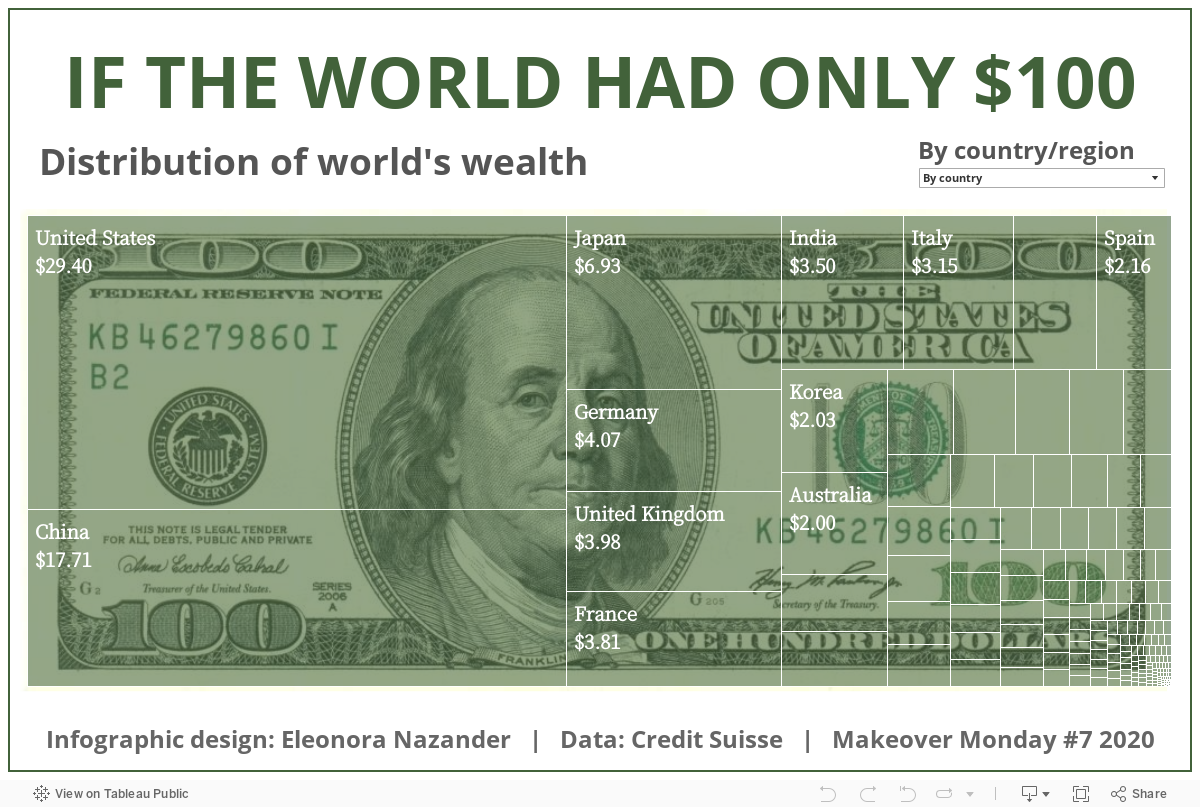
A majority of the world’s wealth is concentrated in just a few countries. In fact, almost a third of household wealth is held by Americans, while China’s population accounts for nearly a fifth.
Using data from Credit Suisse, this graphic by Eleonora Nazander shows the distribution of household wealth worldwide, highlighting the wealth gap that exists across regions.
Top 10 Wealthiest Countries
To help simplify things, this graphic shows how much household wealth each country would have if the world only had $100.
As the graphic illustrates, the top 10 wealthiest countries would hold an estimated $77, or 77% of global household wealth. Here’s a breakdown of what their cut of $100 would be:
| Country | Total Wealth ($B) | Share of $100 |
|---|---|---|
| 🇺🇸 United States | $105,990 | $29.40 |
| 🇨🇳 China | $63,827 | $17.71 |
| 🇯🇵 Japan | $24,992 | $6.93 |
| 🇩🇪 Germany | $14,660 | $4.07 |
| 🇬🇧 United Kingdom | $14,341 | $3.98 |
| 🇫🇷 France | $13,729 | $3.81 |
| 🇮🇳 India | $12,614 | $3.50 |
| 🇮🇹 Italy | $11,358 | $3.15 |
| 🇨🇦 Canada | $8,573 | $2.38 |
| 🇪🇸 Spain | $7,772 | $2.16 |
| Total | $278 Trillion | $77.09 |
The U.S. comes in first place, holding $29.40, or almost a third of total wealth, while China comes in second, accounting for $17.71.
This makes sense considering the high concentration of ultra-wealthy individuals in both countries—China and the U.S. are home to more than half of the world’s billionaires, and eight of the 10 richest people on the planet are Americans, including the world’s richest, Elon Musk.
Japan ranks third on the list, accounting for $6.93. Like the U.S. and China, Japan also has a high portion of ultra-high net worth citizens, or individuals with a net worth of $30 million or more.
Interestingly, India ranks seventh on the list, despite having the third-highest number of billionaires worldwide and a massive population of 1.4 billion. One contributing factor to this could be the country’s relatively high levels of poverty.
Wealth Inequality
It’s important to note that, while the U.S. and China hold a majority of the world’s wealth, both countries still struggle with wealth inequality.
Currently, the top 1% of U.S. households hold 31.7% of the country’s household wealth. And while China has made progress on poverty in the last decade through rapid economic growth, the wealth gap between the country’s rich and poor has widened in recent years.
Governments in both countries have announced plans to tackle wealth inequality. For instance, the Biden administration is working to pass legislation that would increase taxes on businesses and wealthy Americans. Meanwhile, the Chinese government announced its five-year plan to crack down on private enterprise, in an attempt to break up monopolies and ultimately achieve “common prosperity.”

This article was published as a part of Visual Capitalist's Creator Program, which features data-driven visuals from some of our favorite Creators around the world.


Money
How Debt-to-GDP Ratios Have Changed Since 2000
See how much the debt-to-GDP ratios of advanced economies have grown (or shrank) since the year 2000.


How Debt-to-GDP Ratios Have Changed Since 2000
This was originally posted on our Voronoi app. Download the app for free on Apple or Android and discover incredible data-driven charts from a variety of trusted sources.
Government debt levels have grown in most parts of the world since the 2008 financial crisis, and even more so after the COVID-19 pandemic.
To gain perspective on this long-term trend, we’ve visualized the debt-to-GDP ratios of advanced economies, as of 2000 and 2024 (estimated). All figures were sourced from the IMF’s World Economic Outlook.
Data and Highlights
The data we used to create this graphic is listed in the table below. “Government gross debt” consists of all liabilities that require payment(s) of interest and/or principal in the future.
| Country | 2000 (%) | 2024 (%) | Change (pp) |
|---|---|---|---|
| 🇯🇵 Japan | 135.6 | 251.9 | +116.3 |
| 🇸🇬 Singapore | 82.3 | 168.3 | +86.0 |
| 🇺🇸 United States | 55.6 | 126.9 | +71.3 |
| 🇬🇧 United Kingdom | 36.6 | 105.9 | +69.3 |
| 🇬🇷 Greece | 104.9 | 160.2 | +55.3 |
| 🇫🇷 France | 58.9 | 110.5 | +51.6 |
| 🇵🇹 Portugal | 54.2 | 104.0 | +49.8 |
| 🇪🇸 Spain | 57.8 | 104.7 | +46.9 |
| 🇸🇮 Slovenia | 25.9 | 66.5 | +40.6 |
| 🇫🇮 Finland | 42.4 | 76.5 | +34.1 |
| 🇭🇷 Croatia | 35.4 | 61.8 | +26.4 |
| 🇨🇦 Canada | 80.4 | 103.3 | +22.9 |
| 🇨🇾 Cyprus | 56.0 | 70.9 | +14.9 |
| 🇦🇹 Austria | 65.7 | 74.0 | +8.3 |
| 🇸🇰 Slovak Republic | 50.5 | 56.5 | +6.0 |
| 🇩🇪 Germany | 59.3 | 64.0 | +4.7 |
| 🇧🇪 Belgium | 109.6 | 106.8 | -2.8 |
| 🇮🇱 Israel | 77.4 | 56.8 | -20.6 |
| 🇮🇸 Iceland | 75.8 | 54.6 | -21.2 |
The debt-to-GDP ratio indicates how much a country owes compared to the size of its economy, reflecting its ability to manage and repay debts. Percentage point (pp) changes shown above indicate the increase or decrease of these ratios.
Countries with the Biggest Increases
Japan (+116 pp), Singapore (+86 pp), and the U.S. (+71 pp) have grown their debt as a percentage of GDP the most since the year 2000.
All three of these countries have stable, well-developed economies, so it’s unlikely that any of them will default on their growing debts. With that said, higher government debt leads to increased interest payments, which in turn can diminish available funds for future government budgets.
This is a rising issue in the U.S., where annual interest payments on the national debt have surpassed $1 trillion for the first time ever.
Only 3 Countries Saw Declines
Among this list of advanced economies, Belgium (-2.8 pp), Iceland (-21.2 pp), and Israel (-20.6 pp) were the only countries that decreased their debt-to-GDP ratio since the year 2000.
According to Fitch Ratings, Iceland’s debt ratio has decreased due to strong GDP growth and the use of its cash deposits to pay down upcoming maturities.
See More Debt Graphics from Visual Capitalist
Curious to see which countries have the most government debt in dollars? Check out this graphic that breaks down $97 trillion in debt as of 2023.

-

 Real Estate2 weeks ago
Visualizing America’s Shortage of Affordable Homes
-

 Technology1 week ago
Ranked: Semiconductor Companies by Industry Revenue Share
-

 Money1 week ago
Which States Have the Highest Minimum Wage in America?
-

 Real Estate1 week ago
Ranked: The Most Valuable Housing Markets in America
-

 Business1 week ago
Charted: Big Four Market Share by S&P 500 Audits
-

 AI2 weeks ago
The Stock Performance of U.S. Chipmakers So Far in 2024
-

 Misc2 weeks ago
Almost Every EV Stock is Down After Q1 2024
-

 Money2 weeks ago
Where Does One U.S. Tax Dollar Go?