In June 2021, we unveiled our new UX-maturity model along with a free, self-reported maturity quiz. Since then, we’ve acquired a large number of quiz responses from over 5,000 UX professionals around the world.
This article presents our analysis of this self-reported UX-maturity data.
Scoring the Quiz
The self-assessment quiz consists of 13 questions. These questions are closely based on the maturity model and are intended to capture different aspects of UX maturity. Each response earns a number of points. These points are totaled at the end of the quiz to produce a maturity score.
The quiz was iteratively tested with UX professionals from many different organizations to determine whether the scores produced a reasonable result.
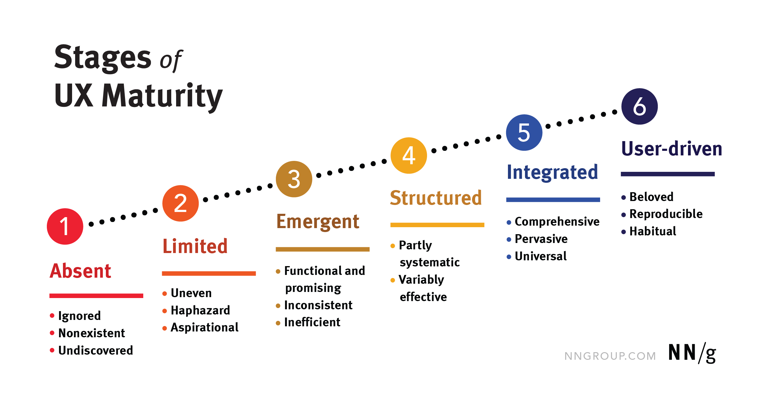
Raw scores range from 0 to 100, with the following breakdown by stage:
|
UX-Maturity Stage |
Score Range |
Percentage of Respondents |
|
1: Absent |
0-10 |
1% |
|
2: Limited |
11-30 |
17% |
|
3: Emergent |
31-51 |
49% |
|
4: Structured |
52-72 |
28% |
|
5: Integrated |
73-93 |
4% |
|
6: User-Driven |
94-100 |
0.04% |
(Note: The score ranges for different stages were established through a separate analysis based on the relative importance of different UX-maturity factors that were captured by the different questions.)
Stage 3 Is the Average in Our Dataset, But Not in Reality: Selection Bias

Stage 3 (Emergent) was by far the most common stage in our dataset — 49% of respondents were placed in that stage. However, that doesn’t mean that most organizations in the world fall into that category.
UX practitioners from around the world responded to this survey, but we believe that they were mostly people who have regular UX exposure (for example, NN/g newsletter subscribers and people who follow UX-related tags on social media). That fact suggests that these quiz respondents were not representative for all organizations (a selection bias).
As a result, we suspect that there could be many very low-maturity organizations that are not captured by this data because they don’t know or care about UX maturity. (This type of result is called a floor effect.)
The selection bias is likely to primarily impact the number of respondents and resulting trends for stage 1 and stage 2 organizations.
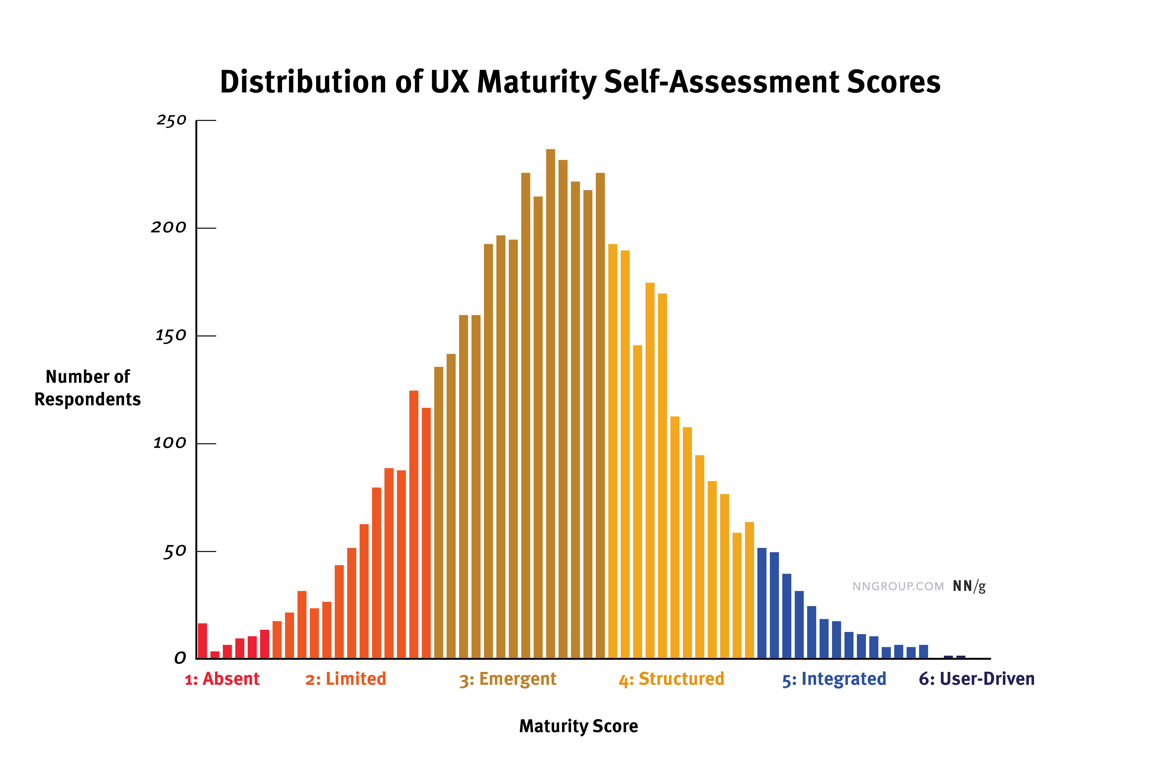
While most organizations in the world are probably not in stage 3, it does make sense that a majority of UX professionals would work at such organizations. In this stage, organizations are getting some user-centered-design work done and seeing the benefits. Awareness and buy-in are expanding, but resources are still too limited to maximize the benefits of UX. That’s exactly when UX professionals might be interested in getting help and advice from organizations like NN/g.
We also observed a large proportion (28%) of responses in stage 4, Structured. In stage 4, organizations start to build UX into their operations and culture. They often produce high-quality designs. Many companies become complacent at this stage and never move past it.
Stage 5 (Integrated) and stage 6 (User-Driven) are the two highest stages and were scarce in our dataset — only 4% and 0.04% respectively. To some extent, this finding matches our expectations. It’s incredibly difficult for organizations to achieve and maintain those levels of UX success. However, it’s very possible that there’s a ceiling effect in our dataset (beside the previously mentioned floor effect). Organizations thriving at these high levels may not feel a need to assess their practices, since things are working so well.
Role Strongly Impacts Perception of UX Maturity
We don’t believe that an individual’s assessment is the best way to determine organization-wide maturity. (A more reliable approach would be to hire an outside company to perform an objective third-party assessment.) However, we created the maturity quiz to help UX professionals quickly and roughly gauge where their organizations might be.
Even though we attempted to design the survey to be as objective as possible by including specific, concrete questions, each individual’s impression of UX in their organization is dependent on their:
- Role
- Involvement in UX activities
- Awareness of those activities
- Perception of UX
As result, we anticipated that respondents within the same company might obtain slightly different maturity scores for their organization. In very large companies, this variation might be even more severe.
(In fact, we saw that several teams had all their members take the quiz separately and then pooled their scores to get a slightly more objective measure of their organization’s UX maturity.)
When we compared average raw scores by role, this difference in perception became clear: people in research, leadership, and experience-design positions rated their organizations’ maturity higher than other roles like engineering, visual design, or marketing.
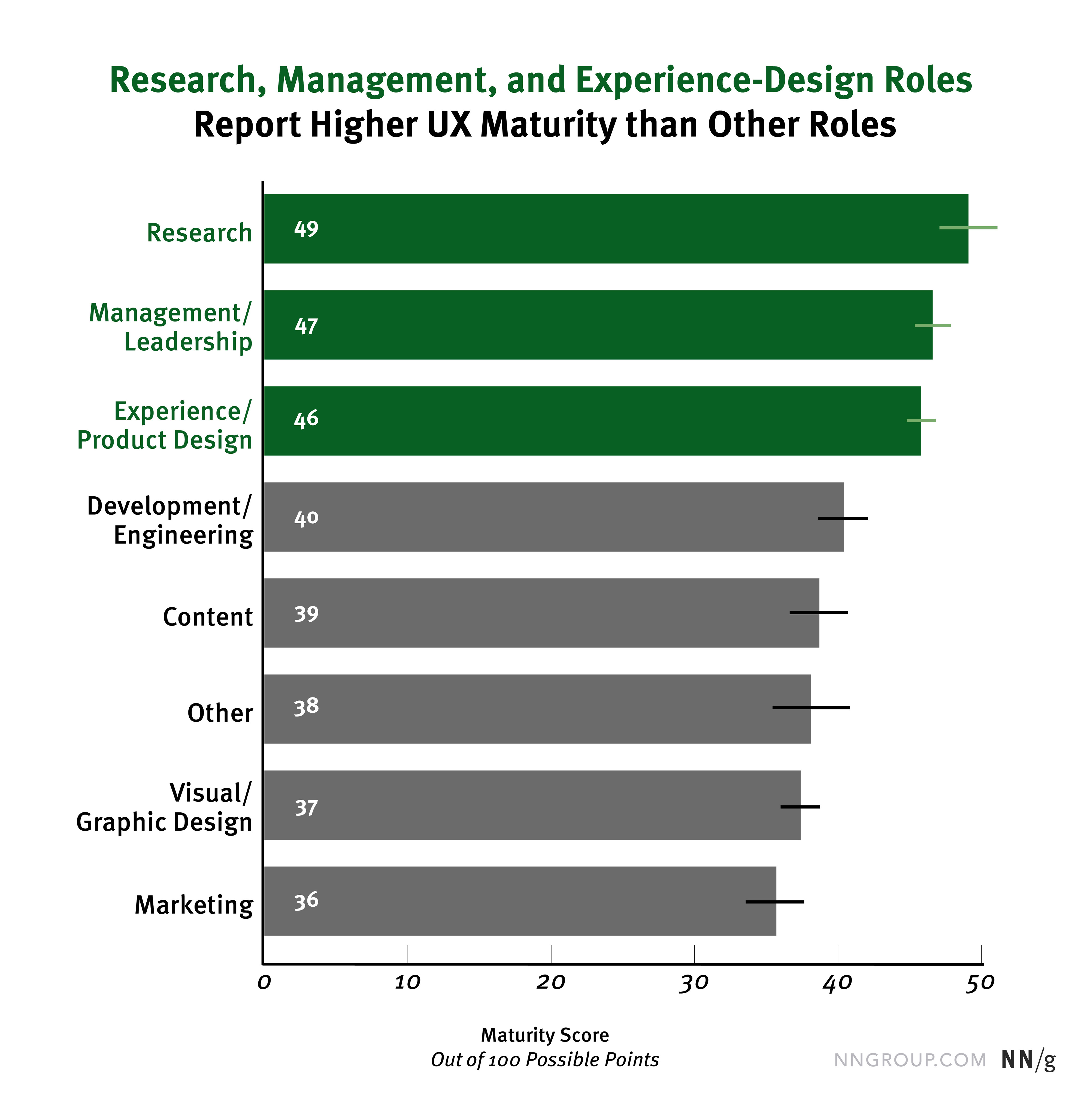
The score difference between UX/management roles and other roles makes sense for three reasons:
- Roles like UX researcher, UX lead, or UX designer don’t even exist in companies with low maturity levels — often, they don’t appear until companies have some interest in UX (usually in stages 2 or 3).
- People in UX-related roles or in management positions are likely to have more awareness about UX work and advancements in progress.
- UX-related roles may be likely to have more positive and optimistic perspectives on the impact of UX in their organizations than their coworkers in other roles.
If you happen to be in one of these roles, this finding highlights the value of internally publicizing the work you’re doing. Beyond changing perceptions of your company’s UX maturity, talking about UX advancements with your coworkers helps them understand how UX works and why it’s valuable — a critical tactic for slowly advancing UX maturity in your company over time.
No Practical Differences by Region
It’s reasonable to assume that average UX maturity might vary by region. Being located in a region with high cultural understanding of UX design is helpful to any individual company. That cultural factor makes it more likely that the company’s employees will be aware of or even knowledgeable about user-centered–design practices.
While we did find some statistically significant differences in average raw score by region, those differences were very small. All regions had average raw scores from 42 to 46 — all within stage 3.
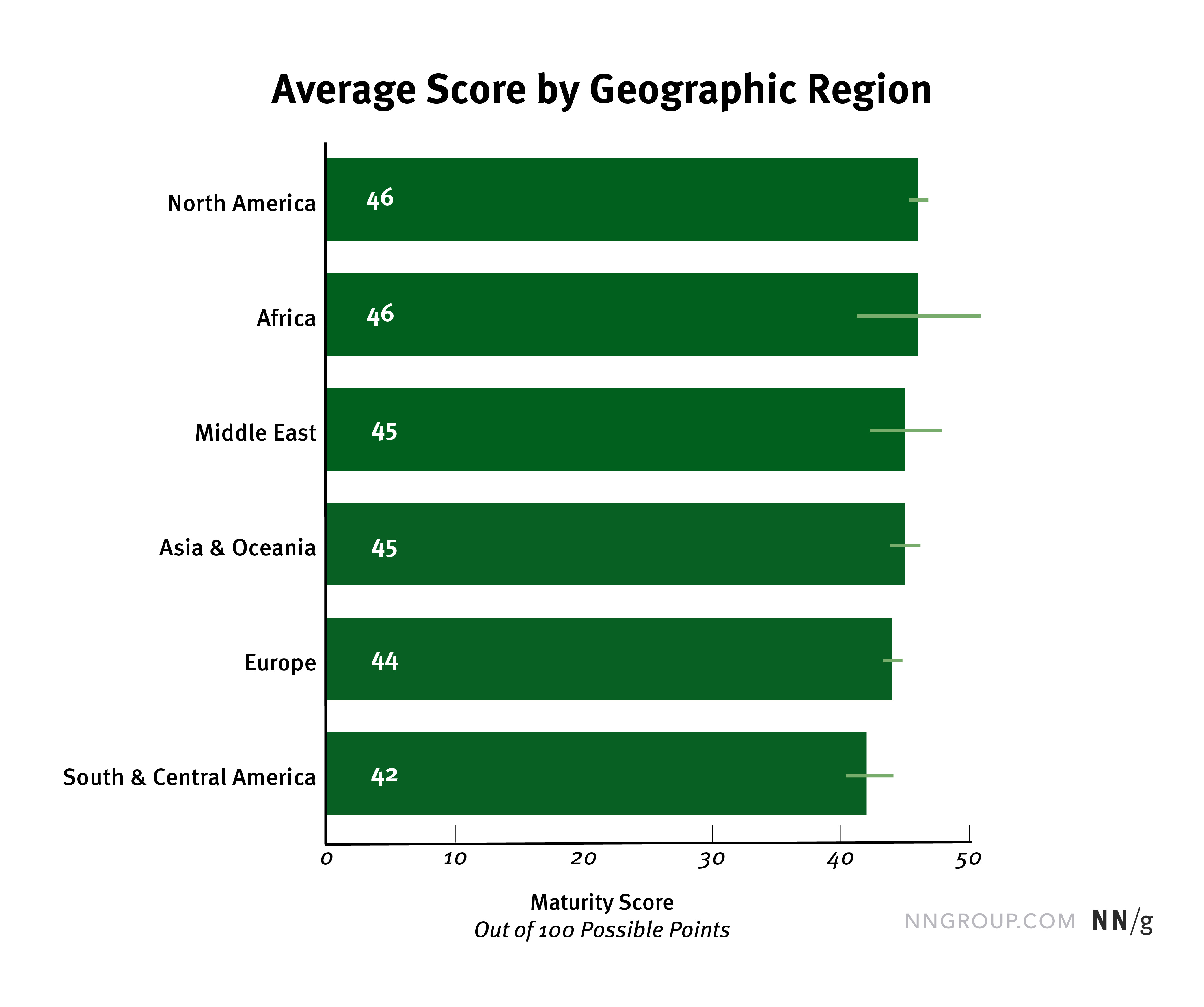
We believe that these averages are highly impacted by the floor effect mentioned above: some regions may have larger or smaller proportions of companies in stages 1 and 2, but those were poorly captured by this quiz.
Additionally, our data set underrepresents certain regions. We collected thousands of responses from North America and Europe, for example, but only 22 from Africa and 84 from the Middle East (thus the wide confidence intervals for those regions).
We suspected that English-speaking Western regions might have slightly higher average maturity scores, since early user-centered–design movements originated in those regions. Non-English speakers are still at a disadvantage in the world of UX, because many UX resources are published only in English. (As a relatively tiny company, NN/g publishes primarily in English, but recently we’ve started publishing Chinese content through our WeChat account.)
When we compared the average scores from the US, UK, Canada, and Australia vs. the rest of the world, we did find a statistically significant difference, but that difference was too tiny to have any practical significance (a single point out of 63 possible points).
(Statistical significance tells us whether we would get the same result if we collected a new set of responses in the same way. However, a finding only has practical significance if it has any impact in the real world. In our case, would we expect much better user experiences from products designed in those countries that scored two points higher in the UX-maturity quiz? No.)
It would be wonderful if every geographic region in the world had equal access to UX resources and equal opportunities to improve UX maturity. While that will likely be true in the future, we aren’t convinced that it’s true now. It’s very possible that this difference in average maturity could be larger in reality, since our data is biased against low scores due to the floor effect.

Company Size Doesn’t Impact Average Score
We anticipated that we might see slight differences in average maturity scores in different-size organizations. Larger companies often have bigger budgets and room for DesignOps and ResearchOps roles, which are things we ask about in the quiz. However, we found no statistically significant differences in average raw score by company size. All three organization groups (small, medium, large) had similar average raw scores and tight confidence intervals.
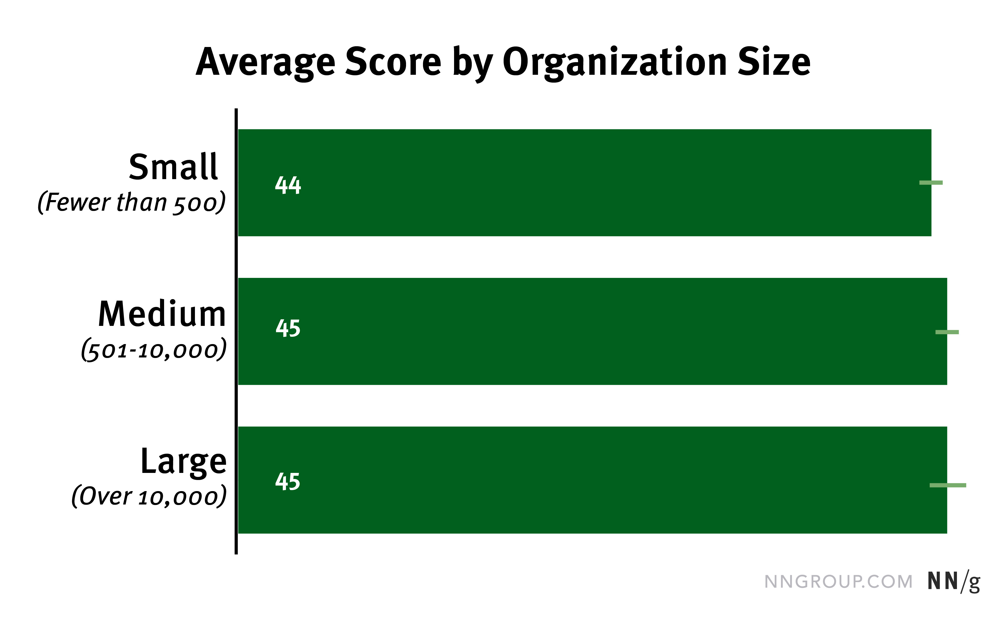
While it is true that large organizations have some advantages in terms of budgets and UX roles, they also struggle to achieve the massive cultural shifts which are often necessary to improve UX maturity. They also often struggle with changing infrastructure and outdated work processes.
Smaller (and often younger) companies have the advantage of adapting their processes faster or even starting off with modern UX approaches. Many startup companies can skip the lower maturity stages altogether if they’re founded with a respect for user-focused design and strategy.
Conclusion: Find Out Your UX-Maturity Stage
While it’s interesting to see what stages others are in, it’s far more important for you to know the current stage of your company. This information is crucial to determining which strategies will help you advance.
Take advantage of our self-assessment quiz to roughly gauge where you are now. And compare your score with the above chart to see where you range compared to other companies. Consider taking the quiz over months or years as your company’s approach to UX changes, or ask each of your team members to take the quiz and compare your stage scores.