Table of Contents
1 | Introduction to Design Tokens
2 | Managing and Exporting Design Tokens With Style Dictionary
3 | Exporting Design Tokens From Figma With Style Dictionary
4 | Consuming Design Tokens From Style Dictionary Across Platform-Specific Applications
5 | Generating Design Token Theme Shades With Style Dictionary
6 | Documenting Design Tokens With Docusaurus
7 | Integrating Design Tokens With Tailwind
8 | Transferring High Fidelity From a Design File to Style Dictionary
9 | Scoring Design Tokens Adoption With OCLIF and PostCSS
10 | Bootstrap UI Components With Design Tokens And Headless UI
11 | Linting Design Tokens With Stylelint
12 | Stitching Styles to a Headless UI Using Design Tokens and Twind
What You’re Getting Into
The start of my series on design tokens. In this first installment, I go through a fictional narrative that highlights to use case for design tokens. By the end, we'll have a high-level understanding of what design tokens are and an appetite for getting to know the technology supporting them. This series on design tokens was written as I was researching the subject. For my more mature thoughts on design tokens and how to use them to build production-ready design system tools at scale, you can read my book Design Systems for Developers.
Example: You’re Building a UI Component Library in React for “ZapShoes”
So, you work for a company called “ZapShoes.” It’s an e-commerce application that promises to ship their shoes faster than all of their competition.
In the spirit of being zappy, you’re team of frontend engineers has built a blazing fast JavaScript site built upon the JamStack architecture.
The design processes for the application has not been so zappy. The site looks pretty good and all but it’s been long overdue to organize the design.
A fresh team of talented UI/UX designers have breathed new life into this weakness and whipped up a hot design system.
So far, the design system includes some online documentation with specifications for typography, copywriting, color palette, and nifty UI components.

The UI components look great on the documentation but it’s high time that they look great in the actual application.
Your team has been tasked with implementing a UI component library that follows the design specifications of the design systems documentation.
Your ears perk and you are beaming with excitement.
“UI component library?!?! Heck yeah. I’ve been itching to make a zappy React library for some time now. While I’ve been waiting for an opportunity like this, I’ve been exploring styled-components in a side project. I know just what to do for this new library!”
You get busy developing that fresh React library. You decide to use
styled-components so that each component is styled as the
design documentation has specified. You create an additional CSS file in
the React library to style the rest of the basic web elements.
You launch the library and the customers are thrilled with the new look, as are the designers.
Some time goes by and another team has been spun up to create an
application for support documentation. They decide to use Gatsby so they
dig the React flavor of the UI component library but your peers from that
team suggest to make a theme provider with
styled-components instead of defining the all styles at the
component level. A week goes by and you’ve merged a PR for that change.
Cool!
Around the same time a team was spun up the support application. There was another team that was created to work on making tools for customer support. They’ve decided to build there tools using Vue. They’re not too pleased about the UI components being built with React. Awkward.
Since they decided to use vue-styled-components, y’all agree
to extract a stylis file
(light-weight, SCSS-like preprocessor used by
styled-components). Everything is awesome!
…until the team that has built some landing pages and other marketing content with pure HTML, CSS, and JavaScript (in the spirit of npm ruin dev).
All of y’all now agree to share the CSS output of the style file. Crisis averted!
You think the worst is behind you when all of a sudden you learn that the mobile app team is using React Native and used plain JSX to style their application. They created their own fork of the CSS file and created JavaScript objects.
To make matters worse, the design team has launched a slight redesign. Instead of just updating the original React UI component library, there are now multiple layers to update. Worst of all, as time goes on, it becomes hard to remember what was the source of truth for the original styles and what was an application-specific extension or override.
A scenario like this is why design tokens can be helpful.
What Are Design Tokens?
The Context
Every design system provides specifications, or “specs”, for the styles of UI elements that make up an application. By specifying the styles for the UI elements in an application, the goal is that any application in a company (whether mobile, web, or desktop and React, Vue, or something else) will have the same look and feel.
The “specs” of each UI element includes a specific set of styles, or properties, specifying the color, typography, size, and spacing that is needed to create the desired look and feel.
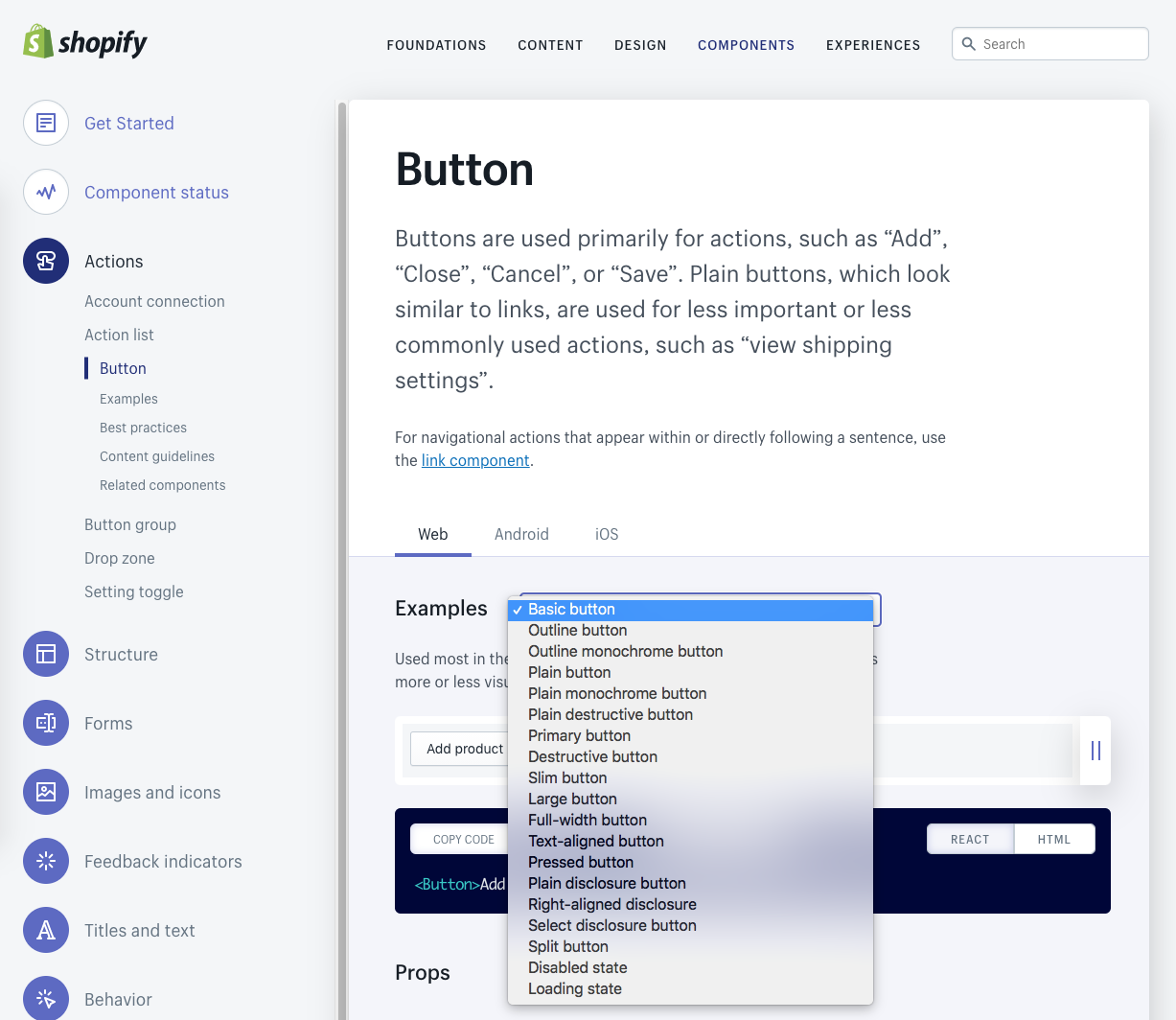
Many of the UI elements also offer different options, or “variants.” For example, a button can have a “basic”, “outline”, “disabled”, etc. variant:
One way to have a consistent look and feel across all the applications within a company would then be to create a shared UI component library. Each component would have to implement the exact specifications called out by the design system’s documentation.
There are several pitfalls that can occur.
First, the developer team that implements the shared UI component library may make a mistake when converting the documentation to code. Sure, this can be ensured by manual testing of the component library. Even better, you can have the designers work with the developers so that the design system’s documentation automatically generates the code for the component library with the appropriate styles. You can see this on Shopify’s Polaris design system documentation that I screenshoted earlier.
Second, the UI component library may not work across different platforms. A component for the web may not work on a native mobile app.
Third, the UI component library may not work across different technologies (even when on the same platform). As in my fictional example, there was a break down between the React and Vue implementations.
Finally, there is no way to predict the future as to what teams will be added and what technologies and platforms will win out in the long-haul.
Whenever there is a breakdown with the implementation of a UI component library to fit across different technologies and platforms, you have to introduce a shared way to extract and share the underlying specs, the basic building blocks of the design documentation, for every component and every component’s variant. That way, each team, regardless of platform or technology, can construct their own UI components with the correct specs.
In my fictional example, every time there was a pitfall, a new, common way to share specs was introduced. The natural evolution to a common way of sharing the design system specs started from a very specific implementation.
What if you instead started with the creation of a common way to share the specs of a design system and then let teams go off and build their own component libraries for their specific platforms and technologies? This would not only prove to be a better overall experience, but it would also be flexible for the inevitable shift in technology that comes in future years.
For this reason, many have brainstormed the best way to do this.
Some have suggested creating a common CSS architecture. That is a very respectable approach given that CSS is incredibly flexible across not only web technologies, but even some technologies for other platforms. However, maybe other platforms where CSS doesn’t completely fit, and it certainly isn’t future-proof. It also means that web applications are stuck with CSS when they have the potential to use something like SASS variables, for example.
At the end of the day, what is it that CSS provides us that is common across all platforms and technologies? In other words, is it really the “atom,” or the most common possible way to represent our specs?
Well, no.
Let’s look at an example:
  .button {
    color: black;
  }

  .button .primary {
    color: purple;
  }
The common “spec” is not the CSS classes, it is the
color property.
Ultimately, the “atom” representing those specs that can be consumed by code are key-value pairs. This is exactly what is meant by “design tokens.”
Design tokens are key-value pairs that represent the specs of a design system.
They are platform and technology agnostic, flexible for any team and any future evolutions of codebases.
What if there was a way to manageable “dictionary” of the design tokens of a design system so that they could be auto-generated from design files (from tools like Sketch, Figma, etc.)? And, what if there was a way to automatically export them to a format (i.e. CSS, SASS, JavaScript) meeting the preference of different consumers?
Well, that tooling exists and is being used by companies such as Amazon, Salesforce, Shopify, Mozilla, Adobe, and more.
In my next post, we'll talk about how to implement that tooling.

