A UX designer’s guide to user psychology: Get a list of the most relevant design principles & cognitive biases that will help you build more habit-forming products.
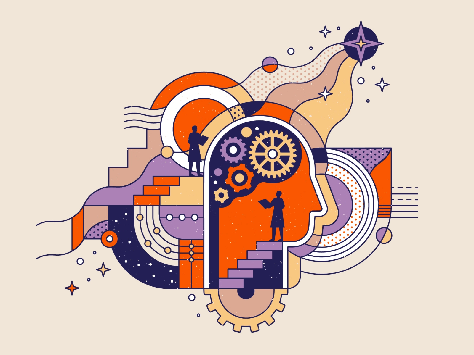
As designers, we have an enormous responsibility to shape the world. We identify patterns and develop empathy to build products or services with a high frequency of use and a high perceived value. But how can we create experiences capable of solving a problem when there’s an infinite combination of people and contexts?
To engage users to act repeatedly, we need to understand their underlying psychology: what are the reasons behind what drives user behaviour?
For starters, every interaction a person has with a digital product follows the same pattern:
Information — User filters the information
Significance — User looks for its meaning
Time — User takes an action within a time frame
Memory — User stores fragments of the interaction in their memory
For each of these stages of interaction, I’ve compiled a list of the most relevant design principles and cognitive biases that will help you to build habit-forming products. Let’s get straight into it.
Information
The first stage of a users’ interaction with your product is filtering the information in front of them. Here are a few psychological principles to follow when designing for this stage of the interaction.
Hick’s law is a psychological principle that states that the time required to make a decision increases with the number and complexity of options presented.
Design Tips:
- Break complex tasks into small steps to reduce cognitive load.
- Leave the complex tasks for the end of the journey.
- If it’s impossible to reduce the number of options, make the content easy to skim.
1. Hick’s Law
Priming is a phenomenon that affects a type of implicit memory that acts automatically and influences decision-making by temporarily increasing access to units of knowledge related to stimuli previously seen.
Design Tip:
- Use images or videos that clearly state the benefit of using your product or service.
2. Priming
Cognitive load theory suggests that learning is more effective when designers and users share the same mental model.
Memory has a limited capacity, so it’s best to avoid overloading users with additional information that does not directly contribute to the main objective. Information overload will increase the chances of a user abandoning a task in progress due to a growing sense of distress.
Be mindful of the differences when you design a journey. Most of the time, the difference between an expert and a novice user is the familiarity with the material.
Design Tips:
- Remove repetitive information.
- Increase working memory capacity by using both audio and visual to convey information.
- Use familiar visual cues to avoid unnecessary learning.
- Organize the information in a way that makes sense.
3. Cognitive Load
Expose complex features only when the user can predict the next step. When designing an experience, different levels of user expertise should be taken into consideration, allowing your design to be adapted according to specific needs.
Design Tips:
- Identify scenarios and write stories for different user types. Include context and reasons why they should access the product or service.
- Carry out a usability test and evaluate time, precision, success, and satisfaction.
4. Progressive disclosure
An aesthetically pleasing design generates a positive response in people’s brains by increasing the threshold of tolerance for errors. It also improves usability perception while increasing authority.
Design Tip:
- Use aesthetics to help users discover how they can interact with an element. If it looks like a button, it must be a button.
5. Aesthetic-usability effect
Significance
The next stage of a users’ interaction with your product is making sense of the information presented. Here are a few psychological principles to follow when designing for this stage of the interaction.
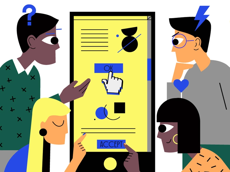
People observe and accept the actions of others as correct, especially if they are unsure or the information is ambiguous. The greater the number of people who recommend using something, the greater is the acceptance.
Design Tips:
- Introduce social proof as soon as possible.
- Video testimonials are the future of social proofing.
6. Social Proof
The difference between what users know and what they need to know might be the necessary stimulus that prompts them to fill the knowledge gap.
Design Tips:
- Capture users’ attention with engaging titles that stimulate curiosity.
- People want to feel safe when making a decision. Use sentences that contain the words “like”, “can” or “do”, to reinforce the confidence in your speech.
7. Curiosity gap
Mental models help us to make sense of reality by creating internal representations of the outside world, regardless of whether they are accurate or not.
We all perceive the world individually, therefore we create our own mental models. Empathizing with our audience means being aware of their mental models and designing accordingly. Every mismatch between your product and the user will provoke inherent friction that could cause a drop-off.
Design Tips:
- Whenever possible, use labels that explain how the interface works.
- Use symmetrical elements whenever possible, as they are visually pleasing and convey harmony.
8. Mental models
The average person can only keep 7 items (±2 more or less) in their working memory.
Design Tips:
- Group content into small groups to improve processing, compression, and easy memorization of information.
- Keep in mind that short-term memory capacity varies by person, prior knowledge, and context. Don’t use the magical number seven to justify unnecessary design limitations.
9. Miller’s Law
Time
After filtering through information and assigning it meaning, the next stage of a users’ interaction is to take an action within a certain period of time. Here are a few design tips to encourage your users to take the action you want them to take in this time frame.
The brain has a unique system that keeps us always looking for rewards. Habit-forming products collect information about user behavior and preferences with every session to craft an experience based on a loop of a trigger, action, reward, and investment. In other words, greater frequency translates to greater perceived utility.
On Twitter, for example, the investment comes in the form of a follow. Even if there is no immediate reward, doing so renders the service more valuable and increases the likelihood of being used again.
Design Tip:
- Reward users for taking an action (making a purchase, referring a friend, etc.)
10. Investment loops
Any interaction with a product is seen as a threat to users since it instinctively involves a compromise. Keep your initial request at the bare minimum and increase complexity as your user progresses through the conversion funnel. Remember, the smaller the commitment, the lower the threat.
Design Tips:
- Start with agreeable actions to boost your users’ confidence. Once you have enough positive stimuli, invite them to take the big leap (make a purchase, acquire a subscription, etc.)
- Break down large tasks into small simple steps to streamline the process. By doing so, you’ll reduce the cognitive load required to complete a task.
11. Commitment & consistency
Memory
After taking an action, users will store fragments of the interaction in their memory. Here’s how you can make that experience positive and more memorable for your users.
Always provide exit points. Invite your users to exit at the peak of the experience. A delayed exit can harm the whole experience because it’s perceived as an unnecessary detour from the user’s main objective.
Design Tips:
- Follow the example of YouTube or Netflix and consider creating a queuing system.
- Include messages when a task is completed successfully.
12. Provide exit points
Users judge the experience by its peak and how it ends. They don’t evaluate the average or the sum of all micro-experiences. Peaks (highs or lows) and the end of the experience weigh heavily on the brain.
Design Tips:
- Celebrate when users have completed a critical task.
- Provide clear starting points to end the experience at a high peak.
13. Peak-end-rule
A task in progress creates a specific tension that can only be resolved upon completion. People remember incomplete or interrupted tasks rather than complete ones. Missing information causes stress that makes incomplete tasks more accessible and easier to remember.
Design Tips:
- Invite your users to discover additional content.
- Provide a progress indicator that will increase the chances your user compeltes the task.
14. Zeigarnik Effect
It’s our natural impulse to impose order and give meaning to our observations. Stories reveal details about characters, places, and events creating an empathetic bond with our heroes. Meaningful stories can strike a chord that can trigger strong reactions and deep memories.
Design Tips:
- Use storytelling to convey a point of view to stakeholders.
- Create a plot with a conflict to help users envision how they can overcome a problem using your design.
15. Storytelling effect
About the Author: Maximiliano Cabrera is a User Experience Designer, enthusiast writer, and researcher. Find him at maxicabrera.com.


