Would you like to be notified of new content?
By John O'Shea
We all run applications on our laptops, tablets, and smartphones. It’s easy for us to see if the device is powered up and if the Wi-Fi network connection is online. We know that our screens will display any critical notifications, like low free disk space warnings. In fact, the general speed and responsiveness of the user interface (UI) can be a good indicator of whether the device has enough resources, like memory or CPU, to run our applications.
Anyone who has provided remote tech support for their family’s devices can attest that it’s a little more difficult to detect and diagnose problems when you can’t see and interact directly with the device. So, when it comes to running cloud-based services, we face a similar challenge: How do we monitor these remote services, and how do we know our customers are happy?
To observe a single-host service, we can log onto that host, run a variety of runtime monitoring tools, and inspect logs to determine the root cause of what is happening on the host. However, single-host solutions are only viable for the simplest, non-critical services. At the other extreme are the multitier, distributed microservices that run on hundreds or thousands of servers, containers, or serverless environments.
How does Amazon see how all cloud-based services, running in multiple Availability Zones in many Regions worldwide, are actually behaving? Automated monitoring, automated remediation workflows (for example, traffic shifting), and automated deployment systems are critical to detecting and resolving the vast majority of issues at this scale. However, for many reasons we still need to be able to see what these services, workflows, and deployments are doing at any moment in time.
Dashboarding at Amazon
We use dashboards as one mechanism to address this challenge of staying on top of activity in our cloud services. Dashboards are the human-facing views into our systems that provide concise summaries of how the system is behaving by displaying time series metrics, logs, traces, and alarms data.
At Amazon, we refer to the creation, usage, and ongoing maintenance of these dashboards as dashboarding. Dashboarding has evolved into a first-class activity because it’s as critical to the success of our services as other day-to-day software delivery and operational activities, such as designing, coding, building, testing, deploying, and scaling our services.
Of course, we don’t expect our operators to monitor dashboards all the time. Most of the time nobody watches these dashboards. In fact, we have found that any operational process that requires a manual review of dashboards will fail due to human error, no matter how frequently the dashboards are reviewed. To address this risk, we created automated alarms that constantly evaluate the most important monitoring data being emitted by our systems. Typically, these are metrics that indicate either that the system is approaching some limit (proactive detection, before impact) or that the system is already impaired in some unexpected way (reactive detection, after impact).
These alarms can execute automated remediation workflows and can notify our operators that there is an issue. The notification directs the operator to the exact dashboards and runbooks that they need to use. When I am on call and an alarm notification alerts me to an issue, I can quickly use related dashboards to quantify customer impact, validate or triage the root cause, mitigate, and reduce time to recovery. Even if the alarm has already started an automated remediation workflow, I need to see what the automated workflow is doing, what the effect is on the system, and, in exceptional circumstances, move the workflow forward by providing human confirmation for safety-critical steps.
When an event is in progress, Amazon typically engages multiple oncall operators. The operators might be using different dashboards as they step through a sequence of tasks. These tasks typically include quantifying the impact to customers, triaging, tracing across multiple services to the root cause of the event, observing automated remediation workflows, and executing and validating runbook-based mitigation steps. Meanwhile, peer teams and business stakeholders are also using dashboards to monitor the ongoing impact during the event. These different participants communicate using incident management tools, chat rooms (with bots like AWS Chatbot), and conference calls. Each stakeholder brings a different perspective on the data that they see in dashboards.
Each week, Amazon teams and broader organizations also run operations review meetings that are attended by senior leaders, managers, and many engineers. During those meetings we use a wheel of fortune to choose high-level audit dashboards. Stakeholders review our customers’ experience and key service-level objectives, such as availability and latency. The audit dashboards that these stakeholders use typically show operational data from all Availability Zones and Regions.
In addition, when doing long-term capacity planning and forecasting, Amazon uses dashboards that visualize the highest-level business, usage, and capacity metrics that our system emits over longer time intervals.
Types of dashboards
People use dashboards to manually monitor services, but one size doesn't fit all use cases. For most systems we use many dashboards, each of which provides a different view into the system. These different views allow different users to understand how our systems are behaving from different perspectives and over different time intervals.
The data that each audience wants to see can vary significantly from dashboard to dashboard. We have learned to focus on the intended audience when we design dashboards. We decide what data goes into each dashboard based on who will use the dashboard and why they will use the dashboard. You’ve probably heard that at Amazon we work backwards from the customer. Dashboard creation is a good example of this. We build dashboards based on the needs of the expected users and their specific requirements.
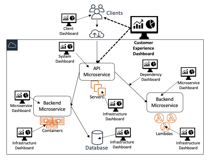
The following diagram illustrates how different dashboards provide different views into the system as a whole:
High-level dashboards
Customer experience dashboards
At Amazon, our most important and widely used dashboards are customer experience dashboards. These dashboards are designed for use by a broad group of users that includes service operators and many other stakeholders. They efficiently present metrics on overall service health and adherence to goals. They display monitoring data that is sourced from the service itself and also from client instrumentation, continuous testers (such as Amazon CloudWatch Synthetics canaries), and automated remediation systems. These dashboards also contain data that help users answer questions about the depth and breadth of impact. Some of these questions are likely to be “How many customers are impacted?” and “Which customers are most impacted?”
System-level dashboards
The entry points to our web-based services are typically UI and API endpoints, so dedicated system-level dashboards must contain enough data for operators to see how the system and its customer-facing endpoints are behaving. These dashboards primarily display interface-level monitoring data. These dashboards display three categories of monitoring data for each API:
- Input-related monitoring data. This can include counts of requests received or work polled from queues/streams, request byte size percentiles, and authentication/authorization failure counts.
- Processing-related monitoring data. This can include multi-modal business logic path/branch execution counts, backend microservice request counts/failure/latency percentiles, fault and error log output, and request trace data.
- Output-related monitoring data. This can include response type counts (with breakdowns for error/fault responses by customer), size of responses, and percentiles for time-to-write first response byte and time-to-write complete response.
In general, we aim to keep these customer experience and system-level dashboards as high level as possible. We deliberately avoid the temptation to add too many metrics to these dashboards because information overload can distract from the core message that these dashboards need to convey.
Service instance dashboards
We build some dashboards to facilitate fast and comprehensive evaluation of the customer experience within a single service instance (partition or cell). This narrow view ensures that operators who work on a single service instance are not overloaded with irrelevant data from other service instances.
Service audit dashboards
We also build customer experience dashboards that intentionally display data for all instances of a service, across all Availability Zones and Regions. These service audit dashboards are used by operators to audit automated alarming across all service instances. These alarms can also be reviewed during the weekly operations meetings mentioned earlier.
Capacity planning and forecasting dashboards
For longer-term use cases, we also build dashboards for capacity planning and forecasting to help us visualize the growth of our services.
Low-level dashboards
Amazon APIs are typically implemented by orchestrating requests across backend microservices. These microservices can be owned by different teams, each of which is responsible for some specific aspect of processing the request. For example, some microservices are dedicated to request authentication and authorization, throttling/limit enforcement, usage metering, creating/updating/deleting resources, retrieving resources from datastores, and starting asynchronous workflows. Teams typically build at least one dedicated microservice-specific dashboard that shows metrics for each API, or unit of work if the service is asynchronously processing data.
Microservice-specific dashboards
Dashboards for microservices typically show implementation-specific monitoring data that requires deep knowledge of the service. These dashboards are primarily used by the teams that own the services. However, because our services are heavily instrumented, we need to present data from this instrumentation in a way that won’t overwhelm the operators. So, these dashboards typically display some data in aggregated form. When operators identify anomalies in the aggregated data, they typically use a variety of other tools to dive deeper, executing ad-hoc queries on the underlying monitoring data that de-aggregate the data, trace requests, and reveal related or correlated data.
Infrastructure dashboards
Our services run on AWS infrastructure that typically emits metrics, so we also have dedicated infrastructure dashboards. These dashboards focus primarily on the metrics emitted by the compute resources our systems run on, such as Amazon Elastic Compute Cloud (EC2) instances, Amazon Elastic Container Service (ECS)/Amazon Elastic Kubernetes Service (EKS) containers, and AWS Lambda functions. Metrics such as CPU utilization, network traffic, disk IO, and space utilization are commonly used in these dashboards, along with any related cluster, Auto Scaling, and quota metrics that are relevant to these compute resources.
Dependency dashboards
In addition to compute resources, in many cases microservices depend on other microservices. Even if the teams that own those dependencies already have their own dashboards, each microservice owner typically creates dedicated dependency dashboards to provide a view of how both upstream dependencies (for example, proxies and load balancers) and downstream dependencies (for example, data stores, queues, and streams) are behaving, as measured by their service. These dashboards can also be used to track other critical metrics, such as security certificate expiry dates and other dependency quota usage.
Dashboard design
At Amazon, we consider consistency in the presentation of data to be critical to the successful creation of a dashboard. To be effective, consistency must be achieved in each dashboard and also across all dashboards. Over the years, we have identified, adapted, and refined a common set of design idioms and conventions that we believe make dashboards accessible to the broadest audience, ultimately increasing their value to our organization. We’ve even found subtle ways to measure and improve these design conventions over time. For example, if a new operator can quickly understand and use the data presented in dashboards to learn how a service works, that is an indication that those dashboards are presenting the right information in the right way.
A very common tendency when designing dashboards is to overestimate or underestimate the domain knowledge of the target user. It’s easy to build a dashboard that makes total sense to its creator. However, this dashboard might not provide value to users. We use the technique of working backwards from the customer (in this case, the dashboard users) to eliminate this risk.
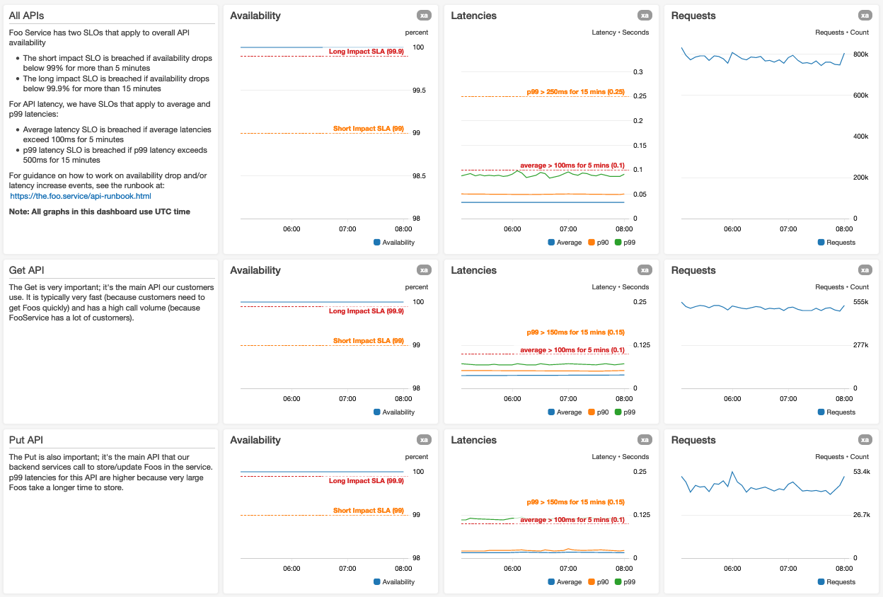
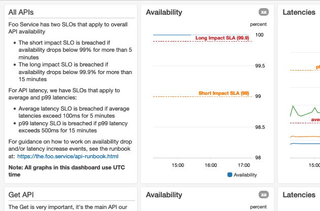
We have adopted a design convention that standardizes the layout of data in a dashboard. Dashboards render from top to bottom, and users tend to interpret the initially rendered graphs (visible when the dashboard loads) as the most important. So, our design convention advises placing the most important data at the top of the dashboard. We have found that aggregated/summary availability graphs and end-to-end latency percentile graphs are typically the most important dashboards for web services.
Here’s a screenshot of the top of a dashboard for a hypothetical Foo Service:
We use larger graphs for the most important metrics
If we have many metrics in a graph, we ensure that the graph legends don’t vertically or horizontally squeeze the visible graph data. If we are using search queries in graphs, we make sure to allow for a larger than normal set of metrics results.
We lay out graphs for the expected minimum display resolution
This avoids forcing users to scroll horizontally. An oncall operator on a laptop at 3 AM might not notice the horizontal scroll bar without an obvious visual clue that there are more graphs to the right.
We display the time zone
For dashboards that display date and time data, we make sure that the related time zone is visible in the dashboard. For dashboards that are used concurrently by operators in different time zones, we default to one time zone (UTC) that all users can relate to. This way users can communicate with each other using a single time zone, saving them the time and effort of doing excessive mental time zone translations.
We use the shortest time interval and datapoint period
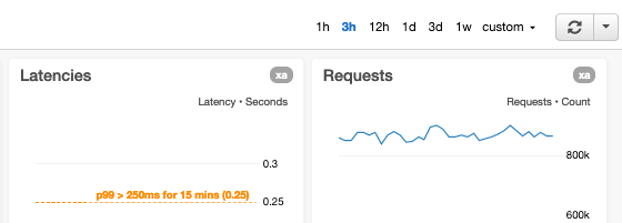
We default to the time interval and datapoint period that is relevant to the most common use cases. We ensure that all graphs on a dashboard initially display data for the same time range and resolution. We find that it’s beneficial if all graphs within a section of the dashboard have the same horizontal size. This allows easy time correlation between graphs.
We also avoid plotting too many datapoints in graphs because this slows down the dashboard load time. In addition, we’ve observed that displaying excessive datapoints to the user can actually reduce visibility into anomalies. For example, a graph of a three-hour interval of one-minute resolution datapoints with just 180 values per metric will render clearly in even small dashboard widgets. This number of datapoints also provides enough context to operators who are triaging ongoing operational events.
We enable the ability to adjust time interval and metric period
Our dashboards provide controls for quickly adjusting both the time interval and metric period for all graphs. Other common interval x resolution ratios that we use in our dashboards are:
- 1-hour x 1 minute (60 datapoints) – useful for zooming in to observe ongoing events
- 12-hours x 1 minute (720 datapoints)
- 1-day x 5 minutes (288 datapoints) – useful for viewing daily trends
- 3-days x 5 minutes (864 datapoints)
- 1-week x 1 hour (168 datapoints) – useful for viewing weekly trends
- 1-month x 1 hour (744 datapoints)
- 3-months x 1 day (90 datapoints) – useful for viewing quarterly trends
- 9-months x 1 day (270 datapoints)
- 15-months x 1 day (450 datapoints) – useful for long-term capacity reviews
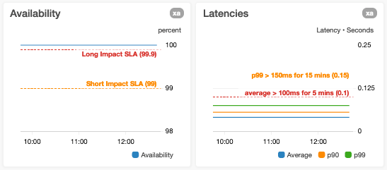
We annotate graphs with alarm thresholds
When we graph metrics that have related automated alarms, if the alarm thresholds are static, we annotate graphs with horizontal lines. If the alarm thresholds are dynamic, that is, based on forecasts or predictions generated using artificial intelligence (AI) or machine learning (ML), we display both the actual and threshold metrics in the same graph. If a graph shows a metric that measures an aspect of the service that has known limits (such as a “maximum tested” limit or a hard resource limit), we annotate the graph with a horizontal line indicating where the known or tested limits are. For metrics that have goals, we add horizontal lines to make those goals immediately visible to the user.
We avoid adding horizontal lines to graphs that already use both a left and a right y-axis
If you add horizontal lines to these graphs, users might find it difficult to know which y-axis the horizontal line relates to. To avoid this ambiguity, we split graphs like this into two graphs that use a single horizontal axis only and add the horizontal lines only to the appropriate graph.
We avoid overloading a y-axis with multiple metrics that have very disparate value ranges
We avoid this situation because it can result in reduced visibility into the variance of one or more metrics. An example of this is when we plot p0 (minimum) and p100 (maximum) latencies on the same graph where the values of the p100 datapoints may be orders of magnitude larger than p0 datapoints.
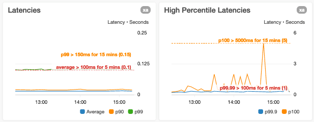
We are wary of shrinking the y-axis bounds to the current datapoint value range only
A casual glance at a graph with a y-axis range limited to datapoint values can make a metric look far more variable than it actually is.
We avoid overloading single graphs
We want to ensure that we don’t have too many statistics or unrelated metrics in a single graph. For example, when adding graphs for request processing, we typically create separate adjacent graphs in the dashboard for the following:
- Availability % (Faults/Requests * 100)
- p10, Average, p90 latencies
- p99.9 and Maximum (p100) latencies
We don't assume the user knows exactly what every metric or widget means
This applies in particular to implementation-specific metrics. We want to provide sufficient context in dashboard text, for example with description text beside or below each graph. The operator can read this text to understand what the metric means. Then the operator can interpret what "normal" looks like and what it could mean if the graph isn't "normal." In this text, we provide links to related resources that an operator can use to determine the root cause. Here are a few examples of the types of links we provide:
- To runbooks. For subject-matter experts, the dashboard can be the runbook.
- To related “dive deep” dashboards.
- To equivalent dashboards for other clusters or partitions.
- To deployment pipelines.
- To contact information for dependencies.
We use alarm status, simple numbers, and/or time series graph widgets where appropriate
Depending on the use cases for the dashboard, we find that displaying a widget that contains a single number (for example, the latest value of a metric) or alarm status is sometimes more appropriate than displaying a complex time series graph of all recent datapoints.

We avoid relying on graphs that display sparse metrics
Sparse metrics are metrics that are only emitted when certain error conditions exist. Although it can be efficient to instrument services to emit these metrics only when necessary, dashboard users can be confused by empty or almost empty graphs. When we encounter such metrics while designing dashboards, we typically modify the service to continually emit safe (that is, zero) values for these metrics in the absence of the error condition. Operators can then easily understand that the absence of data implies that the service is not emitting telemetry correctly.
We add additional graphs that display per-mode metrics
We do this when we’re displaying graphs for metrics that aggregate multi-model behavior in our systems. Some circumstances when we might do this include:
- If a service supports variable-sized requests, we might create a graph for the overall latencies of requests. Plus, we might also create graphs that display metrics for small, medium, and large requests.
- If a service executes requests in variable ways depending on the values (or combinations) of input parameters, then we might add graphs for metrics that capture each mode of execution.
Dashboard maintenance
Building dashboards that present many views of our systems is the first step. However, our systems are continually evolving and scaling, and dashboards need to evolve along with them, as new features are added and architectures are enhanced. Maintaining and updating dashboards is ingrained in our development process. Before completing changes, and during code reviews, our developers ask, "Do I need to update any dashboards?" They are empowered to make changes to dashboards before the underlying changes are deployed. This avoids the situation where an operator has to update dashboards during or after a system deployment to validate the change being deployed.
If a dashboard contains a lot more detailed information than is typical, it might indicate that operators are relying on that dashboard for manual anomaly detection in lieu of automated alarming and remediation. We continually audit our dashboards to determine if we can reduce this manual effort by improving the instrumentation in our services and enhancing our automated alarming. We also aggressively prune or update graphs that no longer add value to dashboards.
By enabling our developers to update dashboards we ensure that we have a complete, identical set of dashboards for our pre-production (alpha, beta, or gamma) environments. Our automated deployment pipelines deploy changes to pre-production environments first. So, our teams must be able to easily validate changes in these test environments using the associated dashboards (and automated alarming) in a manner that is exactly consistent with how they will be validated when the changes are pushed to our production environments.
Most systems are continually evolving as requirements are updated, new features are added, and software architectures change to accommodate scaling over time. Our dashboards are an essential component of our systems, so we follow the Infrastructure-as-Code (IaC) process for maintaining them. This process ensures that our dashboards are maintained in version control systems and that changes are deployed to our dashboards using the same tools that our developers and operators use for our services.
When we conduct a post-mortem for an unexpected operational event, our teams review whether improvements to dashboards (and automated alarming) could have preempted the event, identified the root cause faster, or reduced the mean time to recovery. We typically ask ourselves, “In retrospect, did the dashboards clearly show the customer impact, help operators triangulate to determine the ultimate root cause, and assist with measuring the time to recovery?” If the answer to any of these questions is no, then our post-mortems include actions to refine those dashboards.
Conclusion
At Amazon, we operate large-scale services across the world. Our automated systems constantly monitor, detect, alert for, and remediate any issues that occur. We need the ability to monitor, dive deep, audit, and review these services and automated systems. To achieve this, we build and maintain dashboards that provide many different views of our systems. We design these dashboards for both broad and specific audiences by working backwards from dashboard users. To make dashboards easier for operators and service owners to understand, we use a consistent set of design idioms and conventions to ensure dashboard usability and utility.
Our dashboards provide many different perspectives and views into how AWS services are operating. They play a critical role in delivering a great customer experience by helping Amazon teams understand, operate, and scale our services. We hope this article helps you when you are designing, building, and maintaining your own dashboards. If you would like to see an example of how to create dashboards using AWS services, here is a short video and a self-service guide.
About the author
John O'Shea is a Principal Engineer at Amazon Web Services. His current focus is on Amazon CloudWatch and other Amazon-internal monitoring and observability services.
