How To Analyze Data: Seven Modern Remakes Of The Most Famous Graphs Ever Made
Graphs can be beautiful, powerful tools. Graphs help us explore and explain the world. For hundreds of years, humans have used graphs to tell stories with data. To pay homage to the history of data visualization and to the power of graphs, we’ve recreated the most iconic graphs ever made.
Some are remakes of the original shown in a modern way, and some are efforts to recreate the original. This post was inspired by Edward Tufte, a data visualization expert who has written about these and many more graphs. You can make and embed graphs and create interactive dashboards like these with our free online product or Plotly Enterprise.

March on Moscow
Charles Minard’s 1869 graph of Napoleon’s 1812 march on Moscow shows the dwindling size of the army. The broad line on top represents the army’s size on the march from Poland to Moscow. The thin dark line below represents the army’s size on the retreat. The width of the lines represents the army size, which started over 400,000 strong and dwindled to 10,000. The bottom lines are temperature and time scales, and the overall plot shows distance travelled.
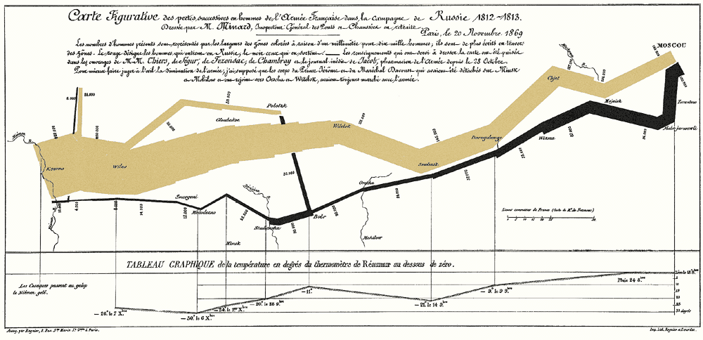
Below is our modern version. We can also make a more exact replica. Moscow is represented by the switch in the middle. The blue line shows temperature along the y-axis on the right. The bottom x-axes show dates and distance. We can also use a custom date format. Hover your mouse to see data appear. This interactivity is brought to you by D3.js, the graphing library Plotly uses. Click and drag to zoom.

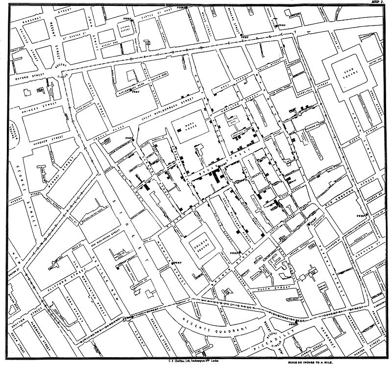
John Snow & Cholera Cases
John Snow’s map below shows the sources of an 1854 cholera outbreak in London. The lines are streets. The black bars represent the number of deaths on a given street. The dots are water pumps. Note the cluster of deaths around the water pump on Broad Street. Snow used his map to support his controversial theory that cholera was spread by drinking contaminated water. Once officials (reluctantly) shut down the Broad Street well, the epidemic subsided. The bacterium that causes cholera was finally isolated by the German physician, Robert Koch, in 1883.
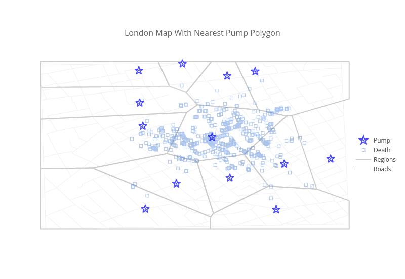
We’ve made the graph using blue squares with opacity to represent deaths. Darker clusters along the gray roads represent multiple deaths. Stars represent pumps. The polygons show deaths organized based on a pump region: where you would go if you visited the closest pump. The right-most region extends beyond the map. If you hover your mouse on the pumps, you can see how many deaths occurred in a given region. Zooming in spreads out clusters.
Causes Of Mortality Polar Chart
Florence Nightingale was an English social reformer and statistician. The first female member of the Royal Statistical Society, Nightingale pioneered use of the polar area diagram. She used the plot to explain the Crimean War when presenting her research to Parliament. Her plot shows causes of death in the army during the Crimean War from 1854-‘56.

Stephen Few notes in “Save the Pies for Dessert” that pie charts make it difficult to compare magnitudes and values that aren’t side-by-side. The same can be true of polar charts. For reference, we’ve made her plot as a polar chart in Plotly using Python. We can solve the comparison issue by making the plot as a stacked bar chart.

The Earth
Maps are perhaps the oldest type of graph. The maps below were made by Martin Waldseemüller in 1507, by Abraham Ortelius in 1570, and by Emanuel Bowen in 1744.

Plotly’s own Chelsea Lyn made this 3D MATLAB globe that shows countries, bodies of water, latitude and longitude, and a flight plan. If you click, hold, and drag the figure, you can flip and spin it. Toggle in and out to zoom or hover to see data.

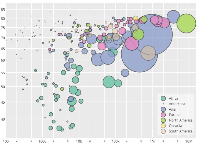
Hans Rosling
Hans Rosling, one of the founders of Gapminder, created a bubble chart that assigns four variables to each country: life expectancy (y-axis), GDP (x-axis), continent (color), and population (bubble size).

Here’s a Plotly version. Hover your mouse to see data, toggle traces on and off in the legend, or click and drag to zoom. See our tutorial to make the chart with Python or our web tutorial. We can also stream the data.
Anscombe’s Quartet: Why We Graph
Anscombe’s Quartet shows four datasets produced by Francis Anscombe in 1973. The datasets have identical (to two decimal places) linear regression coefficients, x and y means, x and y variance, and Pearson Correlation Coefficients. A Nature article reproduced the datasets and plots of each one.

The point is: statistics alone would be confusing and incomplete. Graphing lets us understand the data. See our ggplot2 and matplotlib files to make a version with subplots, and an Anscombe’s-themed blog post to learn more.

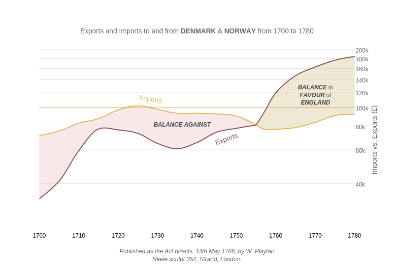
Imports & Exports Line Chart
William Playfair (1759 - 1823) was a Scottish engineer and political economist. He invented the line graph, bar chart, pie chart, and circle graph. His graph below tracks how England went from importing more than it was exporting to exporting more than it was importing.

Here is our version, with a logarithmic y-axis.
Using Plotly for Your Data
Plotly supports collaborative graphing, embedding, and exporting for everyone. Plotly is free for unlimited sharing, or you can run Plotly Enterprise on a private server. Contact us to start a free trial. We made these graphs with a combination of Excel, Google Docs, Python, R, MATLAB, and our web app:

If you liked what you read, please consider sharing. Find us at feedback@plot.ly and @plotlygraphs.
Tagged: #r
20 notes
 marksamueltuttle liked this
 xu-database liked this
alanshemper reblogged this from bwanamarko
 donrontonton liked this
  and0yman liked this
 mathtoast reblogged this from plotlyblog
oztalha liked this
davidtvrdon reblogged this from plotlyblog
ciaranhan reblogged this from plotlyblog
bwanamarko reblogged this from plotlyblog
nikenick42 reblogged this from plotlyblog and added:
Awesome
plotlyblog posted this