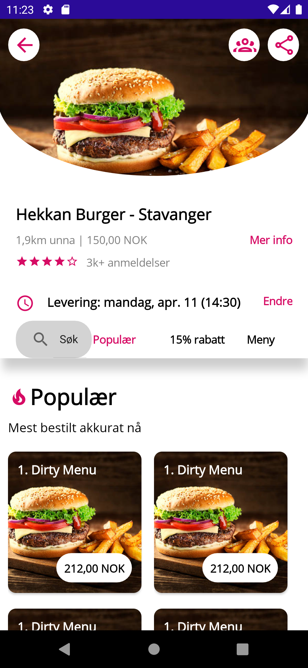
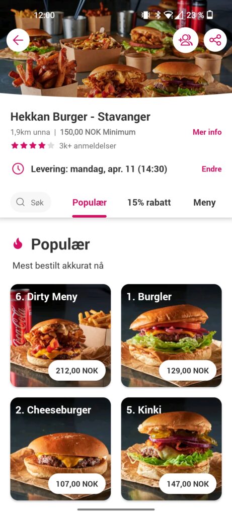
In my previous post, I replicated the UI for the second page of the Foodora app, where they list the different restaurants. In this post I will replicate the third page, where they list all the dishes for a specific restaurant.
As I updated to .NET MAUI Release Candidate (RC) 1 for this post, some things started working again and some stopped working. Setting item template worked again for Android, but setting font icons in an Image or ImageButton stopped working. That’s why I’m setting font icons using Label instead for this post. So the replication isn’t working 100%, but I’m sure things will magically start working again once MAUI hits GA!
Breaking it up
As with the previous parts, I’ll divide the screen into different sections with a Grid.
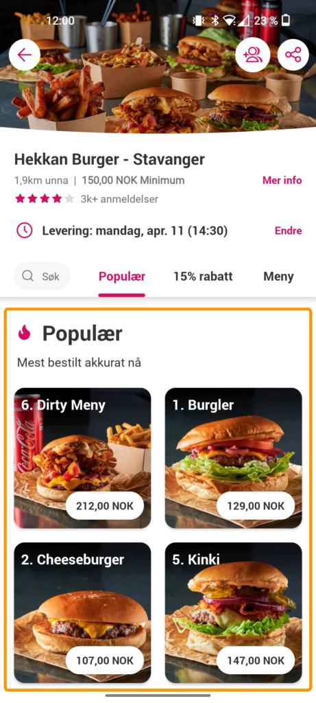
Top section
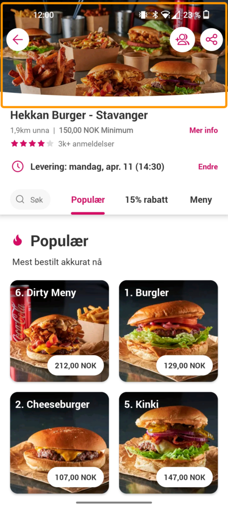
The top section contains an image with a curved clipping on the bottom. It also contains a navigation button along with some other buttons. The clipping was achieved with the new Clip property, which is accessable through all types of VisualElement in .NET MAUI.
I struggled for quite some time to get this clipping to work. Once I actually got it working, I updated from .NET MAUI preview 14 to RC1 and it broke again. Realistically I would have used a path geometry and used the ArcSegment to provide the curve, but this didn’t work. I ended up using a GeometryGroup instead with a combination of RectangleGeometry and EllipseGeometry. This was working until I upgraded to RC1. After that, the Center property of the EllipseGeometry didn’t seem to work, that’s why the curve seems so “deep” in my implementation.
The XAML for the buttons on top of the image looks like this:
And here’s the XAML for the style FontIconWithRoundedCornersStyle:
Info section
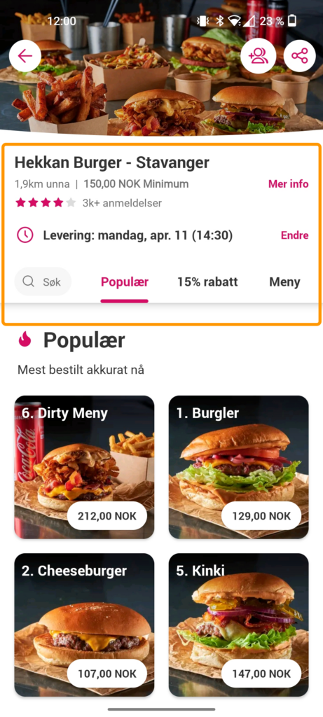
The info section consists of a lot of labels with either text or font icons. I’m using the new VerticalStackLayout and HorizontalStackLayout here to order the elements accordingly. I need to do some tweaks to the margins here and there because the spacing is a bit off somewhere. The styles StarLabelStyle and StarOutlineLabelStyle are label styles to use the font icons for a filled star and a outlined star, respectively.
To achieve the shadow, I used the same solution as I used for the previous blog post: a BoxView with a Shadow property. Reason being again that if I put a shadow on f.ex. the VerticalStackLayout, only the elements inside the layout would get a shadow, not the container itself. I set a Z-Index of -1 on the BoxView to put it behind the other elements (without having to use a Grid). I also use a negative margin to put it under the last text elements of the info section.
Dishes section
The dishes section consists of some labels and a CollectionView. I am using the VerticalGrid layout for the CollectionView, which makes setting up this layout a breeze. The item template was a bit similar to the one I used in my previous post so I made some small adjustments to that and reused it. I am also using the same trick of setting a static ItemsSource for example purposes.
Final thoughts
The Clip property does not seem to be functioning 100% in .NET MAUI yet, at least not as of RC1. I got it working somewhat with preview 14, but it broke when I updated. About 70% of this post went to arguing with said property, but other than that I am very pleased that I managed to get the design working pretty well. I am now also able to provide feedback on issues to be fixed for the next release candidate.
As always, I’ve updated my GitHub sample with the new page (Page3.xaml) if you want to check it out!