Xamarin.Forms has a built-in ListView control which offers rich cross-platform functionality including item selection. In case of UWP the color of the selected item is by default determined by the current accent color of the OS. However, it is a common requirement to customize this to better match the branding of your application. In this article we will show how to do so.
Digging into the default style
When it comes to the styling of UWP control, the first place to visit are the default styles of the controls. You can either find a slightly outdated version [on-line in the documentation](https://msdn.microsoft.com/en-us/library/windows/apps/xaml/f5fba473-bc71-40ec-8df1-ea977c6938ed), or you can find them locally on your hard drive as part of the UWP SDKs. Go to file explorer and navigate to the following path:C:\Program Files (x86)\Windows Kits\10\DesignTime\CommonConfiguration\Neutral\UAP
In this folder you are going to find several subfolders for each of the installed versions of UWP. Select the one which your project is targeting, navigate to the Generic subfolder and finally open the file generic.xaml in your favorite text editor. In this rather huge file search for TargetType="ListViewItem" which should hopefully yield the default style for ListViewItem control that provides the behavior for each individual item in your ListView. Within this style you are going to find out that it uses a number of brush-based resources for different states of the item, including the SelectedBackground property. This is set as follows:
SelectedBackground="{ThemeResource ListViewItemBackgroundSelected}"
Where does this ListViewItemBackgroundSelected resource come from? That's where the second file in the Generic folder comes into play - themeresources.xaml. Open it and search for this key to find:
<StaticResource x:Key="ListViewItemBackgroundSelected" ResourceKey="SystemControlHighlightListAccentLowBrush" />
So yet another reference! Search again to finally find:
<SolidColorBrush x:Key="SystemControlHighlightListAccentLowBrush" Color="{ThemeResource SystemAccentColor}" Opacity="0.6" />
So basically, the selected item is indeed displayed with the system accent color with opacity 0.6. How can we now override this behavior in Xamarin.Forms?
Overriding default color
Application-wide resource
The easier but far less ideal option you have is to override the resource in an application-wide manner. If we provide a custom SystemControlHighlightListAccentLowBrush it will override or instances where this Brush is used (even including other controls). To do this, we will go to the UWP project's App.xaml file and will add a resource in the Application's resource dictionary:
<Application ...>
    <Application.Resources>
         <SolidColorBrush Color="DodgerBlue" x:Key="SystemControlHighlightListAccentLowBrush" />
    </Application.Resources>
</Application>
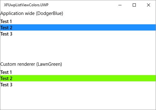
Because the brush has the same key as the system provided one and it is higher in the hierarchy, it will override the system default. All ListViews and other controls in your app should now use the vivid DodgerBlue color for selected item background.
Custom renderer
The less invasive option is to create a custom version of ListView with custom renderer on UWP. First we will create a new SelectionColorListView class in the shared or .NET Standard project:
public class SelectionColorListView : ListView
{
    public static readonly BindableProperty SelectionColorProperty =
        BindableProperty.Create(nameof(SelectionColor), typeof(Color), typeof(SelectionColorListView), Color.LawnGreen);

    public Color SelectionColor
    {
        get => (Color) GetValue(SelectionColorProperty);
        set => SetValue(SelectionColorProperty, value);
    }
}
Now we need a custom renderer for UWP which will check the custom resource when the control is first set:
[assembly: ExportRenderer(typeof(SelectionColorListView), typeof(SelectionColorListViewRenderer))]

namespace XFUwpListViewColors.UWP
{
    public class SelectionColorListViewRenderer : ListViewRenderer
    {
        protected override void OnElementChanged(ElementChangedEventArgs<ListView> e)
        {
            base.OnElementChanged(e);
            if (e.NewElement != null)
            {
                UpdateSelectionColor();
            }
        }

        protected override void OnElementPropertyChanged(object sender, PropertyChangedEventArgs e)
        {
            base.OnElementPropertyChanged(sender, e);
            if (e.PropertyName == nameof(SelectionColorListView.SelectionColor))
            {
                UpdateSelectionColor();
            }
        }

        private void UpdateSelectionColor()
        {
            if (Control != null && Element is SelectionColorListView listView)
            {
                var nativeColor = XamarinColorToNative(listView.SelectionColor);
                Control.Resources["SystemControlHighlightListAccentLowBrush"] = new SolidColorBrush(nativeColor);
            }
        }

        private Windows.UI.Color XamarinColorToNative(Xamarin.Forms.Color color)
        {
            var alpha = (byte)(color.A * 255);
            var red = (byte)(color.R * 255);
            var green = (byte)(color.G * 255);
            var blue = (byte)(color.B * 255);
            return Windows.UI.Color.FromArgb(alpha, red, green, blue);
        }
    }
}
We are waiting for the element or SelectionColor property to be updated and then set the SystemControlHighlightListAccentLowBrush resource for the underlying control. Now, you can use your custom ListView in XAML like this:
<local:SelectionColorListView SelectionMode="Single" SelectionColor="LimeGreen" />
Where local: must be a declared XAML namespace in the ContentPage element:
xmlns:local="clr-namespace:NamespaceOfYourCustomListView"
Note that updating the color at runtime is not possible, because once the selection is first done, the control will keep using the resource that was resolved for the first time.
Further improvements
To unify the style across platforms, you could now provide custom renderers for ListView controls on Android and iOS as well. This is not required though and Xamarin.Forms will otherwise happily use the default ListViewRenderer and ignore the SelectionColor property. In addition, you may want to customize other ListViewItem colors as well - the hover background color, pressed background color, etc.. To do this, you can follow the exact same process as outlined above.
Future
At Build 2018 Microsoft announced an upcoming tool that will auto-generate appropariate default style resources for your application based on your branding. This will make our lives significantly easier and unifying the style for the whole application will be as easy as 1,2,3.
Source code
Source code for this article is available on my GitHub.
Summary
Modifying default UWP control styles in Xamarin.Forms a bit more complicated than doing the same in classic UWP projects. If you don't want to change the behavior of all controls, you should create a custom renderer and perform the changes there only.