Progressively Enhanced Form Validation, Part 2: Layering in JavaScript


In Part 1 of this series, we learned about the browser’s built-in HTML and CSS form validation features and how to use them to create a solid (but not very accessible) foundation.
This article takes that baseline experience and progressively enhances it by layering in ARIA attributes, JavaScript, and the Constraint Validation API.
Feel free to view this article’s completed demo as a reference. The source code is available on GitHub.
Adding JavaScript will help us display consistent error message designs, prevent invalid styles from showing prematurely for all browsers, provide live validation feedback, and create a more accessible user experience. All the drawbacks outlined in Part 1 will be addressed as we explore the following:
- Removing invalid styles on page load for all browsers
- Turning off the built-in form submit validation
- Adding event listeners for live validation
- Using the Constraint Validation API to validate and update the UI state
- Managing the validation states for optional fields
- Handling the form
submitevent - Using a custom design for validation error messages
- Managing the validation state for sticky field values
- What about inputs that cannot be validated with the Constraint Validation API?
Let’s jump in!
Removing invalid styles on page load for all browsers
If we recall from Part 1, browsers not supporting the :user-invalid/:user-valid CSS pseudo-classes will render the invalid UI state prematurely. With JavaScript enabled, we can enhance the user experience to avoid this confusing UI state for all browsers.
We’ll need to use all three of HTML, CSS, and JavaScript to accomplish this. First, let’s add a data attribute to the HTML body element and set it to the default non-JavaScript state:
<!--
  We're using a data attribute to represent the JS-enabled state.
  If preferred, a CSS class works as an alternative method also.
-->
<body data-js-enabled="false">Code language: HTML, XML (xml)
Then, we can use JavaScript to update the “JS-enabled” state. Using JavaScript ensures the default non-JavaScript experience stays intact. Let’s add this logic in an init function as follows:
/**
 * Initialize validation setup
 */
const init = () => {
  // Update the JS enabled state.
  document.body.dataset.jsEnabled = 'true';
}

Code language: JavaScript (javascript)
The nice thing about using a data attribute is the JavaScript code only needs to update one value.
In the CSS, we’ll want to update the existing :invalid/:valid input styles from Part 1 to only apply when JavaScript is not available:
@supports not selector(:user-invalid) {
  [data-js-enabled='false'] input:invalid {
    /* invalid input UI styles */
  }
  [data-js-enabled='false'] input:valid {
    /* valid input UI styles */
  }
}
Code language: CSS (css)
And that’s it! No more invalid styles on page load for all browsers.
Below you can see the before (left) and after (right) difference in a browser (Chrome version 116) that does not support the :user-invalid/:user-valid pseudo-classes:
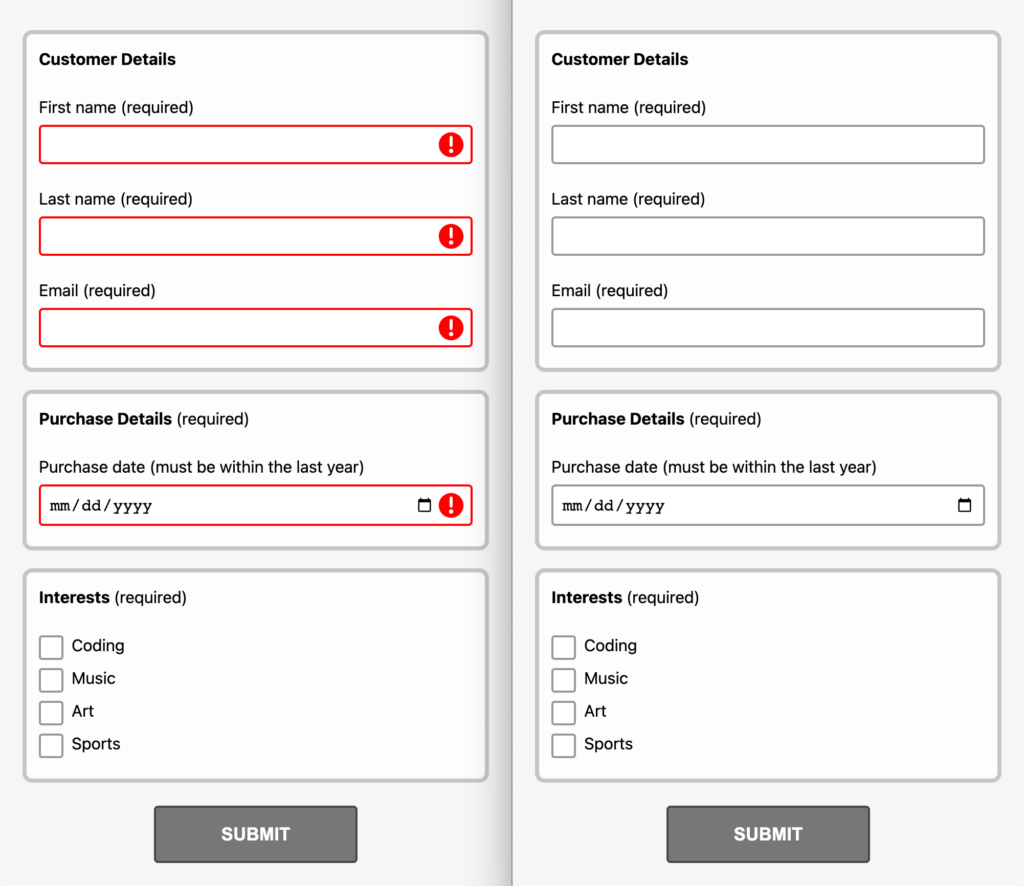
After (right): With JavaScript, Chrome version 116 no longer shows invalid styles on page load.
Note: Chrome intends to ship support soon for the :user-invalid/:user-valid pseudo-classes. Woohoo! 🎉
The CSS change we just made does mean browsers that only support :invalid/:valid no longer have any input validation styles. But no need to fret! We’ll reintroduce those styles back in a moment.
Turning off the built-in form submit validation
By default, submitting a form validates the form data. If invalid, the browser prevents the form submission and displays the built-in error message bubble next to the first invalid form control.
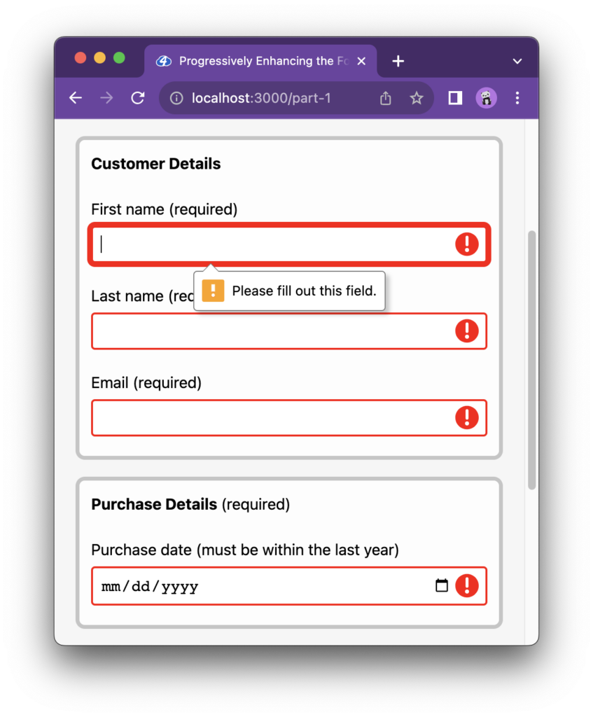
Shown above is Chrome’s error message bubble.
When the browser prevents a form submission, the form’s submit event does not fire. We’ll need to hook into the submit event to validate the form with JavaScript, so we’ll want to turn off the form submission prevention feature. Turning this feature off will also remove the error message bubbles, which isn’t bad because, as noted in the first article, native error message bubbles are not accessible (we’ll add more accessible error messages back a bit later).
We can turn off the built-in feature by adding a novalidate attribute to the form element.
The attribute should be added via JavaScript to ensure non-JavaScript experiences are unaffected. Let’s add a couple more lines to our init function responsible for:
- Adding a
novalidateattribute to theformelement - Adding a form
submitevent listener
/**
 * Initialize validation setup
 */
const init = () => {
  const formEl = document.querySelector('#demo-form');
  // Turn off built-in form submit validation.
  formEl.setAttribute('novalidate', '');
  // Handle form submit validation via JS instead.
  formEl.addEventListener('submit', onSubmit);

  // Other setup code…
}
Code language: JavaScript (javascript)novalidate attribute value to an empty string?
Why are we setting the novalidate attribute value to an empty string?
The novalidate attribute is a boolean attribute. Boolean attributes are true when they are present and false when they are absent. Technically, the value can be anything, but the convention is to use either an empty string or the attribute name as the value (e.g., novalidate="novalidate").
Super! The form is now set up so JavaScript can handle the submit validation step. We’ll return to the onSubmit handler shortly. Keep following along!
Adding event listeners for live validation
By default, form validation only happens when a form is submitted. But with JavaScript, validation can occur as a user types (real-time validation using input or change events) or moves away from an input field (late validation using the blur event); these are known as “live validation” patterns. Your project’s UX design will determine whether or not you need any live validation. For the sake of this demo, though, let’s implement both real-time and late validation to understand how to set it up.
A note on real-time validation
Not all fields should use real-time validation (not all users appreciate real-time validation). Some input fields, such as a password field with a strength meter, are good candidates, but late validation is generally always better. See this article by Vitaly Friedman to learn more about live validation UX.
We’ll first add a CSS class so our JavaScript can hook into all form controls we want to validate using the Constraint Validation API. Let’s use a js-validate class:
<label for="customer-first-name">First name:</label>
<input
  id="customer-first-name"
  name="customerFirstName"
  class="js-validate"
  type="text"
  required
/>
Code language: HTML, XML (xml)
Back in the init function, let’s add JavaScript event listeners for input and blur events for each of the js-validate input elements:
/**
 * Initialize validation setup
 */
const init = () => {
  // Set up `blur` and `input` validation for the inputs that can be
  // validated with the Constraint Validation API.
  document.querySelectorAll('.js-validate').forEach((inputEl) => {
    inputEl.addEventListener('input', (event) =>
      // Call input validation handler function
    );
    inputEl.addEventListener('blur', (event) =>
      // Call input validation handler function
    );
  });

  // Other setup code…
}
Code language: JavaScript (javascript)
Sweet! Next, we can add a JavaScript function that uses the Constraint Validation API to validate the input data.
Using the Constraint Validation API to validate and update the UI state
We’ll want to create a function to call when the input or blur events fire. Let’s name the function updateValidationStateForInput, and it will be responsible for:
- Using the
HTMLInputElement.checkValiditymethod from the Constraint Validation API to check if the data is valid for a given input based on it’stype(e.g.,type="email") and validation attributes (e.g.,required) - Using the
checkValidityvalue to update the input’s valid/invalid CSS classes and also thearia-invalidattribute value
aria-invalid do?
What does aria-invalid do?
The aria-invalid attribute enables assistive technologies to convey additional validation feedback to users:
When a field has
Using Aria-Invalid to Indicate An Error Fieldaria-invalidset to “true”, VoiceOver in Safari announces “invalid data” when the field gets focus; JAWS and NVDA notify the error as an “invalid entry”.
/**
 * Update the validation UI state for a given input element.
 * @param {HTMLInputElement} inputEl The input element to update the UI state for.
 */
const updateValidationStateForInput = (inputEl) => {
  // Check if the input is valid using the Constraint Validation API.
  // Yes, one line of code handles validation.
  // The Constraint Validation API is cool!
  const isInputValid = inputEl.checkValidity();
  // Toggle valid/invalid state class hooks.
  inputEl.classList.toggle('is-valid', isInputValid);
  inputEl.classList.toggle('is-invalid', !isInputValid);
  // Update the `aria-invalid` state based on the input's validity.
  // Converts the boolean to a string.
  inputEl.setAttribute('aria-invalid', (!isInputValid).toString());
};
Code language: JavaScript (javascript)Did you notice?
Thanks to the browser’s native HTML form validation features, input validation happened magically with a single call to the Constraint Validation API’s checkValidity method—no need for custom validation logic. Let the browser do the work!
Also of note, a similar method, reportValidity, performs the same validity check as checkValidity. We don’t use reportValidity because it also reports the outcome to the user, meaning the browser will display the built-in non-accessible error message bubble and double up any custom-designed validation error messages.
With the is-valid/is-invalid class toggle logic set up, we can add new CSS rules to style each of the UI states for the inputs:
/**
 * Provide an enhanced and consistent experience when JS is enabled.
 */
input.is-invalid {
  /* Invalid input UI styles */
}
input.is-valid {
  /* Valid input UI styles */
}Code language: CSS (css)
This also means we can contain the :user-invalid/:user-valid CSS rules to only apply when JavaScript is not available. We’ll want to update the existing selectors from Part 1 as follows:
- Add
[data-js-enabled='false']to the:user-invalid/:user-validselectors
/**
 * For browsers that support :user-invalid/:user-valid
 */
[data-js-enabled='false'] input:user-invalid {
  /* Invalid input UI styles */
}
[data-js-enabled='false'] input:user-valid {
  /* Valid input UI styles */
}
Code language: CSS (css)
With these updates, the :invalid/:valid and :user-invalid/:user-valid CSS rules now only apply when JavaScript is unavailable (the base experience). JavaScript is fully responsible for all valid/invalid states via the new is-invalid/is-valid CSS rules. This helps create a consistent user experience across all browsers when JavaScript is enabled and addresses any browser implementation bugs that may exist (e.g., :user-invalid doesn’t trigger on form submit in Safari).
Moving along, we can then call the newly created updateValidationStateForInput function on input and blur. We also want to set the initial value of the aria-invalid attribute:
/**
 * Initialize validation setup
 */
const init = () => {
  document.querySelectorAll('.js-validate').forEach((inputEl) => {
    // Set up `blur` and `input` validation for the inputs that can be
    // validated with the Constraint Validation API.
    inputEl.addEventListener('input', (event) =>
      updateValidationStateForInput(event.target)
    );
    inputEl.addEventListener('blur', (event) =>
      updateValidationStateForInput(event.target)
    );
    // Should be set to "false" before any validation occurs.
    inputEl.setAttribute('aria-invalid', 'false');
  });

  // Other setup code…
}
Code language: JavaScript (javascript)
Exciting! The form controls now have live validation. Below you can see each input’s UI styles showing both the invalid and valid styles live (as we interact with the form control):
Managing the validation states for optional fields
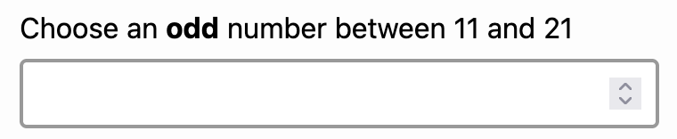
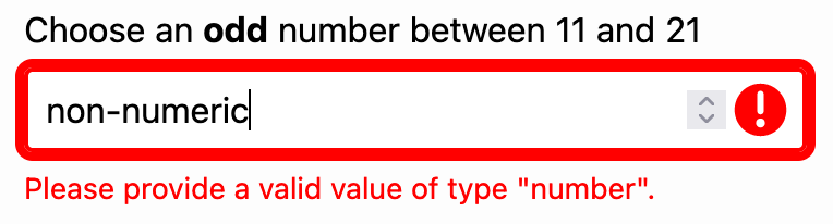
The previous section’s valid/invalid class toggle logic only accounts for situations where all fields are required (e.g., have a required attribute). We’ll need to tweak the logic if the form includes optional fields. Otherwise, an empty optional field could appear as “valid.” Or a validation error message might display without the input’s “invalid” state.
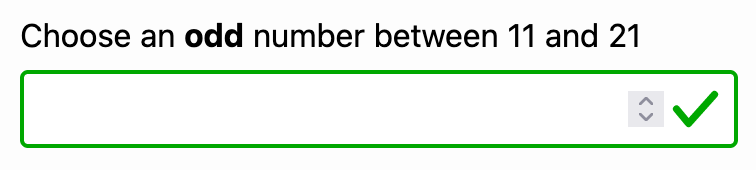
number-type field with non-numeric values shows a validation error but may be missing the “invalid” input styles.To fix these issues, we’ll add the following logic to the updateValidationStateForInput function:
- If an optional field is empty, remove all validation styles
const updateValidationStateForInput = (inputEl) => {
  // Existing code from above here…

  // Handle optional fields that are empty
  if (!inputEl.required && inputEl.value === '' && isInputValid) {
    // Clear validation states.
    inputEl.classList.remove('is-valid', 'is-invalid');
  } else {
    // Required fields: Toggle valid/invalid state classes
    inputEl.classList.toggle('is-valid', isInputValid);
    inputEl.classList.toggle('is-invalid', !isInputValid);
  }

  // Existing code from above here…
};
Code language: JavaScript (javascript)Why check if an optional field is both empty and valid?
You may have noticed that the conditional to clear the validation states confirms that a field is optional, empty, and valid. Unexpectedly, number-type inputs will report empty when you enter non-numeric values in Firefox (long Mozilla discussion) and Safari. This causes a mixed, incorrect visual validation state where only the error renders, but the input won’t show the invalid state. Adding the isInputValid check ensures the expected behavior.
With those changes in place, empty optional fields no longer show a “valid” state, and non-numeric values in number-type fields show the correct “invalid” state.
number-type fields with non-numeric values now show the proper “invalid” state.submit event
Handling the form submit event
Above, we turned off the built-in form submit validation feature so that we could use JavaScript to handle it instead. As a reminder, we added a submit event listener that calls an onSubmit callback function:
/**
 * Initialize validation setup
 */
const init = () => {
  // Other setup code…

  // Handle form submit validation via JS instead.
  formEl.addEventListener('submit', onSubmit);
}
Code language: JavaScript (javascript)
Validation UX requirements differ from project to project, but for this demo, let’s set a goal of matching the browser’s default form submission UX, which includes the following:
- Update each of the form input’s UI state
- Prevent form submission if the form is invalid
- Focus on the first invalid input
Let’s write that logic out in a new onSubmit function:
/**
 * Handler for form submit event.
 * @param {SubmitEvent} event
 */
const onSubmit = (event) => {
  // Update the validation UI state for all inputs.
  document
    .querySelectorAll('.js-validate')
    .forEach(updateValidationStateForInput);
  // Get the form element that was submitted.
  const formEl = event.target;
  // The isFormValid boolean respresents all inputs that can
  // be validated with the Constraint Validation API.
  const isFormValid = formEl.checkValidity();
  // Prevent form submission if any of the validation checks fail.
  if (!isFormValid) {
    event.preventDefault();
  }
  // Set the focus to the first invalid input.
  const firstInvalidInputEl = formEl.querySelector('input:invalid');
  firstInvalidInputEl?.focus();
};
Code language: JavaScript (javascript)checkValidity on the form element?
Hold up, checkValidity on the form element?
Great observation! The checkValidity method of the Constraint Validation API is available not only for input elements but for the form element also. This provides the flexibility to validate individual inputs as needed (e.g., live validation) and the form as a whole (e.g., form submission). And it’s all powered by each input’s constraint validation attributes, wonderful!
Hooray! Form submit validation is now wired up and working. You can see it in action below:
js-validate inputs are validated on form submission; if invalid, form submission is prevented, and the first input with an error is focused.
Using a custom design for validation error messages
You may have noticed we no longer have validation error messages to provide feedback to the user. The lack of validation messages results from adding the novalidate attribute to the form element and is a regression from the browser’s default validation UX. Let’s fix this by bringing them back using a custom design.
We’ll add an “error” element (a paragraph tag is fine) below each js-validate input, where the validation message will be displayed. We want to make sure of a few details:
- The “error” element should have a
hiddenattribute so it is not displayed by default - The input should have an
aria-describedbyattribute with the ID of the “error” element so assistive technologies can convey validation feedback to users when the input is in focus. This addresses WCAG 2.1 Success Criterion 1.3.1: Info and Relationships (Level A).
There’s also an aria-errormessage attribute that is more aligned to this use case but does not have great support yet. For now, aria-describedby is the better choice, though it’s important to note that Chromium browsers treat aria-describedby as an assertive live region. For a deeper dive comparing aria-describedby and aria-errormessage, read “Exposing Field Errors” by Adrian Roselli.
<label for="customer-first-name">First name:</label>
<input
  id="customer-first-name"
  name="customerFirstName"
  class="js-validate"
  type="text"
  required
  aria-describedby="customer-first-name-error"
/>
<p hidden id="customer-first-name-error" class="error">
  <!-- Text content will be set via JS -->
</p>
Code language: HTML, XML (xml)
The error messages are placed under the fields for this demo, though this pattern has some issues. Learn more about this from an excellent article explaining why putting messages under fields may not be the best option by Adrian Roselli.
We’ll need to add logic to the updateValidationStateForInput function to:
- Set the error message using the input’s
validationMessageproperty - Update the error message element’s
hiddenproperty accordingly
validationMessage property?
What is the validationMessage property?
The Constraint Validation API makes the validationMessage property available on input elements and allows us to get the localized browser-specific error message describing the validation constraints that have not been satisfied for the given input. An empty string is returned if the input data satisfies its constraints.
/**
 * Update the validation UI state for a given input element.
 * @param {HTMLInputElement} inputEl The input element to update the UI state for.
 */
const updateValidationStateForInput = (inputEl) => {
  // Check if the input is valid using the Constraint Validation API.
  // Yes, one line of code handles validation.
  // The Constraint Validation API is cool!
  const isInputValid = inputEl.checkValidity();

  // Existing code from above here…

  // Get the error message element for the current input element.
  const errorEl = inputEl.nextElementSibling;
  // Use the browser's built-in localized validation message.
  // The validation message returns an empty string if the
  // validation constraints are satisfied.
  errorEl.textContent = inputEl.validationMessage;
  // Show/hide the error message depending on the input's validity.
  errorEl.hidden = isInputValid;
};
Code language: JavaScript (javascript)
And, tada! The form now uses a custom design for the validation error messages. The best part is we get all the built-in error messages for free! Below, notice the email input has a series of browser-specific validation messages depending on which validation constraint fails. Pretty neat for only a few lines of code!
Have the error message accessibility issues been addressed?
Yes! Replacing the built-in error message bubbles with custom designs addresses the accessibility issues noted in Part 1.
Depending on the browser’s error message value (each browser is different), the following two WCAG 2.1 violations may still exist:
- Success Criterion 3.3.2: Labels or Instructions (Level A) – The reason for the error may not be clear
- Success Criterion 3.3.3: Error Suggestion (Level AA) – The error message may not provide a helpful suggestion
We can address the outstanding accessibility concerns by replacing the browser’s built-in error messages with custom ones. Part 4 of this series explores this very topic. 🙂
The validation error message design in the demo is straightforward (red text below the input), but with the full power of CSS at our disposal, we can get as creative as we’d like. We are no longer locked into the browser’s built-in non-accessible error bubbles that may also not fit the rest of our site’s design.
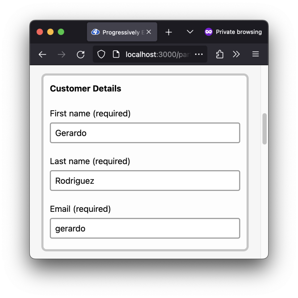
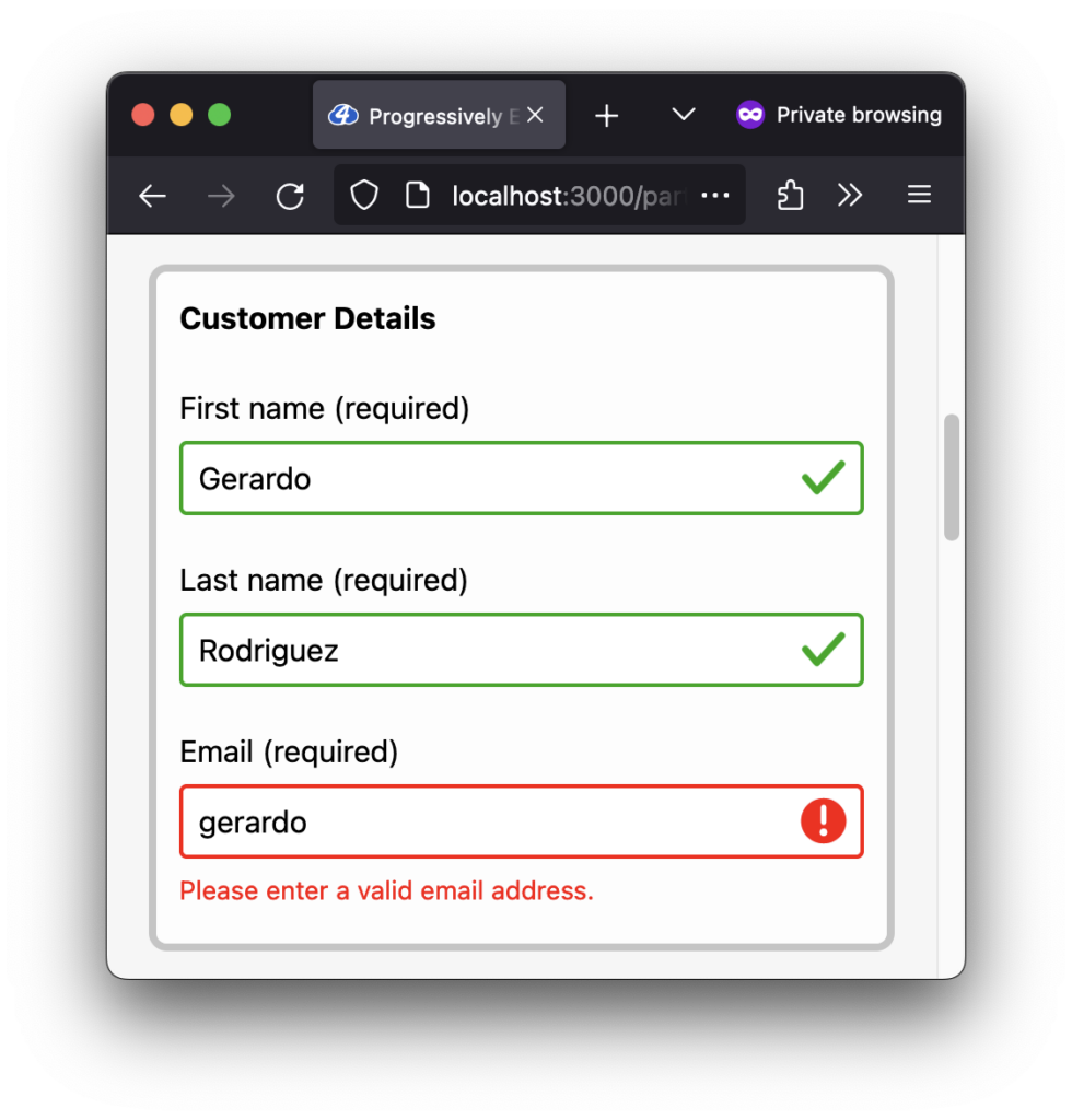
Managing the validation state for sticky field values
If you happen to be a Firefox browser user, you may have noticed that input field values hang around after a page refresh. When this happens, the valid/invalid UI states are missing:
To ensure we account for this use case, we can add a bit of code to the existing init function:
- Run the
updateValidationStateForInputfunction for eachjs-validateinput - Only call the function if the field is not empty (otherwise, empty fields will show the “invalid” state prematurely)
const init = () => {
  // Existing setup code…

  document
    .querySelectorAll('.js-validate')
    .forEach((inputEl) => {
      // Existing code from above here…

      // Update the state for prefilled inputs.
      if (inputEl.value !== '') {
        updateValidationStateForInput(inputEl);
      }
    });
}
Code language: JavaScript (javascript)
The prefilled input fields now show their appropriate valid/invalid UI states. Much better!
What about inputs that cannot be validated with the Constraint Validation API?
If you find yourself in this uncommon situation, you can use custom JavaScript to validate the input data.
A checkbox group is an example that native browser validation features will not validate. Part 3 of this article series examines one way to solve this challenge.
A note on form validation and security
Client-side validation is an important feature to help provide an enhanced, more accessible user experience allowing users to fix invalid data immediately before submitting it to the server. However, the data validation process should also include server-side validation because a malicious user can easily bypass client-side validation, allowing them to send bad data to the server. You can read more about website security on MDN.
Wrapping up
Thank you for following along! It was fun progressively enhancing the form validation experience with JavaScript and making it more accessible, all while using built-in validation features as the foundation.
As mentioned above, Part 3 of this series dives into writing custom JavaScript validation for a checkbox group.
Part 4 explores using the Constraint Validation API’s ValidityState interface to help render custom validation error messages.
Stay tuned!
A special thanks to Tyler Sticka for challenging me to think about form validation from a different perspective. At some point in my journey, the story I created around form validation immediately jumped to using validation libraries or custom JavaScript without considering the browser’s built-in Constraint Validation API. In retrospect, it seems silly not to use the Constraint Validation API; no need to reinvent the wheel! Thanks for always inspiring me to strive for continuous growth. (And thank you for the SVG validation icons!)
Also, a huge thank you to Juliette Alexandria and Adrian Roselli for reviewing this article and providing accessibility feedback. 🙌🏽
More resources
- A Guide To Accessible Form Validation by Sandrina Pereira
- Avoid Default Field Validation by Adrian Roselli
- Designing Better Error Messages UX and A Complete Guide To Live Validation UX by Vitaly Friedman
- Accessible Rich Internet Applications (WAI-ARIA) 1.3:
aria-invalid - MDN Web Docs: Built-in form validation examples
- MDN Web Docs: Validating forms using JavaScript
- MDN Web Docs: Complex constraints using the Constraint Validation API
Missed an article in the series?
I’ve got you! Listed below are all of the articles from the series:
Gerardo Rodriguez is a developer driven by curiosity and the love of learning. His experience with art, design, and development make him a well-rounded maker of things on the web. You’ll find him sharing some thoughts and resources on Mastodon (@gerardorodriguez).