The war between Windows and MacOS has waged for decades. Now, it’s getting dark. Dark mode.
Dark mode, if you’ve managed to dodge the term so far, is an alternative skin for an operating system or app. Most software is designed with a gray or off-white background because, well, because that’s what people are used to seeing.
Yet geeks, particularly developers and engineers, have long boasted about the benefits of a dark streak. It’s easier on the eyes, provides better contrast in most cases, and may even save on battery life – or so the hype says.
In response, Apple and Microsoft have added dark mode support as a feature. Both MacOS and Windows now let you switch to it with just the click of a button. That’s great, but you may wonder – who’s the darkest of them all?
The interface
Dark mode has its roots in the secret interface tweaks of enjoyed by developers, but the version that’s placed in MacOS and Windows doesn’t require any tricks or insider knowledge. MacOS Mojave asks if you’d like to use dark mode when you set it up, and both operating systems let you switch back and forth at the click of a button. There’s no need to reboot or even restart applications currently in use.
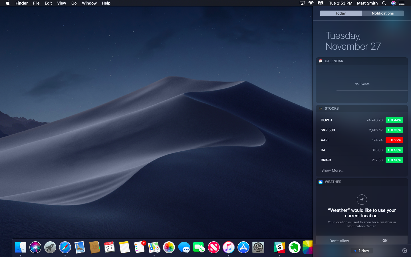
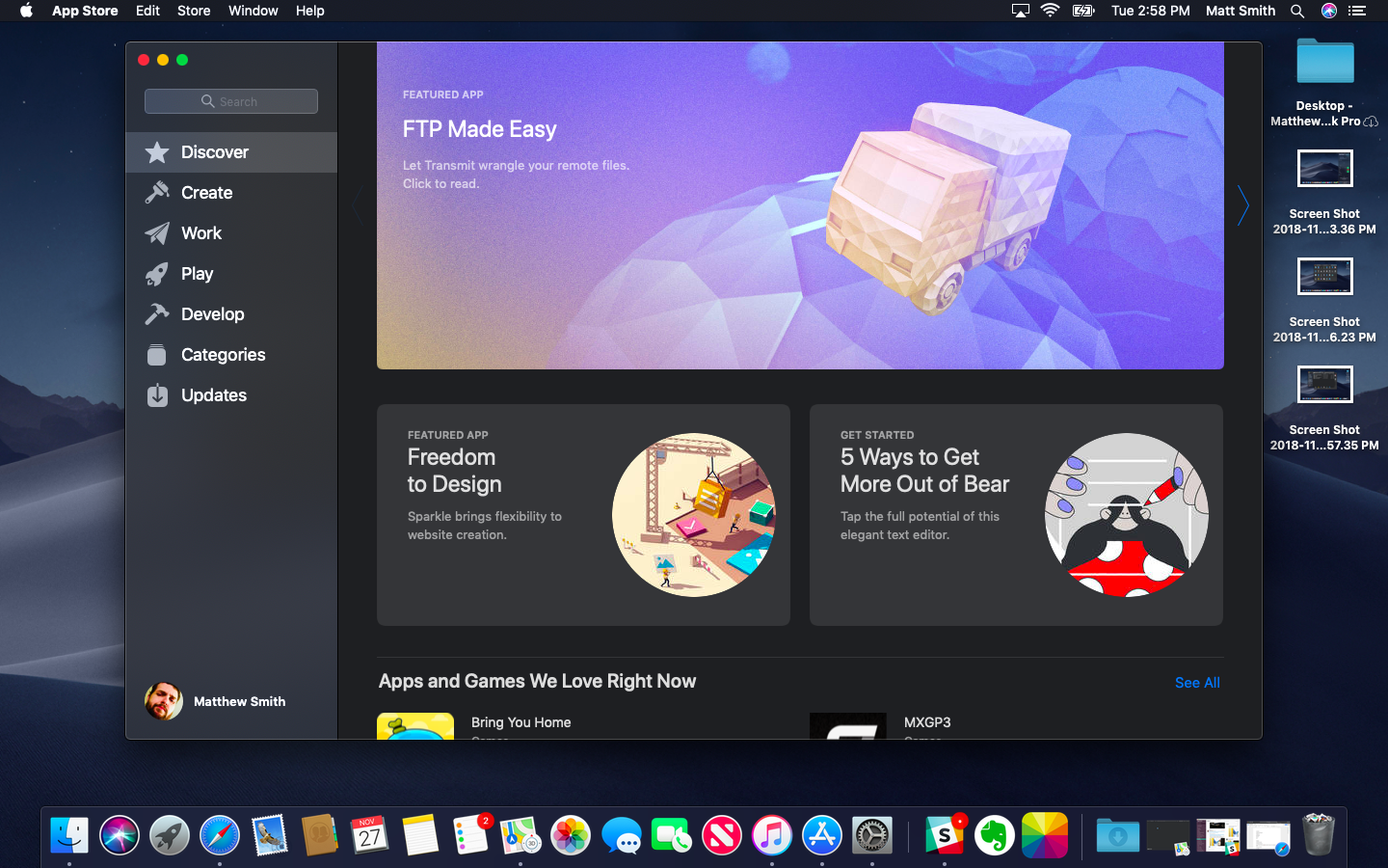
Both operating systems apply dark mode to most first-party applications, too. This includes Calendar, Maps, Contacts, and all the common user interface elements you find on both. Context menus, task bars, docks, and notifications all received the proper coat of paint. Dark mode looks good on both, too, offering tones of black and dark gray that are easy on your eyes.
Either will keep you happy most of the time, but differences do appear when you dig deeper. Here’s the big one; Windows 10’s dark mode only applies to Universal Windows Platform apps. It doesn’t change older, legacy interfaces. That includes Explorer, Task Manager, and all the old Control Panel menus, some of which still don’t have their function replicated in Windows 10’s Settings Menu.

That spoils the feature. The developers, prosumers, and enthusiasts who want dark mode the most are also the people who frequently seek out and use the legacy interfaces that don’t benefit from dark mode.
Web browsing
Activating dark mode in MacOS automatically turns it on in Safari. There’s no independent control of the feature. Microsoft’s Edge browser has dark mode, but it’s toggled separately in Edge’s menu. I can imagine situations when controlling the operating system and browser individually might be helpful, but I think Edge should switch over to match Windows 10 by default.

Each browser looks great in dark mode. All context and option menus appear to render just as they should, offering a high-contrast experience that looks slick. Safari and Edge are fundamentally different in feel, but the dark mode version of each is faithful to the ‘light mode’ look.
We must again nitpick Microsoft’s approach, though, for a reason that’s as simple as it is silly. Edge opens an MSN home page by default. It’s a web page, not part of the application interface, so it doesn’t get the dark mode treatment. This also applies to the “blank” page that you can choose to select instead of MSN. You’ll always be greeted with a grayish-white page in Edge, unless you manually change the home page to a website with a dark background.
Safari has no such problem. Its default new tab page, which has a list of featured websites, will change its background to slate gray when dark mode is turned on.
MacOS and Windows are too dark for others
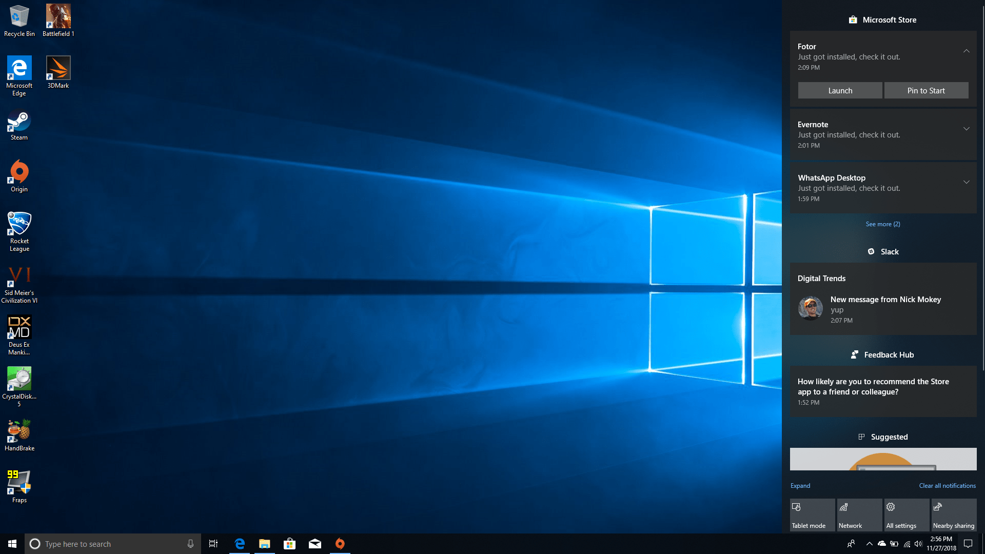
Both MacOS and Windows offer a decent dark mode experience if you stick to first-party apps but, of course, you won’t. Most people use at least a few third-party apps, and some people install tens or hundreds of applications.
Evernote was the only app that switched to dark mode automatically, and only on MacOS.
That does become a problem, because third-party applications generally don’t adopt dark mode when it’s turned on. Comparing OneNote, Slack, WhatsApp, Evernote, and Fotor side-by-side, we found that Evernote was the only app that switched to dark mode automatically, and only on MacOS.
Most applications have a default look. It may be light, or it may be dark; Spotify and Discord are two popular apps that go for a dark theme by default. Very few apps offer an official alternative theme, and fewer still switch to match an operating system’s default.
That’s a bummer, and it often feels as if the developers could do more to support dark mode. It’s a relatively new feature, however. Perhaps third-party apps just need time to catch up.
MacOS is the darkest of them all
We’re thrilled to see MacOS and Windows embrace the darkness. We are fans ourselves, and while using a “light” mode theme doesn’t make our eyes bleed, we prefer the subtle look of dark mode.
Still, one operating system is darker than the other. MacOS offers a better experience, with a complete implementation of dark mode across first-party menus and applications. Congratulations, Apple. Your darkness is unmatched.
Editors' Recommendations
- Don’t download the latest macOS Ventura update just yet
- After decades of Windows loyalty, I’m switching to Mac
- 7 key settings in macOS Sonoma you should change right now
- I love Macs. But here are 5 reasons I keep coming back to Windows
- Apple fixed one of my biggest macOS gripes with Sonoma — but I still want more