Navigation for Design Systems and Style Guides

A key part of my job for the past year has been contributing to design systems. To benefit from those contributions though, users need to be able to find them. That’s why it’s not only the content of a design system that’s important but also its usability. Design systems should be easy to navigate, especially as the system grows.
Design systems vary in size, so the type of navigation that works for one may not work as well for another. However, there are some common solutions. We’ll be looking at some of these different solutions and when it makes sense to use one over the other.
A List
The simplest solution is a list. Lists are easy to understand and require little input from the user. Because of this, they are a great choice for smaller design systems.
There are some best practices for designing a list:
- Grouping navigation items into related sections with concise, descriptive headings improves discoverability.
- It’s also important for the headings and subsequent list items to be distinct. Distinct headings help users to quickly find relevant content without having to read through the entire list.
- The distinction between different sections should also be clear so that sections don’t blur together.
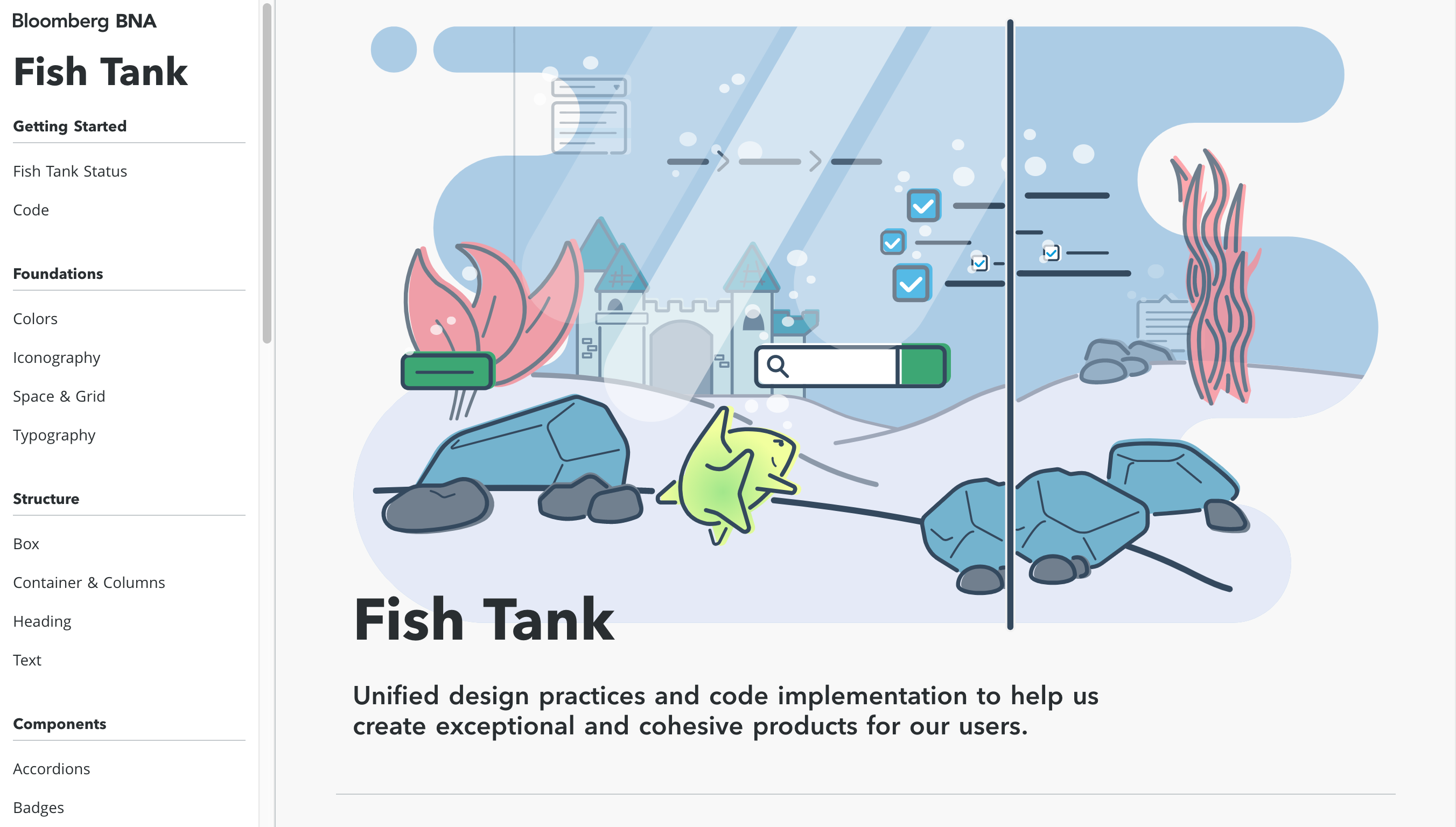
The Fish Tank Design System is a good example of a list-style navigation with clearly organized sections.
Primary and Secondary Navigation
Even well organized and designed lists can become overwhelming in a large design system. One solution is to break the navigation into primary and secondary navigation groups.
The primary navigation provides a high-level overview of the design system and is where each section of the design system is listed. The items in the primary navigation often lead to an overview page. Overviews are helpful because they provide insight into the type of content in each section and how that content should be used.
The secondary navigation includes a list of items specific to a section. In the GOV.UK Design System, each section has a secondary navigation group. For example, in the components section, the secondary navigation includes a list of components.
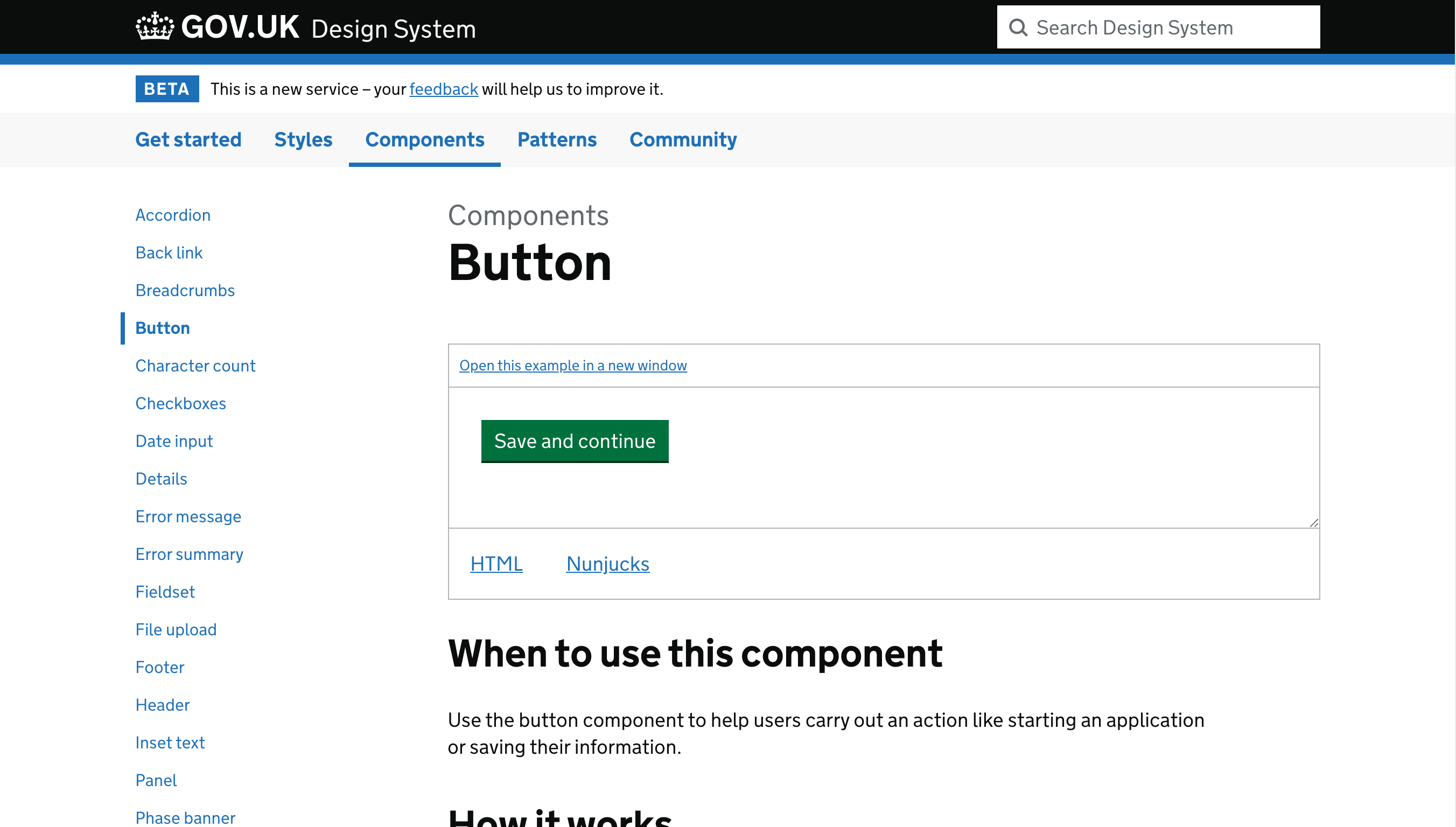
Because the navigation is divided, it’s helpful to provide visual cues that indicate where the user is. Using breadcrumbs or adding an “active” class to the current section and page are both good ways to orient the user.
Accordions
Another solution frequently used by large design systems is an accordion. An accordion is a list of sections that expand and collapse.
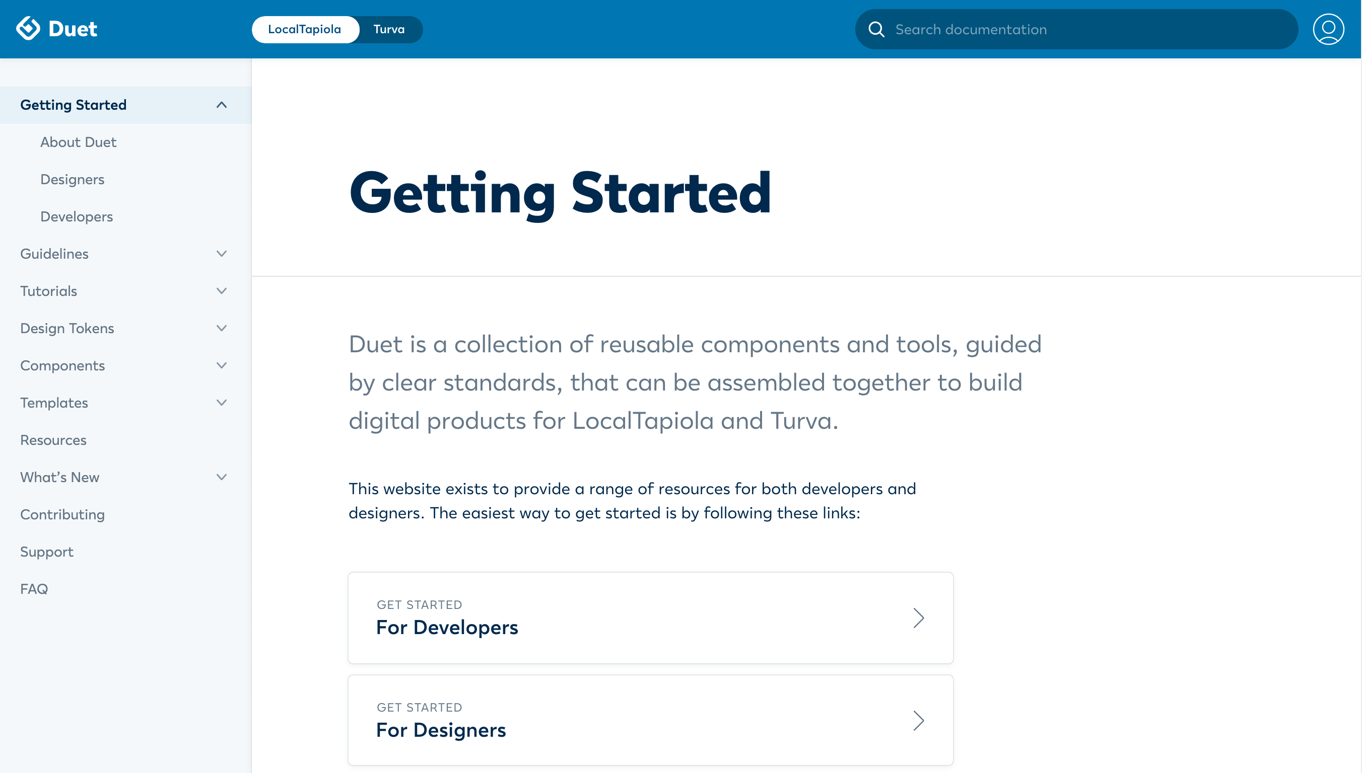
Accordions are useful when a design system has many different sections. In the GOV.UK example mentioned earlier, there were only a handful of items in the primary navigation. In comparison, the Duet Design System has a lot of sections. Even on large screens, it would be hard to fit all these in a horizontal navbar.
Page loads and wait times are other important factors to consider. Accordions have an advantage over the primary and secondary navigation solution because they don’t require a page-load to view the content of another section.
In comparison to the other solutions, accordions are more complex. Because of that, there are some additional behaviors to consider:
- Should sections automatically collapse when another is opened?
- Does each section have a corresponding overview page? If so, how do you link to those?
Combining Navigation Patterns
The different patterns are often used in combination together. It may make sense to use an accordion-style navigation on small screens where there is less space, but a list-style navigation on large screens when the entire navigation is likely to be visible.
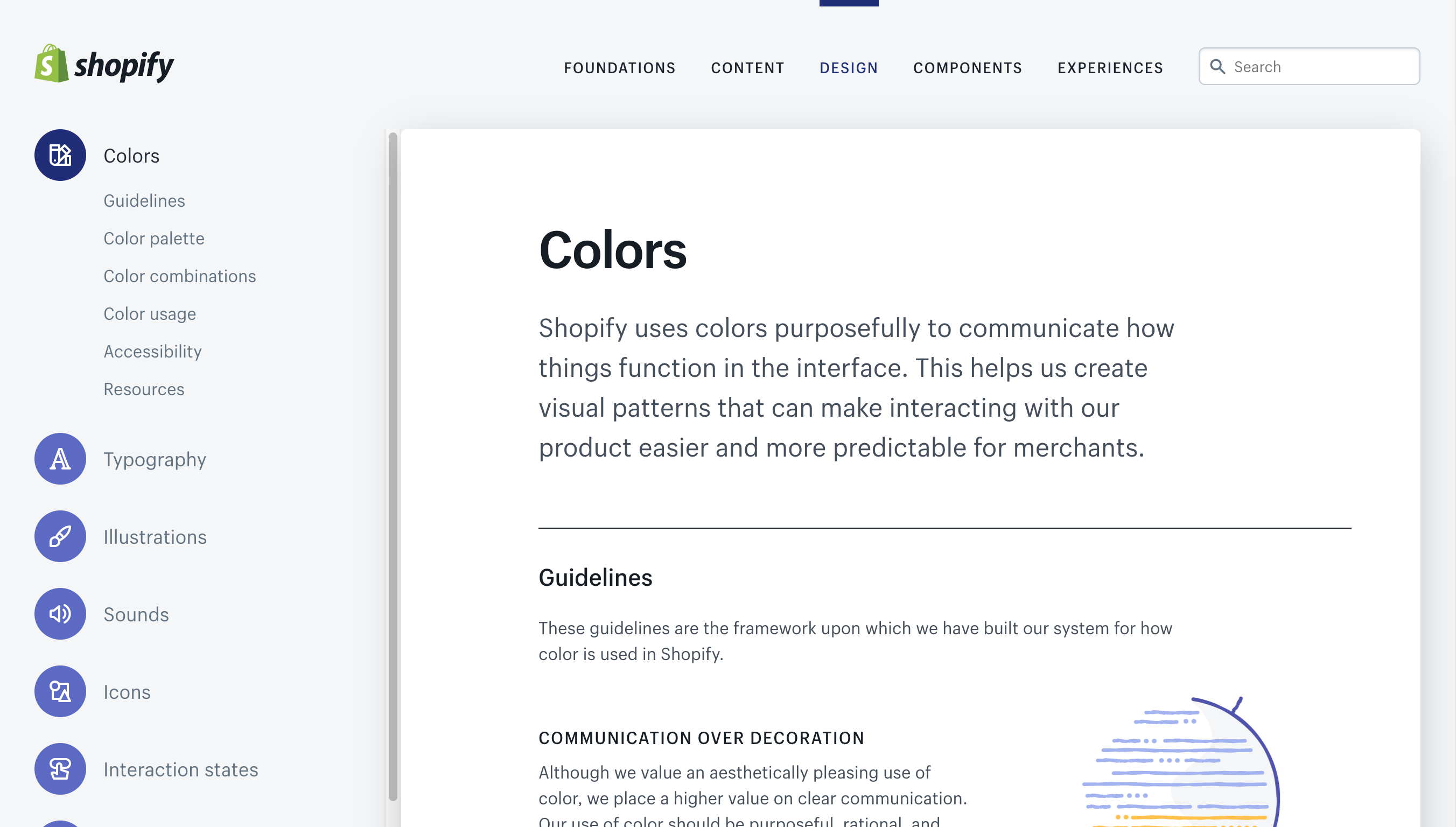
Shopify’s design system, Polaris, has two levels of navigation. The secondary one uses an accordion pattern. The additional level of navigation lets users jump to a specific part of a long page instead of scrolling to find specific information.
Finding a Solution that Works
For an organization to benefit from a design system, it needs to be usable. Everyone, from frequent contributors to unfamiliar users, should be able to find content quickly and easily. Many factors can influence what type of navigation works best, but the solutions outlined here are a helpful place to start.